

What’s a card? What’s a list?
To help us understand when using a card or list is more appropriate for UX purposes, it helps us greatly to first understand what each is and what each does (or is supposed to do). A card is a container that displays various bits of related information, from which users can get even more information. While it’s still a product of flat design, it’s more properly classified as being Flat Design 2.0 since it usually does have light 3D effects like drop shadows to indicate clickability. 3D effects like that visual depth function as the signifier to users, telling them they can click for further information. Interestingly, there’s something of a dichotomy with a card since it usually resembles an actual playing card both in shape and size. This is suggestive of the out-of-date skeuomorphism, where graphical elements resembled actual items. A list is a page where a user’s search criteria or browsing habits takes them. The listing page essentially features a number of various candidate items or entries. Therefore, a list has to facilitate efficient and quick eye scanning for proper UX. This is an important distinction that helps us differentiate when a list is more appropriate than a card, in terms of usability.When to use cards
Now that we know the key differences between cards and lists, it’s easier for us to know with confidence when using each is appropriate in web design.For information browsing (as opposed to searching)
Cards make it hard or even impossible for users to easily discern the ranking importance of content. For instance, cards provide no obvious information about the order in which content should be viewed on a page since the outline/borders of cards all look similar. Certainly, basic eye-tracking research always suggests that users first begin with content on the top and left of a page, but lists make it way more intuitive for users to follow along with this fundamental way of absorbing online content.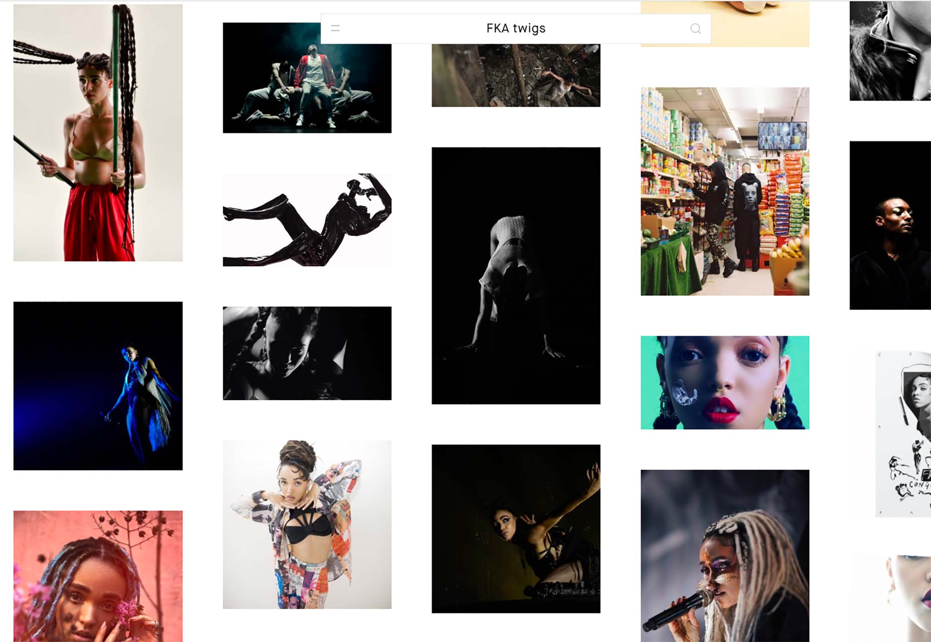 That’s why using cards for browsing huge collections—like those on Pinterest, for instance—is ideal. When you’re just browsing search results on Pinterest, instead of determining in what order to view it, the infinite scroll of card-based results makes browsing attractive, fun and easy. Whenever you see something interesting, you can immediately click on the card for more info. It’s instant gratification.
For groupings of diverse items
Depending on the app or program you’re using, you’ll eventually encounter a one with a dashboard that uses card-based design to make it easy to differentiate between various types of content. This is an example of the strength of cards to quickly allow users to identify the different types of content they’re managing.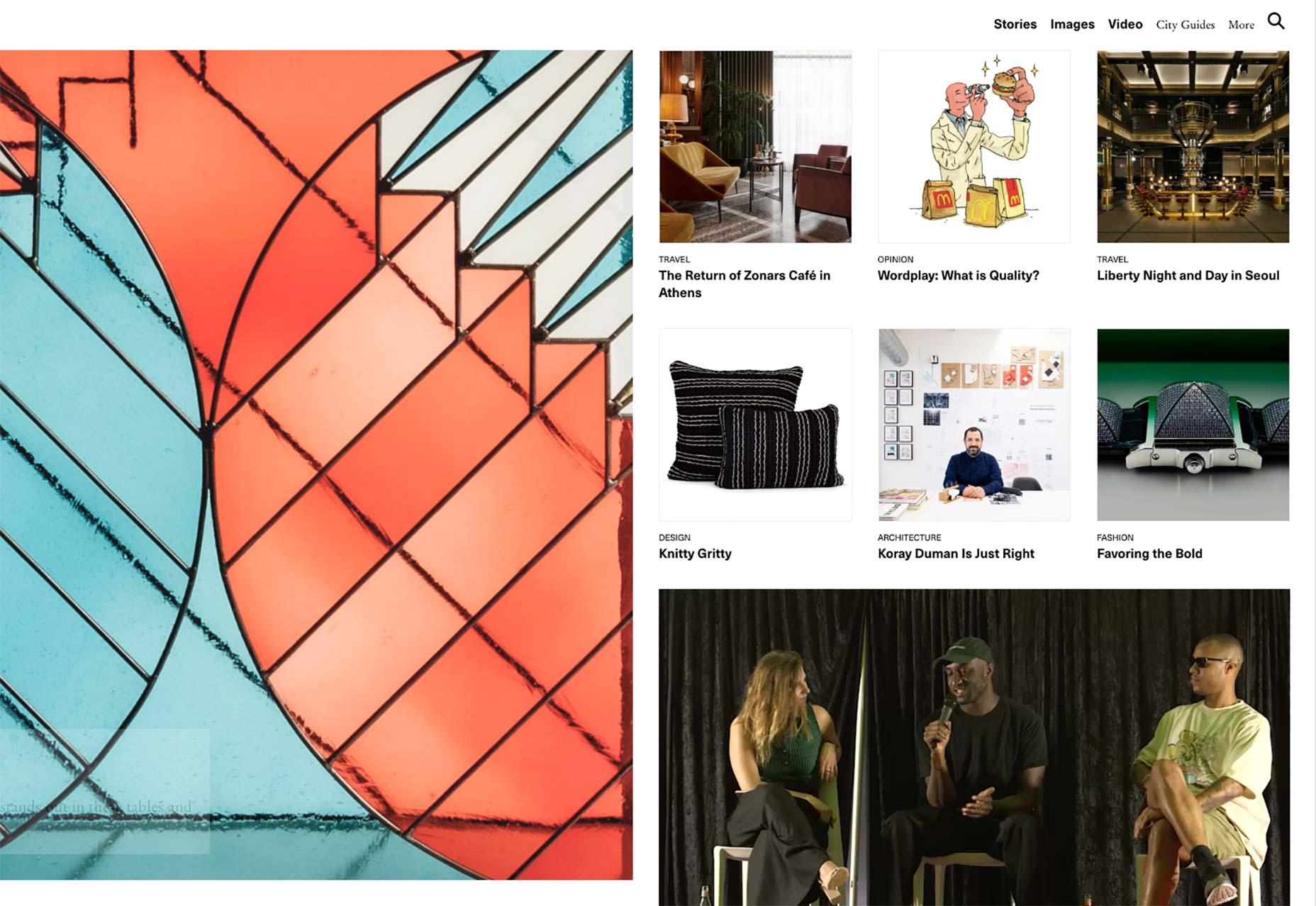 Since cards use borders to establish visual boundaries, they’re ideal when it comes to grouping disparate elements.
When to use lists
Lists can be a bit more straightforward than cards, perhaps because they’ve been around longer in web design. As a result, it tends to be easier to determine when to use them well.For efficient eye scanning
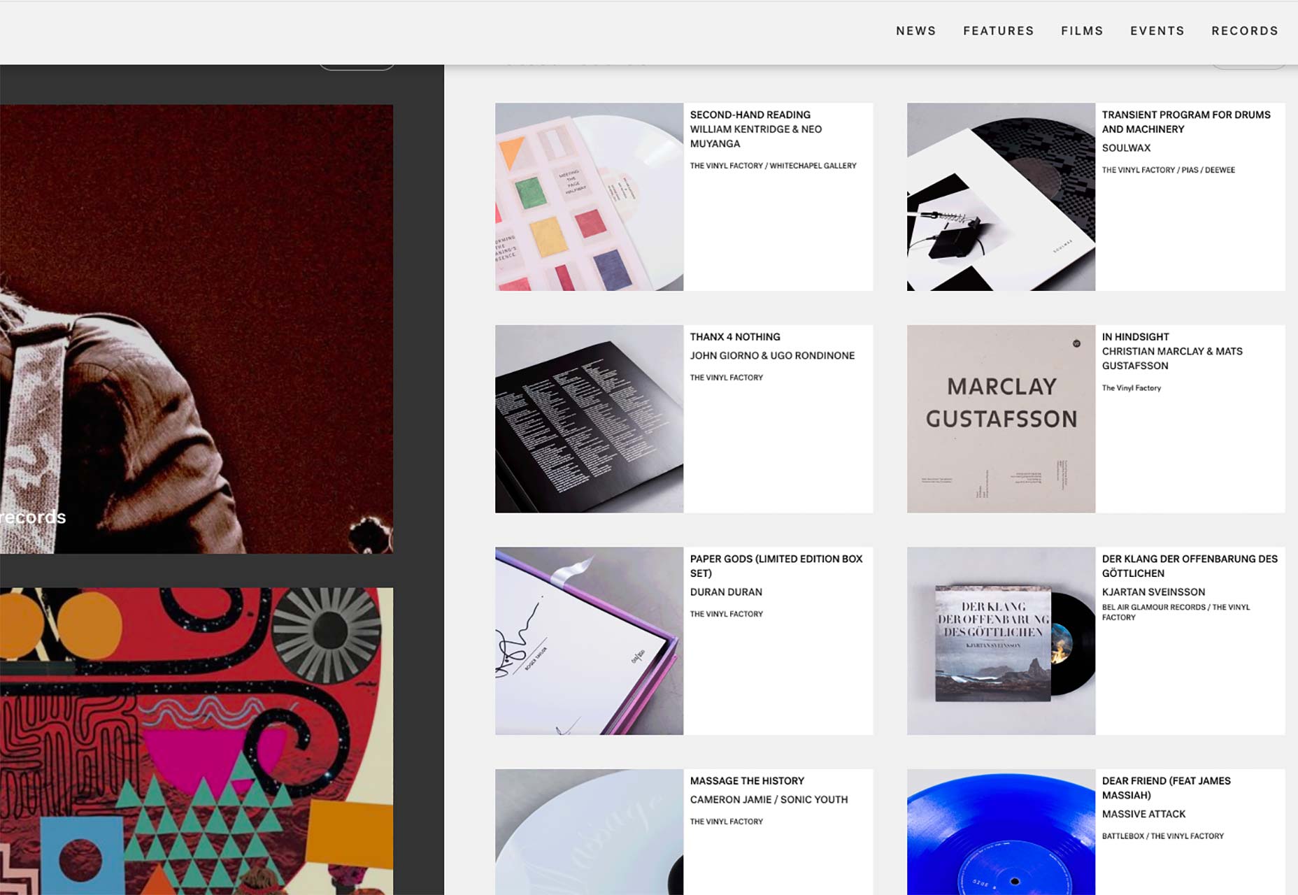
Lists are preferred when users need to quickly search for something they want on a site, as when they’re perusing the search-results page after entering their search terms. Lists that are vertical and where one element sits on one row above the next help to focus the user’s eyes much better than cards, as lists are fixed whereas cards don’t sit in fixed positions in rows.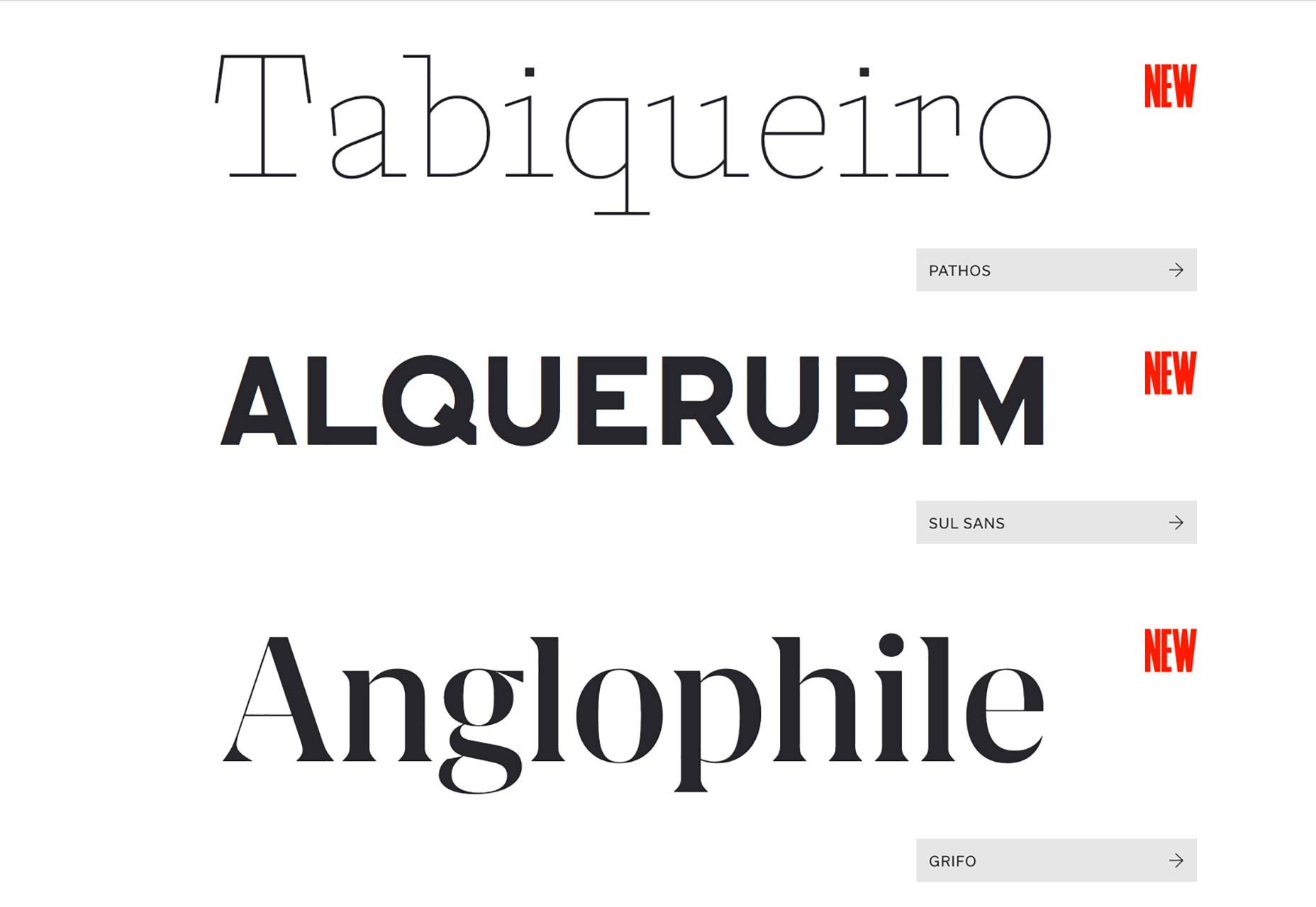
For smaller screens
Simply put, cards take up way more real estate on the screen. This makes their use on mobile devices and some tablets problematic because it forces users to scroll down on the page to see more choices sooner than when lists are used. Since a list’s elements just sit in short rows down the length of a page, users can see more choices without having to rely on short-term memory (which those looking at a card-based design would have to do when they start scrolling down to see more elements). As soon as your design demands that users remember choices further up on the screen, they’ll start to encounter cognitive load, which harms UX. Cognitive load means your brain has to work harder to remember something while it’s still processing additional, new information. This in turn leads to slowing down the speed of tasks and, potentially, complete abandonment of a user task. On my smartphone’s App store app, app categories are organized into a neat, vertical list that displays eight items on one page, without me worrying about having to scroll down to see more and remember the earlier choices. If this had been done in a layout with the much bigger cards, I’d have only been able to see a few choices at most, hampering my UX.
Cards vs. lists
Cards are simply an organizational system to display bits of related information that’s linked to additional information deeper into the site navigation. They’re great for letting users browse lots of information and for grouping items. Lists are pages that show search results and entries that are candidate items matched to the search query. They’re ideal for organizing similar content into vertical alignment. Remember this vital distinction between the two, and you’ll be organizing content masterfully with great design.Marc Schenker
Marc’s a copywriter who covers design news for Web Designer Depot. Find out more about him at thegloriouscompanyltd.com.


Read Next

3 Essential Design Trends, May 2024
Integrated navigation elements, interactive typography, and digital overprints are three website design trends making…

How to Write World-Beating Web Content
Writing for the web is different from all other formats. We typically do not read to any real depth on the web; we…
By Louise North

20 Best New Websites, April 2024
Welcome to our sites of the month for April. With some websites, the details make all the difference, while in others,…

Exciting New Tools for Designers, April 2024
Welcome to our April tools collection. There are no practical jokes here, just practical gadgets, services, and apps to…

How Web Designers Can Stay Relevant in the Age of AI
The digital landscape is evolving rapidly. With the advent of AI, every sector is witnessing a revolution, including…
By Louise North

14 Top UX Tools for Designers in 2024
User Experience (UX) is one of the most important fields of design, so it should come as no surprise that there are a…
By Simon Sterne

What Negative Effects Does a Bad Website Design Have On My Business?
Consumer expectations for a responsive, immersive, and visually appealing website experience have never been higher. In…

10+ Best Resources & Tools for Web Designers (2024 update)
Is searching for the best web design tools to suit your needs akin to having a recurring bad dream? Does each…
By WDD Staff

3 Essential Design Trends, April 2024
Ready to jump into some amazing new design ideas for Spring? Our roundup has everything from UX to color trends…

How to Plan Your First Successful Website
Planning a new website can be exciting and — if you’re anything like me — a little daunting. Whether you’re an…
By Simon Sterne

15 Best New Fonts, March 2024
Welcome to March’s edition of our roundup of the best new fonts for designers. This month’s compilation includes…
By Ben Moss

LimeWire Developer APIs Herald a New Era of AI Integration
Generative AI is a fascinating technology. Far from the design killer some people feared, it is an empowering and…
By WDD Staff