

1) Dark overlay on images
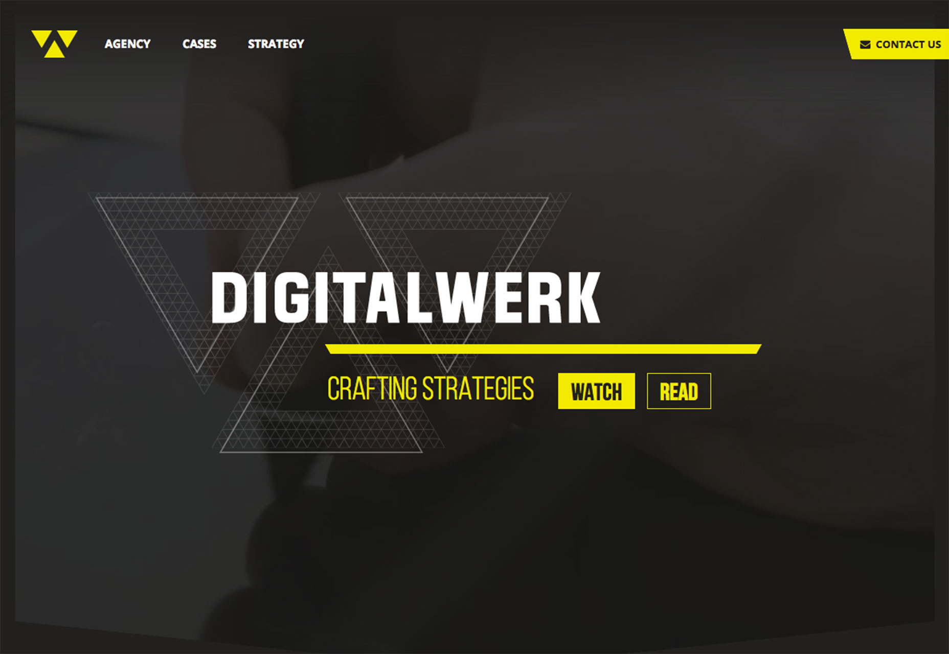
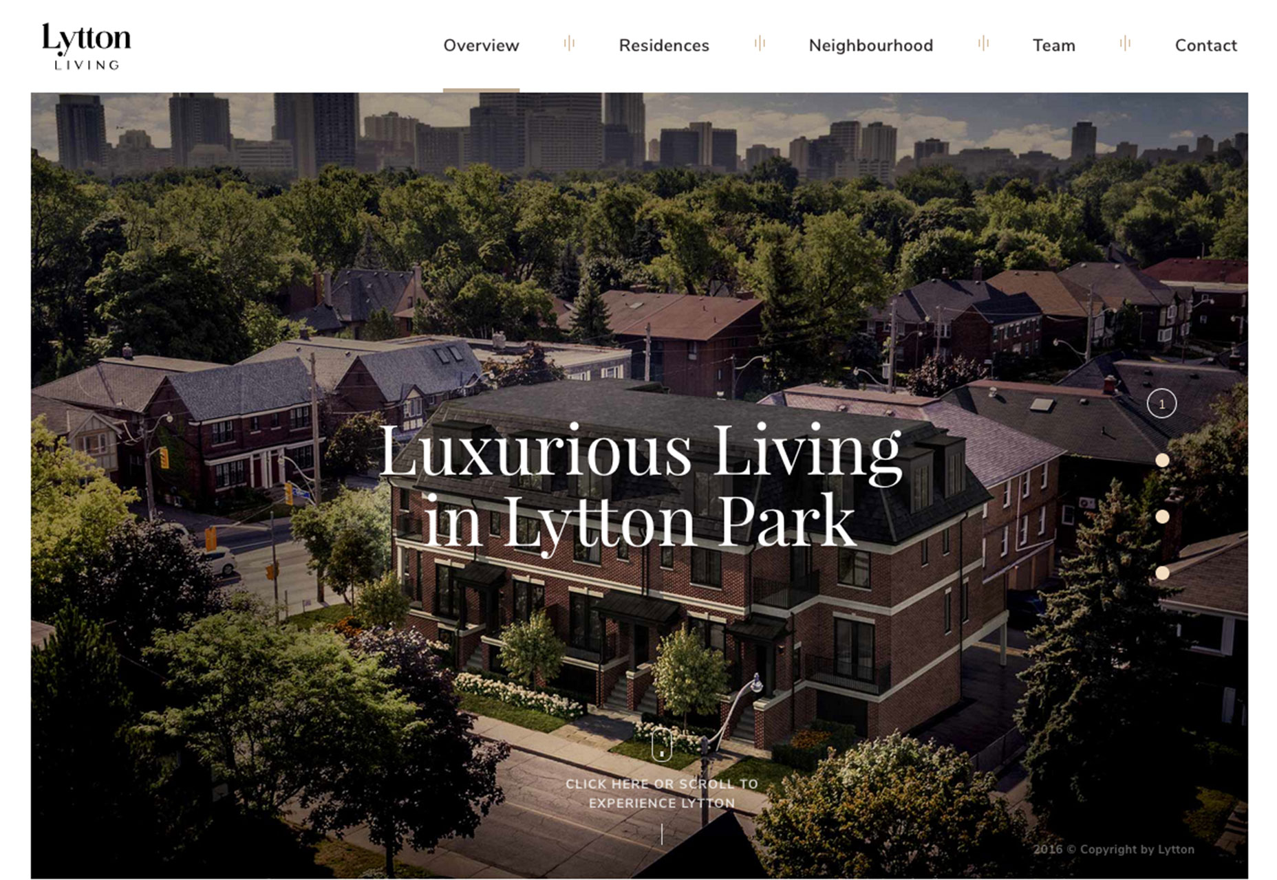
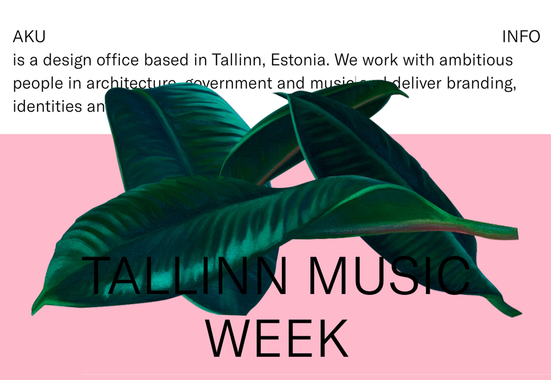
It doesn’t matter if the hero image is still or moving, a dark color overlay can help even colors in a way that makes it easier to add text and other elements to a layer on top of the image. While this might sound like a shortcut at first, there’s a lot of value in this technique. The primary reason to opt for a color overlay is to enhance readability. Most images contain light and dark color variances, making it a challenge to add lettering that is readable on every device. Even if there’s a perfect placement for desktop wide screens, the same image and text combination may render undecipherable on a mobile screen. That’s where a color overlay helps. The semitransparent wash of color over an image or video should amp up the contrast. Then white or light-colored lettering has a place and will remain readable. Dark color overlays are visually interesting for other reasons as well. Don’t get stuck in the trap that dark means black or gray. A dark overlay can be any color, such as the green used by Internetum, below. A fun or unusual color choice can help draw users into the design. A dark overlay can do one more thing: it can help camouflage an image or video that you don’t want to be at the forefront of the design. This could be because the image is a little old, a little soft in terms of composition or just one that falls a little flat. A color overlay can change the mood of the image, make it a little less prominent and help the design focus more on other content, such as text, calls to action buttons or other graphic elements. Overlays can be really dark, such as Digital Werk or can provide a subtle darkening in the manner of Lytton Living. You know you have the right balance when you can still see the image and all layered elements are easy to read.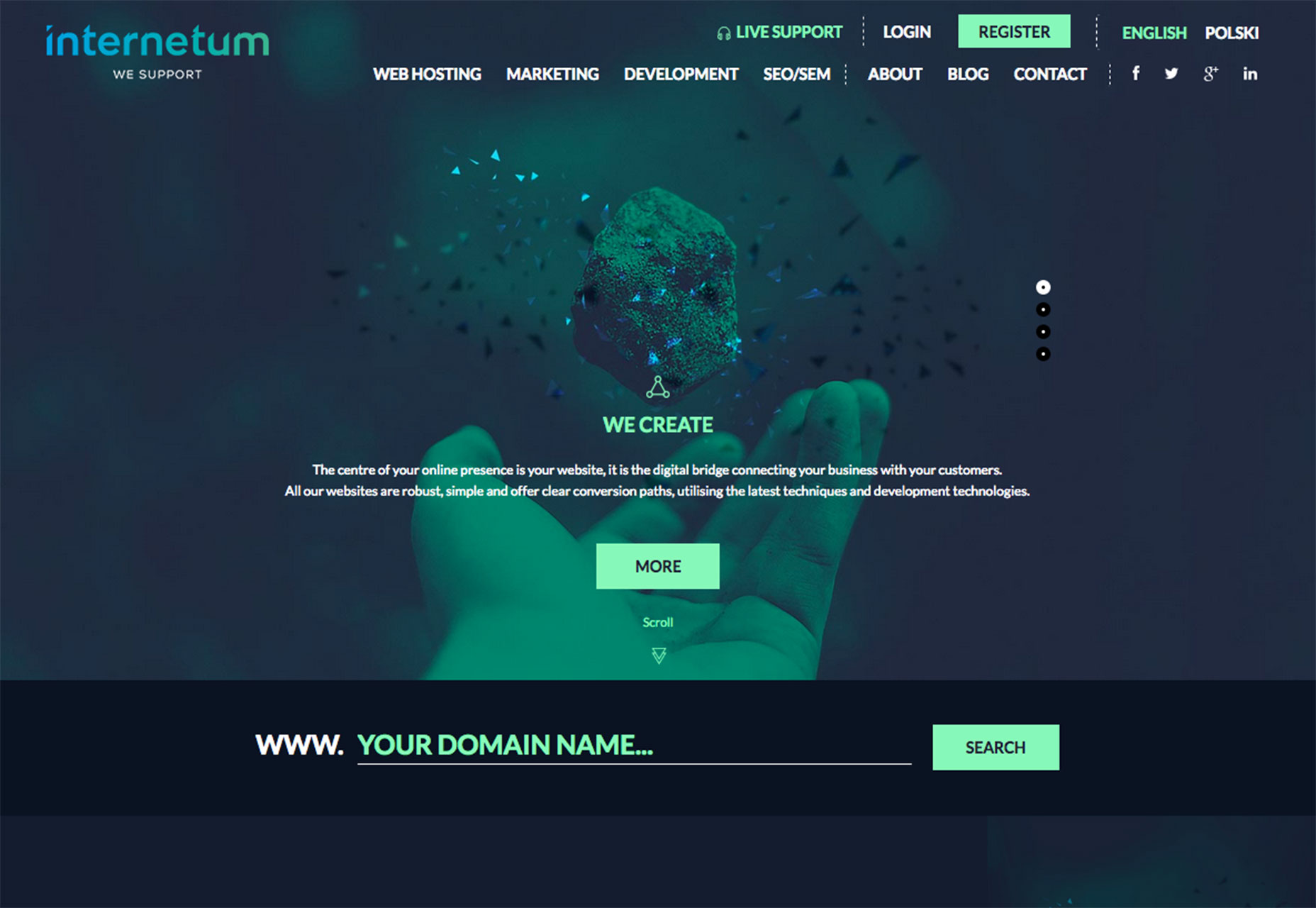
2. Brutalism
Ugly. Harsh. Sharp. Busy. These are just a few of the words that some have used to describe the brutalism website design trend. But just because a designer experiments with brutalism does not mean the design is a hot mess. It’s quite the opposite.This style employs a different style and sensibility that includes things you see and things you can’t. Ben McNicholl described it this way in a post for Envato: “’Brutalism’ comes from the French word for ‘raw,’ so keep that in mind when you’re writing your code.
“A website doesn’t have to be a horror show of unordered images and clashing font colors; the way the code has been written is also symbolic of the style. Embedded CSS, untabbed code, HTML tables, the list goes on.”
There are enough examples of brutalism that there’s a whole website gallery devoted to these designs. In the introduction, the website refers to brutalism in this way: “In its ruggedness and lack of concern to look comfortable or easy, brutalism can be seen as a reaction by a younger generation to the lightness, optimism and frivolity of today's web design.” What’s particularly interesting about brutalism is that the design looks so different from all the flat and minimal styles that have been so prevalent. If you come across one of these designs, you can’t help but stop, look and explore. Whether you think it is beautiful or ugly or something in between, that’s the ultimate goal of any website design.
3. Hollow lettering
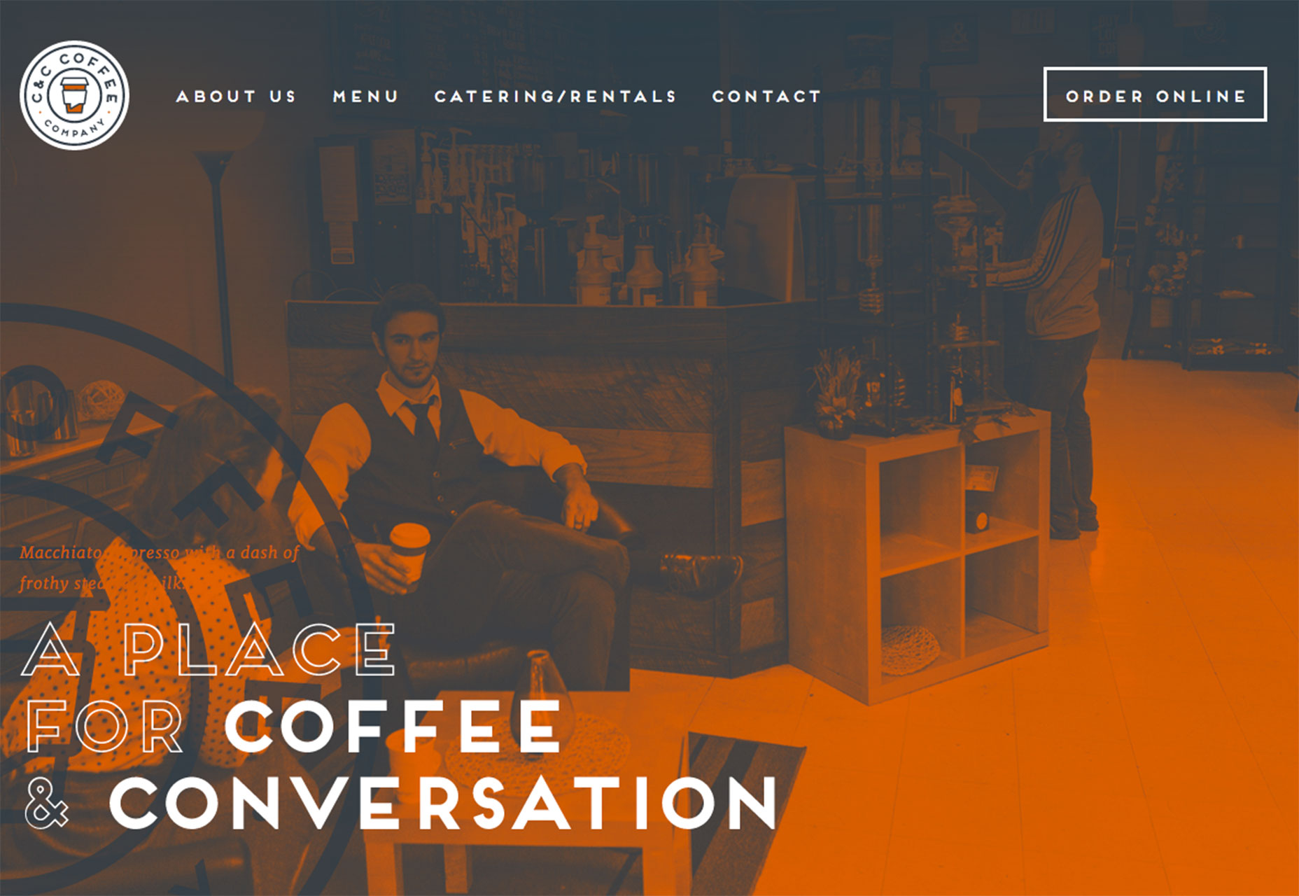
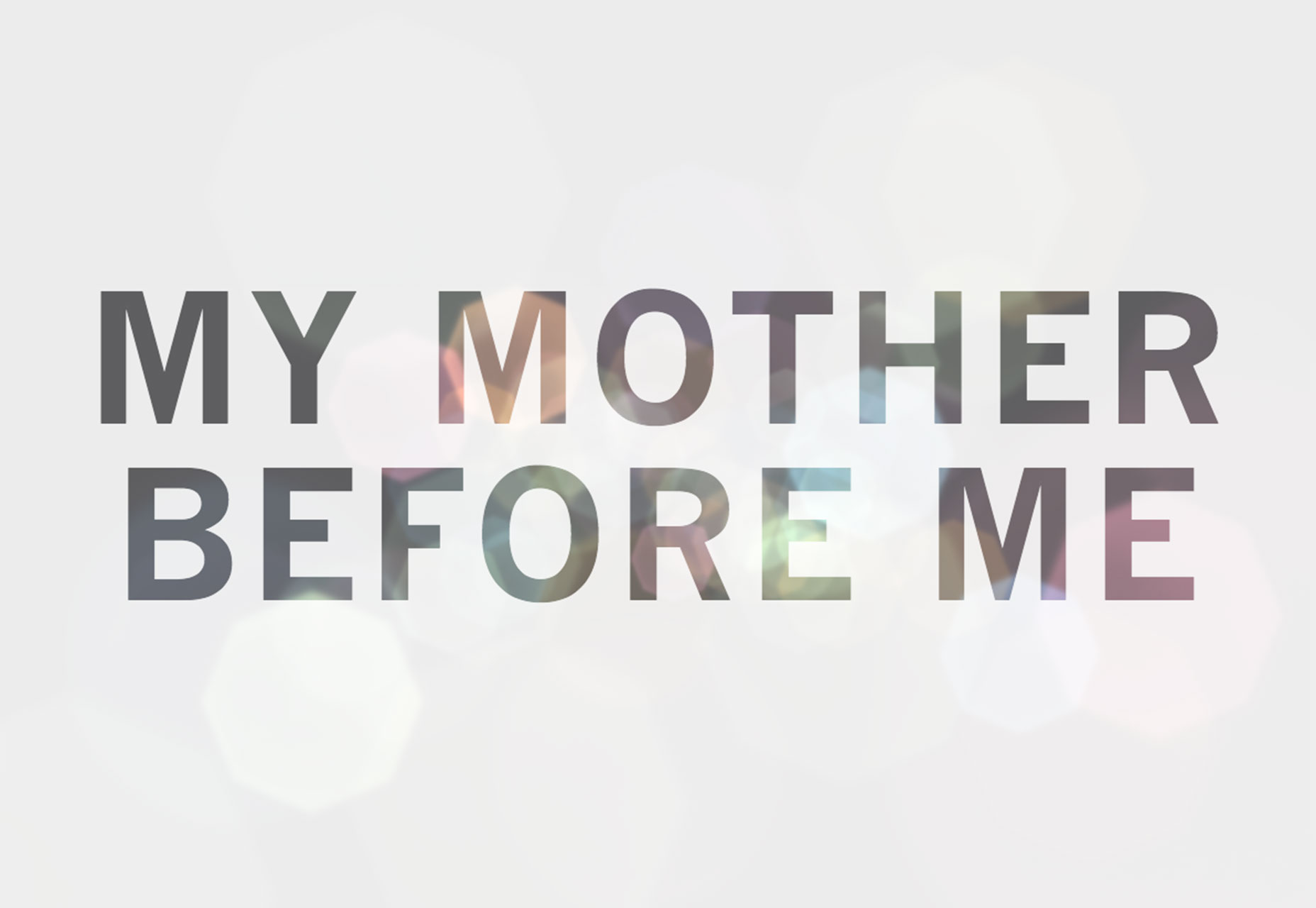
Letters with interesting fills are beginning to pop up all over the place. What’s interesting about this trend is that it has two distinctly different looks:- Hollow lettering over an image or colored background, such as C&C Coffee.
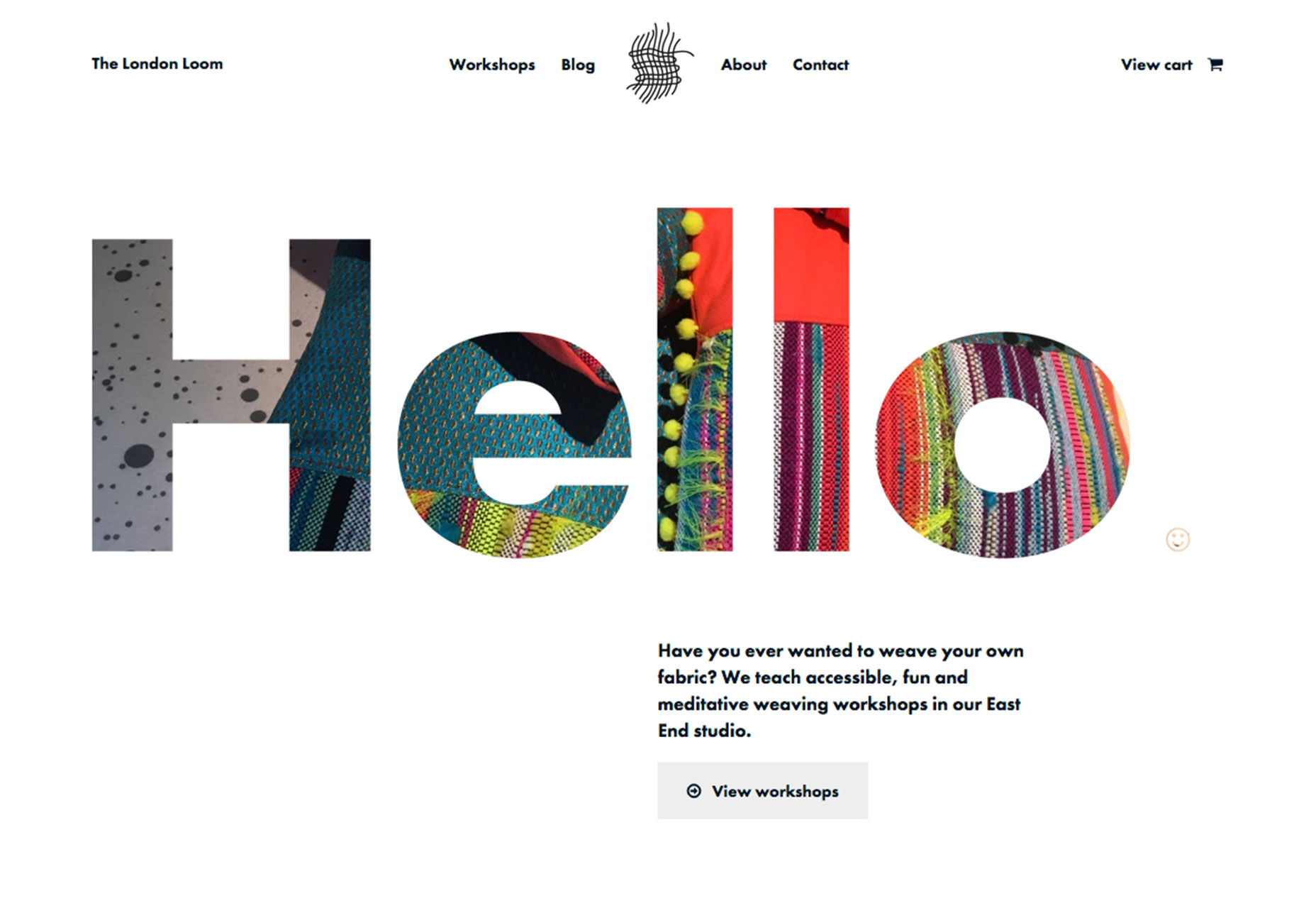
- Lettering filled with an image on a plain background, such as The London Loom, with an alternative version where you can almost see the image with a background with subtle transparency, such as My Mother Before Me.
Conclusion
Unlike some other trends where you can implement small changes, these three options present more of an overall style shift. Can you see yourself using any of them in future projects?What trends are you loving (or hating) right now? I’d love to see some of the websites that you are fascinated with. Drop me a link on Twitter; I’d love to hear from you.
Carrie Cousins
Carrie Cousins is a freelance writer with more than 10 years of experience in the communications industry, including writing for print and online publications, and design and editing. You can connect with Carrie on Twitter @carriecousins.


Read Next

3 Essential Design Trends, May 2024
Integrated navigation elements, interactive typography, and digital overprints are three website design trends making…

20 Best New Websites, April 2024
Welcome to our sites of the month for April. With some websites, the details make all the difference, while in others,…

Exciting New Tools for Designers, April 2024
Welcome to our April tools collection. There are no practical jokes here, just practical gadgets, services, and apps to…

14 Top UX Tools for Designers in 2024
User Experience (UX) is one of the most important fields of design, so it should come as no surprise that there are a…
By Simon Sterne

What Negative Effects Does a Bad Website Design Have On My Business?
Consumer expectations for a responsive, immersive, and visually appealing website experience have never been higher. In…

10+ Best Resources & Tools for Web Designers (2024 update)
Is searching for the best web design tools to suit your needs akin to having a recurring bad dream? Does each…
By WDD Staff

3 Essential Design Trends, April 2024
Ready to jump into some amazing new design ideas for Spring? Our roundup has everything from UX to color trends…

How to Plan Your First Successful Website
Planning a new website can be exciting and — if you’re anything like me — a little daunting. Whether you’re an…
By Simon Sterne

15 Best New Fonts, March 2024
Welcome to March’s edition of our roundup of the best new fonts for designers. This month’s compilation includes…
By Ben Moss

LimeWire Developer APIs Herald a New Era of AI Integration
Generative AI is a fascinating technology. Far from the design killer some people feared, it is an empowering and…
By WDD Staff

20 Best New Websites, March 2024
Welcome to our pick of sites for March. This month’s collection tends towards the simple and clean, which goes to show…

Exciting New Tools for Designers, March 2024
The fast-paced world of design never stops turning, and staying ahead of the curve is essential for creatives. As…