

1) Weber’s law of just noticeable difference
Anyone who’s used Facebook over the last 5 years knows that not much has changed in that time. Facebook is a mega corporation worth over $350 billion, so you might expect a lot to have changed in three years. Why is Facebook retaining every key element of its design? The answer to this same question explains why every major website—including Google, Twitter and Amazon, despite their large budgets—do not make drastic redesigns. It is explained by Weber’s law of just noticeable difference, which states that the slightest change in things won’t result in a noticeable difference; if you’re looking at a bulb, for example, and the light dims or brightens just a bit, you’re unlikely to notice the change—if it brightens significantly, however, you will notice the change. In the same way, if you’re carrying a weight of 100kg, removing 1kg from it is unlikely to make much of a difference in the weight, you’re unlikely to notice it. If you were to remove 10kg from the 100kg weight, however, the difference in weight becomes instantly apparent. Research shows that we dislike a massive change in existing structures and systems, even if those changes will benefit us, and there is ample evidence that show protests when major websites make massive changes and redesign. Simply put, Weber’s law coupled with our natural averseness to change shows that the best way to approach a redesign is subtly; make your redesign slow and subtle, changing a little here and there gradually—in such a way that most people won’t even know you’re doing a redesign—until you’ve completely revamped the redesign. Not only will this ensure your design is well accepted by the majority, but a good portion of your audience would have gotten used to your redesign before it is completed and very few will complain.2) Understand that we respond to color differently
While we often deeply trust our instinct and experience, it is another thing for them to stand science’s test. For example, do you know that the same design that works for an audience of male readers often won’t work for an audience of female readers—even if it’s for the same website selling the very same products? One of the most important factors you should consider when redesigning a website is the audience. Are the audience predominantly male or female? This matters a great deal! Research has found that people will form an opinion about things within 90 seconds, and that color influences up to 90 percent of the opinion people form. The color you use for your design alone can make it a failure or success. That said, it is important to realize that men and women see colors differently. The graphics below show the colors both men and women like as well as the colors they dislike the most:Colors they like
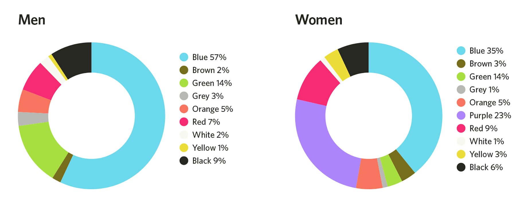
Colors they dislike
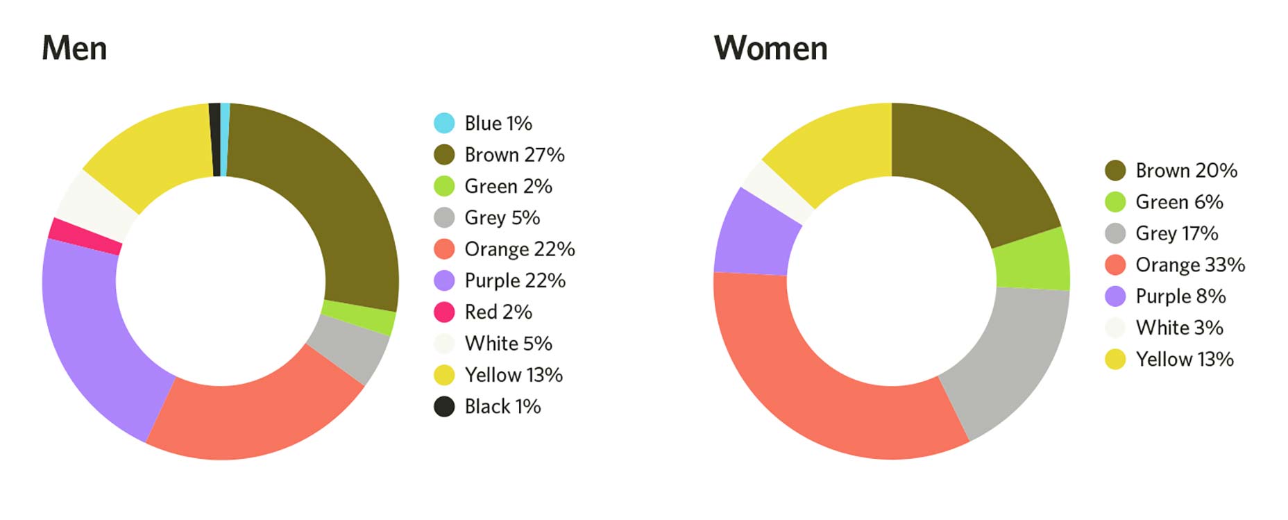 Image Credit: HelpScout
When doing your next redesign, consider the audience of the website that will be using the design. Are they primarily male or female? Let their gender influence the color you use.
Image Credit: HelpScout
When doing your next redesign, consider the audience of the website that will be using the design. Are they primarily male or female? Let their gender influence the color you use.
3) The sensory adaptation phenomenon
Have you ever wondered about why you don’t feel your clothes or shoes? Ever wondered about why, even though you were initially irritated by it, you no longer notice your neighbor’s dog’s constant barking? This is explained by a psychological phenomenon called “sensory adaptation.” It states that we tend to tune out stimulus if we get repeatedly exposed to it—initially, we find it annoying, but later we just don’t notice it. Now, how does this relate to web design? It’s simple: you design a website and use the very same color scheme and button color for important parts that you want the user to take action on. Due to the fact that these essential parts blend in with the design color scheme, and that people have been seeing the same color all over your design, people are naturally wired to tune them out—they don’t see the key elements on your page, and you lose out on conversions. When designing or redesigning a website, it is essential to make your CTAs stand out; if the whole design color scheme is blue, you must not use the color blue for the CTA or to highlight the most important action on the page. Most people believe the color red or orange is the most effective for boosting conversions; it isn’t. A color red button used on a page with red color scheme will convert awfully, but a color green button on the same page will convert much better. Use something that stands out for essential elements; this way, it doesn’t activate people’s sensory adaptation, and your conversion doesn’t suffer.4) Type: bigger is better!
When it comes to text, designers often obsess over look and appeal: “Wow, should I use a serif?” “That new font looks dope! Let me give it a shot!” Except that psychology shows that, when it comes to design, most of the things we designers give importance to are not what the end users really care about. Why we care about aesthetics and how appealing the latest typeface will make our design appear, the average user cares about basic things like usability. In essence, the average user cares a lot more about font size than about font type. In fact, research has shown that people want type to be bigger and simpler, and that larger type elicits a strong emotional connection in readers. In essence, people want simple, large type. Based on data from available research, experts advise not using a font-size lesser than 16px.5) Perceptual set
Is this a monster or a tree? Okay, how about this, is it a vase or two faces?
 What you see will differ depending on your experiences; as with the image of the “vase or two faces,” if you’re an artist, especially if you just finished working on a vase, you’re likely to see a vase in the image. If you just left a gathering of lots of people, and if you’ve not seen a vase in months, you’re likely to see two faces.
This phenomenon is explained by the “perceptual set theory,” which explains our tendency to perceive information based on our expectations, existing information and experiences. In essence, people from different cultures are likely to perceive the very same thing differently.
The implication for web designers is that people have certain expectations of web design—some general and some based on certain industries. For example, most people have a certain expectation for where a site’s navigation bar will be (in the header), putting it elsewhere (in the footer, for example) will confuse a lot of users and lead to bad user experience. The same goes for every element of your site design.
It’s good to be innovative. When you’re going to be innovative, however, make sure you include clues to guide people about the new elements. Most importantly, test people’s response to the new elements and readily change anything people do not respond well to.
What you see will differ depending on your experiences; as with the image of the “vase or two faces,” if you’re an artist, especially if you just finished working on a vase, you’re likely to see a vase in the image. If you just left a gathering of lots of people, and if you’ve not seen a vase in months, you’re likely to see two faces.
This phenomenon is explained by the “perceptual set theory,” which explains our tendency to perceive information based on our expectations, existing information and experiences. In essence, people from different cultures are likely to perceive the very same thing differently.
The implication for web designers is that people have certain expectations of web design—some general and some based on certain industries. For example, most people have a certain expectation for where a site’s navigation bar will be (in the header), putting it elsewhere (in the footer, for example) will confuse a lot of users and lead to bad user experience. The same goes for every element of your site design.
It’s good to be innovative. When you’re going to be innovative, however, make sure you include clues to guide people about the new elements. Most importantly, test people’s response to the new elements and readily change anything people do not respond well to.
Robert Mening
Robert Mening is a web developer, investor and WordPress enthusiast. You can read his latest guide about WordPress customization here.


Read Next

20 Best New Websites, April 2024
Welcome to our sites of the month for April. With some websites, the details make all the difference, while in others,…

Exciting New Tools for Designers, April 2024
Welcome to our April tools collection. There are no practical jokes here, just practical gadgets, services, and apps to…

14 Top UX Tools for Designers in 2024
User Experience (UX) is one of the most important fields of design, so it should come as no surprise that there are a…
By Simon Sterne

What Negative Effects Does a Bad Website Design Have On My Business?
Consumer expectations for a responsive, immersive, and visually appealing website experience have never been higher. In…

10+ Best Resources & Tools for Web Designers (2024 update)
Is searching for the best web design tools to suit your needs akin to having a recurring bad dream? Does each…
By WDD Staff

3 Essential Design Trends, April 2024
Ready to jump into some amazing new design ideas for Spring? Our roundup has everything from UX to color trends…

How to Plan Your First Successful Website
Planning a new website can be exciting and — if you’re anything like me — a little daunting. Whether you’re an…
By Simon Sterne

15 Best New Fonts, March 2024
Welcome to March’s edition of our roundup of the best new fonts for designers. This month’s compilation includes…
By Ben Moss

LimeWire Developer APIs Herald a New Era of AI Integration
Generative AI is a fascinating technology. Far from the design killer some people feared, it is an empowering and…
By WDD Staff

20 Best New Websites, March 2024
Welcome to our pick of sites for March. This month’s collection tends towards the simple and clean, which goes to show…

Exciting New Tools for Designers, March 2024
The fast-paced world of design never stops turning, and staying ahead of the curve is essential for creatives. As…

Web Tech Trends to Watch in 2024 and Beyond
It hardly seems possible given the radical transformations we’ve seen over the last few decades, but the web design…
By Louise North