

1. Split Screens
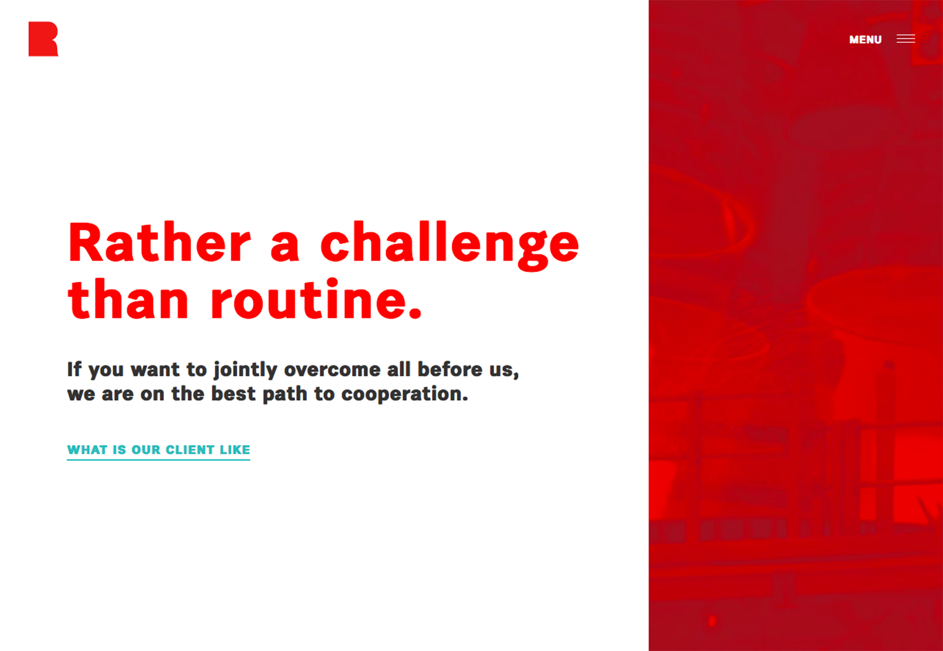
Split screen design was something that started gaining traction in mid-2016 and now it is a big deal. Browse through collections of website design and split screen outlines are everywhere. What’s nice is how quickly the style has evolved. Early split screen designs featured mostly symmetrical designs with a yin and yang style aesthetic. The new split screens have a more “anything goes” feel to them. The three examples below show three very different ways to use the same trend.- Rency uses a split design to contain a loop video and the main navigation. The contrast between the white area and red is stark and forces the eye across the screen. It also ensures the user will find the navigation because it is the only element within the colored portion of the design.
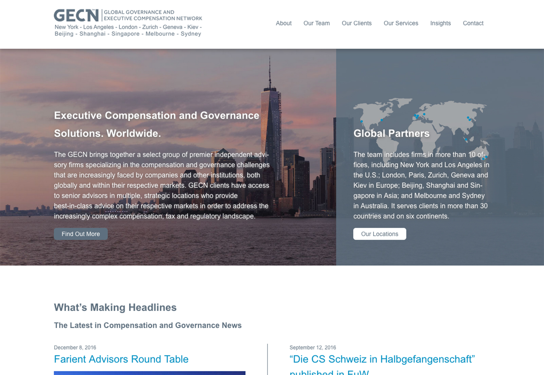
- GECN is a complex governmental site that uses a split screen to convey two different ideas with two links immediately in the design. While the split isn’t full-screen and contains a lot of text, this is a good alternative for a design with lots of calls to action, user bases or complicated content.
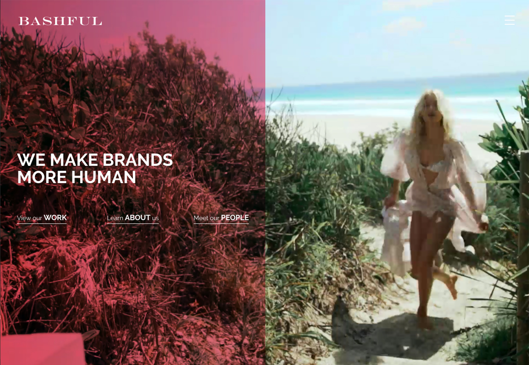
- Bashful uses a concept similar to Rency but with a twist: The design features a full-screen video loop and half of it is covered with a tinted color box. All the clickable elements are inside the tinted area and the navigation menu is hidden in the top right corner of the video.
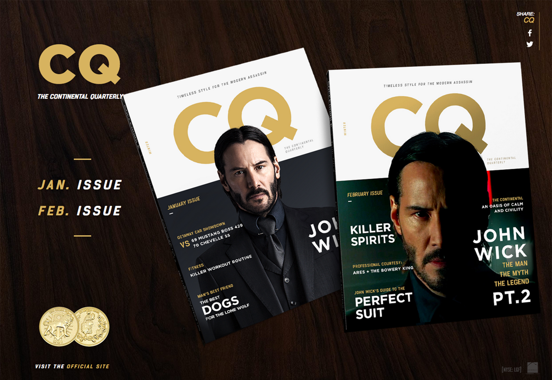
2. Italics
One of the least used character styles is getting more play as a display option. Italics are making their way into the typography palettes of designers, and not just for the occasional point of emphasis. More italics are being used for display typefaces, secondary elements such as links or menu items or for broader emphasis. Italics are a fresh take on your typical type styles. Because they aren’t so widely used, this trend is one that is sure to grab the attention of visitors, even if they aren’t sure what about the lettering got their attention in the first place. Italics are a subtle change that don’t even require a new typography palette. They do come with some cautions and suggestions for best practices.- To make the most of italics use them sparingly for small blocks of text.
- Use a highly readable typeface if you plan to italicize; novelty options can get tricky.
- Use the typeface italic and don’t try to create your own version by slanting letters. (That can get messy in a hurry.)
- Use italics to represent commonly italicized elements, such as the title of something, as showcases in many of the examples below.
- Pair italics with a simple effect, such as an animation or color, for even more emphasis.
- Because italics can be a little more difficult to read, make sure there is plenty of contrast between the type and background.
- Pair italic type options with a simple serif or sans serif typeface as to not detract from the italic.
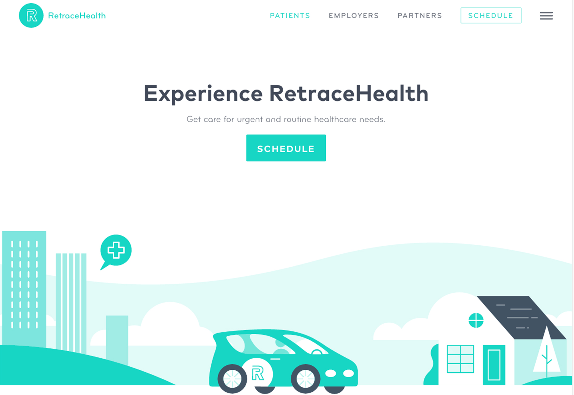
3. Solid Backgrounds with a ‘Trick’
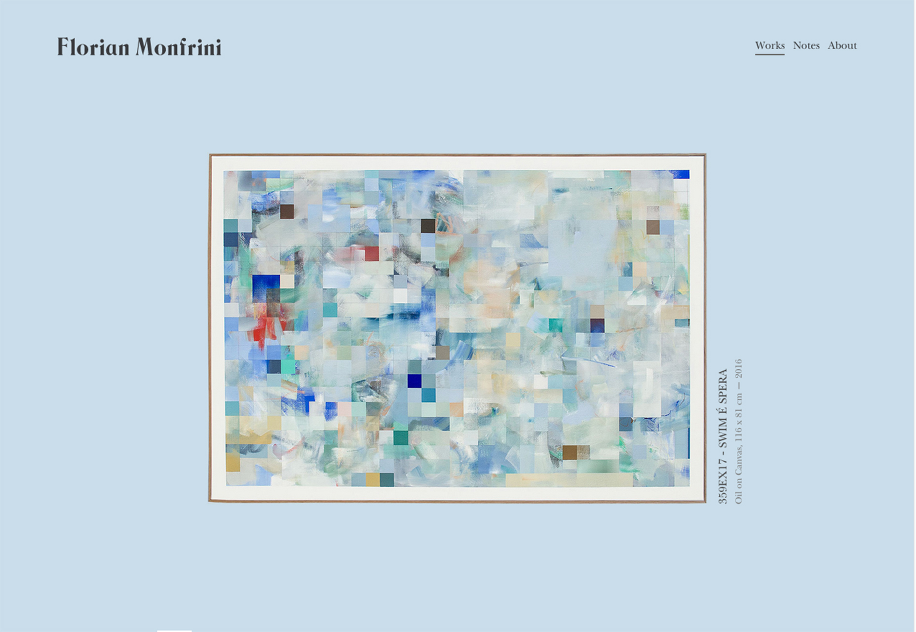
One of the easiest ways to create visual emphasis is with contrasting elements. While a solid color background might seem plain or flat, it can be the perfect canvas for a design trick, such as animation, illustration or sound. The contrast between the starkness of the background and the trick, helps bring the user interface element to life. From the simple bouncing squares in the 3K design to the fun cartoon from Retrace Health to the parallax scrolling of Florian Monfrini. Each of the effects stands out because of the simplicity of the background. Further, these backgrounds don’t get in the way of the design either. Each one is white or pastel and fades out of the foregrounds so that users focus on the messaging of the primary content. (Black or simple dark backgrounds can work equally well.) This is why it works: Users aren’t caught up in the canvas and the design almost pops off the screen. It’s almost like art on a wall. If the wall is painted with wild colors and patterns, it can be tough to see the framed image that you are there for, but a piece of art on a white wall is a showpiece. This design trend creates a showpiece for that trick you’ve been wanting to incorporate into a project. It can be almost anything. And it will be the highlight of the design with a simple canvas to display it on. One caution when planning a color choice for a simple background: For the most impact stick to a white, black or neutral color. Bold, bright colors are almost a design trick in themselves and might detract from your goal.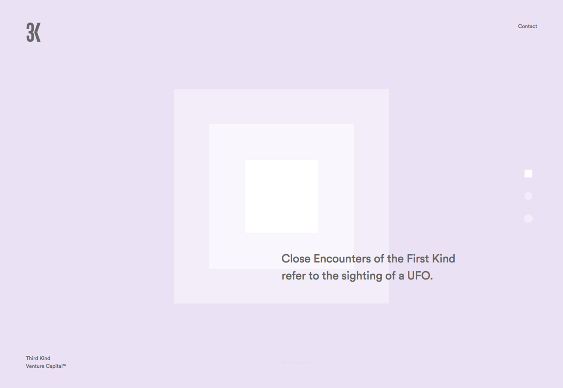
Conclusion
Every design needs to place emphasis on something. That’s why this group of trends is so refreshing. Each underlines something important for users with an easy to understand way of providing emphasis. Users know exactly what italics mean and they can see variance in split screens or backgrounds that contrast with user interface elements. What trends are you loving (or hating) right now? I’d love to see some of the websites that you are fascinated with. Drop me a link on Twitter; I’d love to hear from you.Carrie Cousins
Carrie Cousins is a freelance writer with more than 10 years of experience in the communications industry, including writing for print and online publications, and design and editing. You can connect with Carrie on Twitter @carriecousins.


Read Next

20 Best New Websites, April 2024
Welcome to our sites of the month for April. With some websites, the details make all the difference, while in others,…

Exciting New Tools for Designers, April 2024
Welcome to our April tools collection. There are no practical jokes here, just practical gadgets, services, and apps to…

14 Top UX Tools for Designers in 2024
User Experience (UX) is one of the most important fields of design, so it should come as no surprise that there are a…
By Simon Sterne

What Negative Effects Does a Bad Website Design Have On My Business?
Consumer expectations for a responsive, immersive, and visually appealing website experience have never been higher. In…

10+ Best Resources & Tools for Web Designers (2024 update)
Is searching for the best web design tools to suit your needs akin to having a recurring bad dream? Does each…
By WDD Staff

3 Essential Design Trends, April 2024
Ready to jump into some amazing new design ideas for Spring? Our roundup has everything from UX to color trends…

How to Plan Your First Successful Website
Planning a new website can be exciting and — if you’re anything like me — a little daunting. Whether you’re an…
By Simon Sterne

15 Best New Fonts, March 2024
Welcome to March’s edition of our roundup of the best new fonts for designers. This month’s compilation includes…
By Ben Moss

LimeWire Developer APIs Herald a New Era of AI Integration
Generative AI is a fascinating technology. Far from the design killer some people feared, it is an empowering and…
By WDD Staff

20 Best New Websites, March 2024
Welcome to our pick of sites for March. This month’s collection tends towards the simple and clean, which goes to show…

Exciting New Tools for Designers, March 2024
The fast-paced world of design never stops turning, and staying ahead of the curve is essential for creatives. As…

Web Tech Trends to Watch in 2024 and Beyond
It hardly seems possible given the radical transformations we’ve seen over the last few decades, but the web design…
By Louise North