

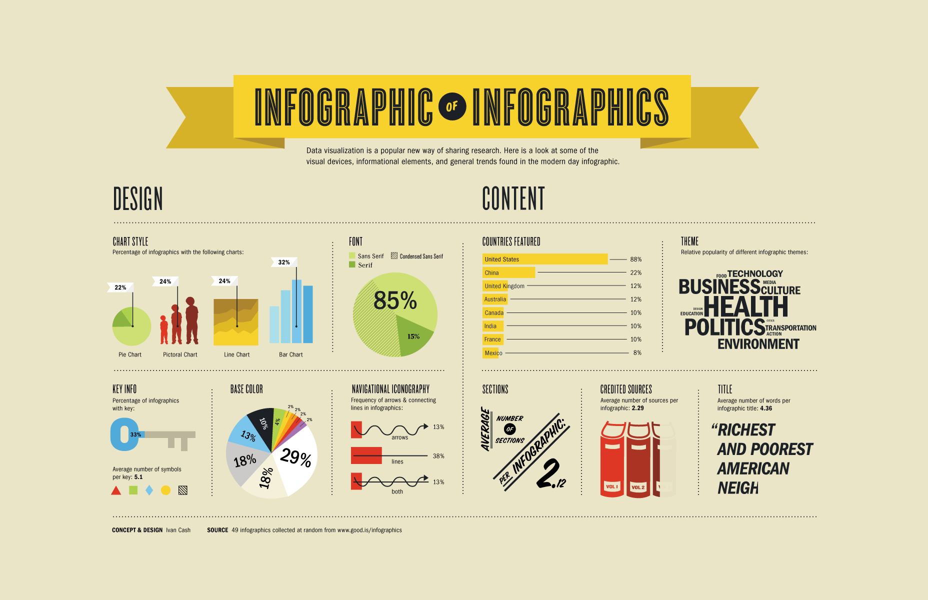
Perfect infographics start with a thesis
The number one thing to understand about designing successful infographics is that it cannot just be “a bunch of stats or other figures arranged visually on a page.” Infographics, like any other marketing collateral, are used best when they're telling a story. In this particular case, that story just happens to be told primarily with figures and data as opposed to good, old-fashioned text. Because of this, before you even get into the visual element of your Infographics you'll need to settle on a thesis statement: What exactly are you trying to say? What impression do you want the reader to take away when they finally get to the end? The answer to this question will dictate every choice you make moving forward, so it’s an important one to settle on as quickly as possible.Structuring your infographic
Once you've settled on the story you're trying to tell, the next thing to do is to nail down your structure. Think of it a bit like telling a joke: First you introduce the setup, meaning the context that people need to understand what is to come; then, you expand on that setup and offer the hook (the thing that keeps people interested); finally, you hit them with the punch line (the surprise at the end of the joke that generates the laugh). If you don't have these core elements, or if they're not in the appropriate order, your joke (or in this case, your infographic) won't be nearly as successful as you need. In terms of infographics, the ideal structure is as follows:- Introduce your topic, either by way of a short block of text or by a bold opening fact or figure.
- Introduce a complication. This is a problem that you're offering a solution to, or an idea that you're going to be expanding on.
- Expand on that complication. Your reader should learn why this topic is important and should slowly be able to get an idea of what you're trying to say about it.
- Finally, the conclusion. This is the period on the end of your sentence that sums up what someone has learned, what they can do with this information and where they can find more if they so choose.
Don't forget about design
Just because you can make an infographic without a graphic design degree, doesn't mean you can throw out all the tried-but-true rules of visual communication. The data you arrange should naturally flow from top to bottom. These elements should be presented in a way that guides the reader from one point to the next, often without them even realizing you're in control in the first place. Each data point should build and expand on the one that came before it, eventually leading the reader directly to the beautiful climax (or punch line) that they were after in the first place.Payman Taei
Payman is the founder of Visme, a tool for creating infographics and other engaging content. He loves to write about topics that help fuel people's design and communication skills.


Read Next

20 Best New Websites, April 2024
Welcome to our sites of the month for April. With some websites, the details make all the difference, while in others,…

Exciting New Tools for Designers, April 2024
Welcome to our April tools collection. There are no practical jokes here, just practical gadgets, services, and apps to…

14 Top UX Tools for Designers in 2024
User Experience (UX) is one of the most important fields of design, so it should come as no surprise that there are a…
By Simon Sterne

What Negative Effects Does a Bad Website Design Have On My Business?
Consumer expectations for a responsive, immersive, and visually appealing website experience have never been higher. In…

10+ Best Resources & Tools for Web Designers (2024 update)
Is searching for the best web design tools to suit your needs akin to having a recurring bad dream? Does each…
By WDD Staff

3 Essential Design Trends, April 2024
Ready to jump into some amazing new design ideas for Spring? Our roundup has everything from UX to color trends…

How to Plan Your First Successful Website
Planning a new website can be exciting and — if you’re anything like me — a little daunting. Whether you’re an…
By Simon Sterne

15 Best New Fonts, March 2024
Welcome to March’s edition of our roundup of the best new fonts for designers. This month’s compilation includes…
By Ben Moss

LimeWire Developer APIs Herald a New Era of AI Integration
Generative AI is a fascinating technology. Far from the design killer some people feared, it is an empowering and…
By WDD Staff

20 Best New Websites, March 2024
Welcome to our pick of sites for March. This month’s collection tends towards the simple and clean, which goes to show…

Exciting New Tools for Designers, March 2024
The fast-paced world of design never stops turning, and staying ahead of the curve is essential for creatives. As…

Web Tech Trends to Watch in 2024 and Beyond
It hardly seems possible given the radical transformations we’ve seen over the last few decades, but the web design…
By Louise North