

The Early Years
In the years following Microsoft’s discovery, landing pages proliferated. And in the true style of the early Internet, they were messy, shouty affairs. Often several different brash sales pitches competed for prominence with the obligatory glowing testimonials, all on a white background. That started to change in 2009, a year in which the landing page seemingly graduated and became professionalised. Almost overnight, a series of specialist companies sprang up and started to offer recognisably modern design. Messages became shorter, funny even. The background turned from white to hues of blue, and the photos came into focus. Along with these visual improvements, the marketing concept was refined too. By running sites in parallel—known as A/B testing—designers literally got a scientific answer as to what worked best.The ‘Rules’ of Writing a Landing Page
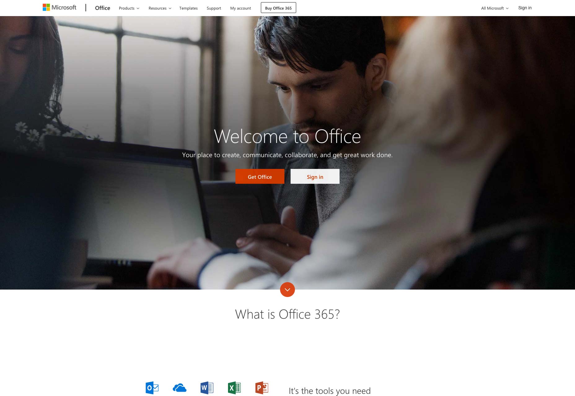
There is a lot of advice available online regarding the writing of compelling, high-converting landing pages. It comes from experienced marketeers and it has worked very well in the past. Certain elements of this advice effectively serve to define what we understand as a landing page today: A catchy headline; a punchy intro directly addressing a core customer need or desire; and a concise ‘call to action’. Lance Jones, of Copy Hackers, recommends writing a landing page from the bottom up. He says:Start with the goal. The call to action. The thing you want visitors to a landing page to do. Then, work backward from your button, writing only copy that will convince people to click that button. Nothing else makes it on the page. Nothing.The ‘CTA’ is perhaps the defining characteristic of the pure landing page. While some marketeers still advise including testimonials, and telling customers exactly how you will solve their problem, others have stripped things back to the very basics: the initial page is primarily just a ‘buy’ button or an email field, even if a little bit more info is available by scrolling. Microsoft themselves have evolved towards this approach.
Short and Simple Sells
While popping a ‘buy’ button in front of the customer straight off is visually appealing, that simplicity of approach is only possible when people already know what the product is. Big companies with enough branding behind them are just providing a gateway to the product: Smaller businesses can attempt this by running social media or advertising campaigns that sell on specific points. The landing pages these campaigns point to can, in theory, be highly simplified because the selling points have already been addressed. Businesses offering relatively complex and high value services will struggle to sell directly through a conventional, simple landing page., however. Their options, in the modern era, are to go for a simple first screen that then scrolls to further information set out in a visual, reassuring and intuitive way, like this Australian business finance firm; or to target something less than a full sale.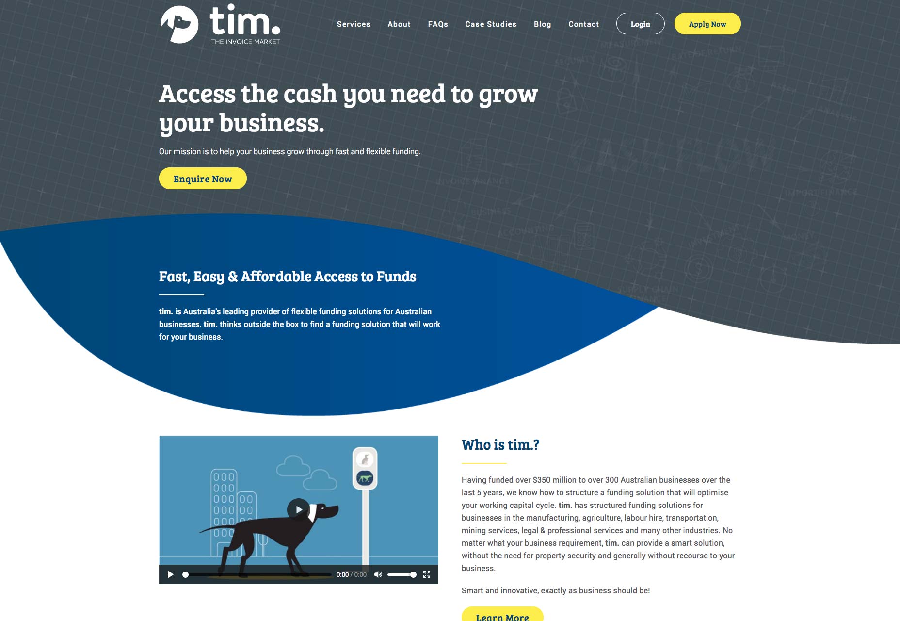
The Squeeze Page
If all you want is an initial contact or an email address from a customer, you don’t need to go for a hard sell. In this example, a no-obligation opportunity to interact leads the customer into a mini-site. What marketeers call a funnel, these simple ‘squeeze pages’ have become a sub-category of the landing page.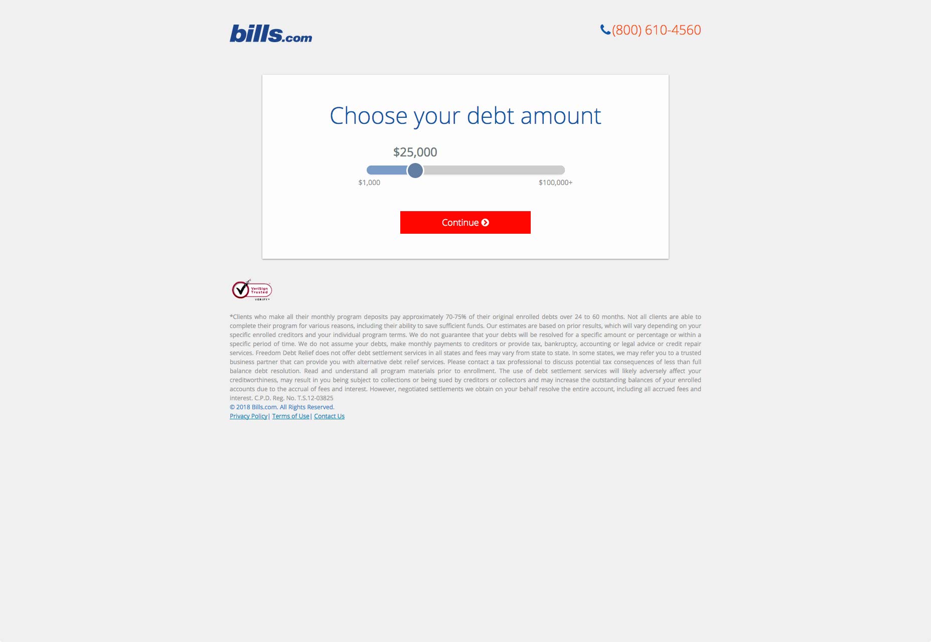 The concept of a squeeze page is to keep things very simple, because all you want is an initial contact or, more usually, an email address. In order to do this, businesses offer a free downloadable guide; a trial version; or a no-obligation consultation, for example. For a squeeze page to work, is has to be clear that what is being offered is free.
Linking to a Search
There is one further approach for more complex services, and that is to simply start the customer’s search for them. Airlines and online booking companies do this: imagine how Hotels.com will load on your screen if you search for ”Paris hotels” and then click on the company’s ad.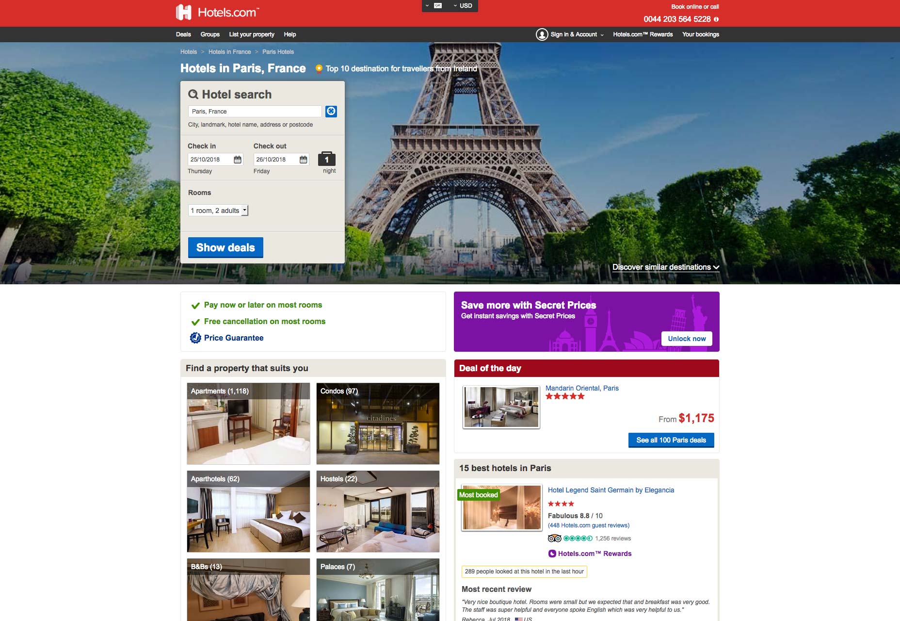
The Landing Page Links Debate
Most landing pages have links—84% of them, if you believe the latest count, which seems reasonable. But a series of A/B tests by HubSpot, using their own landing pages, suggested that at best links made no difference and at worst they were an unwelcome distraction: when it came to free trials and demos, the versions without links performed 16% and 28% better in terms of conversions, respectively. Tests by other companies have shown even bigger jumps in conversion rate when all links are removed. But these tests have no way of accounting for cautious potential customers who want to browse your site a little before they commit to buying—because these potential big spenders would eventually contact you via a different page, or perhaps by a phone call. Unsurprisingly therefore, the inclusion or otherwise of links—even to your own homepage, remains a hotly contested topic for landing page experts. Online marketer Neil Patel suggests that the only clickable link on a landing page should be your call to action, and possibly a link to more information for those who are undecided:Forget about links to everything else…all they do is clutter up the page and increase the likelihood that your visitors will abandon your landing page without converting.
Pages Must Fit the Business
What seems clear is that as landing pages have evolved, they have become more varied. Despite ruthless live testing, no secret formula has emerged. Indeed, several different approaches have thrived in response to the many and varied businesses that use them. Karla Cook, writing for Hubspot this year, said:Best practices will tell you that both short and long forms perform well—it all depends on whether you want to generate a lot of (potentially) lower-quality form submissions, or a smaller number of higher-quality submissions.If you’re an online business that can offer something immediate, therefore, landing pages work and you want to keep them simple. It seems brutal, but the statistics suggest that, if you can offer a free trial, a demo version, or if you basic product is basically free, then all you need is a catchy page that looks good, loads quickly and is highly functional and intuitive. If you’re in a more complex sector and you want this, it’s even worth creating a freebie—usually an e-book or guide—as a way of collecting email addresses with this approach. On the other hand, if you provide complex products and are essentially hoping that customers will call your expert advisers—or you, if you’re a small business—and discuss their needs in more depth, you’ll want them to be able to check you out in full. Arguably, what you will then build is not a true landing page. But if it is designed to meet specific traffic, then the basic rules are still applicable. Neil Patel sums it up:
Your copy should be clear and concise. It should be persuasive, too. Landing pages are not the place to show off your creativity, unless that creativity is clear, concise, and persuasive. Leave the creative turns-of-phrase for your blog.
Dominic Jeff
Dominic Jeff is a journalist and copywriter who has worked on The Scotsman, Scotland on Sunday and the Plymouth Herald. Since leaving the newspaper industry in 2015, he has worked closely with award-winning PR agencies and ambitious early-stage companies to produce great websites, exciting press releases, and closely-followed blog series. His own writing can be seen at www.dominicjeff.co.uk


Read Next

3 Essential Design Trends, May 2024
Integrated navigation elements, interactive typography, and digital overprints are three website design trends making…

How to Write World-Beating Web Content
Writing for the web is different from all other formats. We typically do not read to any real depth on the web; we…
By Louise North

20 Best New Websites, April 2024
Welcome to our sites of the month for April. With some websites, the details make all the difference, while in others,…

Exciting New Tools for Designers, April 2024
Welcome to our April tools collection. There are no practical jokes here, just practical gadgets, services, and apps to…

How Web Designers Can Stay Relevant in the Age of AI
The digital landscape is evolving rapidly. With the advent of AI, every sector is witnessing a revolution, including…
By Louise North

14 Top UX Tools for Designers in 2024
User Experience (UX) is one of the most important fields of design, so it should come as no surprise that there are a…
By Simon Sterne

What Negative Effects Does a Bad Website Design Have On My Business?
Consumer expectations for a responsive, immersive, and visually appealing website experience have never been higher. In…

10+ Best Resources & Tools for Web Designers (2024 update)
Is searching for the best web design tools to suit your needs akin to having a recurring bad dream? Does each…
By WDD Staff

3 Essential Design Trends, April 2024
Ready to jump into some amazing new design ideas for Spring? Our roundup has everything from UX to color trends…

How to Plan Your First Successful Website
Planning a new website can be exciting and — if you’re anything like me — a little daunting. Whether you’re an…
By Simon Sterne

15 Best New Fonts, March 2024
Welcome to March’s edition of our roundup of the best new fonts for designers. This month’s compilation includes…
By Ben Moss

LimeWire Developer APIs Herald a New Era of AI Integration
Generative AI is a fascinating technology. Far from the design killer some people feared, it is an empowering and…
By WDD Staff