Your source for front-end development, performance optimization, frameworks, HTML/CSS/JS tips, Webflow/Figma-to-code workflows, and core web technologies. Focused on helping designers build faster, cleaner, more scalable sites.

Moving Beyond UX: The Rise of the Agentic Experience (AX) Designer
AX Design stands for Agentic Experience Design. It is an emerging design discipline focused not on creating human-facing user interfaces (UI), but…

The Digital Renaissance: Why 2026 is the Most Exciting Year to be a Web Creator
If you have been following the chatter on tech forums lately, you might think the web design and development industry…

The “Vibe Coding” Crisis: Is Web Design Becoming a Commodity?
The year 2026 will be remembered in the design community as the year the “Executioner” died. For decades, a significant…
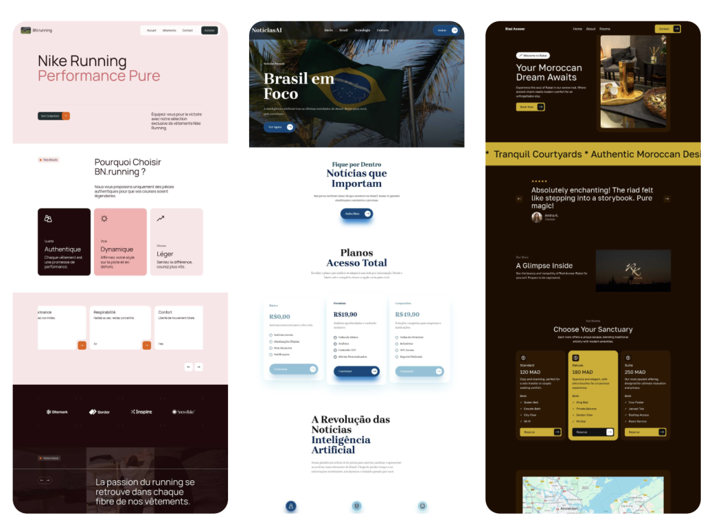
7 Best Design Tools & Resources for Faster Web Builds in 2026
Best design tools and resources are those that can lay claim to characteristics that typically include ease of use and…
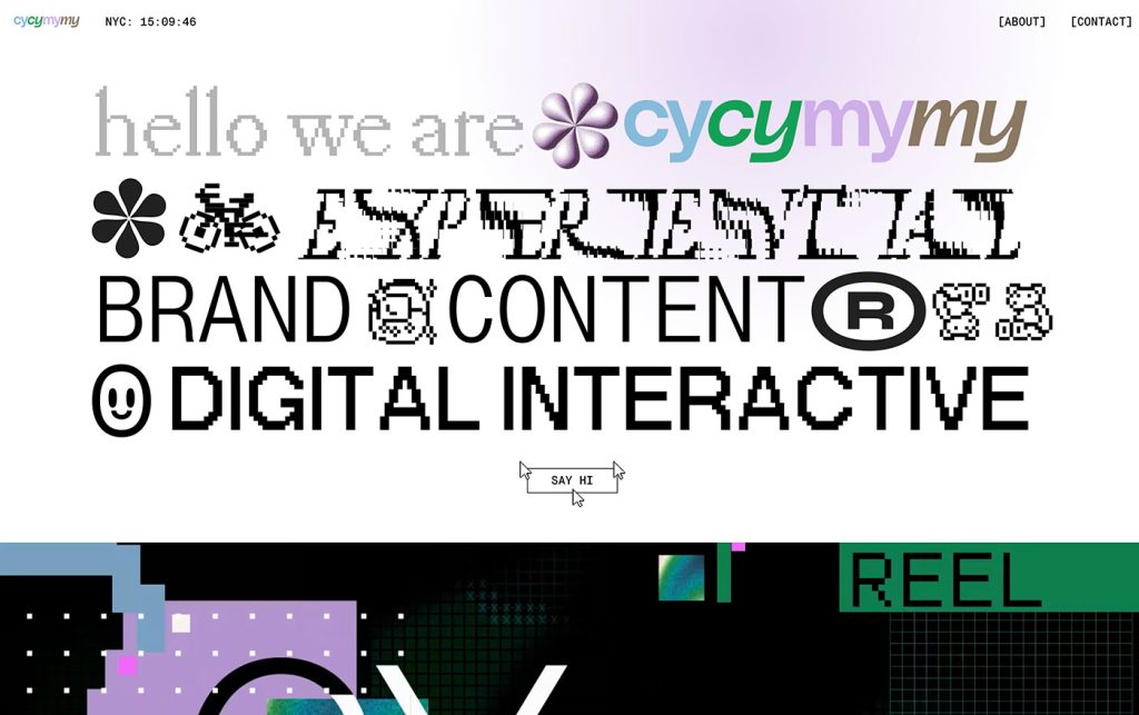
Not Useless: Why Experimental Websites Matter More Than You Think
Every once in a while, a site comes along that makes you pause, grin, and think: Wait—websites can do that? Maybe it’s…

Product Thinking for UI Designers: Decisions Beyond the Pixels
For a long time, the industry treated design like a relay race. The Product Manager (PM) would run the first…
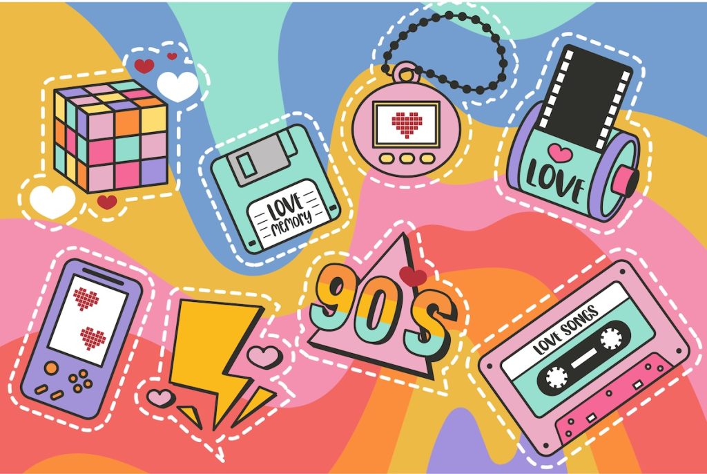
Pixel Nostalgia: Why We Miss the 90s Web (Even If It Was Ugly)
It’s easy to laugh at the 90s web now — the blinking GIFs, Comic Sans banners, table layouts held together…

How “Liquid Design” Broke the iPhone and Forced Apple’s Great Reset
The launch of iOS 26 was heralded as a “Spatial Awakening.” Apple’s design team, led by the high-concept vision of Alan Dye,…
Framer vs. WordPress vs. Webflow: Who Actually Wins in 2026?
Every few years, the web design world crowns a new “ultimate platform.” Once upon a time, it was WordPress. Then…
Density vs. Clarity: The Core Tension in Modern UI Design
Every generation of designers seems to rediscover the same paradox: the more information we can display, the less anyone can…
Why Webflow Isn’t the Future — Yet
Webflow has become the poster child for the no-code design revolution—a world where designers can “build for the web” without…
What Figma Got Wrong About Design Systems
When Figma first revolutionized collaborative design, it promised something that sounded irresistible: true consistency at scale. Design systems became the new…

Why Designers Are the New Bureaucrats
There was a time when design meant making something—actually making something. You’d open Photoshop (or, if you’re older, Illustrator 9), throw…

Your Brand Just Evolved: The Rise of AI-Generated Identities
For most of design history, a brand has been a fixed thing — a logo, a color palette, a tagline,…

7 Real Predictions for Web Design in 2026
Every December, design Twitter fills with lists of “hot trends” that sound like buzzwords generated by an algorithm: “AI-native ecosystems,”…

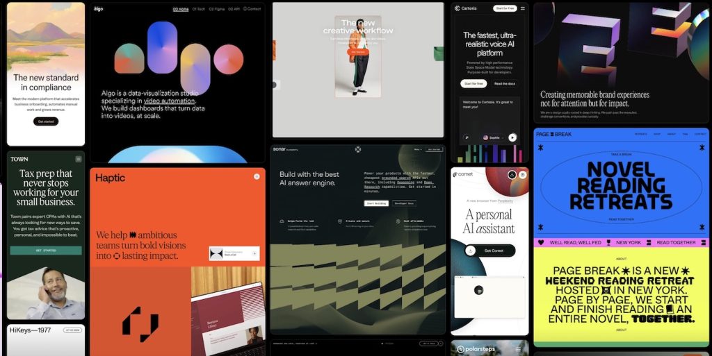
Drowning in Options? The Future Belongs to Curators, Not Creators
Got it — let’s refocus firmly on curation, tighten around that theme, and balance the paragraphs — not too short, not too long…

The Rise of the Invisible Designer
Somewhere between the Dribbble boom and the personal-brand gold rush, design became performance art. We stopped making and started marketing. The loudest designers…
Blogging Is Dead. Long Live the Blog.
Let’s say it out loud: blogging, as we once knew it, is dead. That romantic era of handcrafted posts, quirky sidebars, and…