25 Examples of Web 2.0 and Traditional Design Rules Coming Together
 In the large scope of the design world, the term "Web 2.0" is relatively a new one.
With it, comes its own set of standards, some strong, others not so strong, since Web 2.0 in itself is a very fickle, ever-evolving definition of design standards.
Countless examples of Web 2.0 sites have broken the rules of what was once considered strong design.
On the other hand, in many cases Web 2.0 has strengthened common design misnomers; it places a focus on usability, interface, and readability.
At its best, Web 2.0 stands as an equal to the traditional design rules practiced for centuries, though it is no doubt a reflection of our society in its current state of hustle and bustle.
Here's a collection of 25 sites showcasing how Web 2.0 and traditional design practices can come together to form truly stunning websites.
1. Pixel Matrix Design
Josh Pyles is a nice guy, and he's also a fantastic, disciplined designer. His latest iteration of Pixel Matrix is a stunner, and makes especially good use of color and a strong grid system. Browse over his portfolio and you'll see that he carries this practice into his client work.
If you check out the "About" page (making note of the nice tab system in play), you can see that Josh has included a nice photo of his workspace.
Below this shot is a great balance of Web 2.0 styled fonts, which establish an extremely strong hierarchy of information. He keeps his own bio small and tucked into the sidebar, and balances the larger text of the content area with smaller, sophisticated type in the sidebar.
Traditional Aspects:
- Great grid system.
- Wonderful color theory
- Strong hierarchy of information
Web 2.0 Enhancements:
- Beautiful gradients.
- Subtle details.
- Large, highly legible font choices.
- A great number of ways to stay connected.
- Even the contact form has a nice implementation of rounded corners!
2. MuttInk
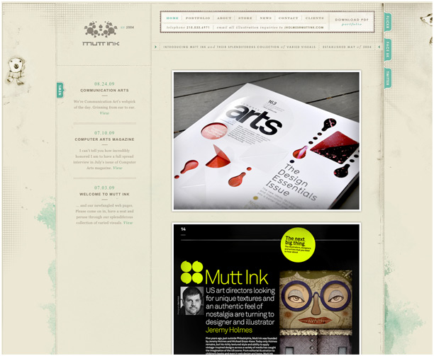
Lately texture seems to be the greatest thing since rounded corners, and though MuttInk's site might not be classified as typical Web 2.0, one glance is all that's required to know that Jeremy Holmes (the man behind the work) is an amazing designer and graphic artist.
An attention to detail, texture, and a strong identity places this as a personal fave.
Even though the days of overly-muted colors are somewhat behind us (which is a good thing, in my opinion), I'm still a fan of subtle, earthy tones that are complimented with bright accents, and MuttInk has pulled this off brilliantly.
The turquoise atop the beige really pops, and maintains the "drafting table" feel that permeates the site. And though the type is on the tiny side, and a bit tough to read in spots, it still looks great on the page.
Traditional Aspects:
- Extremely close attention to detail.
- Nice type (though perhaps too small).
- Great brand identity.
- Great use of space, particularly on the portfolio pages.
Web 2.0 Enhancements:
- Great use of texture.
- Big, professional images showcasing the work.
- Quick access to social linkage.
3. 45 Royale
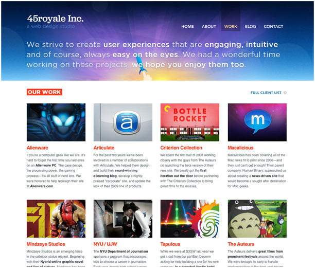
The portfolio over at 45 Royale not only showcases an amazing array of work, but it shows that the team behind the site understands good use of multiple design standards. It's a fantastic blend of Web 2.0 fallbacks, but has a solid foundation in traditional design standards (and just look at those colors!).
In particular, 45 Royale has one of the best grid systems I've seen lately, and the images they've chosen to showcase the work really mesh well with the fluorescent colored header above.
Seeing the color theory and organization mesh with such great harmony is always a treat, and they've supplemented it all with a highly sophisticated blend of fonts, both large and small.
Bright colors surrounding a secondary palette of gray, white, and black? Awesome.
Traditional Aspects:
- One of the better examples of a grid system.
- Plenty of whitespace and breathing room.
- Brilliant color choice.
- Good flow of information.
Web 2.0 Enhancements:
- The colors simply sing...so much that I listed it in both categories.
- Jumbo-sized type is highly legible, though tasteful.
- Great use of Illustration and graphics.
- Multitude of projects are well organized and nicely displayed.
4. Pinch Zoom
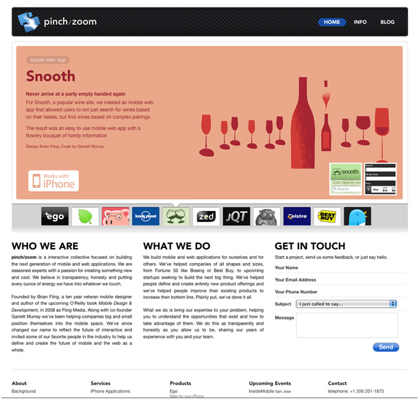
I'm a sucker for great illustration, especially when it's presented atop a wonderful example of white space. I love this site so much that simply clicking through the portfolio is a blast. Great whitespace, great grid system, and wonderful use of JavaScript; these things have a way of speaking to me (yes, I'm in front of a computer quite a lot).
The important thing to keep in mind when we're faced with the many technologies available these days, especially the fancy fades and trickery made possible by JavaScript, is to taper them and reign them in.
Remember the late nineties when Flash was all the rage? Remember how sick of Flash we all got afterwards? Good Web 2.0 standards are just as much about discipline as it is about design, and Pinch Zoom has it well under control.
They sprinkle their site with the fancy goodness, yet keep it lean and fun, with virtually zero time waiting on the images.
Traditional Aspects:
- Another great grid system (seeing a pattern here?).
- Black on white never seems to get old.
- Nice balance of fonts and headlines. (The small font, though legible, could maybe be a point size or two larger).
Web 2.0 Enhancements:
- The JavaScript portfolio slider is dang fun and effective.
- Interface is minimalist and direct.
- Varied use of Illustration is a great touch.
- Embraces the web's current technology without becoming cumbersome.
- Unique solutions to page layout (Check out the mega-dropdown when clicking the info tab. There's virtually an entire website hiding up there!).
5. Cameron Moll
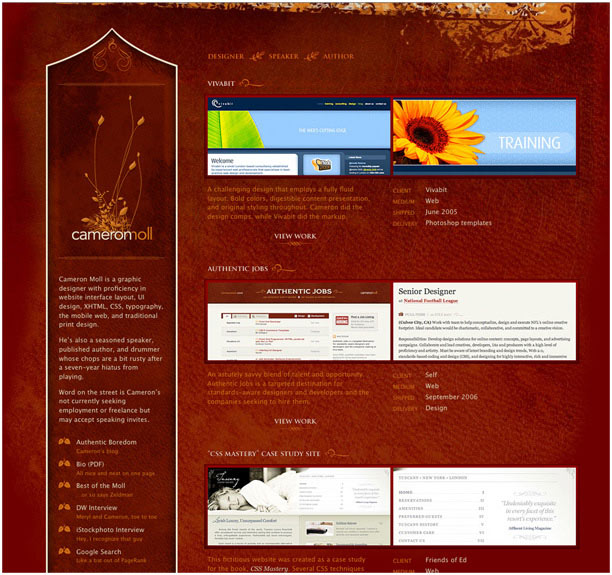
I've always been a fan of Cameron's work, and as you can tell he tends to stay on the traditional side of the design playing field. Though his blog site tends to fall within the traditional side of sophisticated design and small fonts there's no denying the elegance and beauty of his portfolio page, which is a fantastic balance of the new and the traditional.
The colors are vibrant and the font choices mesh with the overall feel, but again, the type can get pretty small in places, which is a Web 2.0 no-no. But who am I to nit-pick? Cameron has found great success and is the man behind Authenticjobs.com, a great resource for designers (and one that's helped pay my bills).
Traditional Aspects:
- Well-structured content.
- Subtle color variations are a nice touch.
- Type looks elegant, though tends to ride on the small side of the spectrum. Even so, it's legible and looks nice.
Web 2.0 Enhancements:
- Very nice use of texture.
- Portfolio contains nice images of the work, which are very straightforward and easy to navigate.
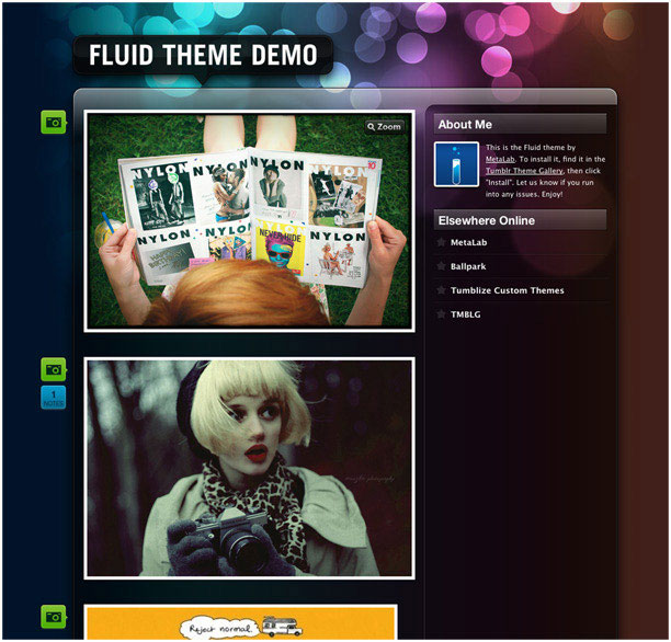
6. Metalab's "Fluid" Tumblr theme
The only Tumblr theme to make the list is entitled "Fluid," by Metalab design. It made the list because of a simple reason: It's a freaking beautiful example of Web 2.0 at its best. Simple, clean, and gleaming with color.
One might consider it a bit one-side in this comparison (it's a Web 2.0 catch-all). That's because Metalab is known for setting standards in the Web 2.0 arena, and this site is a testament to that fact. Metalab Design keeps the foundational rules in mind, however, and keeps the structure simple and well organized.
Transparency and overlapping graphics are one of the newer trends in Web 2.0. They give a site a great amount of depth and imbue a cutting edge, almost futuristic look. Metalab's "Fluid" has embraced this concept and, better yet, delivered it to the masses as a downloadable theme.
Traditional Aspects:
- Simple, effective structure.
- Stands out in the masses of Tumblr themes.
- Contemporary (though simple) color scheme.
Web 2.0 Enhancements:
- Big, vibrant photography.
- Ups the ante for cutting edge Web 2.0 design
- Highly legible fonts and headers.
- Use of rounded corners and gradients are taken to the extreme, but they are presented in a fun, modern Web 2.0 solution.
- Icons are a great, minimalist way to navigate the options for each post.
- Let's not forget about the transparent backgrounds!
7. Viget
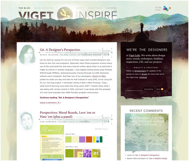
Oh boy. This site. It gets me every time. Sure I'm a softy for texture, but this designer has also captured the subtlety of good color theory and hierarchy.
I mean just check out those portraits near the bottom! They're eye-catching yet they don't compete with what could be a very complicated design flow. Let's not forget the great font choices and watercolor feel. The icing on the cake is that, though the site is image-heavy, it loads in a snap!
Another cool aspect of this site is that the designers want to share a lot of information with their community, and it's not information that sells them as designers, but information that they feel typical users might find valuable.
They allow you to dig deeper without cramming their needs down your throat, which is always a welcome practice.
Traditional Aspects:
- Well-structured content.
- Beautiful color and type.
- Though the fonts are on the small side, the main content is still easy to read.
- Great artwork fuses seamlessly into the design (cool portraits).
Web 2.0 Enhancements:
- Watercolor theme is extremely contemporary, and though it's image-heavy, it's been engineered to load lean and mean.
- Sidebar content is well organized and content-driven.
- Unique solution to the "Speech Bubble" box in the sidebar.
- Lots of shared, content-driven information.
8. FeelWire
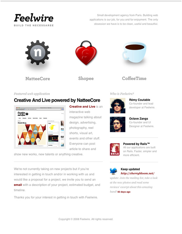
Another amazing example of great whitespace is Feelwire. Black type on white backgrounds, with great shades of gray in between, never seems to get old. Add a couple of brightly colored icons, and you have yourself a simple, yet effective site. It's all about simplicity here (heck, they only have one page!).
The Web 2.0 styled icons serve as the centerpiece for this page, and they go a long way in holding the site together. They also prevent the site from being overrun with text, and give the user something to be curious about.
Upon rolling over these icons, I was really happy with what I found: A very simple hover status that gave me the information I was looking for, doing so with the ever-popular Web 2.0 "Speech Bubble". A great touch.
Last thing: Though I like the red links, which also pop off of the page and interact well with the icons, I do think they should make the contact link a bit more noticeable. As of now it's a bit too tucked into the content, and I really had to search for a way to get in touch with these talented developers. Just sayin'.
Traditional Aspects:
- Short, sweet, and to the point: a single page site.
- White space!
- Subtle, tasteful font choices.
- Nice, basic layout.
Web 2.0 Enhancements:
- The glossy icons pop off the page, in a good way.
- Really cool rollovers on the icons keep the site uncluttered, yet give you the information you need in a fun way.
- Nice avatars add a human element.
9. Agami Creative
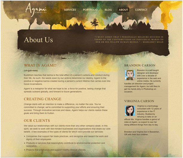
Okay, maybe it is just a personal thing with these highly textured sites, but what Agami Creative does, it does very well. It's another contemporary example of how image-heavy sites can become a perfectly acceptable solution in a day of high-speed connections.
The centerpiece of this site is most definitely the watercolor header, which serves as a perfect backdrop to the crafty logo design. It also houses the navigation, placing just enough emphasis on its location, yet without insulting the user (because most people know where to find the navigation these days.).
Clicking over to the portfolio page, you'll notice a layout with the perfect amount of breathing space and a strong grid system.
Simple images contribute to the work and draw your eyes to the individual projects, like looking through a keyhole to the final result. All of this is wrapped up with a sophisticated serif font for the headers and a highly legible sans-serif font for the body text.
Traditional Aspects:
- More beautiful use of color theory.
- Great artwork.
- Interesting combination of type/fonts.
- Artistic, hand-drawn logo has a feel that is carried throughout the site.
Web 2.0 Enhancements:
- Oversized navigation makes it easy to move around the site.
- They make it really easy to get in touch.
- Use of avatars is a good idea (though honestly I think they could have done better with these. Not sure how the anime look is supposed to mesh with this site other than the Asian influence?).
- Love the texture!
10. Adit Shukla
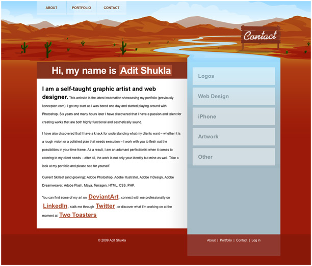
Another site with a great illustrative approach, Designer Adit Shukla also knows how to put together a great color scheme, and even plays with a nice solution to the sidebar.
For some odd reason, many sidebars are sloppy and overlooked, as if designers have permission to ignore the rules of good design when throwing together the sidebar of a site. Not with this site.
Though the content is minimal (even a bit sparse), one can't help but love the creativity involved, especially in the illustrative header, which adds a well-needed amount of depth. The navigational tabs up above are a nice touch as well.
Traditional Aspects:
- Vibrant colors.
- Creative solutions to common elements, such as the sidebar and the header.
- Illustration adds a lot of depth.
Web 2.0 Enhancements:
- Simple layout with a well-developed header illustration, which also houses the navigation.
- Large type is effective.
- Multiple ways to navigate the site (though honestly, I'm not convinced this is such a good thing).
- Transparent tabs are a nice touch.
12. Cream Scoop
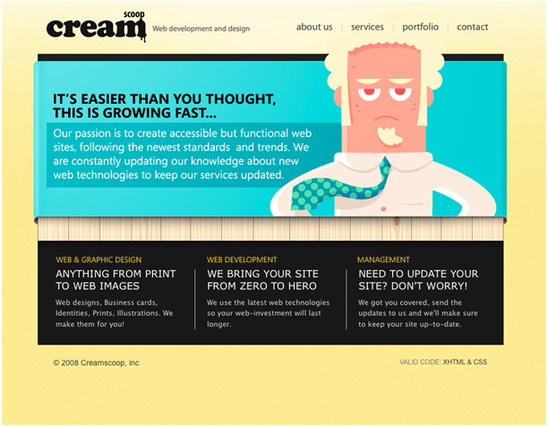
The first thing you'll notice about Cream Scoop is the bold selection of colors used throughout the site. They're not afraid to take the colors up a notch from the norm, and the result is as refreshing as it is different.
Though the colors are bold, there are also subtle blends of strong type and gradients that are peppered throughout the site. Notice how the background gradient brightens at the top, like the edge of a spotlight, to highlight the otherwise minimal navigation. The type is well organized and balanced, with a distinctly Web 2.0 feel.
Traditional Aspects:
- Bold selection of colors, yet a selection that works in surprisingly effective ways.
- Minimalist navigation that gets the job done.
- Great use of playful illustration.
- Layout is structured but fun.
Web 2.0 Enhancements:
- Fantastic use of a gradient in the background.
- Bright blue really grabs your attention and directs it to the important stuff.
- Cool use of avatars on the about page (how old are these guys?).
- Great fonts used throughout.
13. Carbonica
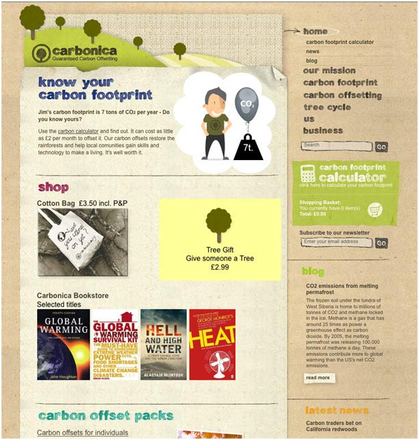
Carbonica forgoes the gradients and shiny goodness of Web 2.0 and goes for a "pieced together" look reminiscent of a scrapbook. Great use of texture and animation, but also a really fun take on hand-drawn type.
Be sure to scroll down a bit and check out the icons, which also fit the theme perfectly!
Traditional Aspects:
- Basic structure is in play.
- Hand-crafted lettering goes well with the theme of the site.
- The animation is a nice touch (but sorry, the use of Flash keeps this point out of the Web 2.0 Category).
Web 2.0 Enhancements:
- The texture is great.
- Drop shadows add realistic depth.
- Nice icons, photos, and illustration.
14. DSGN + DVLP
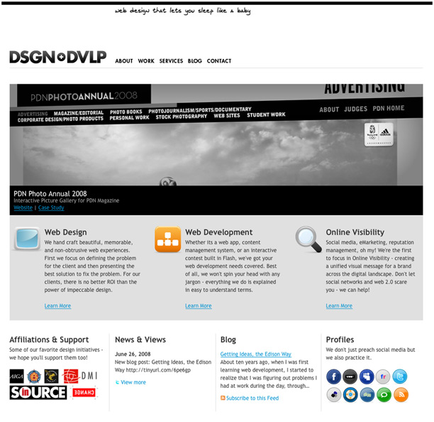
Again the overall black and white color scheme works for this site, and they accent this direction with some clean icons pulled right out of the Web 2.0 handbag.
The homepage stands on its own as a sort of splash page, and has a good mix of icons, strong layout, and even a bit of photography. All of these elements come together in a sophisticated way and manage to emit quite a bit of energy.
You'll notice that the secondary pages use a separate, 3-column template to serve up the information. It's all very much a minimalist design, but that's not a bad thing.
Traditional Aspects:
- Black, white and gray offer a distinct feel.
- Good balance of type on the homepage.
- 3-column secondary page template allows a consistent flow of information once you navigate away from the homepage.
Web 2.0 Enhancements:
- Social media awareness is definitely in play.
- Glossy icons scattered throughout add needed color.
- Good mix of photography and icons.
- Jumbo icons are featured on the secondary pages.
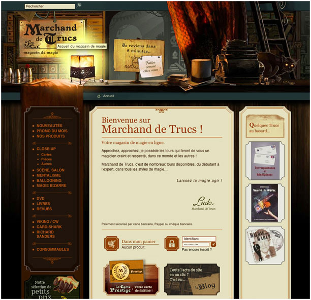
15. Marchand de Trucs
So maybe I can't speak the language, but that doesn't mean the site isn't still speaking to me... Okay, that line was lame, but still this site is pretty sweet. It contains wonderful artwork and, behind it all, a great foundation and structured content. Not too bad for what (I think) appears to be an online magic shop!
Traditional Aspects:
- Intense attention to detail.
- Color theory is well in play, and it's a very involved palette at that.
- Good use of fonts that follow the general theme of the site.
Web 2.0 Enhancements:
- Extremely nice use of illustration as a header
- Relatively large icons.
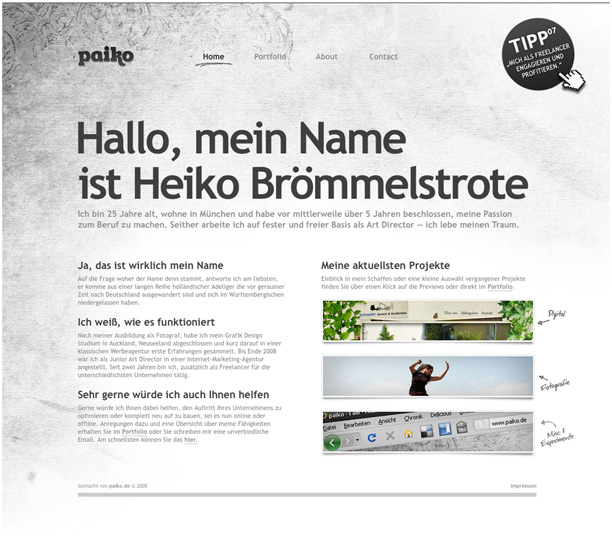
16. Paiko
Paiko, though simple, is one of my favorite sites on the list. It comes across as a split blend of traditional design staples and Web 2.0 enhancements: Good type of all sizes (including the very Web 2.0 mega-headlines), great whitespace, and of course the ever-important grid that holds it all together.
The choice of adding texture in the background really sets the site apart, and adds another layer to the already strong design; it is treated with care, and not overly used as it is in some sites. This texture, combined with the more sophisticated appeal of the site, goes a long way in strengthening Paiko's identity.
Browse over to the portfolio page to see an example of great spacing and grid structure, not to mention some fun examples of well-cropped images.
Traditional Aspects:
- Simple, two-column grid structure with gutter space that gives it a nice airy feel. This structure is carried throughout the site, which gives it a very consistent flow.
- Crafty feel adds a nice touch, without being overbearing.
- Font variations and color are very sophisticated.
Web 2.0 Enhancements:
- Jumbo-text!
- The headline is huge and highly legible, and plays nicely against the smaller type below.
- Great images and layout on the portfolio page.
- Conservative use of texture adds to the overall identity.
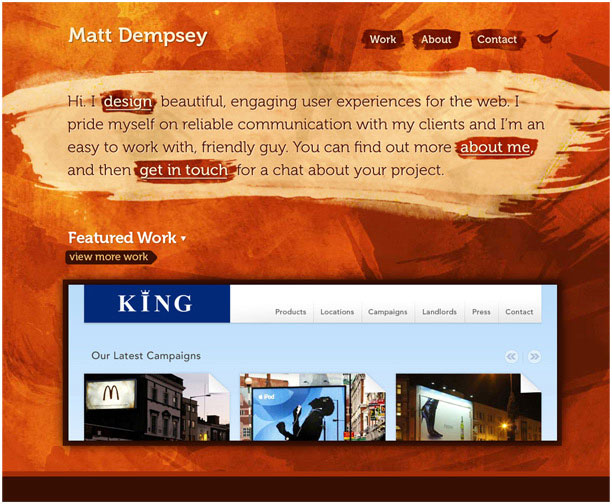
17. Matt Dempsey
On the other extreme of the texture spectrum, we have a site by Matt Dempsey. Now, there's definitely a thing as too much texture, and some would have a valid point if they argued that this site goes to far.
However, I still like it, and the details won me over as I started sifting through the information. Matt isn't afraid to break a few rules that have always bugged me (like keeping information above the fold, an idea I feel was invented at a round-table discussion of over-thinking marketing folks. I say so because I once was one of those marketing folks.).
When it comes down to it, Matt Dempsey presents his work, and his site, in a bold and "in your face" manner. And breaking a few rules is what being a designer is all about, whether the rules are old or new.
Traditional Aspects:
- Believe it or not, there's a simple grid system underlying the texture.
- Distinct and unique
- Not afraid to break a few rules
Web 2.0 Enhancements:
- Matt uses an obviously Web 2.0 approach to his fonts and logo
- Good use of technology on the interior pages (the JavaScript slider is a cool touch).
- Every bit of important information is huge and easy to read.
- Portfolio presents the work in a fun, high-tech way.
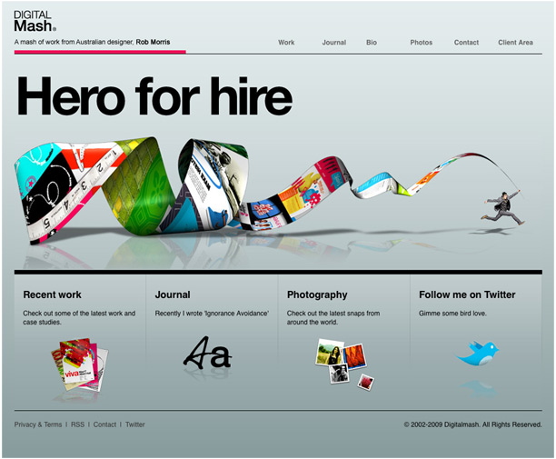
18. Digital Mash
With Digital Mash, you can see that plenty of thought went into the items they wished to include in the site, or better yet, the items they chose to leave out.
Being able to cut back the fat is an important practice for any designer, and Digital Mash lays out the basics, and only the basics. Open the page and you'll know within seconds what the author of the site is all about.
The smooth gradient of the background does a great job of presenting the content in a sophisticated manner. From the clean type, to the punchy graphic of the illustration, the site keeps it simple.
The best part has to be when you dig deeper into the site. Head to the work page and you'll find a portfolio presented in an almost old-fashioned way; the individual pieces look as though they're ready to be printed and bound into a leather attache case.
However, the sleek presentation, the dropshadows, and the small details (such as the slightly bent corners of each piece), give it all a contemporary slant. Combining the new and the old. Gotta love it.
Traditional Aspects:
- Trimmed away unnecessary elements.
- Vibrant colors on the homepage and in the header of the secondary pages add a vibrant accent to the gray background.
- Hierarchy of information is strong, and so is the general flow of the site.
Web 2.0 Enhancements:
- Amazing presentation of the portfolio images; dropshadows, upturned edges, and small details really bring this site to a higher standard.
- Nice gradient in the background really presents the information well.
- Large type and oversized imagery are friendly to the eyes.
- Very cool navigation solution.
19. Kyan Media
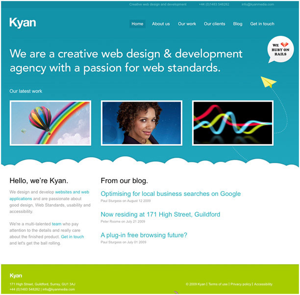
Kyan Media is another site that leans heavily on the Web 2.0 side of the spectrum. The cloud design and the vibrant blue color palette are straight out of the book, but it's an extremely strong example of the standard.
The site plays it straight, and in large letters tells you exactly what they do, followed by examples of the work. It's a simple design strategy found in countless sites, and for good reason. It's quick, and doesn't threaten a short attention span.
And, like all good examples, it embraces the technology as well as it does traditional design rules. Take some time and hover over the examples of work. It's a fun and informative way to present featured portfolio pieces, and allows us, the user, to dig deeper, or to get the basics with just a glance.
Traditional Aspects:
- Everything has an extremely solid feel.
- General layout of each page is strong
- The informational hierarchy is great.
- Fonts, headers, and font colors are consistent throughout.
Web 2.0 Enhancements:
- Bright blue color palette.
- Fun use of illustration (who doesn't like clouds?).
- Punchy photography.
- Good implementation of technology.
- Subtle dropshadows add depth.
- Highly legible fonts and oversized headers.
20. Rockatee
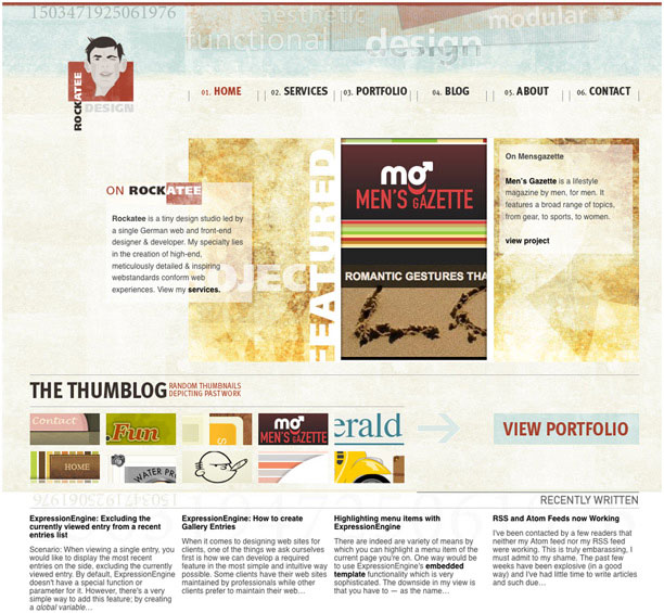
Well, it says "Functional Design" in the header, so it had better work, right? Luckily, this site does. It's another example of how texture is creeping into the web design market and confirming the notion that we're well into the high-speed era of surfing the web.
Something you might notice is that Rockatee has quite a few projects on display in the portfolio section, so a streamlined solution was definitely in order. They did so with a series of snapshots, which showcase the depth of their prolific portfolio. Do yourself a favor and check it out.
Another feature of note is the nice navigation. It's well placed and makes the site a breeze to click through. They even help you along on the homepage with a nice big button that leads to the portfolio.
Traditional Aspects:
- Everything has an extremely solid feel.
- General layout of each page is strong.
- Color theory is well explored and implemented.
- Strong attention to detail.
Web 2.0 Enhancements:
- Fantastic navigation.
- Big buttons lead you to the important bits.
- Cool "snapshot" portfolio with great crops of the individual works.
- Site showcases the designers many side projects, but doesn't let them get in the way of the central elements.
- Great idea with the timeline on the "About" page.
21. Things That Are Brown
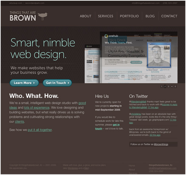
Another one of my personal favorites is Things That Are Brown. They pull off an extremely polished site that is an equal to (or better than) sites created by large agencies, yet they also give you an inside look at the people behind the scenes.
The about page contains great photography that, while professional enough, is also has a very homemade appeal. You can tell that the team took a trip outside, scouted a decent spot, and took a few snapshots with their own digital cameras.
A professional, yet accessible and friendly team is exactly the type of team I want to work with. These people are real.
This is one of those rare sites that seamlessly fuses strong design rules with modern tweaks. Their tagline, "Humbly Awesome," is dead on.
Traditional Aspects:
- Nice color with great accents.
- Good use of artwork that integrates well.
- Solid and consistent throughout.
Web 2.0 Enhancements:
- Navigation is clean and easy to read.
- Nice buttons that don't overdo the gloss.
- Photography is personal and adds a human touch to the site.
- The portfolio is clear and easy to navigate, with great presentation of the work.
- Headlines are large, yet sophisticated.
22. Andrew Bradshaw
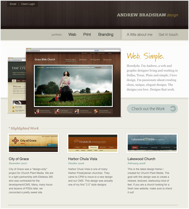
This is perhaps one of the most sophisticated sites on the list. Andrew has a great way of meshing texture, type, buttons, and photography into a congealed package. He also keeps hierarchy in mind, accentuating the important aspects and minimizing the sections that may not be of interest to all users.
The navigation is a highlight, with varying colors appearing as you hover over the tabs; a very sleek touch.
Also of note is the textured header and the strong font choice used in his logo. Again, Andrew combines subtlety and accents to create a beautiful site that is thorough and compelling throughout.
Traditional Aspects:
- Overall appeal of clean sophistication.
- Good use of accent elements, both in color and with type.
- As usual, a strong grid system holds it together.
- Hierarchy is implemented well.
Web 2.0 Enhancements:
- A different take on buttons.
- Brilliant use of photography and image presentation.
- Awesome details in the navigation.
23. James Lai
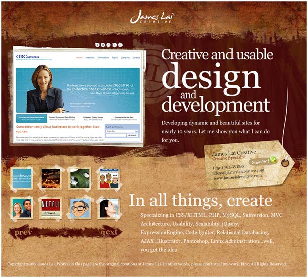
Lately I have a thing for single page websites, and as you've probably guessed, I'm a sucker for texture as well. Enter James Lai, a designer who knows how to present himself through a fancy use of type, texture, and animation.
What I commend him for the most is his ability to keep his site to a single page, and forgive us the "All About Me" page found on virtually every site. Though I place a high value on the human element, sometimes the work speaks for itself, and I can't fault a guy for believing in his own skill set.
Traditional Aspects:
- Simple, single-page solution.
- Animation adds interest to the presentation (though it slowed the site a bit on my end).
- Good attention to detail.
Web 2.0 Enhancements:
- Huge type on the homepage tells you the exact purpose behind the site.
- Contact information is easy to find.
- Cool thumbnails help users navigate the portfolio.
- Interesting use of texture.
24. Subvert
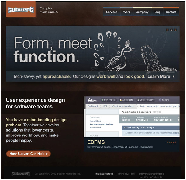
Subvert was included not only for its obviously functional layout, but for the fading slideshow featured on the homepage. The presentation is fun, but it's also informative and valuable to potential clients.
The background texture is complimented by transparent details, including a great navigation system featuring transparent tabs! The hover status of this navigation is subtle and maintains the transparency.
I tend to navigate directly to the work pages on these sites, and Subvert doesn't disappoint in its presentation. The grid structure is strong and easy to navigate, and upon clicking, the user is taken to an expanded view of the work.
Traditional Aspects:
- Great overall flow.
- Strong presentation of the portfolio on the "Work" page.
Web 2.0 Enhancements:
- Huge type presented on a fading slideshow.
- Transparent navigational tabs!
- The buttons are nice and add a good contrast to the backgrounds.
- Slideshow of the office on the "Company" page is a nice touch.
- Embraces technology.
25. Yellow Bird Project
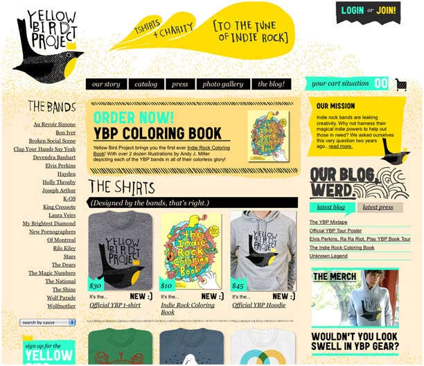
At first glance this site might appear a bit disheveled or scattered, but the more I look at it, and the more I browse through its pages, the more I've noticed the strength of its organization. Better yet, the Indie-inspired design really starts to appeal the longer the stay, and the scattered look of the site actually fits the theme.
If you check out the Photo Gallery, you'll see a slew of amateur photos that once again add to the Indie look, while showcasing the product.
This sort of underground approach, which was made popular by sites like threadless.com, immediately attaches the viewer to the product.
They want to be a part of the crowd and don't feel as though someone is just trying to sell them something. If that isn't a Web 2.0 philosophy, I'm not sure what is.
Traditional Aspects:
- Crafty logo really establishes the feel, which is carried out throughout the entire site.
- Though it feels scattered or loose at first, one realizes that this "put together" look is exactly what the designers were going for. They pull off the look while still making the site easy to navigate.
- Consistent, non-traditional approach.
Web 2.0 Enhancements:
- It's more about the philosophy with this one. While the social aspect of Web 2.0 is in full effect, this site is also made strong because of its viral marketing approach and great underlying philanthropy.
- Builds a community!
- Great photos and easy navigation don't hurt either.
In Closing...
Web 2.0 is a tough standard to define, as where traditional design standards are a rigid collection of rules and guidelines (grid structure, color theory, letter spacing, kerning, tracking, and so on), Web 2.0, while containing similar standards, is almost more so a way of life.
It combines philosophy, marketing, technology, ease of use, and countless other aspects of our busy universe with an ultimate goal of making things easier for the masses.
In that regard, Web 2.0 and the traditional rules that were established ages ago, ultimately share the same goal: To organize the chaos, and to simplify the complex.
These days, it can be a tough gig, so we need all of the tools at our disposal, whether they're cutting edge, or whether they've been proven over centuries past.
Written exclusively for WDD by Josh Sears. He is a Writer, Illustrator, and Designer for a slew of web-based projects. He makes his living as Lead Web Designer, Creative Director, and Co-Owner of Littlelines.com. You can check out his work here, or follow his updates on Twitter.
How do you use web 2.0 elements with traditional design? Please share examples from your own portfolio or other good examples that you may have come across.

