 By now most bloggers using WordPress should have upgraded to the latest version of WordPress which is officially at version 3.0.1.
Along with updates to the core framework, when version 3.0 was released the WordPress team also added a new default theme, replacing the now obsolete Kubrick. The new theme, as most of you are probably aware, is called Twenty Ten.
Not to sound too corny here, but from the first moment I laid eyes on Twenty Ten, I fell in love with it. But I'm not talking about theme's visual design (which is pretty humdrum); I'm talking about the front-end code, which has seen a number of improvements over the previous default theme.
In this article, I'll discuss some of these improvements that I feel are worthy of examination and imitation.
And keep in mind that this is not a discussion of the features of the theme itself; this is a discussion of the structure and organization of the HTML and CSS and how it provides an excellent model to follow for front-end developers.
It's HTML5 Ready
The first thing you'll notice when you view the source of the Twenty Ten theme is the simplified doctype, which means it's technically capable of using HTML5. So, while there aren't any of the common HTML5 elements in the theme (like and ), the HTML5 doctype is a step in the right direction.
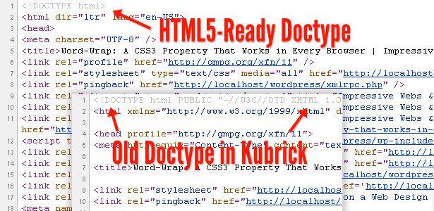
You'll notice in the source that there are a few other markup simplifications: the character encoding declaration is simplified, and the HTML element doesn't have the "xlmns" attribute. Both of these improvements are based on the HTML5 spec.
So, even if you're not using any of the common HTML5 elements in your pages, you could still make your pages HTML5-ready by including the new simplified doctype, and removing some of the other soon-to-be obsolete elements, thus following the example of the developers of Twenty Ten.
Proper Use of the h1 Tag
This is an improvement that's easier to examine when looking at the actual PHP files that create the markup, and constitutes a definite improvement over Kubrick for best-practices SEO, semantics, and accessibility.
In Kubrick, on every page the top-level heading (<h1>) is the website title. This is fine for the home page, but not secondary pages. Thus, a single article page in Kubrick has the article's title marked up with the <h2> element. According to Roger Johansson of 456 Berea Street this is not best practice.
Take a look at the screen grab below displaying how the new Twenty Ten theme handles this problem:
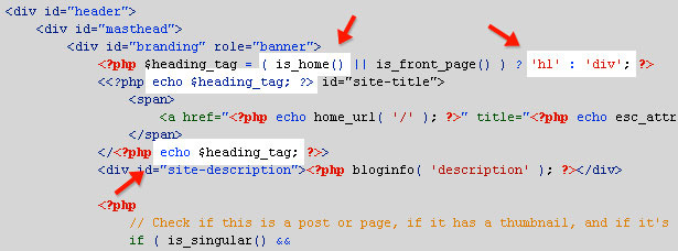
The PHP code in header.php changes the markup depending on which page is being viewed. If the home page is being viewed, the element that surrounds the page title becomes the <h1> element. On any other page, the title is wrapped in a <div>. In the latter case, this allows the <div> element to be more meaningful on secondary pages, contributing to SEO and overall accessibility.
Eric Meyer's CSS Reset Included
Recognizing the usefulness of a CSS reset, the Twenty Ten theme developers have also included a variation of Eric Meyer's CSS Reset at the top of the theme's CSS file, crediting Meyer in a comment:
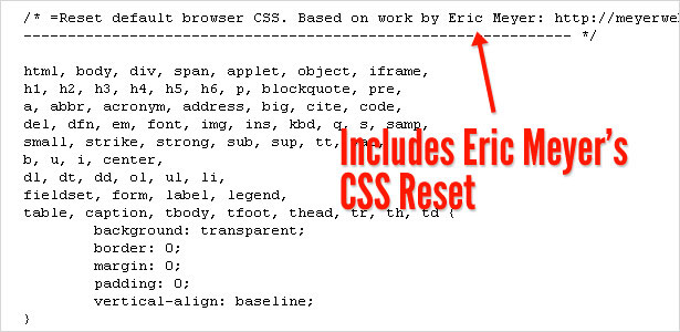
A reset can go a long way towards achieving cross-browser compatible CSS layouts. So the inclusion of the reset is no surprise here and is another technique employed by the Twenty Ten developers that's worthy of imitation.
Closing Tags are Commented to Indicate IDs and Classes
At one of my previous jobs, I was working on a lot of inherited code, and some of the previous developers suffered from divitis, making it difficult to rearrange or target elements in the markup. So, in new projects, I started adding comments at the end of <div> elements, to ensure that during future maintenance anyone could easily see which element ended where. This was especially important for deep-nested sets of <div> tags.
The Twenty Ten developers have recognized the value of comments to identify the names of <div> elements, so they've done something similar, except they've taken it a step further:
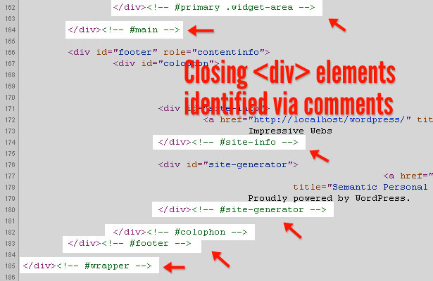
Their comments not only include the ID or class name of the element they identify, but also indicate whether or not the name is a class or ID. The first comment in the screenshot above is for an element that has an ID of "primary" (indicated by "#primary") and a class name of "widget-area" (indicated by ".widget-area").
So, while my own convention is to just name the element regardless of class or ID, they've included a single character (the hash or period) to identify the attribute on which the name is based. This is a good practice to follow, and is just a simple way to enhance the clarity and maintainability of your markup.
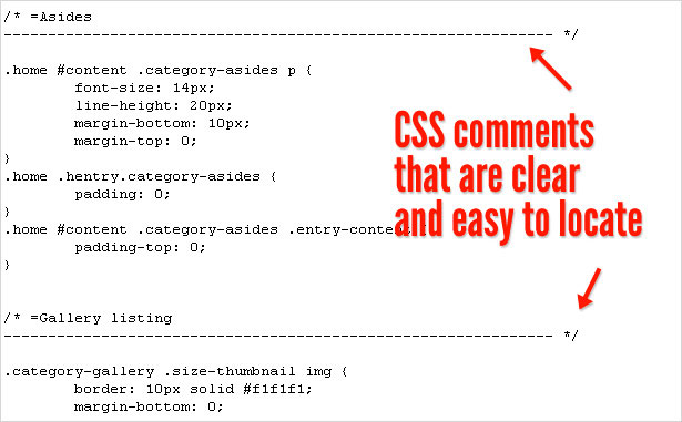
CSS is Commented More Clearly
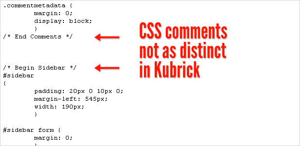
Finally, staying on the topic of commenting, I noticed a clear improvement in the way CSS is commented and organized in Twenty Ten, as compared to Kubrick. This is no doubt something that many front-end developers have tried to do for a number years, and it's good to see the Twenty Ten developers following suit. Below is a screenshot showing the distinct comments in Twenty Ten's CSS file, making them very easy to find when scanning through the styles:
By contrast, in Kubrick the comments were not as easy to spot when scanning the file:
Conclusion
It's understood that one of the best ways to become a better coder is to study the work of others. And that advice certainly applies to front-end code that is easily accessible on pretty much every website.
The five things I've discussed in this article are not necessarily anything new in front-end development, but I think seeing these practices implemented on a single project is unique, and so the Twenty Ten developers (who are evidently Matt Thomas and company) have done a great job in this regard, providing some excellent techniques and examples worthy of imitation.
This post was written exclusively for Webdesigner Depot by Louis Lazaris, a freelance writer and web developer. Louis runs Impressive Webs where he posts articles and tutorials on web design. You can follow Louis on Twitter or get in touch with him through his website.
Have you noticed anything else about the new default WordPress theme's code that's worthy of discussion? Please share your comments below.


