 Buttons and navigational elements are quite possibly the most commonly used interface objects in both desktop and mobile design. They pull an interface together, allowing users to get from A to B in a single click.
Most importantly, a button has to look good. It has to scream “Click me!,” or else it simply won’t be as effective as it needs to be. Buttons are commonly used to “”Search,” “Submit,” “Send,” “Buy” and “Upload.”
In this article, we’ll look at seven common button elements in modern interface design: textures, patterns, 3-D, pixel-perfect strokes, indented backgrounds, glows and highlights.
You’ll find 35 fantastic examples of these techniques as well as a handful of mini-tutorials for Photoshop.
1. Textures
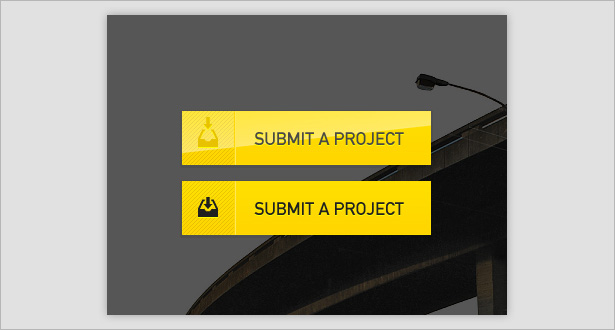
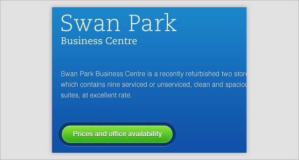
Using texture is a great way to add some depth to buttons and make them stand out a little from the rest of the interface (and ultimately making them more clickable). Below are some great examples of textures in buttons.
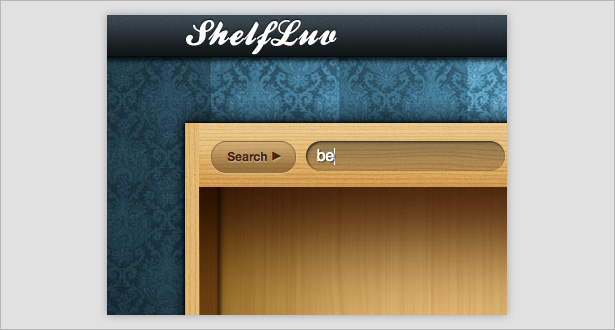
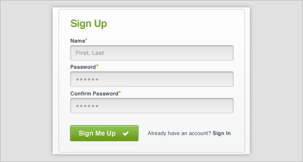
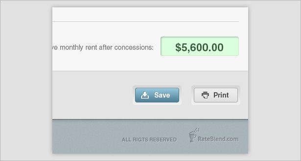
ShelfLuv uses texture throughout to add dimension to its interface, especially in the button and text field areas.
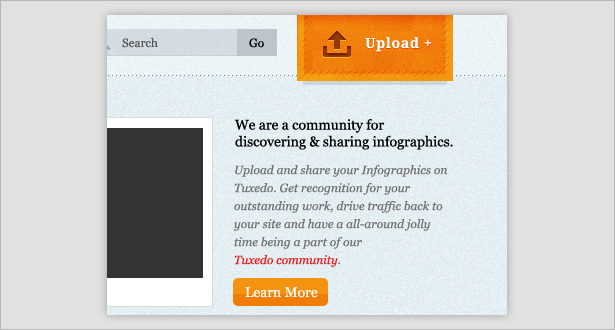
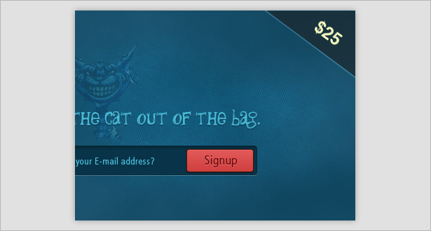
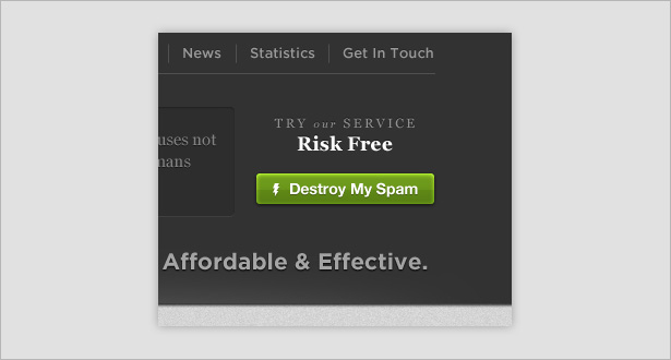
Texture is used all over this interface, but it is heavier in the “Upload” button area, making it a focal point.
The texture here is blended well with the beveled button, making it look real.
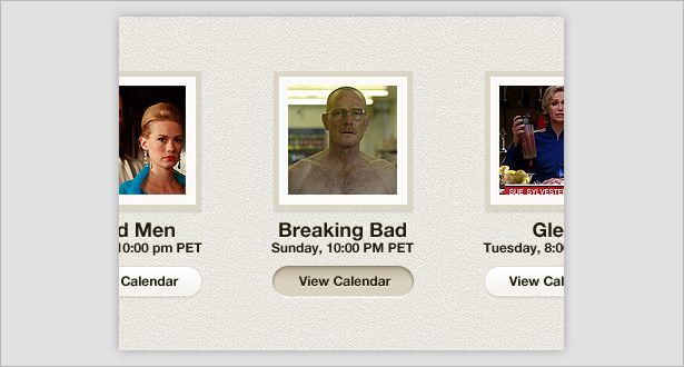
Texture isn’t actually used on this UI button but does appear in the background, allowing the button to stand out.
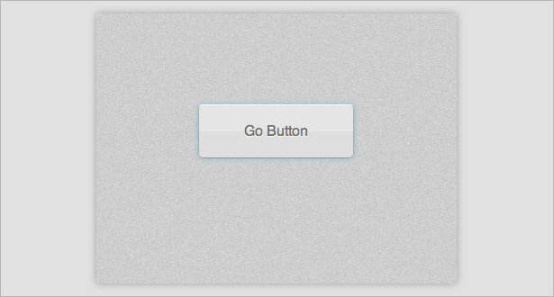
Creating a Textured Button
Create a simple background using the Shape tool and by adding noise (Filter → Noise → Add Noise).
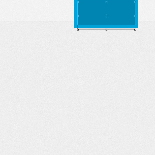
Reselect the Shape tool and draw a rectangle, making sure the top of it is hidden off the edge of the canvas.
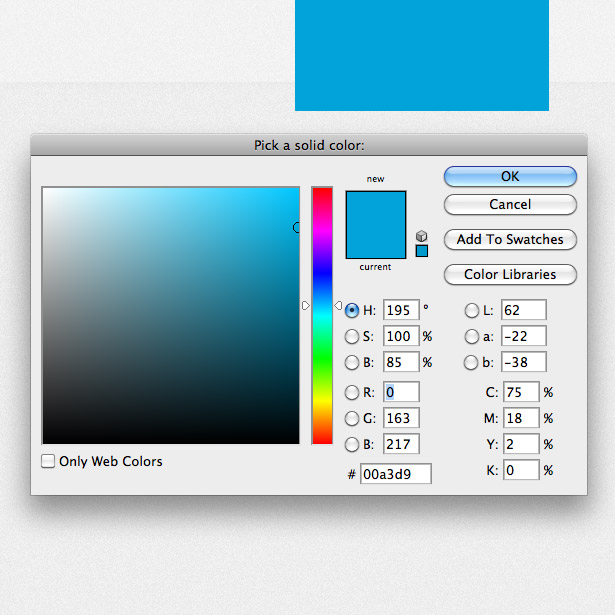
Change the color of the shape to blue. I used #00A3D9.
Duplicate the Shape layer and resize it in the same position. Change the color to a slightly darker blue.
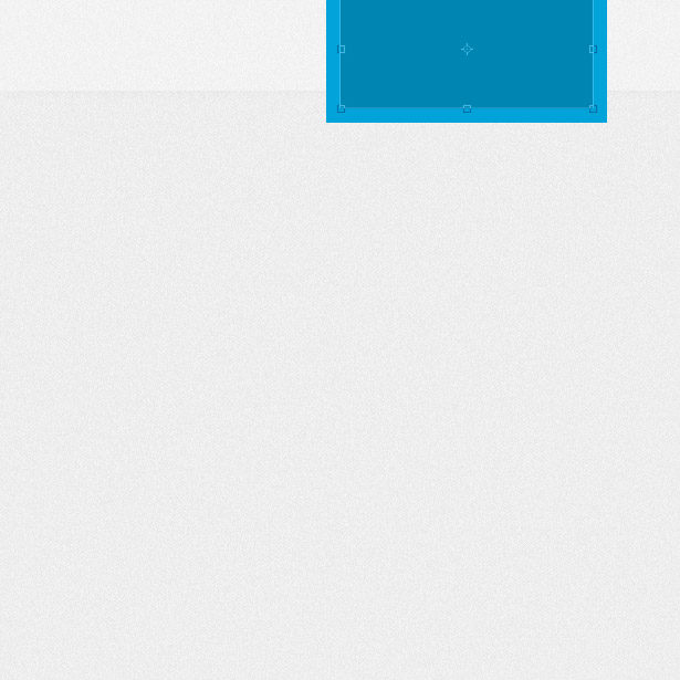
Duplicate the layer once more. Position the layer beneath the last two Shape layers, and change the color to a light gray.
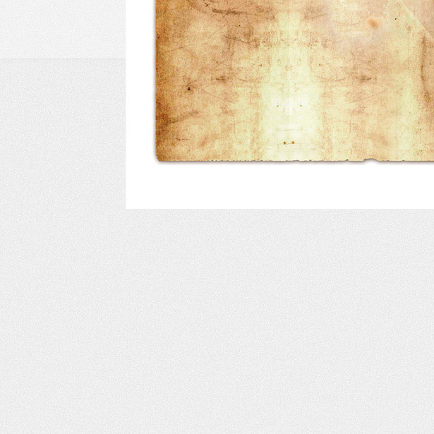
Photograph or download a paper texture (I used one from Lost & Taken). Go to File → Place, and locate the file to place it in the document. Resize it and position it over your blue shapes.
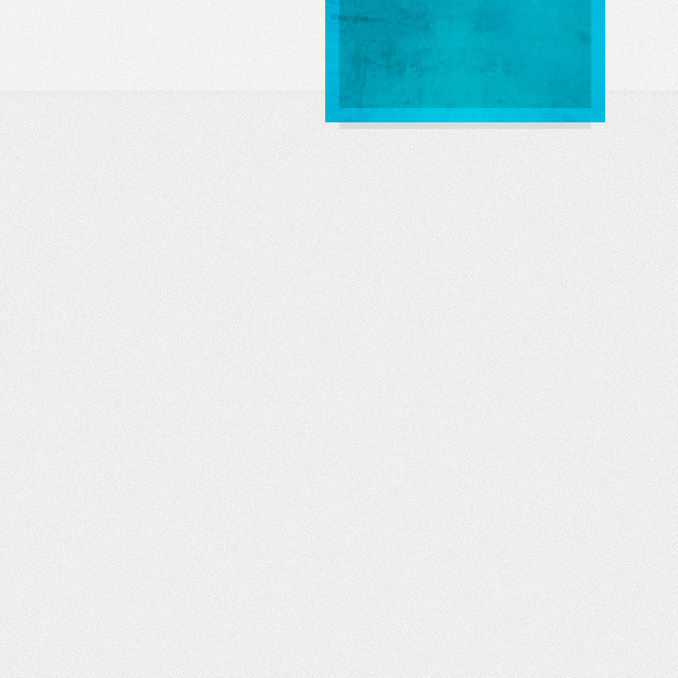
Remove any excess texture by using the Marquee tool, and change the blending mode of the texture. Experiment with different modes because different textures produce different results. You may also want to lower the opacity levels a little.
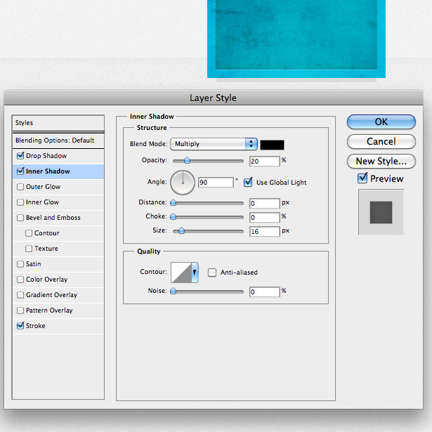
Open the Layer Style window for your darker blue shape, and apply the following Drop Shadow style to add a subtle white shadow.
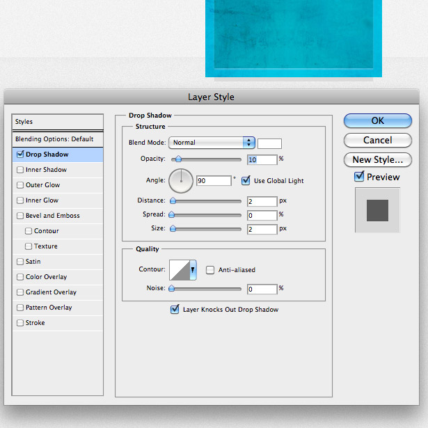
Now apply a Stroke to your shape using the settings below.

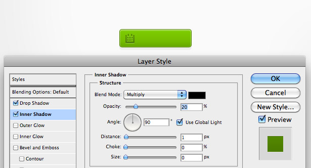
Finally, add an Inner Shadow to the shape, to give it further dimension.
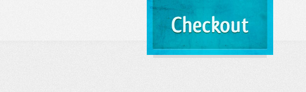
Add some text to the button and you’re done!
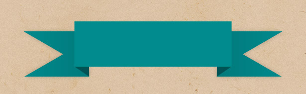
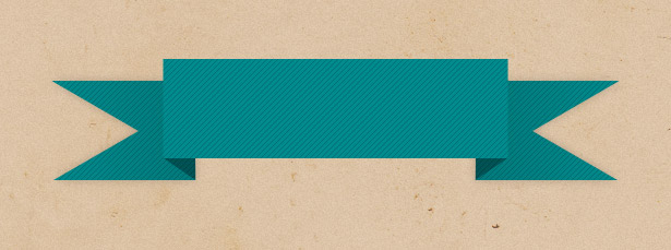
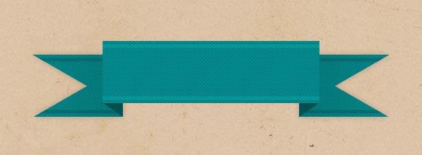
2. Patterns
Patterns are another great way to add a bit of interest and depth to interface buttons. Below are a few examples of patterns in buttons, all subtle yet effective.
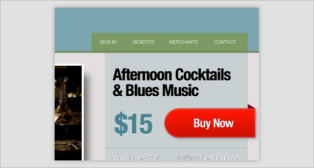
A diagonal reflection is used on the left side of the button here to separate the icon from the type.
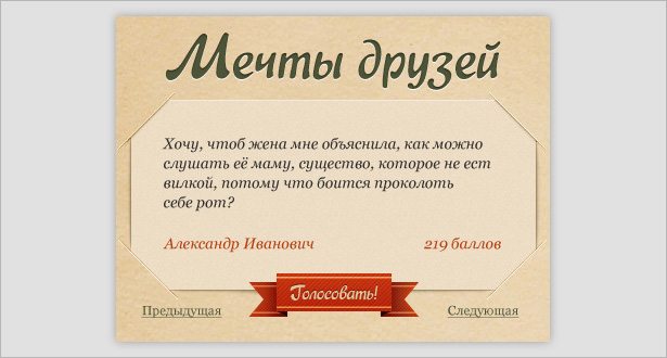
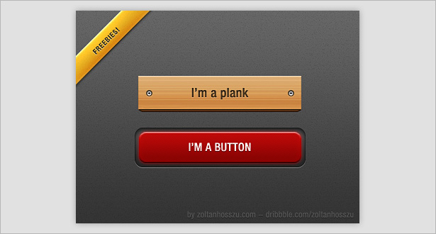
A diagonal line is used in this button, fitting the vintage look while adding dimension to the design.
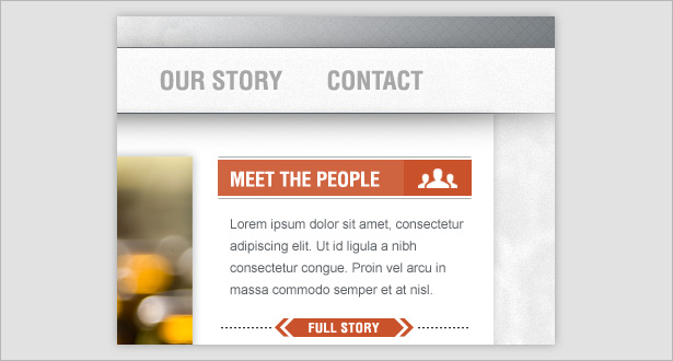
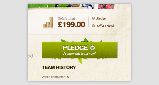
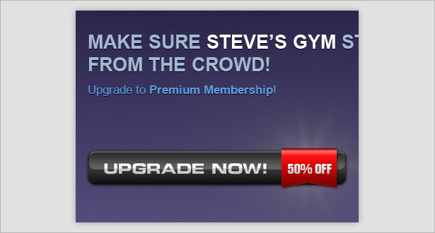
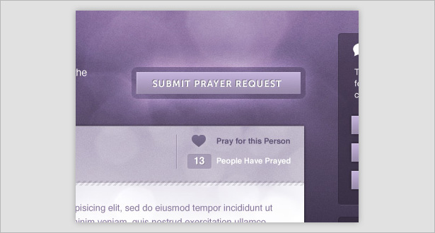
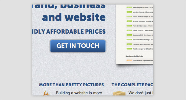
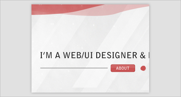
This is my favorite use of a pattern in these examples. Although not used in the buttons themselves, the pattern in the gray header adds dimension to the whole design and ultimately helps the orange buttons stand out.
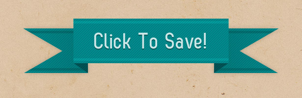
Creating a Patterned Ribbon Button
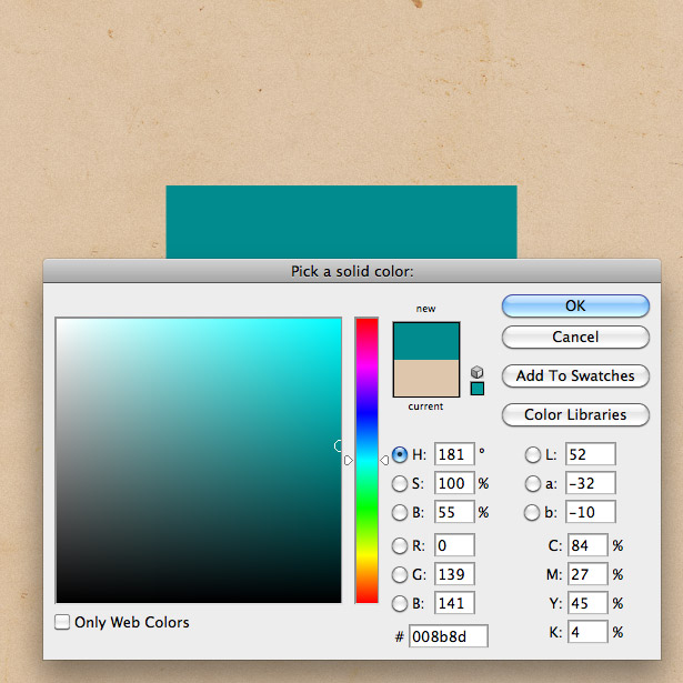
After creating a textured background using the technique in the previous mini-tutorial, draw a rectangle using the Shape tool, and fill it with a blue-green. I used the color #008B8D.
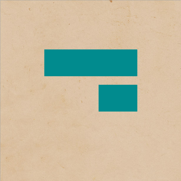
Draw another shape with the same height and color.
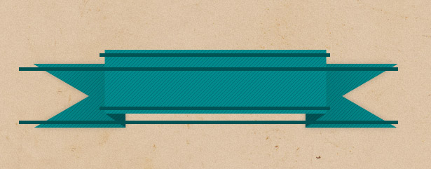
Using the Lasso tool, create a triangle, as seen below. Position it over the edge of the new shape, and hit the “Delete” key to remove the area we don’t need.

Duplicate the shape and go to Edit → Transform → Flip Horizontally to make it face the opposite direction.
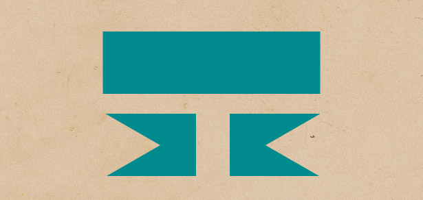
Position the two shapes beneath the larger shape, as seen below.
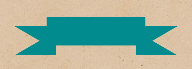
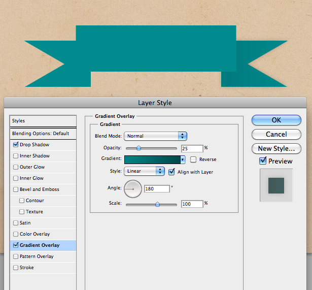
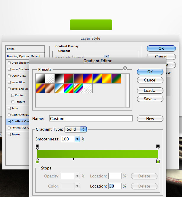
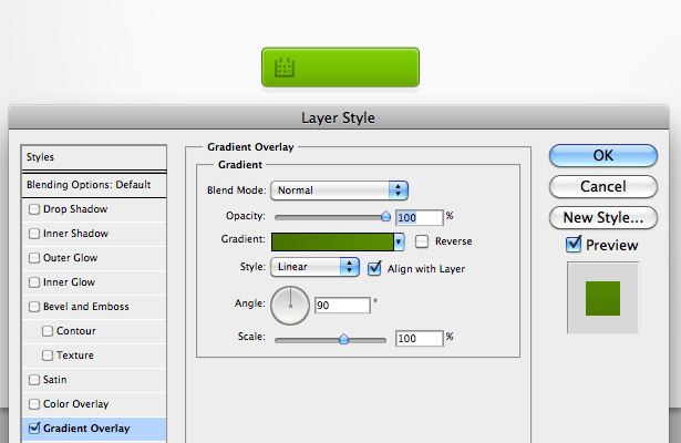
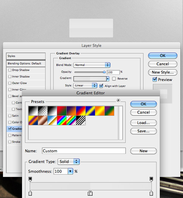
Right-click on one of your shapes, and open up the Blending Options / Layer Style window. Apply a Gradient Overlay similar to the one seen below. You can also add a subtle Drop Shadow. Once done, right-click on the layer and select “Copy Layer Style.” Select your other banner shape. Right-click and select “Paste Layer Style.” Open the Layer Style window, and change the angle of your Gradient Overlay from 180° to 0°.
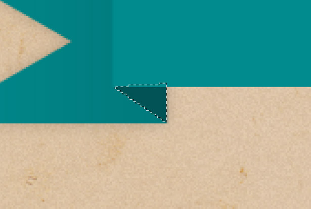
Using the Lasso tool, create a selection similar to the one seen below to match up the two corners of our shapes. Fill it with an even darker color.
Duplicate the layer, flip it horizontally, and position it on the other side.
Create a line pattern. Alternatively, you could use the one that I made below.

Paste the pattern over your whole banner. While holding Command + Shift, click on the layer thumbnails of all of your banner layers. This will select all of them. Right-click and select “Select Inverse.” With your line pattern layer selected, press the “Delete” key to remove the areas of the pattern you don’t need.
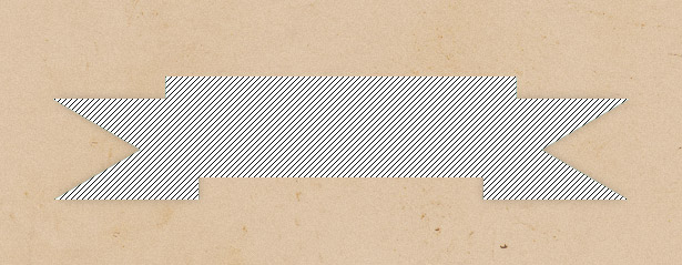
Change the Blending Mode of the pattern layer to “Multiply” to hide the white from the layer. Now drop the opacity down to somewhere between 25 and 75%. Experiment for the best result.
Using the Shape tool, create some lines similar to the ones below.
Remove the areas that sit on the image’s background.
Experiment with the Blending Mode of each of your lines. Here is the result:
3. 3-D
Three-dimensional buttons are great because it makes the buttons look far more realistic. They’re almost impossible not to click! The only drawback is that the effect is rather playful and so doesn’t suit all websites (such as corporate ones). Below is a selection of some lovely 3-D buttons.
The shadows and 1-pixel lines here highlight certain areas and make the button appear 3-D. This and some good CSS effects would make for a super-interactive button.
Our second element (patterns) is also used in this design to add dimension to an already very 3-D button.
This button takes a slightly different approach, relying only on gradients for its 3-D look.
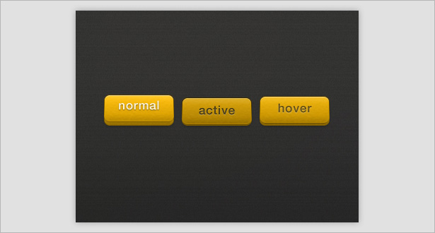
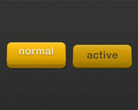
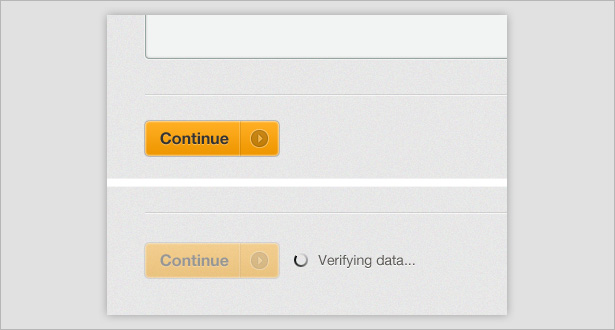
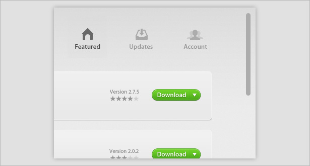
This set shows different heights to indicate whether the button is in its normal, hover or active state. The lines and texture give the buttons a more life-like appearance.
Like a couple of other examples in this section, a combination of gradients and strokes makes these buttons look 3-D.
This button looks 3-D because of its “out of the box” design, being wrapped around the UI.
Creating a 3-D Button
Start by drawing a shape with the Rectangle tool, with a corner radius of 7 pixels. Open the Layer Style window, and apply a Gradient Overlay going from dark red to light red. Use an even lighter red at the very end of the gradient bar to highlight the top of what will be our 3-D button.
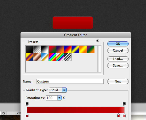
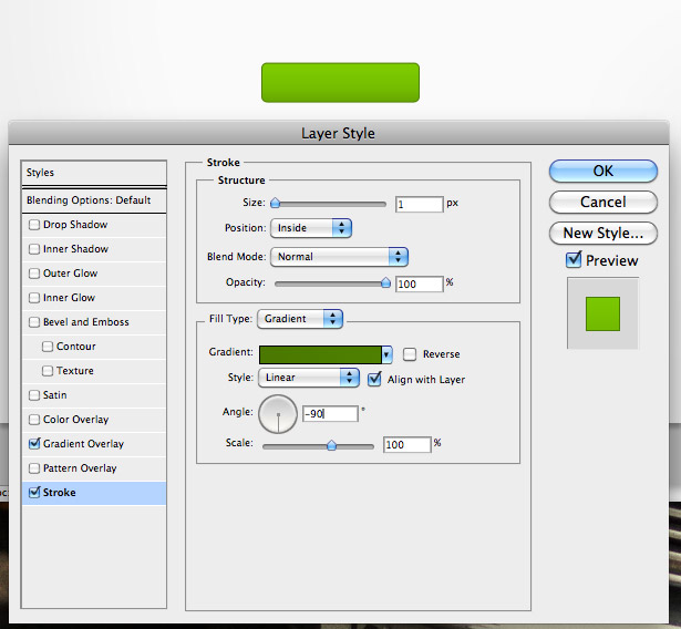
Now apply a stroke to the button. Change the fill type to “Gradient” so that you can change the color of the top and bottom of the stroke. Go from a light to dark red (the opposite of the Gradient Overlay).
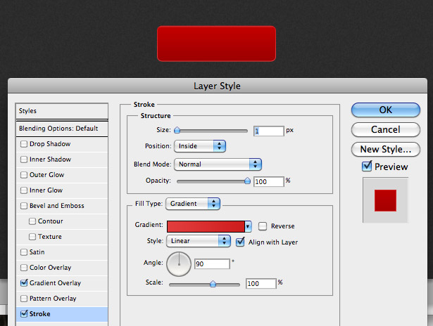
It should look something like this so far:
Duplicate the Shape layer. Nudge the original layer down by about 10 pixels.
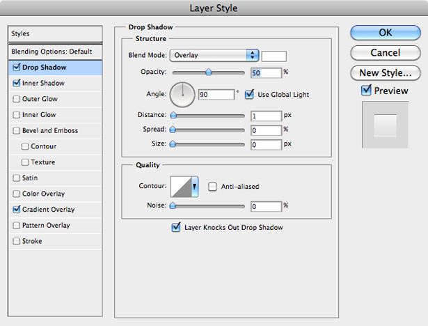
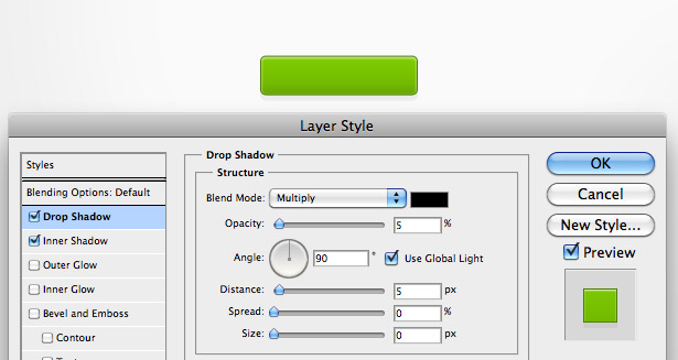
Apply a Drop Shadow to the original layer using the settings seen in the screenshot below.
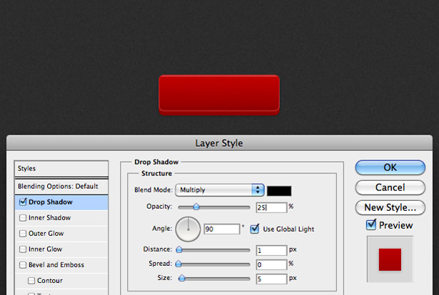
Also, darken the Gradient Overlay by making each individual color in the gradient bar a little darker.
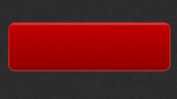
You should have something that looks like this:

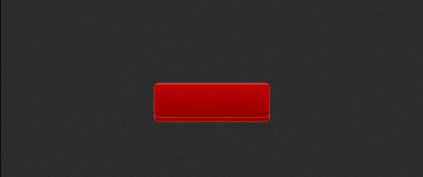
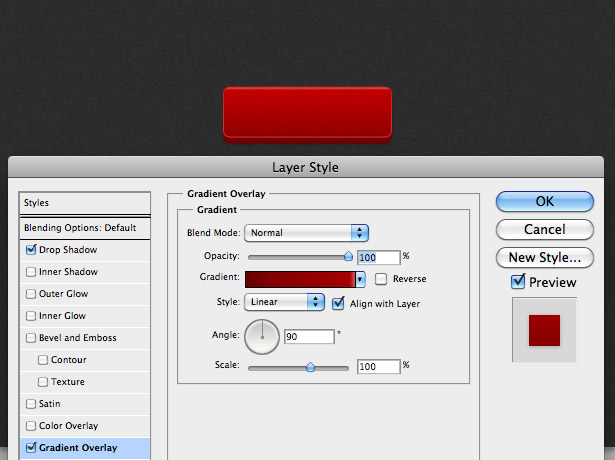
Select the Text tool, and type something on the button. Open the Layer Style window, and apply a Gradient Overlay similar to the one seen below:
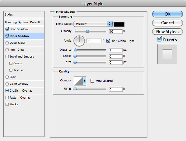
Apply an Inner Shadow using these settings:
Apply a Drop Shadow using these settings:
And we’re done! You should end up with something like this:

4. Pixel-Perfect Strokes
The art of perfecting pixels has become integral to all aspects of user interface design, not just buttons. One-pixel lines (or strokes) give buttons depth and a slightly 3-D look. They also make buttons look indented. Here are some brilliant examples of this.
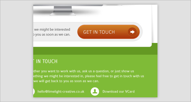
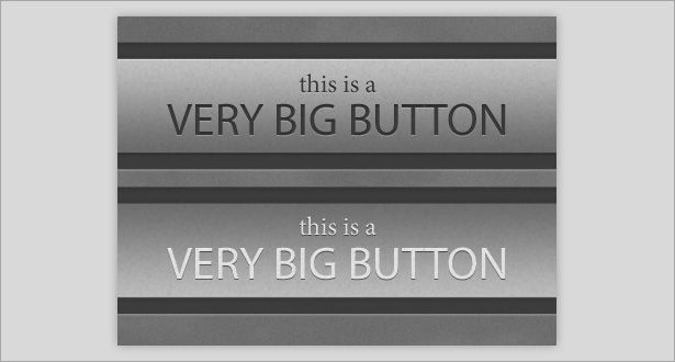
You can clearly see that a white (overlaid) 1-pixel line is used as a highlight at the top of the red button, with a darker line at the bottom. This makes it appear slightly 3-D and adds a lot of detail to the page.
The typography in this button has an inner shadow, making the button appear as if it is sitting above the interface.

These CSS3-only buttons (absolutely no Photoshop) have 1-pixel strokes that make them stand out from the background and appear indented when clicked.
Another example of a 1-pixel light stroke at the top of the button to act as a highlight.
This green button shows a slightly different approach, with an inner glow acting as a highlight at the top of the button. The stroke on the outside creates a very fine shadow.
Yet another button combining the aforementioned techniques.
This basic button has a thin stroke and delicate drop shadow to make it stand out from the simple design.
This button has a subtle inner glow to make it stand out from the background. Its active state has a lowered opacity, which does the trick.
Forget the button: this whole design is pixel-perfect, with its modern typography and lines making for a beautiful user interface.
Create a Pixel-Perfect Button
Select the Rectangle Shape tool (found in the toolbar at the top of Photoshop when the Shape tool is selected), and give it a corner radius of 5 pixels. Draw a black rectangle similar to the one below.

Open the Layer Style window, and apply a Gradient Overlay to the shape. I used a dark green to a slightly lighter green.
Give the shape a gradient stroke, going from a green to an ever-so-slightly darker green.
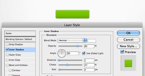
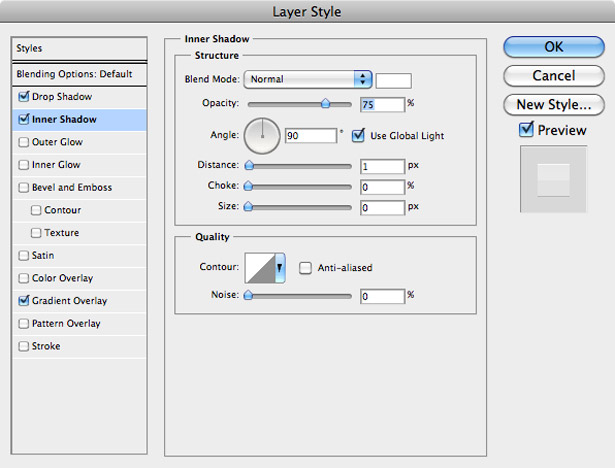
Now give the shape a white Inner Shadow style, using the settings seen below.
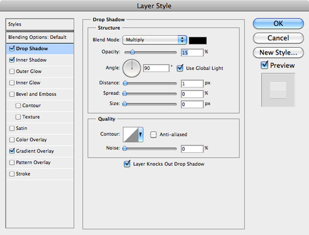
And now a Drop Shadow, with a size of 0 pixels and an opacity of just 5%.
Find an icon on the Internet (or create your own), and place it in your document by going to File → Place, positioning it correctly. Apply a Gradient Overlay to it.
Give the Inner Shadow of your icon a distance of 1 pixel, and the white Drop Shadow a distance of 1 pixel. This makes the icon look like it was engraved into the button.
Add some text to the button, and apply a low-opacity Drop Shadow effect using the Layer Style window. Here’s the result:

5. Indented Backgrounds
An indented background makes a button look like it is buried in it, giving the button depth and visual interest. Below are some great examples of this.
This button background has a subtle inner shadow to make it appear indented.
The inverted gradients in this background make the buttons appear indented.
A combination of strokes and drop shadows gives these indented buttons more depth.
This button background has several styles, including a gradient, inner shadow and drop shadow.
This indented button background is a lot smaller than what we’ve seen but still follows the same techniques.
Yet again, a drop shadow and inner shadow are used to create an indent.
6. Glows
Glows are a fairly hard technique to pull off in interface design, and are usually seen only in dark interfaces (although we’ll see a light example below). These examples show how glows can be used in different ways.
A glow is used on the inside of this button, giving it an all-around highlight.
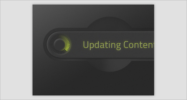
Glows are cleverly used to make the typography in this button stand out from the dark background. And the glows make the loading bars appear lifelike.
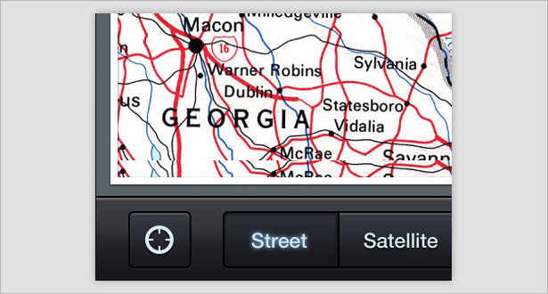
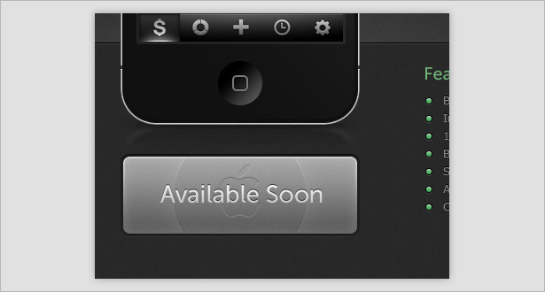
Glows are commonly used in dark interfaces for the iPhone. Here we see a glow around the typography when the button is in its active state.
The light and fairly subtle glow gives this button the extra boost it needs to become beautiful.
Creating a Light Glowing Button
Using the Rectangle Shape tool once again, draw a rectangle, this time with a corner radius of 3 pixels. Apply a Gradient Overlay similar to the one below. Give your center colors a position of “49” and “50.”
Apply the following Inner Shadow.
Apply the following Drop Shadow.
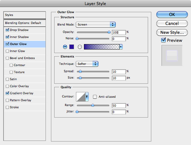
Apply the following Outer Glow.
Add some typography to the button. You should end up with a nice, clean and incredibly easy-to-produce result like this:

7. Highlights
Highlights give buttons depth, visual interest and clickability. The examples below prove this.
A simple low-opacity white shape is used on the top half of this button to give it a bit of depth and help it fit the overall red and gray interface.
As with many others buttons in this post, a 1-pixel stroke highlights this one.
Light to dark to light gradients serve as highlights and shadow for these buttons.
This post was written exclusively for WDD by Callum Chapman, the man behind Picmix Store and Circlebox Blog.
Which button designs do you use most and why? Did you find a higher click thru rate for some designs? Please share below...
WDD Staff


Read Next

20 Best New Websites, April 2024

Exciting New Tools for Designers, April 2024

14 Top UX Tools for Designers in 2024

What Negative Effects Does a Bad Website Design Have On My Business?

10+ Best Resources & Tools for Web Designers (2024 update)

3 Essential Design Trends, April 2024

How to Plan Your First Successful Website

15 Best New Fonts, March 2024

LimeWire Developer APIs Herald a New Era of AI Integration

20 Best New Websites, March 2024

Exciting New Tools for Designers, March 2024
