 Optimizing websites for the mobile web is a chore. And optimizing e-commerce websites for the mobile web is a beast that designers and developers have only begun to tame.
Not surprisingly, larger companies are embracing the medium first, likely because they have the resources and sales flow to justify it. After all, even if an e-commerce website gets sizable traffic, a small percentage of that will be mobile-based. And an even smaller percentage of that traffic will actually complete their sales.
With the momentum only really beginning in this arena, people’s experience with full mobile e-commerce transactions is limited. This makes the niche an experimental one at best. Fortunately, given the nature of e-commerce, success can be carefully measured and tested. This is a medium still in need of definition.
A huge hurdle towards progress is the scarcity of examples. Surfing galleries to find a ton of interesting ideas is not even close to being quick and easy. There are only a few small collections of mobile design, even less for e-commerce. To address this, I have collected 10 fantastic examples of mobile e-commerce. QR codes have been included for easier browsing. You can find many apps for your mobile phones that can read these codes.
1. Walmart

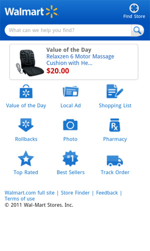
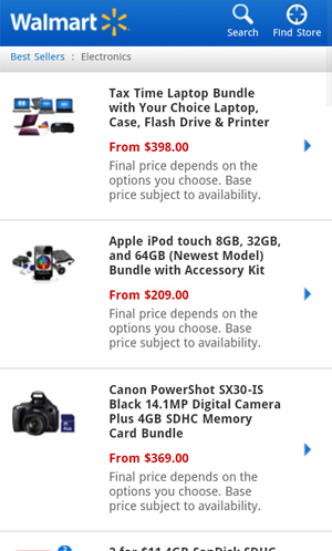
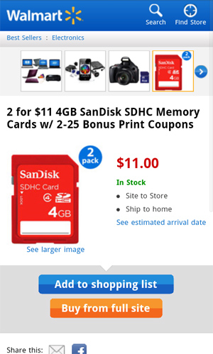
One common approach of all of the websites featured here is to have a portal-type home page. Walmart is no different. However, while most of the websites rely on text-based lists, this one has a grid of icons, which is much easier to browse. Many of the mobile websites covered here have lists that are so small that they are hard to use. Walmart combines icons with text to make the targets easy to hit.
The biggest gotcha on the Walmart website is that you have to jump to the main website to complete a transaction. Still, the information and buttons are extremely easy to use, clear in function and well organized.
2. Toys-R-Us

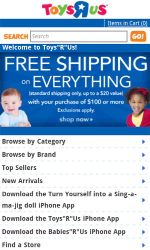
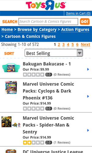
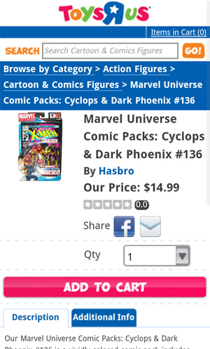
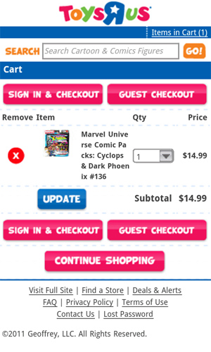
The Toys-R-Us website is a step in the right direction. But it could do a few key things better. First, I found the list of buttons on the home page to be just a tad too small. I understand the temptation to shrink them down to preserve space, but they would be much easier to use with just a little more room. Sure, I would have to scroll more, but that’s a good trade-off.
Once you get past the home page, it gets much better. In particular, this website has one of the better shopping-cart pages. The buttons are clear, and the balance between density and tap-ability seem right. All in all, a good example of how to clearly communicate action points.
3. Crocs

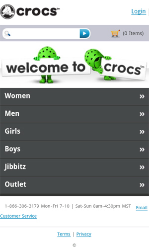
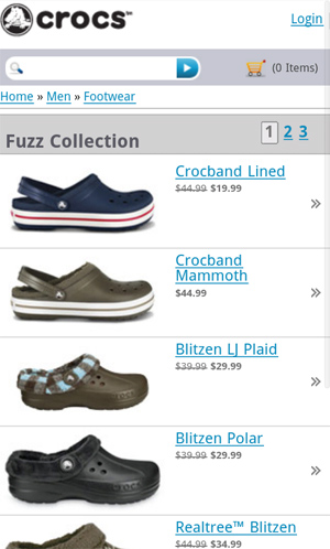
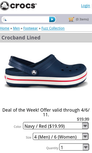
Mobile development is still very much dominated by developers, so finding a beautifully designed mobile website is a relief. Such is the case with Crocs. Its website is well implemented and a beauty to look at.
The catalog list view is particularly clean. The only way it could be made any leaner would be to eliminate product names. Regardless, each row makes for an easy target, with clear and relevant information.
4. JC Penny

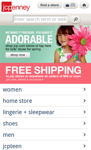
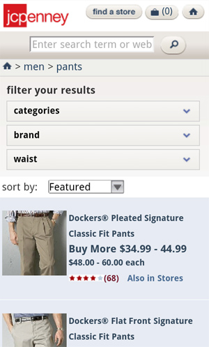
One problem that designers of the JC Penny mobile store faced was product scope. How do you enable users to effectively browse a wide range of options in a section such as men’s pants? The solution, a simple drop-down system, allows customers to quickly filter criteria to get to the products they need.
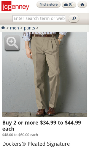
The big images are a really nice feature as well. Notice how easy it is to see the actual items in the product detail view. I suspect that the conversion rate of mobile websites is extremely low, and I can’t help but think that great photography like this is one of the few weapons to combat this.
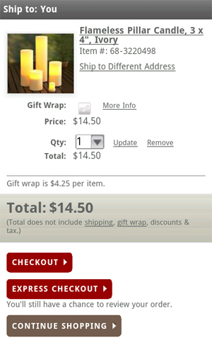
5. Pottery Barn

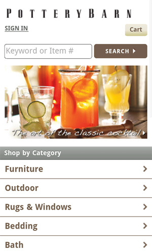
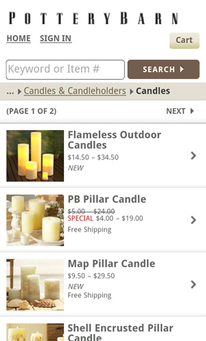
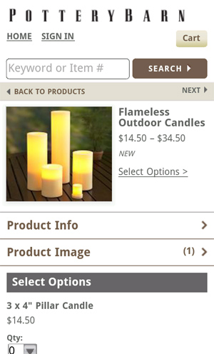
The formula should be pretty clear by now: logo at the top, search below that, a lead-in graphic to promote a product or sale, followed by a list of main product categories. And we find that exact structure on Pottery Barn’s mobile website.
One absolutely brilliant detail is this website’s solution to the problem of long breadcrumbs. You’ll notice in the list of product categories that the breadcrumb trail has been greatly shortened to include only the last part of the string. Compare this to the intrusiveness of the breadcrumb on Toys-R-Us, and you’ll appreciate this space-saving solution.
6. Threadless

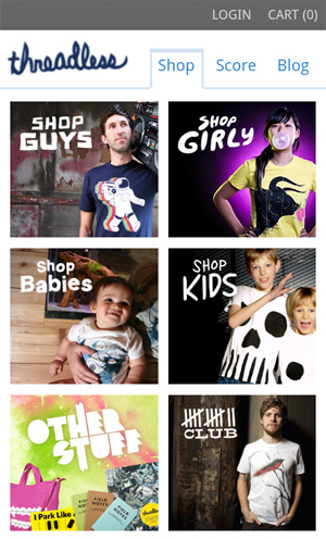
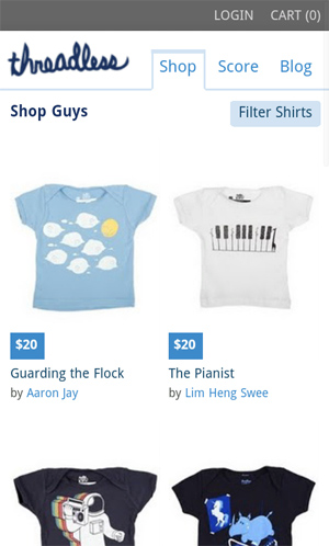
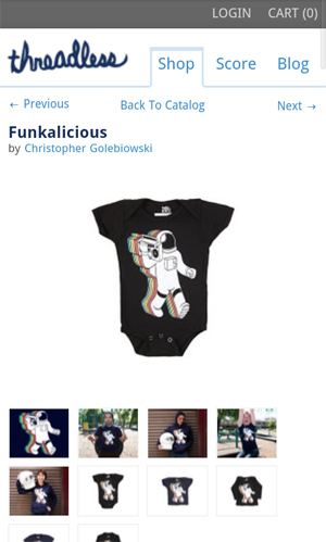
It is no surprise that Threadless’ mobile website is fantastic. The home page follows the category portal formula, but with a twist. Much like Walmart’s website, the grid approach here is much easier to use than most. The photography is engaging and makes the store feel like a true shopping experience. Something about it just feels less mechanical than most of the other stores covered here.
You will find this same grid approach in the product list view, which is a nice relief and showcases the products very well. The designers managed to minimize wasted space while maintaining ease of use.
7. Brookstone

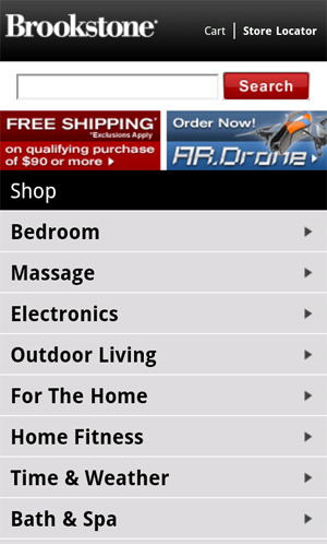
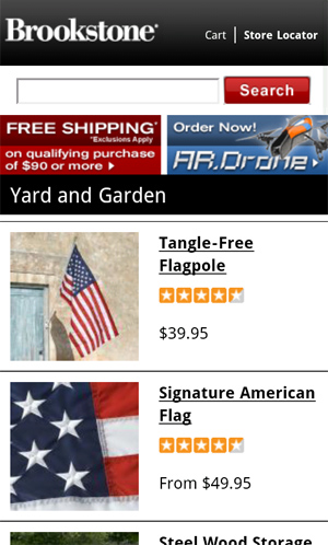
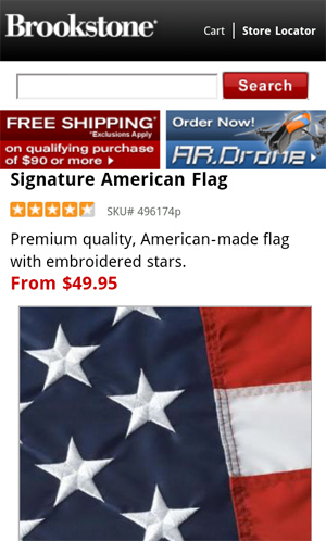
Brookstone’s mobile store suffers from a dense home page. But once you get past it, the website gets better. The big clear photography is much appreciated. I don’t know if the images were optimized for mobile devices, but they sure are among the easiest to see in this whole batch.
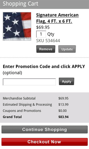
One weak point is the amount of scrolling required on the shopping cart page to get to the check-out button. The content could do with some pruning and optimization to close the deal.
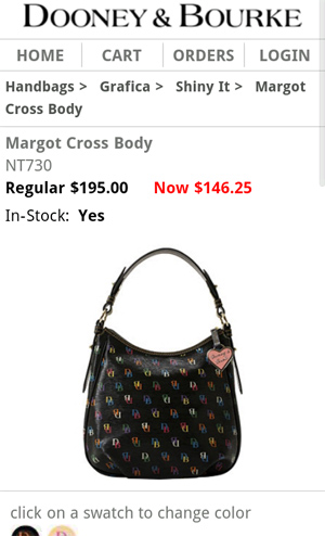
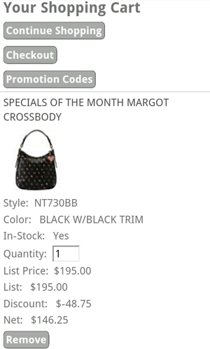
8. Dooney & Bourke

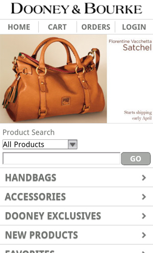
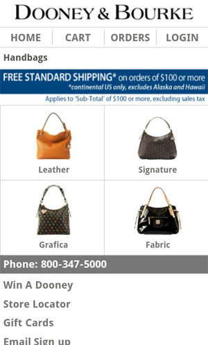
I really appreciate the photography on Dooney & Bourke’s home page. It conveys exactly what the company sells as soon as you land on the page. A subtle detail to say the least, but certainly something to consider.
One irritating point about the product detail view is that the quantity field is blank by default. I had to add a “1” in order to add a product to my cart. But it’s unlikely that I would order more than one of the same $150 bag.
Also, the shopping cart page feels a bit like an afterthought. But I will give the company credit for putting key action items at the top. The chances of customers forgetting what they’ve just put in their cart are slim, so focusing on helping them get to the check-out page is a smart idea.
9. Buy.com

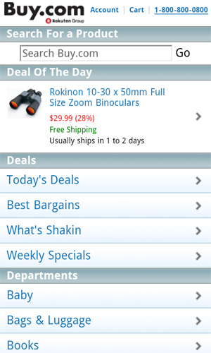
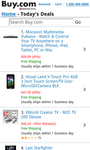
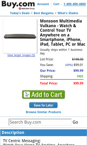
The home page of Buy.com has something that no other home page in this article has: an actual product. The thinking of most e-commerce stores is to create a mobile portal that allows users to dig into the full product line. While this might be essential, Buy.com inspires me to consider alternatives.
What if a better approach is to focus on deals? The home page is prime real estate; given the challenge of closing sales, why not devote all of your effort to putting something irresistible in front of customers. Notice that before you reach the list of departments on this website, you see the featured product and four separate links to sales, deals and specials.
10. Petco

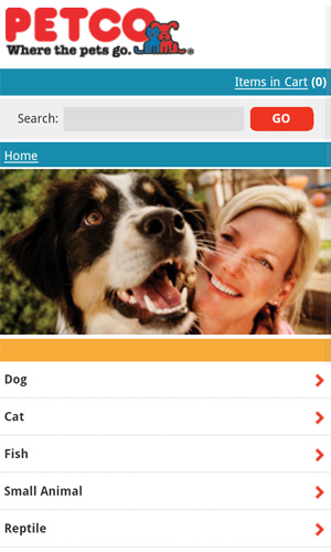
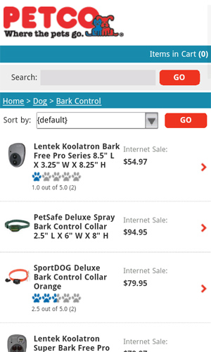
A great feature of the mobile web is that it eliminates fluff. So, when I see the home page of Petco’s mobile website, I can’t help but wonder whether the big photograph is useful in any way. The company name and accompanying dog-and-cat icon communicate the product focus. So, why show this silly image? Instead, I would put either a special deal or a grid of category icons. While I appreciate the polish of the website, it could be tweaked a bit.
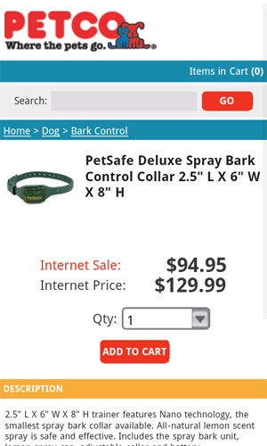
The company does hit on an ingenious idea in the product detail view by highlighting Internet-only sales. Why not go a step further and make some of them mobile-only specials. Wording aside, the product detail page is fantastically clean and clear. Tucking the full-length descriptions below the key functions and information also seems like a wise decision.
Conclusion
Designing mobile websites is hard, and designing mobile e-commerce websites is perhaps doubly so. Figuring out how to help customers find the right product and how to convert that process into a sale is far from easy. I hope this small collection of resources brings some fresh ideas to your next (or perhaps first) mobile website design.
Written exclusively for WDD by Patrick McNeil. He is a freelance writer, developer and designer. In particular, he loves to write about web design, train people on web development and build websites. Patrick’s passion for web design trends and patterns can be found in his books on TheWebDesignersIdeaBook.com. Follow Patrick on Twitter @designmeltdown.
What do you think if these examples? Please share in the comments below...
WDD Staff


Read Next

20 Best New Websites, April 2024

Exciting New Tools for Designers, April 2024

14 Top UX Tools for Designers in 2024

What Negative Effects Does a Bad Website Design Have On My Business?

10+ Best Resources & Tools for Web Designers (2024 update)

3 Essential Design Trends, April 2024

How to Plan Your First Successful Website

15 Best New Fonts, March 2024

LimeWire Developer APIs Herald a New Era of AI Integration

20 Best New Websites, March 2024

Exciting New Tools for Designers, March 2024
