 Web content can make or break a website – no matter how good the design is. Most designers know this from first-hand experience.
So it wasn’t surprising when WDD visitors who read How to spot and avoid web copy that kills websites demanded a follow-up showcasing good web content.
Whether you or your clients write content for your websites, or you partner with content writers (aka web writers, copywriters, SEO copywriters, etc.), the content needs to attract visitors, engage them, and ultimately entice them to take desired actions. Only then do you truly attain a winning website.
Here are good web content examples, and what makes them work.
Mailchimp
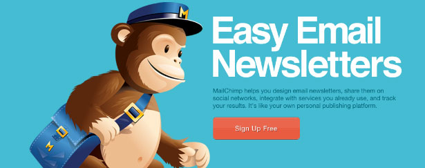
The folks at Mailchimp get right down to ‘monkey business’ with a clear explanation of what they offer: Easy Email Newsletters. No “Best-in-class automated information distribution system technology” rubbish here. They get to the point, saying more with less. It fits with their mantra of making things easy. Headline, short and descriptive intro, ‘sign up free’ button and a cute chimp graphic – done. They carry the straight talk throughout the inner pages. For instance, the ‘Forever Free Plan’ on the pricing page notes: Store up to 2,000 subscribers. Send up to 12,000 emails per month. No expiring trials. No contracts. No credit card required. Pretty clear. No confusing jargon or legal babble. Lesson learned:
The Mailchimp crew went out of their way to organize information in a user-friendly manner to help visitors locate and process what they need quickly and easily. Web copywriters, designers and developers – not visitors – should do the heavy lifting, i.e. clearly defining and arranging key tasks and messages. These chimps deserve a banana break.
37 Signals
37 Signals offers popular “frustration-free” collaboration and productivity tools to freelancers and small businesses, and they keep their web content straightforward, too. When visitors arrive to a site, they want to know if they’re at the right place. 37 Signals helps people determine that immediately by noting who can benefit from their solutions (designers, consultants, manufacturers, etc.). And they nicely segment their offerings and provide descriptive teasers for each tool, setting expectations on what to expect beyond each link. For example, when you mouse over the Basecamp button, the text reads: Are you still managing projects with email? Are you still using Excel for your to-do lists? It’s time to upgrade to Basecamp. Manage projects and collaborate with your team and clients the modern way. They demonstrate they understand you and your pain, and offer a better way to work. In addition to handy screenshots, 37 Signals provides third-party endorsements of its awesomeness through a seal that states, “Trusted by millions of people in over 30 countries,” along with a series of succinct, relevant testimonials. Providing ‘social evidence’ is an effective way to gain credibility and trust on the Web because people naturally take comfort in going with the masses. Lesson learned:
Words brand your business, for better or worse. Take a page from 37 Signals; their content is kept simple, practical and friendly, which is consistent with their apps. They’re not just stating they provide frustration-free experiences, they’re demonstrating it.
Groupon
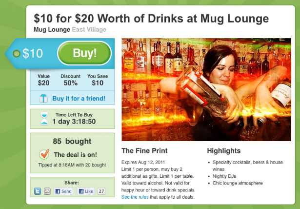
Like ‘em or hate ‘em, Groupon is deploying character to differentiate itself and stay ahead of the crowded deal-of-the-day market. Injecting color and humor into its ads makes Groupon a distinctive corporate persona that’s alluring to many people and fostering customer loyalty. The following examples prove ‘dull’ isn’t a part of their vocabulary. Like German shepherds, human bodies demand treats before they'll sit quietly for piano recitals or chase off nut-stealing squirrels. Reward an obedient exterior with today’s Groupon… In today's workplace, sleeveless, bicep-broadcasting business suits are a common sight, and deal-closing golf games are eschewed in favour of sweat-slicked cage matches. Get in shape to vault over the corporate ladder with today's Groupon… Tea has been used since ancient times to fight illness, overcoffeed caffeine rushes, and the letter U. Pay homage to leaves' most prolific progeny with today’s Groupon… As long as the writers remember they’re writing for the audience, not for their egos, the entertainment value could continue to make it exciting to watch for and review new promos. It makes the competitors appear pretty lame, and will likely help prolong Groupon’s shelf life. Lesson learned:
Web content can conceive a personality, set a tone and create expectations. Does everyone in your newest client’s industry sound the same? They could take a chance like Groupon, shake things up, and arouse the market. Maybe you could, too.
Turning web content challenges into wins
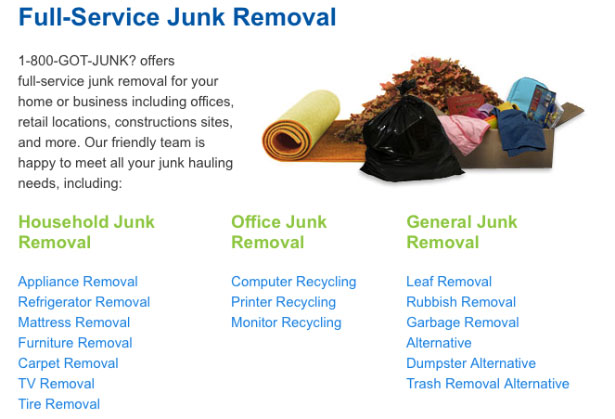
Having written web content about everything from used construction equipment to medical diagnostics software for clients worldwide, our copywriters at Webcopyplus are able to serve up behind-the-scenes insights surrounding some recently completed projects. 1-800-GOT-JUNK: Key messages and keywords Rapidly growing with 200-plus franchise partners in the US, Canada and Australia, this marketing-savvy company needed simple, accessible content that highlighted key points: they provide fast, convenient and professional service, and they’re environmentally responsible. So related messaging was woven throughout the site’s main pages. Also, to promote organic presence on search engines, descriptive keywords were tactfully integrated throughout the content. Here’s an example of keyword-rich content at work: Got old furniture, appliances, electronics, tires, construction debris, or yard waste you need to make disappear? 1-800-GOT-JUNK? can take away almost any material we can fit in our trucks, without you ever lifting a finger.
Choosing and using the right keywords pays off. Google terms like old furniture removal or junk removal, and you’ll likely see their site appear at or near the top of search results.
Uniserve: Cleaning up for visitors
Over the years, this Canadian telecom company accumulated three websites with contributions from several stakeholders, resulting in different and conflicting styles and messages. After fleshing out and prioritizing products and services, and defining key differentiators with design partner Beyond Media, content was revamped from top to bottom. In fact, 400-plus pages on three sites were streamlined down to one 80-page website.
To covey key messages clearly and provide visitors an effortless online experience, great care was taken to remove every word possible. Uninspired, long-winded messages were replaced with succinct, upbeat points. Following is some example banner content.


 UBC: Catering to Visitors
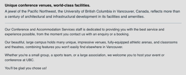
When University of British Columbia's (UBC) Conferences and Accommodations enlisted the services of an SEO firm, their traffic increased, but their bounce rate went through the roof. The problem: programmers merely keyword stuffed their content, with little or no regard for visitors.
 While keywords remained an important part of the equation, descriptive content was carefully crafted to help reveal distinct qualities of each conference venue and accommodation option, in addition to the benefits of working with UBC’s knowledgeable staff. The enhanced content, created in partnership with Creative Engine, allows visitors to quickly and easily determine which product will suit their needs best, and helps overcome concerns (i.e. access to a kitchenette and high-speed Internet), which has lead to increased bookings.
Every word counts
Never forget that every word on a website can influence a visitor’s buying decision and loyalty. For example, a rewrite that removed words like “nasty spam” from a landing page’s fine print helped promotional gift company SwagLove improve its conversion rate by 385% (1.9% versus 8.9%). Content should eliminate roadblocks, not create them. Carefully review the words on the websites you design. Are they helping or hurting your clients? Like good design, good content can clearly tell visitors how they’ll benefit from a product or service, provide guidance, and make it easy for them to take action. Quality content keeps website visitors – and your clients – happy, and coming back for more.Rick Sloboda
Rick is a Senior Web Copywriter and Content Strategist at Webcopy+, which helps designers and businesses boost online traffic, leads and sales with optimized web content. His clients range from independent retailers to some of the world’s largest service providers, including AT&T, Bell Mobile, Tim Hortons and Scotia Bank. He advocates clear, concise and objective website content that promotes readability and usability, and conducts web content studies with organizations in Europe and the U.S., including Yale University. Rick speaks frequently at Web-related forums and seminars, and serves as a Web program committee advisor with various organizations, including Langara College and Vancouver Career College. He’s also the PR Chair for Graphic Designers of Canada (GDC).
Read Next
3 Essential Design Trends, May 2024
Integrated navigation elements, interactive typography, and digital overprints are three website design trends making…
How to Write World-Beating Web Content
Writing for the web is different from all other formats. We typically do not read to any real depth on the web; we…
By Louise North
20 Best New Websites, April 2024
Welcome to our sites of the month for April. With some websites, the details make all the difference, while in others,…
Exciting New Tools for Designers, April 2024
Welcome to our April tools collection. There are no practical jokes here, just practical gadgets, services, and apps to…
How Web Designers Can Stay Relevant in the Age of AI
The digital landscape is evolving rapidly. With the advent of AI, every sector is witnessing a revolution, including…
By Louise North
14 Top UX Tools for Designers in 2024
User Experience (UX) is one of the most important fields of design, so it should come as no surprise that there are a…
By Simon Sterne
What Negative Effects Does a Bad Website Design Have On My Business?
Consumer expectations for a responsive, immersive, and visually appealing website experience have never been higher. In…
10+ Best Resources & Tools for Web Designers (2024 update)
Is searching for the best web design tools to suit your needs akin to having a recurring bad dream? Does each…
By WDD Staff
3 Essential Design Trends, April 2024
Ready to jump into some amazing new design ideas for Spring? Our roundup has everything from UX to color trends…
How to Plan Your First Successful Website
Planning a new website can be exciting and — if you’re anything like me — a little daunting. Whether you’re an…
By Simon Sterne
15 Best New Fonts, March 2024
Welcome to March’s edition of our roundup of the best new fonts for designers. This month’s compilation includes…
By Ben Moss
LimeWire Developer APIs Herald a New Era of AI Integration
Generative AI is a fascinating technology. Far from the design killer some people feared, it is an empowering and…
By WDD Staff


