 For America, creating a government website from the states, all the way down to the federal government can be an interesting but controversial task. It's important to follow a user-centered design process and make it easy for citizens to find the information they're looking for.
Any confusion in the way the site is setup, its search functions or even the appearance can create large amounts of controversy between citizens and governments; as history has shown.
With that said, we're going to look at the best practices for creating government websites by comparing local with federal, the usability of these sites and their designs.
Note: To eliminate the chance of political debates in the comments, any reference to government hierarchy will be according to the US Constitution instead of their socially accepted hierarchies.
Transparency
Let’s start by taking a look at two .gov websites, the White House and the Santa Monica City Council.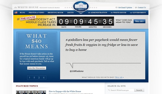 White House (top) and Santa Monica City Council (bottom) websites
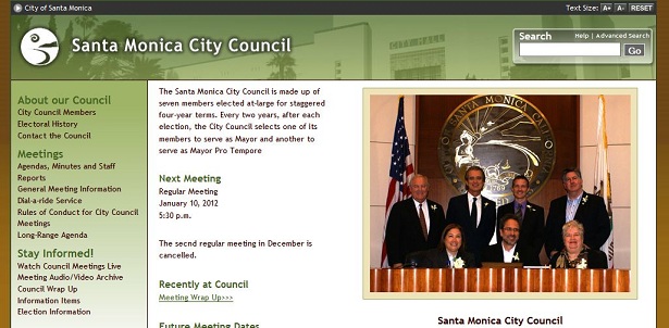
When considering the issue of transparency, which is priority #1 for most citizens when looking at a government website, the White House fails miserably. Important information is extremely hard to find and may require hours of research to get a clear understanding of what's going on inside the White House due to its lack of organization. On the other hand, the Santa Monica City Council does a decent job of providing transparency. When you first arrive to the site, it's easy to find the last meeting that was held, all of the issues that were discussed, and any resolutions that occurred. Minutes are accounted for, and it's even easy to find out when the next meeting will be held so that you can watch it online. It's also important to provide an easily accessible and user-friendly search. This is an area where the White House website performs well. The search box is easy to find and the results are well organized, allowing the user to put them in chronological order. The Santa Monica City Council also has an easy to find search box, but when the results are directed to Google it completely breaks the consistency of the website. Results are difficult to sort through and the information isn't always relevant to your search. So when looking at these two government websites, we can learn the proper way and the wrong way to provide transparency. By focusing on transparency on the homepage, the Santa Monica City Council website can be perceived as caring about its citizens as its primary concern. Adversely, citizens may get frustrated with the White House because their website makes it increasingly difficult to find important information. In conclusion, while it's important to maintain an aesthetic appeal, it's even more important to make transparency easily accessible. I see no reason why both can’t be done, with the aesthetic appeal of the White House website, and transparency put on the homepage like the Santa Monica City Council website.
Issues
This is a dramatically important piece of any government website. Let's start by taking a look at one that has done this well.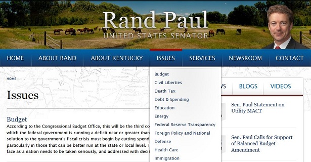 Sen. Rand Paul website
The website of Sen. Rand Paul lays out the issues in a very cohesive manner. By simply hovering over a menu item that clearly states "issues" you get a nice drop-down menu with all of the issues laid out for you. This is a very simple, straightforward approach to delivering the information citizens need. Not only that, but when you choose one of the issues, the information is laid out thoroughly and in a user-friendly way. It's a very good example of what you should do when creating a government website.
Now let's take a look at a government website that hasn't done this so well.
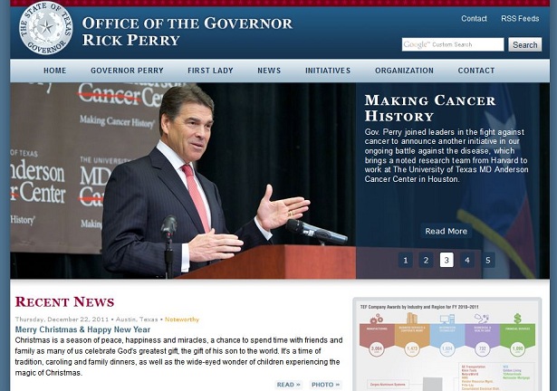 Gov. Rick Perry website
Now even though the website of Gov. Rick Perry has a nice feature slider, digging deeper it's actually pretty unorganized. Finding the issues where the governor stands can be a fairly daunting task. The website is more centered around mainstream news rather than focusing on information that's important to citizens, such as the issues.
To summarize, when you are creating a government website, you never want to make the issues hard-to-find. Make sure these are easily accessible to help citizens make informed decisions.
Mainstream Design
It's extremely important that government websites have a professional and polished look. In order for a government website to be taken seriously, as statistics have shown, it needs to look and feel mainstream. With that said, let's take a look at a government website that has plenty of mainstream appeal.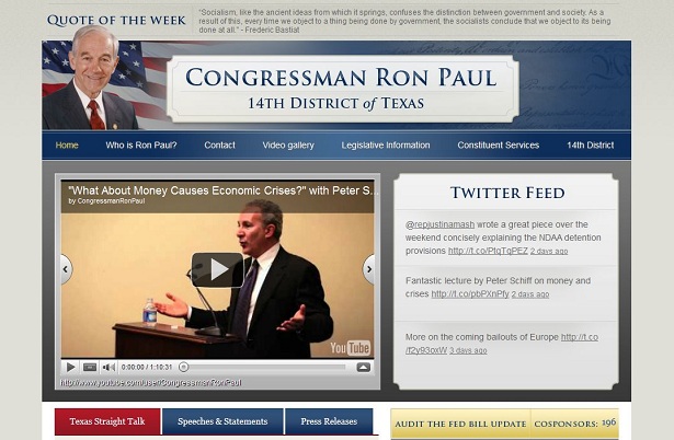 Congressman Ron Paul website
A website such as Congressman Ron Paul's has this mainstream look and feel, so therefore it can be taken seriously. When a government official comes to you asking to create a website for them, it's important that you understand what the mainstream looks and feels like. Blue and red are common colors that government websites like to use, especially when they are federal. A large header with the representative's photo, their name, and what position they hold is a very common practice as well. Study what mainstream government websites look and feel like, and you're almost guaranteed to get repeat customers.
Now when looking at a government website that isn't so mainstream, we go back to the Santa Monica City Council.
 Santa Monica city Council website
This is a good example of where the notion "content is king" holds true as the websites bounce rate hovers around 58% in the past month, which isn’t terrible. It's hard to look past the fact that this website looks like it was created in 1995, however, you'll see that there is plenty of important information and it’s easily accessible at that. Putting the content aside though, it's not a website many people will stay on for the design alone.
So how important is design in a government website? Well, with the bounce rate at 58% and the average user staying on the site for 2 min., the Santa Monica City Council website shows that the importance of the design is moderate. However, it is noticeably important when you compare their website with Congressman Ron Paul's website, which has a bounce rate of around 52% and an average time on site of around 3 min., whose design follows more along the mainstream guidelines. Those numbers may not seem like a very big difference, but if you know anything about usability testing then you know they are significant.
So in closing, the importance of a government website design is the reason why it is number three on the priority list. However, if you want to have repeat customers and referrals, you may want to consider understanding what government mainstream websites look and feel like. Officials want to be taken seriously through their websites design just like anyone else, so you should provide that for them.
Conclusion
Spend some time going through various government websites and ask yourself the following questions.- What do they look like?
- What is the feel that they are trying to generate?
- What do people complain about on the forums or do they have one?
- What do they have in common?
- What don't they have in common?
- Whose user data looks better and why?
Justin Hubbard
Justin Hubbard has been helping businesses since 2007 by creating timeless, memorable logos as part of a branding package and modern, user-friendly websites.
Read Next
20 Best New Websites, April 2024
Welcome to our sites of the month for April. With some websites, the details make all the difference, while in others,…
Exciting New Tools for Designers, April 2024
Welcome to our April tools collection. There are no practical jokes here, just practical gadgets, services, and apps to…
14 Top UX Tools for Designers in 2024
User Experience (UX) is one of the most important fields of design, so it should come as no surprise that there are a…
By Simon Sterne
What Negative Effects Does a Bad Website Design Have On My Business?
Consumer expectations for a responsive, immersive, and visually appealing website experience have never been higher. In…
10+ Best Resources & Tools for Web Designers (2024 update)
Is searching for the best web design tools to suit your needs akin to having a recurring bad dream? Does each…
By WDD Staff
3 Essential Design Trends, April 2024
Ready to jump into some amazing new design ideas for Spring? Our roundup has everything from UX to color trends…
How to Plan Your First Successful Website
Planning a new website can be exciting and — if you’re anything like me — a little daunting. Whether you’re an…
By Simon Sterne
15 Best New Fonts, March 2024
Welcome to March’s edition of our roundup of the best new fonts for designers. This month’s compilation includes…
By Ben Moss
LimeWire Developer APIs Herald a New Era of AI Integration
Generative AI is a fascinating technology. Far from the design killer some people feared, it is an empowering and…
By WDD Staff
20 Best New Websites, March 2024
Welcome to our pick of sites for March. This month’s collection tends towards the simple and clean, which goes to show…
Exciting New Tools for Designers, March 2024
The fast-paced world of design never stops turning, and staying ahead of the curve is essential for creatives. As…
Web Tech Trends to Watch in 2024 and Beyond
It hardly seems possible given the radical transformations we’ve seen over the last few decades, but the web design…
By Louise North


