 Every now and then I’m approached by design students and clients asking me to critique their logos.
While I’m not particularly fond of critiquing anyone’s work, especially when it's hard to find something positive to say, I’m happy to help students raise their game and charge a consultancy fee to any client looking for a professional opinion.
Specializing in the creation of identities allows me to easily identify —no pun intended — a pattern of common mistakes designers make when creating logos. Some are downright bad, and should be avoided at all costs, while others can be overlooked depending on the peculiarities of the project.
This list contains some of the most common mistakes I have seen in my design career.
Whether you are a designer looking to improve your skills or a small business owner looking to understand the process behind logo design, this article will help you learn from the mistakes of others; and either save you valuable design time or prevent you from making a poor investment.
1. Designing without a briefing
This sounds so wrong in so many levels, that I feel a bit silly even including this advice in this list, but the truth is that we all have done it. I know that I have, on many of my own personal projects, especially when working on something that I’m particularly passionate about.
However, while designing without a briefing is possible, more often than I would like to admit, I have found myself scrapping whatever design I made only to get back to the start and write a proper briefing for it. Ultimately, when creating for oneself, writing a briefing for personal projects saves time, but can in many cases also help to mature the initial idea.
That’s the general advice for personal projects, but client work is a whole different story.
The briefing exists to help designers know what they need to design, and how they need to design it. However, it also has a key role in defining the designer-client relationship. Without it, designers would be overwhelmed by the amount of design freedom, and clients would not know what to expect from the project, or how far can they go in making requests to the designer.
Here's were I get serious about briefings, and I genuinely mean it. Working without a briefing on client work is a recipe for disaster. If you want to design high quality logos and compete on a professional level, you must have a briefing for each project.
2. Designing for yourself
Design can easily become a highly personal and passionate experience, so knowing for whom a logo is being created can be a hard lesson to learn, and that's not a challenge just for designers, more often than not, clients are also guilty of analysing a design based on their personal tastes rather than their audience's needs.
You must understand who your logo target audience is, and then learn as much as you can about them. Whenever possible, get in touch with them and talk about the project your are working on. Listen to what they have to say, and use what you learn from this interaction during the design process.
Image via Shutterstock
Here's a warning especially for small business owners: do not rely entirely on their opinions to create your design. You should only refer to your target audience to extract their perspective, and always hire a professional designer to translate that into something that works. Otherwise, you'll end up with a Franken-logo, the nightmare of the logo design world.
The truth is that learning how to wear the shoes of the target audience is one of the most valuable skills a designer can learn, and an extremely handy skill for any small business owner as they can apply that to all areas of their business, not only design. Remember, design for your target audience, not for yourself.
3. Not understanding the client's USP
Each business has its own USP (unique selling point) and that is one of the most crucial things to keep in mind when designing a logo. It can be anything, from a secret formula (Coca-Cola), to being one-of-its-kind (Google), to being highly innovative (Apple).
I'm not suggesting that companies should literally insert their USPs in the designing of their logos, that would be terrible. Logos are not supposed to be literal, but understanding the practical side of a business will more often than not lead into the generation of ideas.
This is an essential part of my own logo design process, and actually, the exact first thing I look to understand. It works every time, just like a charm.
Knowing what is your client's business USP will help you to find what's the unique approach you should take when designing their logo. Every business has its own angle, and taking this into account can help you build a successful brand.
4. Not considering the brand positioning
Branding is a concept that stretches far beyond identity design, but in order to design a logo that truly reflects the core identity of the brand for which its being designed, one must understand the positioning of this brand.
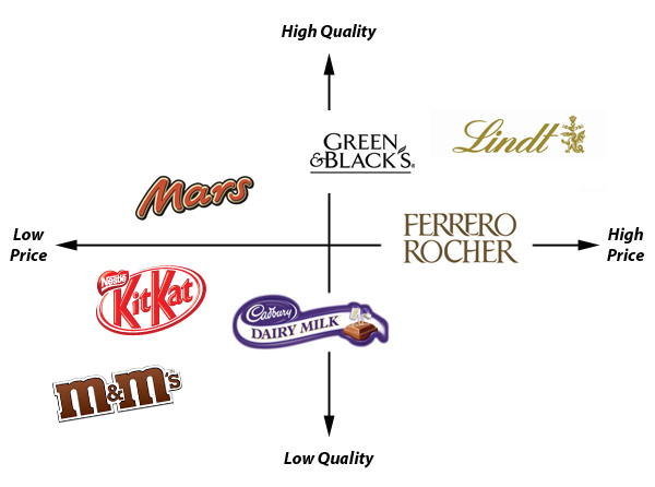
Brand positioning is all about the relationship of one brand to other brands, usually primary competitors. The easiest way to make that analysis is by using a marketing diagrammatic technique called perceptual mapping, where you can visually display the perceptions of a brand in relation to others, thus finding the brand positioning.
If marketing is not your forte, that may sound pretty confusing, but is actually simpler than it looks, check out the example below which helps to put some sense into it.

Perceptual mapping of chocolate brands analyzing the positioning of quality and price.
Here I'm analysing the positioning of a few chocolate brands in relation to quality and price, two aspects highly relevant to customers.
It's essential to understand that one can analyse status, usability, durability or any other dimension that is pertinent to the perception of customers; a well defined brand positioning will be thought from many different perspectives.
With all of that in mind, it becomes easy to see, that the logo you are designing must look like it belongs to the place where the brand is positioned. Thinking about that will raise the chances of your logo receiving a positive perception from customers.
5. Not doing enough research
Understanding your client USP and its brand positioning are essential to anyone looking to design a successful logo, but that's not all the research you can do about your client's business.
Allocate some considerable time to do research work, so you can understand what is the context of the business; who are the primary and secondary competitors; how and where the logo will be used; and who is the primary target of the company.
The internet is in your favor, there's a lot you can learn about your client's business and market without even having to ask any questions. Remember that Google is your friend, and you can ask him anything you want!
The truth is that clients, more often than not, don't understand how to use design to their advantage, so they just don't give you the information you need from start. Don't be afraid of asking a lot of questions, even if they sound pretty basic.
Always bear in mind that designing a logo without understanding your client's business, is like shooting an arrow while blindfolded expecting to hit bullseye. While you may be able to accomplish that, it will be all about luck, and that is what you want to avoid. The more information you are able to collect, the better your design will be.
6. Not considering the limitations of reproduction
This is a classic mistake. Here is where the majority of young designers fail, as they don't foresee future applications the brand will require. There are plenty of things you should consider, but the good news is that this mistake is one of the easiest to overcome.
All you need to do is to ask questions. Will your client need the logo printed on the side of a pen, to use as a promotional item? Or, will it be printed on the company’s vehicles or large scale outdoors? Find out how the logo will be used even before you start thinking about design.
Even if your logo looks fabulous on a website; on the smallest size; and printed in the largest size; there's always something you may forget. Here's an example, think about how frustrating can it be if your client loves your logo, and even though is perfectly scalable, the design you chose is impossible to embroider on a t-shirt.
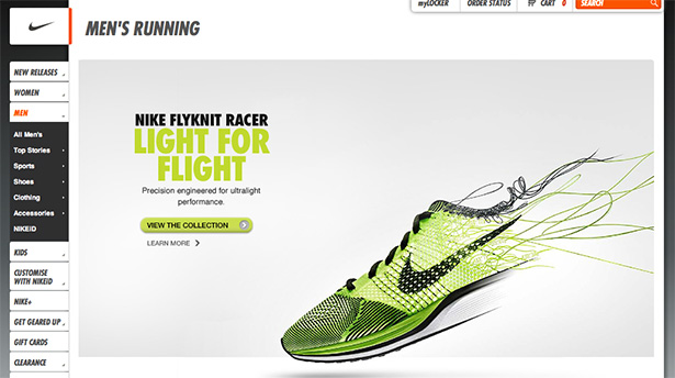
If you want your logo to be applicable on any surface, keep it simple, like Nike's swoosh:
7. Showing too many options
If there's one piece of advice I truly wish I had understood earlier in my career it is this one. It would have saved me a vast deal of time, but on the other hand, whenever I talk about this subject with other designers it seems to be a mistake we all need to experience.
Young designers need a great deal of practice to sharpen their skills, develop their own aesthetic language, and learn enough about the trade to feel confident enough to present fewer options. That's pretty hard to accomplish without a great deal of experience.
On the other hand, some designers choose to show many options as a way to raise the perceived of value of their own service. I understand why they are doing that, but I don't think there's real value in showing multiple options.
The end of the story is that clients will only use one of the solutions you show anyway, so wouldn't be more productive to come up with one idea that you genuinely think is the best, instead of dividing your time and effort in creating multiple solutions? Think about it.
But clients ask me to see multiple options! What should I do about that?
Well, that's true, some clients will ask you for that, but then it comes to you to take the initiative and educate your client on how identity design works, and why getting fewer options is actually better than getting many options to choose from.
Whenever I'm working on an identity project, I always have many ideas of what to design, but hardly present more than the idea which I believe to be the best solution for the project I'm working on. Because I spend a considerable amount of time thinking about the brand I'm going to design, I feel quite comfortable explaining, in the finest of the details. It's easy to justify why the option I'm presenting is the best solution for my client's business. That's more value than showing multiple options.
Perhaps this particular mistake is more about a process of gaining experience that every designer needs to go trough to raise their game. On the other hand, I'm sure about one thing: avoiding the other mistakes I mention on this list will raise your confidence about your own work and presenting fewer options becomes more natural.
8. Relying on digital trickery to create a logo
What happens when you remove the gradients, reflections, drop-shadow effects and change the color to white over a dark background? Is your logo still there? If you are still able to see your logo perfectly, the chances are you have designed a good logo, but if not, then it's time to start thinking about it all over again.
Using digital trickery to make a weak design look strong is one of the easiest things to do, all you need is Photoshop, and knowing which effects to apply, but these types of logos are just not good long-term identities, they don't help to build brand value.
The rule of the thumb here is to design the logo in its simplest form. Once the essence of the logo is working, then you may consider adding some trickery to better fit the logo to specific applications, but never as an essential part of the design.
9. Not being able to explain your design
It’s terrible when a client questions a feature of your design and all you have to say is “I designed it this way because I think it looks good”. Bear in mind that if you use the "I like" argument, you are also allowing your client to do the same, and that can easily turn the discussion into a battle of “taste”. Guess who's going to lose…
Every single pixel of a logo must be thought-of, it must have a concept behind its looks, and the overall result must show a solid understanding of the proposed briefing. If you have followed these steps carefully, be not afraid, as I'm sure you will be able to answer any question that may arise once you show off your logo to the world.
If your design is based on actual knowledge and experience your client does not share, you can position yourself as an expert in your field; and your clients are going to respect your choice because they lack the argument to contest something they don't understand.
That is what separates the wheat from the chaff in the design industry.
Conclusion
To paraphrase Eleanor Roosevelt, you can't possibly live long enough to make all mistakes by yourself, so learning from the mistakes of others is pretty good advice.
I must admit however, that I’m a strong advocate for empiric experience. There’s nothing better than learning from your own mistakes, so don’t be too hard on yourself when you do something wrong, there's no shame in it. Mistakes are there to help us grow, not to drag us down.
Are you guilty of any of these mistakes? Is there a mistake you think is harder to overcome than others? Let us know what you think in the comments.
Ray Vellest
Ray Vellest is a brand identity specialist based in London and working with organizations and individuals from all over the world. Ray’s approach to identity design position his clients as leaders of their industries while creating a valuable long-term asset for their businesses. Follow @rayvellest on Twitter to keep up with his latest updates.


