15 unofficial redesigns that are better than the originals


 As designers, we can be extremely critical to different designs and details. If a designer told me they could never suggest a change to a design, I probably wouldn't believe them. Whether it be on a poster or on a t-shirt, I can always find something I might change if I were the one in charge.
It's honestly impossible for me to go a day without wanting to move a button on an app or even redesigning a logo so that it just works better. Rarely do we find perfect designs, but when we do, we make no mistake in lauding over them. Some designs immediately inspire and ultimately leave you desiring to make something as great, if not greater. Other designs don't. It may upset us. It may inspire us to try to do something better.
And trying to make something better is exactly what some designers do.
It's no easy task to try to redesign. I'm part of the line of thinking that it's harder to redesign than it is to create a concept from scratch. These designers have found websites they dislike or see problems with and have tried to fix them. These are wonderful personal projects that have been shared, but are so wonderful that perhaps these companies should look into some of these ideas.
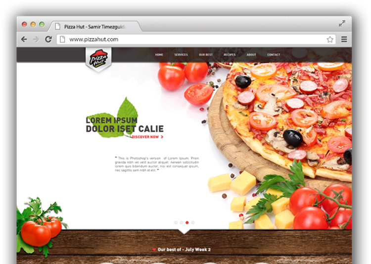
Pizza Hut
Right now, a lot of restaurants are going through rebrands that require them to have a more mature image. Take a look at fast food places such as Burger King, Wendy's and even Taco Bell to see how they are creating a cleaner, more grown-up image for themselves.
One that hasn't hopped on that train yet has been Pizza Hut. This redesign encompasses those more mature ideas by also giving it a touch of rustic naturalness that makes everyone feel better about their ingredients.
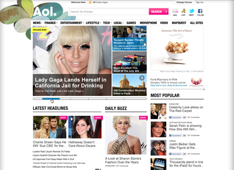
Aol
We don't hear a ton about AOL nowadays unlike like we did when they essentially had a monopoly on the dial-up Internet industry. These days it feels like AOL is still trying to find their way, but they've obviously been trying to go the more progressive and hip route.
This redesign isn't necessarily anything more special than what AOL has now; as a matter of fact, it's very similar. But you can see how this designer took the time out to really clean up the messes and create something easier and a bit more attractive to read.
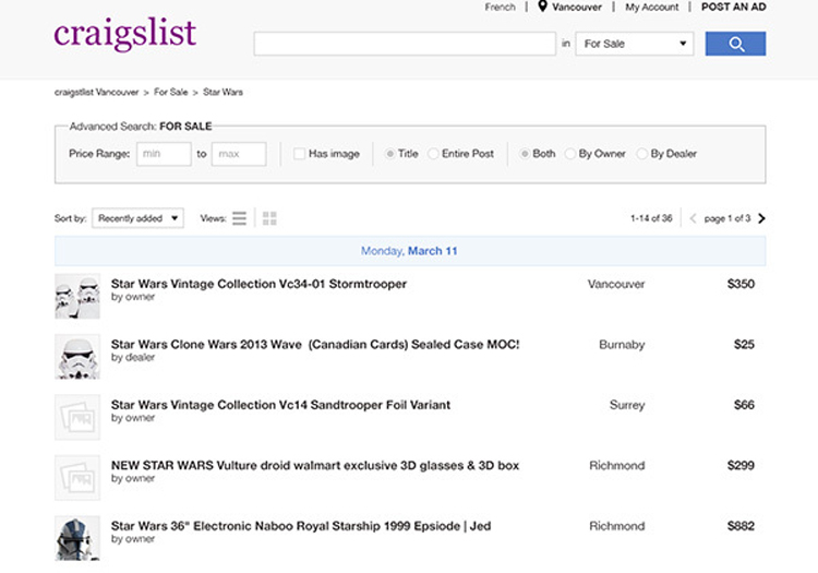
Craigslist
Craigslist was created with no design in mind. I believe the creators here just wanted to put something online and it ended up becoming a hit. In becoming that popular website, it seems like the developers are Craigslist never wanted to change the look of their site, maybe for sentimental purposes.
Well, this designer has created a site that's cleaner and in the process, has created a site that looks like you can trust it more.
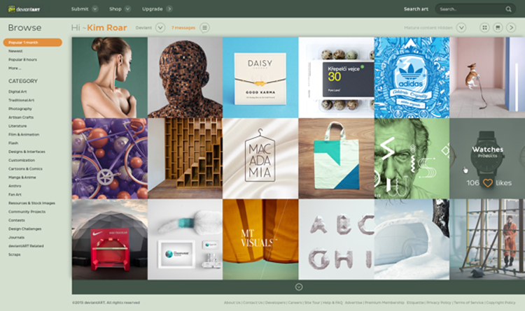
Deviantart
Deviantart is admittedly one of those sites I don't go to unless I have to. Why? I absolutely abhor the design there, even though it's a pretty useful and neat site. If you've not been, it feels kind of cluttered, bulky and overwhelming — oh, and dated.
This redesign makes the front page simpler and also brings it up to date with this edge-to-edge grid. If Deviantart looked more like this, I'd use it much more often. And also notice how the redesign keeps the same kind of essence of Deviantart — they don't try to overdo the changes.
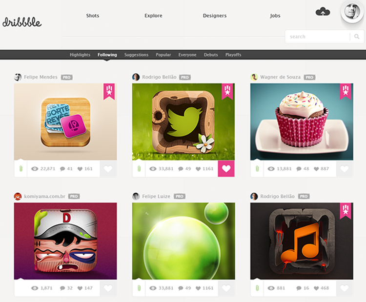
Dribbble
Unlike Deviantart, I think Dribbble is actually a very well designed site from it's layout to it's social platform and more.
There are some really subtle changes in this redesign, but I must admit that I like it. It's updated ever so slightly and also seems to encourage larger shots. They've tried to clean up the navigation a bit, and while it's somewhat peculiar, I actually like it and think it makes sense. This is a very modern redesign for Dribbble.
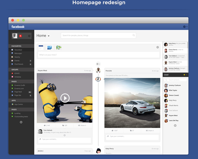
One thing I dislike about Zuckerberg is I feel like he's constantly attempting to improve his social network on the advertising side (for businesses) while leaving the user in the dust. I think he's awfully behind the times and does not care too much about design.
Now that I've gotten that off my chest, let me tell you how much I love this re-imagined concept for FB. It's more mature, it feels less cheap than the current Facebook and just seems to make tons more sense than what we have now. How can we forward this to Mark?
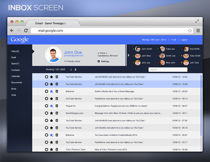
Gmail
Here we begin redesigns of all things Google: Gmail! I'm typically in love with most of what Google designs, but lately it seems they've been experimenting a lot with Gmail and the design tends to take a hit.
This inbox is obviously simpler and I think that's what matters most for an email client. Right now Gmail puts lots of focus on labels, gTalk and advertisements that we really don't care about. But this redesign does a great job of getting to the point and sticking to it.
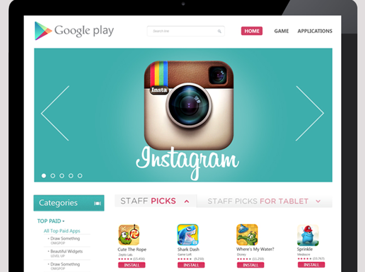
Google Play
Up next is Google Play. And if you've visited it online recently, you know they've actually gone ahead and redesigned it themselves (which I think looks pretty stellar). This web design seems to put lots of focus on what's popular, which I think is obviously important for an app store. It seems to borrow a couple elements from the Apple App Store, but all together I think this is a wonderful redesign.
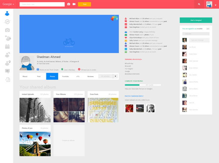
Google Plus
Last in our Google parade: Google+. If you're anything like me and rarely use your Google+ account, your timeline probably looks very boring. On top of that, there isn't much excitement on any Google Plus timeline as that's just not how it's created. This redesign completely rethinks Plus, giving it a little bounce of flavor — it actually looks fun to use. While the colors are probably up to personal taste, I'd definitely say this is one social network I'd like to use.
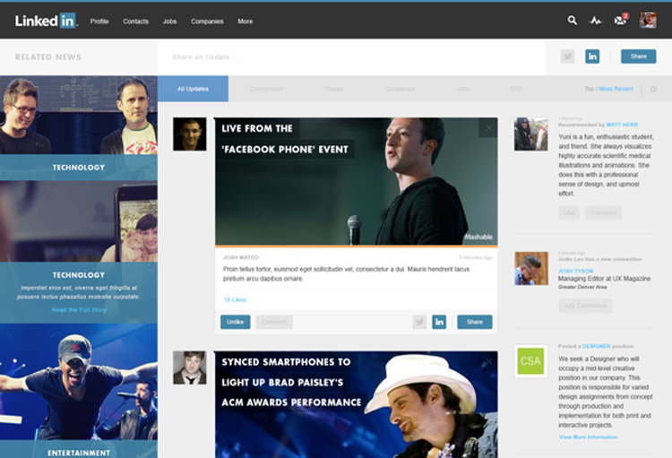
LinkedIn is one of those sites that I always wanted to get into, but never really could. For one reason, I have no clue how to properly use it and secondly, it's a bit overwhelming to me. It seems like a very busy office with people running and bustling around trying to get attention.
This redesign does a good job of calming all that down and creating a really nice layout that utilizes the sidebars very well.
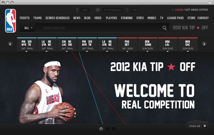
NBA
Well, if you know me, you know NBA.com is one of my favorite websites. And while the NBA did recently redesign their website, it's obvious they should probably stick to the lay-ups and crossover dribbles.
This redesign is very trendy and even a bit of a novelty, but I love the flat color and the simplicity of it all — something the current NBA site knows very little about.
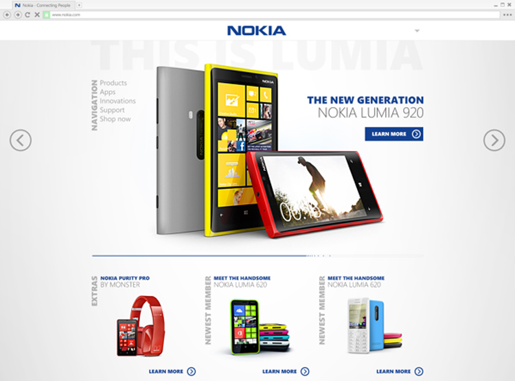
Nokia
Nokia's site was recently designed to where it now looks a lot like a blog.
And while this designer's redesign from below is kind of old, I think they were on to something. Mainly, that it doesn't look like a blog and is actively trying to sell their product. That may or may not be the right thing to do depending on their strategy, but again, I'm not sure why an electronic retailer wants their site to look like a magazine rather than a store. Many customers probably go online to purchase.
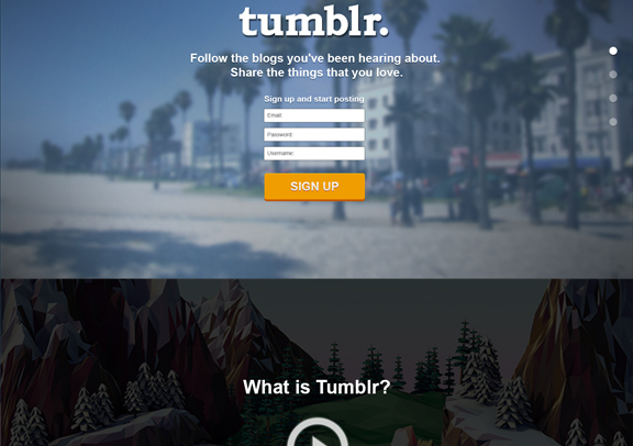
Tumblr
Tumblr is one of my favorite spots on the Internet. You can sit there for hours and get lost in tons of animated GIFs and pictures of really yummy looking dishes.
Nevertheless, this designer thinks the sign up page for Tumblr should be a little more extensive. You'll have to definitely click the image to see the entire thing, but I like how Tumblr is presented more clearly and with more bang than just a sign up page.
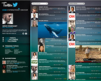
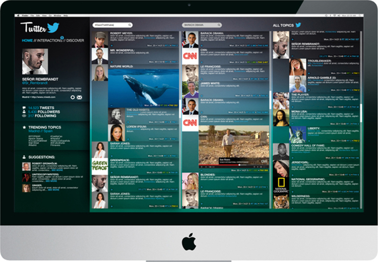
While I believe Twitter is the social network that prides itself on it's simplicity, this overwhelming redesign is rather thoughtful.
Now, it takes some obvious elements from apps like HootSuit with the multiple columns, but it's very nice to see things on one page. Minus the new logo, this would be kind of cool to see implemented if Twitter decided to go more complex.
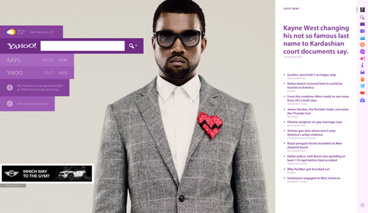
Yahoo!
Yahoo is really an afterthought thanks to the innovation of Google and all they do. If you check out Yahoo's current homepage, it's not great. At all. They've tried to add some wonderful design elements, but all together it's really cluttered and doesn't look much different from any news site.
This designer completely rethought the news site as a whole, creating something truly unique for Yahoo. What I like is that it doesn't just strip everything, but it also keeps a good amount of what Yahoo is obviously interested in, such as news, stocks, etc.
Conclusion
Many of these designs are eye-openers for what we can and should do, not just on these particular sites, but in any site designs. There's obviously a large role in the design of the user interface and what makes sense when designing for lots of people. I love the execution of these redesigns, because they happen to pinpoint solutions to problems and create aesthetically pleasing websites at the same time. That's important in the job of any designer and is important for site visitors. Wouldn't you want to use one of these redesigned websites?
Are these redesigns better than the originals? What sites would you like to see redesigned this way? Let us know in the comments.
Kendra Gaines


Read Next

20 Best New Websites, April 2024

Exciting New Tools for Designers, April 2024

14 Top UX Tools for Designers in 2024

What Negative Effects Does a Bad Website Design Have On My Business?

10+ Best Resources & Tools for Web Designers (2024 update)

3 Essential Design Trends, April 2024

How to Plan Your First Successful Website

15 Best New Fonts, March 2024

LimeWire Developer APIs Herald a New Era of AI Integration

20 Best New Websites, March 2024

Exciting New Tools for Designers, March 2024
