A simple typographic trick to increase text readability by up to 30%

 At its very heart typography is about two things: legibility, which is concerned with how distinguishable letters, words and phrases are; and readability which deals with how easy it is for the brain to convert those elements into a coherent message.
Have you ever found yourself reading a single line of text twice, as if it were two lines, especially when your eyes are tired? It occurs, because the eye gets lost on its journey from right to left (or left to right, depending on your language) from the end of one line to the start of the next. It's the reason that children trace lines with their finger when they're taught to read.
There are a few things that typographers can do to prevent the problem, and they're especially important in large amounts of body text, like news reports or blogs: firstly, make sure that your characters per-line isn't too high, the further the eye has to travel the greater its chance of getting lost; secondly consider a serif font, the greater horizontal impression creates greater visual distinction between lines of text and white space, serving the same role as the aforementioned child's finger; lastly pay great attention to your leading, greater inter-line spacing creates clearer channels for your eye to follow.
In addition to this traditional advice, a new technique has been discovered. BeeLine Reader is a fascinating new plugin for Chrome that demonstrates how it works.
BeeLine Reader adds a color gradient to lines of text, making the transition from the end of one line to the start of the next easier for the eye. Stanford University carried out a test using the plugin and concluded that BeeLine Reader resulted in an average reading speed increase of 10%; the plugin's own site claims a seasoned reader will experience an increase of 25–30%.
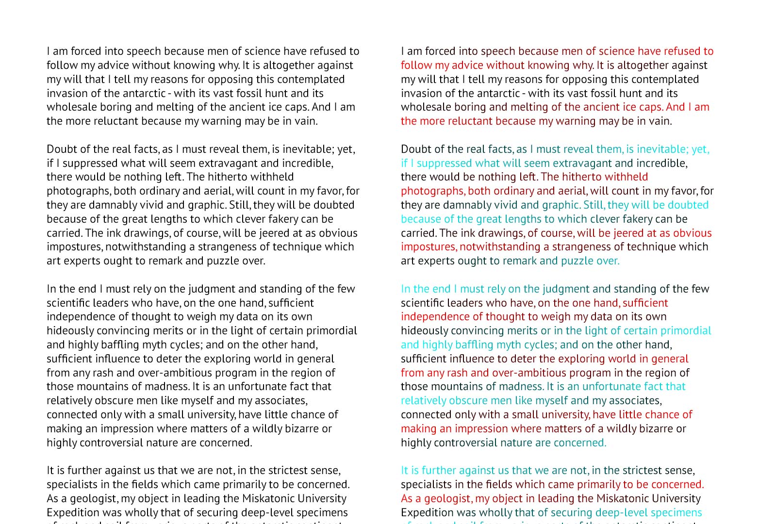
You should be able to read the text on the right much faster than the text on the left.
Whilst I can't say I approve of the plugin forcing text into a single column, or of the colors they've used (ugly for most and useless for anyone with protanopic color-blindness) the principle is sound. There is a gray-scale example on BeeLine Reader's site that improves readability, but wouldn't infringe on anyone's branding. A quick trial of their reading test, showed I improved by 22% using the gray version.
Although there's no easy way to implement this kind of design in simple CSS, it is possible to code as the plugin demonstrates.
If you're designing large amounts of running text — especially if other contraints force you to use columns that are too wide or line-height that is too small — consider applying this technique to compensate.
What do you think of BeeLine Reader's technique? How did you fare in their reading test? Let us know in the comments.
Featured image/thumbnail, color coded image via Shutterstock
WDD Staff


Read Next

3 Essential Design Trends, May 2024

20 Best New Websites, April 2024

Exciting New Tools for Designers, April 2024

14 Top UX Tools for Designers in 2024

What Negative Effects Does a Bad Website Design Have On My Business?

10+ Best Resources & Tools for Web Designers (2024 update)

3 Essential Design Trends, April 2024

How to Plan Your First Successful Website

15 Best New Fonts, March 2024

LimeWire Developer APIs Herald a New Era of AI Integration

20 Best New Websites, March 2024
