
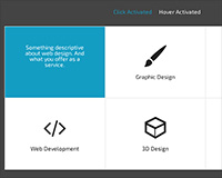 This grid is a fun and pleasing way to show multiple pieces of information in the same amount of space, by having each section of the grid slide away on click or hover, and display extra content.
In the creation process we'll look at the necessary markup, some styling and making the grid responsive as well as the implementation of an icon web font. We'll also study the jQuery needed as well as the different options available.
This is what it'll look like once we've finished:
Creating the grid in HTML
The markup for our grid system is very simple and will pretty much work whatever way you want to build it, but let me explain the essentials: there needs to be a wrapping element around our grid. Then there must be individual sections inside, that will have relative positioning (these will be the visible boxes that make up the grid). Inside of each of those will be two further areas, which will have absolute positioning and fill the entire width and height of their parent element (the box). Then we'll animate their positions so they're either "off-screen" or visible.
Here's the code I'm using in the example:
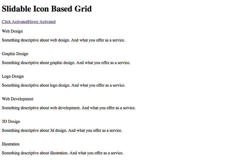
<div id="services" class="cf">
 <section class="service">
 <div class="service-icon"><span class="icon-web"></span><br/>Web Design</div>
 <div class="service-description"><p>Something descriptive about web design. And what you offer as a service.</p></div>
 </section>
 <section class="service">
 <div class="service-icon"><span class="icon-graphic"></span><br/>Graphic Design</div>
 <div class="service-description"><p> ... </p></div>
 </section>
 <section class="service">
 <div class="service-icon"><span class="icon-logo"></span><br/>Logo Design</div>
 <div class="service-description"><p> ... </p></div>
 </section>
 <section class="service">
 <div class="service-icon"><span class="icon-dev"></span><br/>Web Development</div>
 <div class="service-description"><p> ... </p></div>
 </section>
 <section class="service">
 <div class="service-icon"><span class="icon-3d"></span><br/>3D Design</div>
 <div class="service-description"><p> ... </p></div>
 </section>
 <section class="service">
 <div class="service-icon"><span class="icon-illustration"></span><br/>Illustration</div>
 <div class="service-description"><p> ... </p></div>
 </section>
</div> <!-- END #services -->
So as you can see, pretty simple! There's a div with an ID of 'services' and with a clear float class name. Then inside of that are six different <section> elements. Then as we said earlier, there are two DIVs inside that, one with a span to make our icon using an icon font, and a title. Then there's a second where you can put the extra content.
This is as simple as we'll go with the markup, that means that if there's no JavaScript and no CSS it won't actually break our content, it will still be visible (apart from the icons, but as they're empty spans we wont see them anyway). So this is our backup, no styles and no JavaScript content:
Now that we're sure the content is safe. We can move on to our CSS to make it look nice, but more importantly set it up for the jQuery functionality.
Styling the grid with CSS
Let's break the CSS into three parts; the essential that's needed to make our jQuery work, the icon font code, and then the final styles to make it look nice. So here's the first section:
#services .service {
 width: 33%;
 float: left;
 padding: 0.5em;
 min-height: 200px;
 overflow: hidden;
 position: relative;
 border: 1px solid #eee;
}

@media screen and (max-width: 600px) {
 #services .service {
 width: 50%;
 }
}

@media screen and (max-width: 320px) {
 #services .service {
 width: 100%;
 }
}

#services .service .service-icon, #services .service .service-description {
 position: absolute;
 width: 100%;
 height: 100%;
 top: 0;
 left: 0;
 background: #fff;
 padding: 50px 0;
 color: #222;
}

#services .service .service-description {
 left: 100%;
 background: #249EC2;
 color: white;
 padding: 50px;
}

#services .service .service-description:hover { cursor: pointer; }
So let's go through what's going on here. We're first targeting the individual box wrappers (.service) and arranging them into the grid shape, by giving them a fluid width, a minimum height and floating them left (that's why the overall wrapper has a clearfloat fix). Then importantly making their overflow hidden (otherwise we'd see the extra content at all times) and their position relative. We're then also making this grid more responsive friendly by using a couple media queries for some different screen sizes, and increasing the width of each cell. This code means that our grid will start at a 3 column design at full desktop size, and pass through a two column, and then finally a one column while decreasing screen size.
Now that the outer boxes are in place, we target the inner sections, the .service-icon and .service-description. We make these absolute positioned (hence the minimum height in the previous style) and position them both in the top left (we'll change the description's position in a moment). We then make them 100% wide and high so they fill their parent element, and the rest is for visual effect only. Finally we target purely the description div, and make the left value 100%. This pushes the entire box off to the right, and out of sight due to the overflow hidden on the .service div. This 'left' position value is what we'll be targeting and animating with the jQuery, and that is why it's important to define it now.
The icon font
Let's move on to the next step, here we'll use @font-face to get our icon font and define the class names that we've already used in the HTML to appear as the right icons. The first step is finding an online resource that can create an icon font suited to your needs, there are quite a few out there but for this example I've decided to use Fontastic. On the site you first pick the icons you want to use, this obviously changes for whatever project you're working on. But then you can change some info, like the class names of the icons and the font name like this:
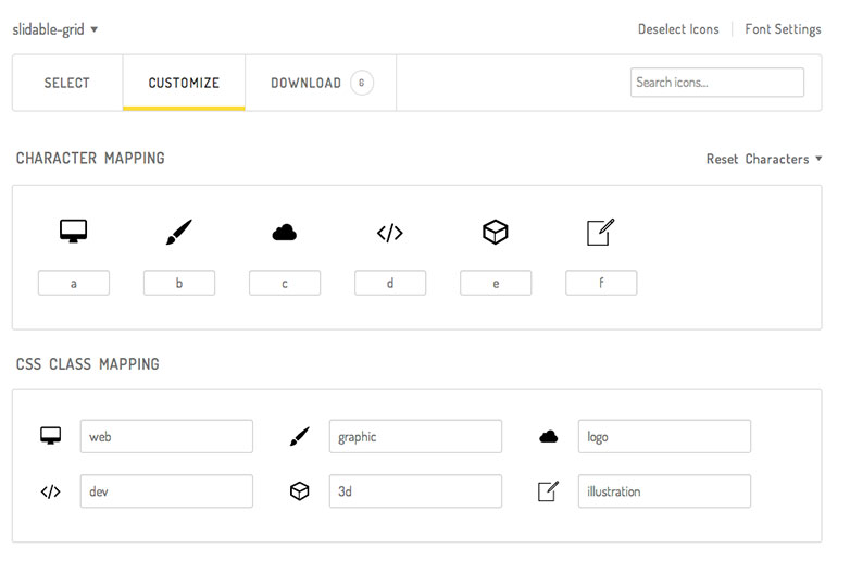
So as you can see I've chosen the class names that we used in the HTML so they will match up with no hassle. The service then gives you a download of a 'fonts' folder and some code. Place the 'fonts' folder in your css folder (or wherever suits you). Then take the code they give and add it to your css file. Here's what you need:
@font-face {
 font-family: "slidable-grid";
 src:url("fonts/slidable-grid.eot");
 src:url("fonts/slidable-grid.eot?#iefix") format("embedded-opentype"),
 url("fonts/slidable-grid.woff") format("woff"),
 url("fonts/slidable-grid.ttf") format("truetype"),
 url("fonts/slidable-grid.svg#slidable-grid") format("svg");
 font-weight: normal;
 font-style: normal;
}

[class^="icon-"]:before,
[class*=" icon-"]:before {
 font-family: "slidable-grid" !important;
 font-style: normal !important;
 font-weight: normal !important;
 font-variant: normal !important;
 text-transform: none !important;
 speak: none;
 font-size: 4em;
 line-height: 1;
 -webkit-font-smoothing: antialiased;
 -moz-osx-font-smoothing: grayscale;
}

.icon-web:before {
 content: "a";
}

.icon-graphic:before {
 content: "b";
}

.icon-logo:before {
 content: "c";
}

.icon-dev:before {
 content: "d";
}

.icon-3d:before {
 content: "e";
}

.icon-illustration:before {
 content: "f";
}
And there you have it. If you reload the project, the icons will appear. Now all that's left is to finish styling to make it look like the final demo.
Final styles
Let's finish off quickly with the final styles that are left. Here is nothing essential, only design to make it look like we want, so it's all pretty self explanatory. Here's the code to center the grid and give it it's maximum width. Also to make the nice hover effect on the icons:
@import url(reset.css);

* { -moz-box-sizing: border-box; -webkit-box-sizing: border-box; box-sizing: border-box; }

.cf:before, .cf:after { content: " "; /* 1 */ display: table; /* 2 */ }
.cf:after { clear: both; }
.cf { *zoom: 1; }

body {
 font-family: 'Exo 2', sans-serif; /* Google Font http://google.com/fonts */
 text-align: center;
 color: #999;
 background: #444;
 -webkit-font-smoothing: antialiased;
}

#services {
 max-width: 850px;
 margin: 0 auto;
}

#services .service .service-icon:hover {
 cursor: pointer;
 color: #249EC2;
}

#services .service .service-icon span {
 display: block;
 -webkit-transition: all 0.1s linear;
 -moz-transition: all 0.1s linear;
 transition: all 0.1s linear;
}

#services .service .service-icon:hover span {
 position: relative;
 bottom: 5px;
}
jQuery functionality
Our goal with the jQuery is to reuse the same snippet of code for the whole grid. We're going to listen for a click event (on the service box) then when that happens we'll animate the icon position to move it away, and bring the description in, we'll also be adding a class name to help with functionality. So first include jQuery on your page, then add our code either in another script file, or inside a <script> tag on the page:
$(document).ready(function() {
 $('.service').click(function() {
 var $this = $(this);
 if ($this.hasClass("open")) {
 $this.find('.service-icon').animate({left: "0"});
 $this.find('.service-description').animate({left: "100%"});
 $this.removeClass("open");
 }
 else {
 $this.find('.service-icon').animate({left: "-100%"});
 $this.find('.service-description').animate({left: "0"});
 $this.addClass("open");
 }
 });
});
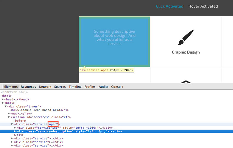
When the page is ready, and when a .service block is clicked, we're looking to see if the block already has a class name of 'open' or not. As they don't start with one the first 'if' section will be ignored. So inside the 'else' we're looking inside the .service block and finding the icon div. We animate the 'left' position to -100%. We then find the description block and animate its left position to 0. This brings it into view. Finally we need to add the class of 'open' to our service block. That means when it's clicked and it shows the extra content it will have an added class of open as you can see here:
So now looking back at the 'if' statement from earlier, we can see that if we click on a .service block that also has a class of open, then we animate the icon back to 0, and send the description back to 100%. We then remove the class 'open' so it is reusable and we can click more than once.
Conclusion and ideas
There it is. This now is a working 'grid' system, where each cell has a second side and has two 'states'. I hope you gained something from this tutorial, this idea is very changeable and adaptable.
As you can see in the demo, there's a second example where the open state is triggered by a hover and not a click. Simply by changing the .click() function in the jQuery to a .hover(). So it's up to you how far you want to push it. You could animate the position from any direction by simply changing the left to something else, or change the speed.
But it should be used in moderation, to add something to the user experience. It's a useful little snippet to upgrade a simple grid and display content in an interesting way.
Have you used this code in a project? Do you have a similar method? Let us know in the comments.
WDD Staff


Read Next

20 Best New Websites, April 2024

Exciting New Tools for Designers, April 2024

14 Top UX Tools for Designers in 2024

What Negative Effects Does a Bad Website Design Have On My Business?

10+ Best Resources & Tools for Web Designers (2024 update)

3 Essential Design Trends, April 2024

How to Plan Your First Successful Website

15 Best New Fonts, March 2024

LimeWire Developer APIs Herald a New Era of AI Integration

20 Best New Websites, March 2024

Exciting New Tools for Designers, March 2024
