

Today’s Medium typography refresh is an evolution. We set out to support a wider variety of stories, bring richer typography to Medium — Brad Birdsall
Medium is primarily about reading, so getting the typography right was a pivotal task for the design team. Marcin Wichary has written a great post on the details in the typefaces, which highlights some of the complexities involved in selecting fonts for multiple languages.
What’s really interesting is that for their UI, Medium has elected to use system fonts, meaning that Medium’s interface blends with the native UI. Rather than a distinction being drawn between Medium and the native OS, the distinction is drawn between the story and the UI. It’s an inventive way of focusing attention on content.
One of the biggest changes is that Medium has embraced the language of Twitter. You can now @ someone and (hopefully) elicit a response, moving Medium away from anecdotes, and towards the conversations that their contextual comments have always favored.
There’s also a new publishing API, allowing you to build an editor that will publish straight to Medium, or hook up a platform like WordPress and syndicate content onto Medium’s platform. If you want to, you can even use a custom domain with your account.
Finally, there’s a new logo…
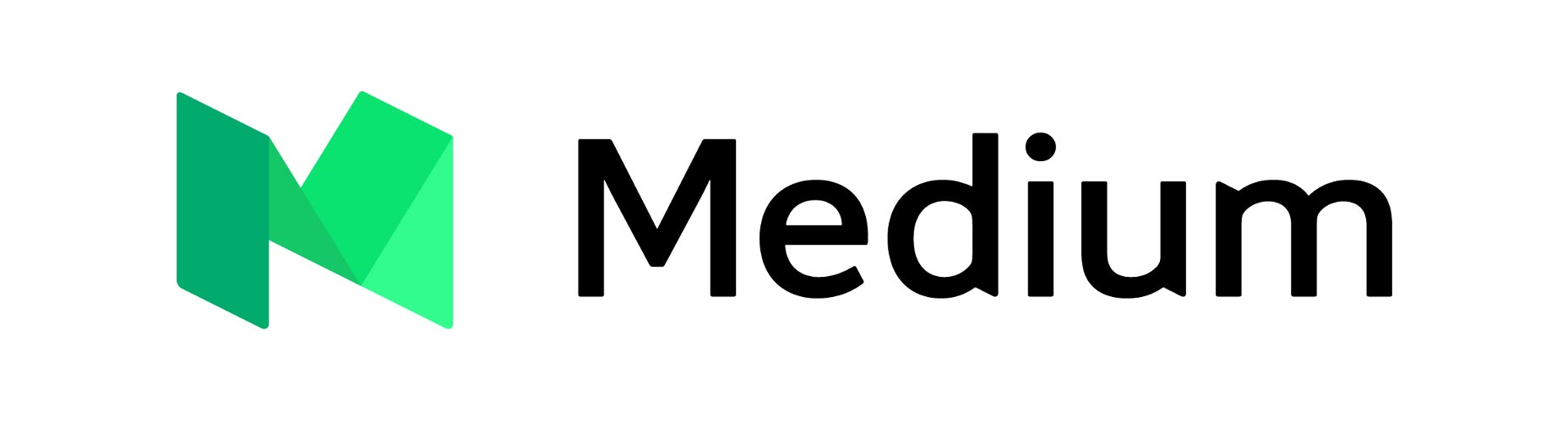 Medium’s new logo
Medium’s original logo uses the uppercase ‘M’ from the Stag typeface. It’s a little lopsided in isolation, but it’s bold, recognizable, and appropriate — it conveys Medium’s emphasis on typography, minimalism, and journalism.
Medium’s new logo
Medium’s original logo uses the uppercase ‘M’ from the Stag typeface. It’s a little lopsided in isolation, but it’s bold, recognizable, and appropriate — it conveys Medium’s emphasis on typography, minimalism, and journalism.
 Medium’s original logo
The new logo, developed by the in-house team in conjunction with type foundry PsyOps is a geometric logomark, coupled with a geometric sans-serif logotype. The new logo is proof positive — if proof were needed — that good math does not equate to good design.
Medium’s original logo
The new logo, developed by the in-house team in conjunction with type foundry PsyOps is a geometric logomark, coupled with a geometric sans-serif logotype. The new logo is proof positive — if proof were needed — that good math does not equate to good design.
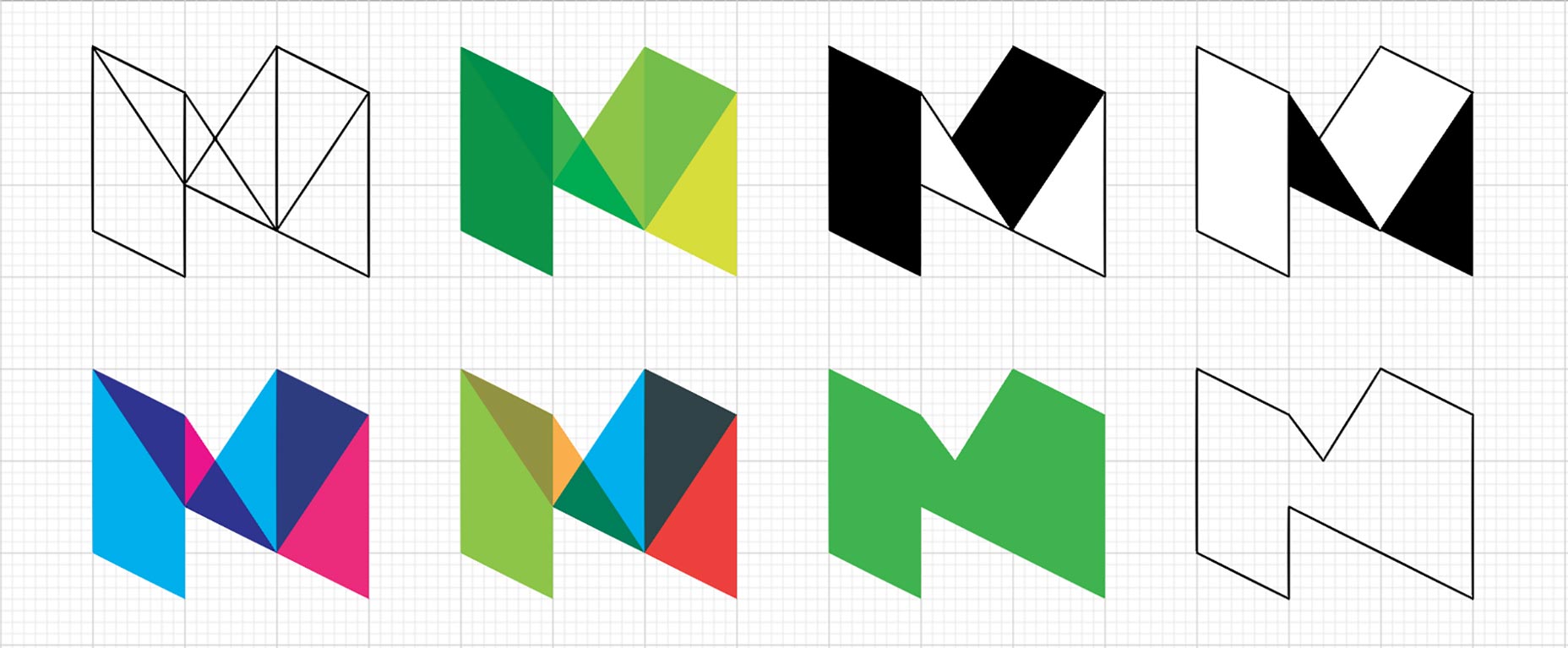 Medium’s new logo in development
The process of redesigning the logo has been documented by the team and it’s clear from the early designs, and the “just for kicks” video they’ve put together, that the team had some dynamic, exciting, and appropriate ideas that deserved to be fully investigated. Whether they ran out of time, or suffered a management hatchet-job is unclear, but the final logo looks like a poor first draft.
The vibrant colors have been reduced to monotone. And to add insult to injury, they’ve rounded the corners on the logomark, destroying the isometric effect that might have emerged given sufficient iterations.
Medium’s new logotype feels just like Facebook’s, and Google’s, and Opera’s; it’s an inoffensive, corporate, geometric sans that speaks little to the product it claims to represent.
Medium’s new brand is weak, clichéd, and inappropriate; happily branding can be revised. What matters most is the product, and the updated Medium raises the benchmark for online publishing once again. Medium is likely to remain the accepted standard for blogging, for some time to come.
Medium’s new logo in development
The process of redesigning the logo has been documented by the team and it’s clear from the early designs, and the “just for kicks” video they’ve put together, that the team had some dynamic, exciting, and appropriate ideas that deserved to be fully investigated. Whether they ran out of time, or suffered a management hatchet-job is unclear, but the final logo looks like a poor first draft.
The vibrant colors have been reduced to monotone. And to add insult to injury, they’ve rounded the corners on the logomark, destroying the isometric effect that might have emerged given sufficient iterations.
Medium’s new logotype feels just like Facebook’s, and Google’s, and Opera’s; it’s an inoffensive, corporate, geometric sans that speaks little to the product it claims to represent.
Medium’s new brand is weak, clichéd, and inappropriate; happily branding can be revised. What matters most is the product, and the updated Medium raises the benchmark for online publishing once again. Medium is likely to remain the accepted standard for blogging, for some time to come.
Ben Moss
Ben Moss has designed and coded work for award-winning startups, and global names including IBM, UBS, and the FBI. When he’s not in front of a screen he’s probably out trail-running.


Read Next

20 Best New Websites, April 2024

Exciting New Tools for Designers, April 2024

14 Top UX Tools for Designers in 2024

What Negative Effects Does a Bad Website Design Have On My Business?

10+ Best Resources & Tools for Web Designers (2024 update)

3 Essential Design Trends, April 2024

How to Plan Your First Successful Website

15 Best New Fonts, March 2024

LimeWire Developer APIs Herald a New Era of AI Integration

20 Best New Websites, March 2024

Exciting New Tools for Designers, March 2024
