

We've historically appealed to a pretty traditional demographic, but we're now making a concerted effort to reach out to a much younger and diverse group of people…and the data says those people are more likely to read our site on mobile phones. — Chris Hughes, The New Republic
The main navigation on the new TNR is infinite scrolling; when you reach the bottom of an article, the next article loads, mimicking the continuous reading of a social media news feed; perhaps not surprising as TNR’s main shareholder since 2012 has been Chris Hughes, co-founder of Facebook.
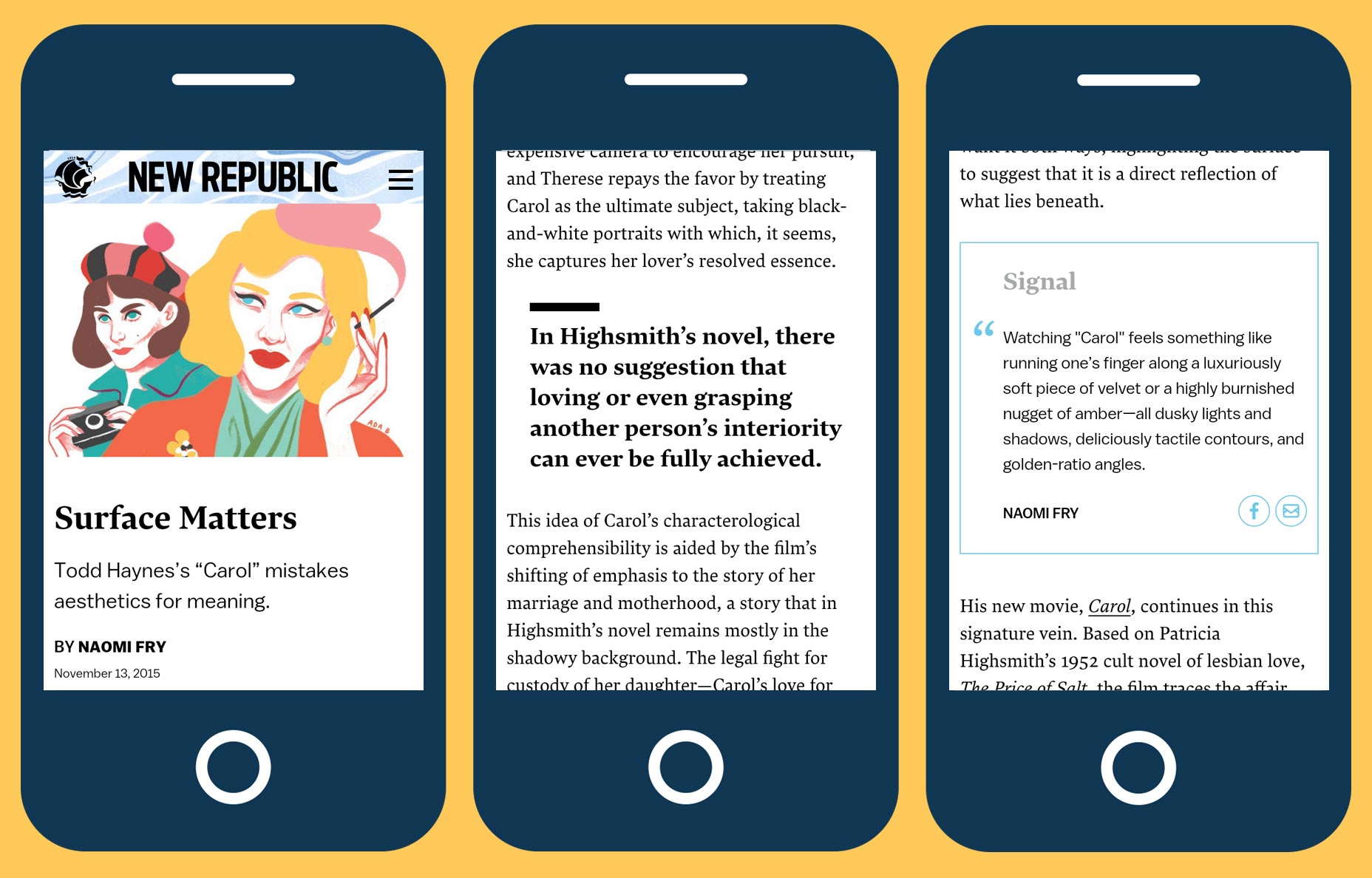 All other navigation has been hidden away behind a hamburger menu, not just on mobile, but desktop as well. It’s an assumption — albeit a popular one — that younger users recognize a hamburger menu, and it certainly alienates less experienced users. The usability of hamburger menus is a contentious issue, but they demonstrably obscure the available options for users; hamburger menus are always mystery meat navigation.
In the case of TNR, the hamburger menu has been used because they had to use something. It feels very much as if it’s been slapped on the desktop because it had already been designed for the mobile version. Concealing items like ‘Advertise’, ‘Contact’, and ‘Jobs’ is one thing; hiding major content sections like ‘Politics’, ‘Culture’, and vitally the ‘Subscribe’ link is another. Even the search function — which many users turn to as a primary navigation tool — has been hidden away.
Where the TNR redesign does work is its focus on content. The designers have approximated the typography of the print version, with both display and body text using Lava, and info text using Balto.
All other navigation has been hidden away behind a hamburger menu, not just on mobile, but desktop as well. It’s an assumption — albeit a popular one — that younger users recognize a hamburger menu, and it certainly alienates less experienced users. The usability of hamburger menus is a contentious issue, but they demonstrably obscure the available options for users; hamburger menus are always mystery meat navigation.
In the case of TNR, the hamburger menu has been used because they had to use something. It feels very much as if it’s been slapped on the desktop because it had already been designed for the mobile version. Concealing items like ‘Advertise’, ‘Contact’, and ‘Jobs’ is one thing; hiding major content sections like ‘Politics’, ‘Culture’, and vitally the ‘Subscribe’ link is another. Even the search function — which many users turn to as a primary navigation tool — has been hidden away.
Where the TNR redesign does work is its focus on content. The designers have approximated the typography of the print version, with both display and body text using Lava, and info text using Balto.
 The site has received a significant speed boost, by dropping Drupal, and replacing it with a custom-CMS. And the frontend feels crisp and responsive having been built with ReactJS.
The big problem with the TNR redesign, isn’t so much that it’s mobile-first, as mobile-only. Whilst desktop browsing may be on the decline, a desktop is not simply a big smartphone, and just as ignoring mobile five years ago cost you 20% of your audience, ignoring desktop now will cost in excess of 40%.
Images use device mockups image, via Shutterstock.
The site has received a significant speed boost, by dropping Drupal, and replacing it with a custom-CMS. And the frontend feels crisp and responsive having been built with ReactJS.
The big problem with the TNR redesign, isn’t so much that it’s mobile-first, as mobile-only. Whilst desktop browsing may be on the decline, a desktop is not simply a big smartphone, and just as ignoring mobile five years ago cost you 20% of your audience, ignoring desktop now will cost in excess of 40%.
Images use device mockups image, via Shutterstock.
Ben Moss
Ben Moss has designed and coded work for award-winning startups, and global names including IBM, UBS, and the FBI. When he’s not in front of a screen he’s probably out trail-running.


Read Next

3 Essential Design Trends, May 2024

How to Write World-Beating Web Content

20 Best New Websites, April 2024

Exciting New Tools for Designers, April 2024

How Web Designers Can Stay Relevant in the Age of AI

14 Top UX Tools for Designers in 2024

What Negative Effects Does a Bad Website Design Have On My Business?

10+ Best Resources & Tools for Web Designers (2024 update)

3 Essential Design Trends, April 2024

How to Plan Your First Successful Website

15 Best New Fonts, March 2024
