

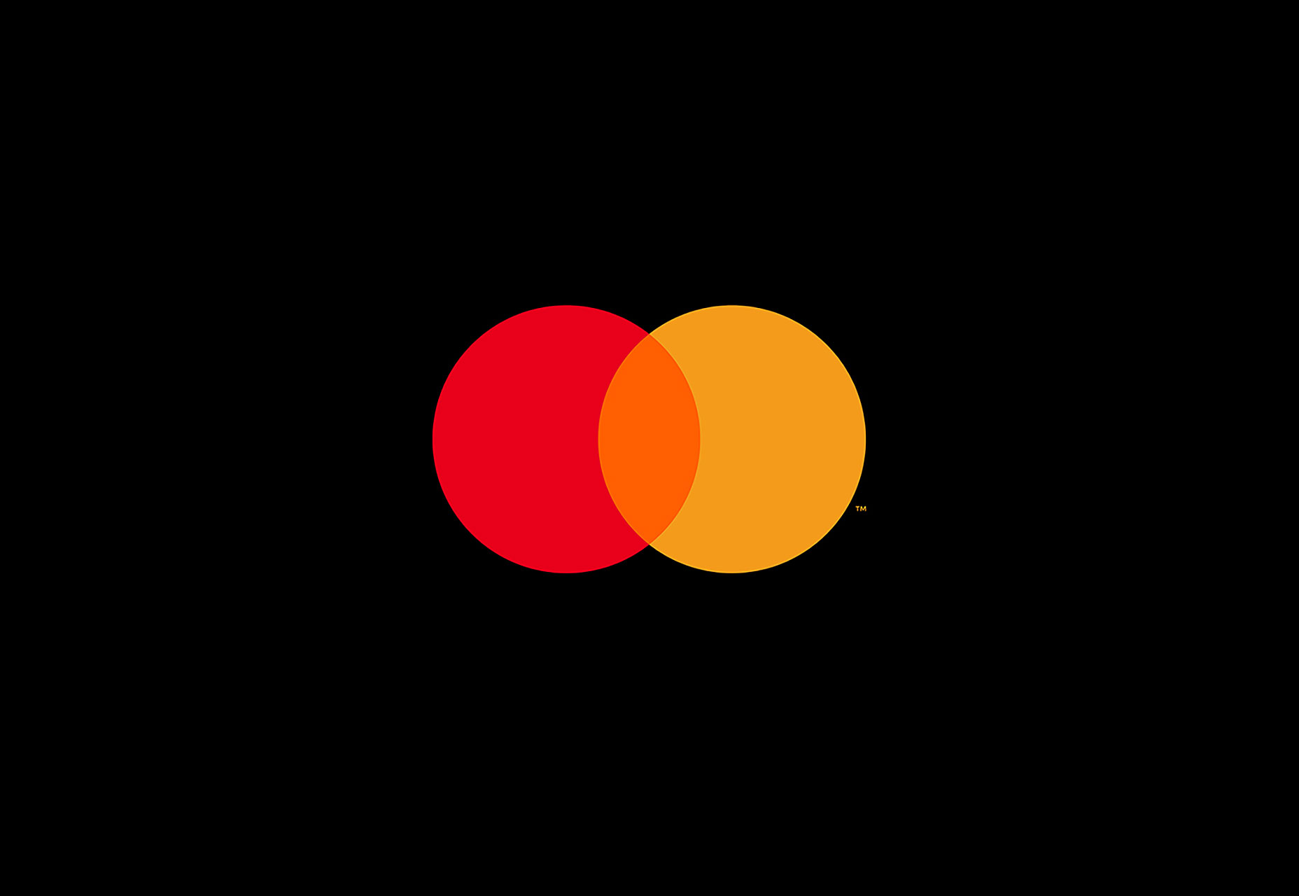
 Instead of the red-and-yellow comb effect in the center of the circles, we know see the true result of red and yellow mixing, which is the color orange. The wordmark “MasterCard” has been entirely kicked out of the circles and now appears underneath them.
The wordmark also features a new typeface, FF Mark. The most notable change is that every letter in the new wordmark is now lowercase while also sporting circular curves that the old wordmark couldn’t accommodate. It’s also gone from white to black.
Instead of the red-and-yellow comb effect in the center of the circles, we know see the true result of red and yellow mixing, which is the color orange. The wordmark “MasterCard” has been entirely kicked out of the circles and now appears underneath them.
The wordmark also features a new typeface, FF Mark. The most notable change is that every letter in the new wordmark is now lowercase while also sporting circular curves that the old wordmark couldn’t accommodate. It’s also gone from white to black.
 The design company that worked on this update, Pentagram, was thankful that it already had much to work with before they began the redesign. The old logo already featured one of the simplest and easiest geometric shapes with which to work, not to mention two of the three primary colors. As a result, Pentagram didn’t really perform a complete overhaul, but, rather, a simple design tweak that updated the logo to today’s branding needs.
The new logo is anything but excessively clever or instantly eye-catching. Instead, it’s a safe and effective transition from a tested design to one that’s complementary to an evolving brand identity.
The design company that worked on this update, Pentagram, was thankful that it already had much to work with before they began the redesign. The old logo already featured one of the simplest and easiest geometric shapes with which to work, not to mention two of the three primary colors. As a result, Pentagram didn’t really perform a complete overhaul, but, rather, a simple design tweak that updated the logo to today’s branding needs.
The new logo is anything but excessively clever or instantly eye-catching. Instead, it’s a safe and effective transition from a tested design to one that’s complementary to an evolving brand identity.
Marc Schenker
Marc’s a copywriter who covers design news for Web Designer Depot. Find out more about him at thegloriouscompanyltd.com.


Read Next

20 Best New Websites, April 2024
Welcome to our sites of the month for April. With some websites, the details make all the difference, while in others,…

Exciting New Tools for Designers, April 2024
Welcome to our April tools collection. There are no practical jokes here, just practical gadgets, services, and apps to…

14 Top UX Tools for Designers in 2024
User Experience (UX) is one of the most important fields of design, so it should come as no surprise that there are a…
By Simon Sterne

What Negative Effects Does a Bad Website Design Have On My Business?
Consumer expectations for a responsive, immersive, and visually appealing website experience have never been higher. In…

10+ Best Resources & Tools for Web Designers (2024 update)
Is searching for the best web design tools to suit your needs akin to having a recurring bad dream? Does each…
By WDD Staff

3 Essential Design Trends, April 2024
Ready to jump into some amazing new design ideas for Spring? Our roundup has everything from UX to color trends…

How to Plan Your First Successful Website
Planning a new website can be exciting and — if you’re anything like me — a little daunting. Whether you’re an…
By Simon Sterne

15 Best New Fonts, March 2024
Welcome to March’s edition of our roundup of the best new fonts for designers. This month’s compilation includes…
By Ben Moss

LimeWire Developer APIs Herald a New Era of AI Integration
Generative AI is a fascinating technology. Far from the design killer some people feared, it is an empowering and…
By WDD Staff

20 Best New Websites, March 2024
Welcome to our pick of sites for March. This month’s collection tends towards the simple and clean, which goes to show…

Exciting New Tools for Designers, March 2024
The fast-paced world of design never stops turning, and staying ahead of the curve is essential for creatives. As…

Web Tech Trends to Watch in 2024 and Beyond
It hardly seems possible given the radical transformations we’ve seen over the last few decades, but the web design…
By Louise North