

1. Old school typography
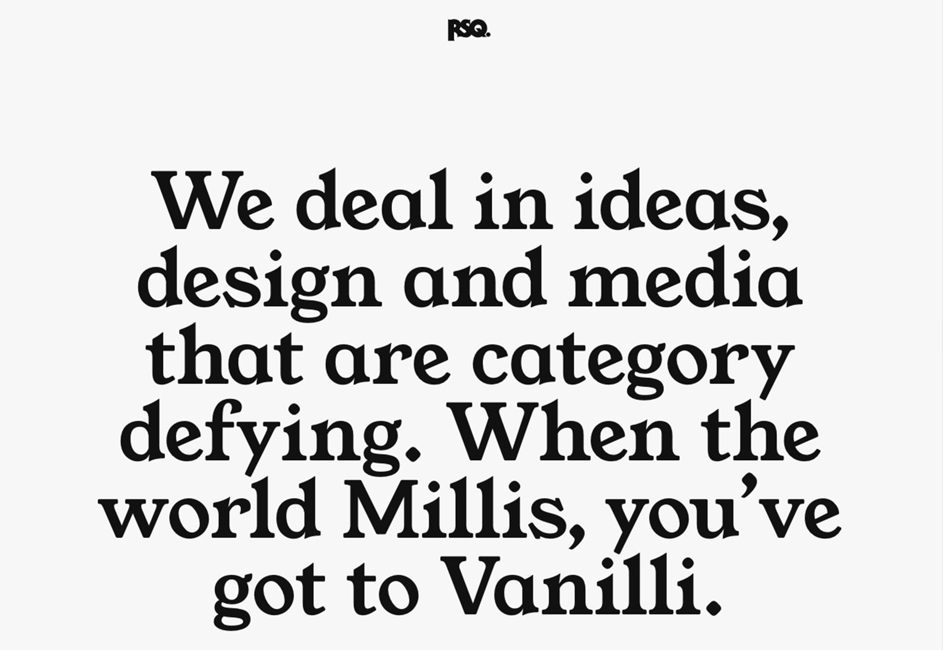
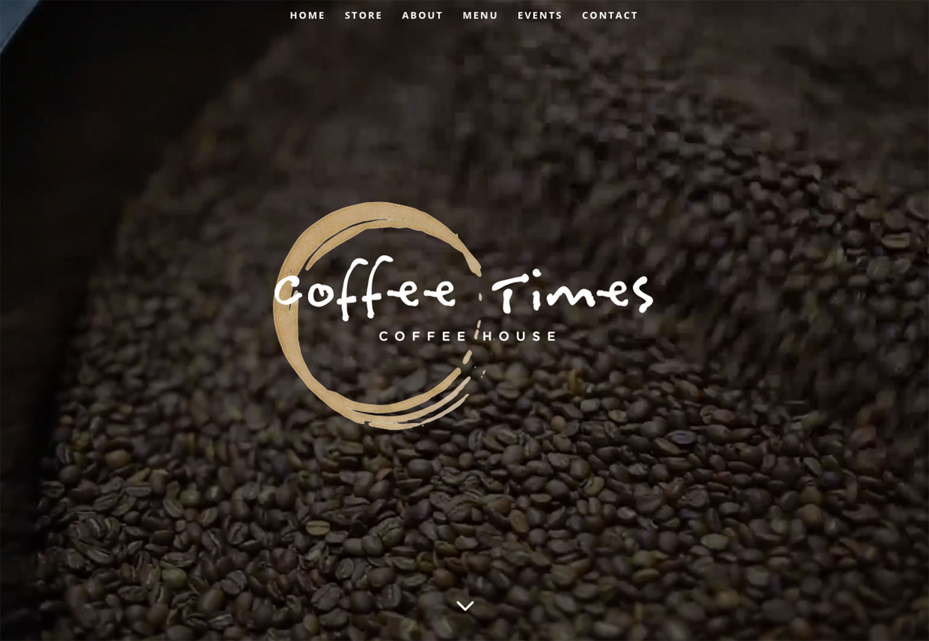
More designers are taking an old-school approach to display typography. Gone are the ultra-thin or condensed sans serifs, and more traditional type styles are in. Old-style, modern and transitional serifs are the new go-to display type style. It’s a bit surprising, actually. For years. The “rule” has been to use sans serifs to improve readability and designers did just that, often without question. The new use of serifs for big type — and even some smaller type — is refreshing and quite readable. The designs often live in a minimal space, so that type does not have to compete for attention and pairings focus on dark lettering on a light background. (All things that aid readability.) Don’t know much about these type styles? Here’s a quick primer on each of these “new” old-school serifs:- Old-style: Lettering has an old-world vibe that carries over from some blackletter and gothic styles from early ages of printing. Letterforms often have small serifs (those tiny strokes at the end of longer stokes) and a rounded form. RSQ, below, is a perfect showcase of old-style typography.
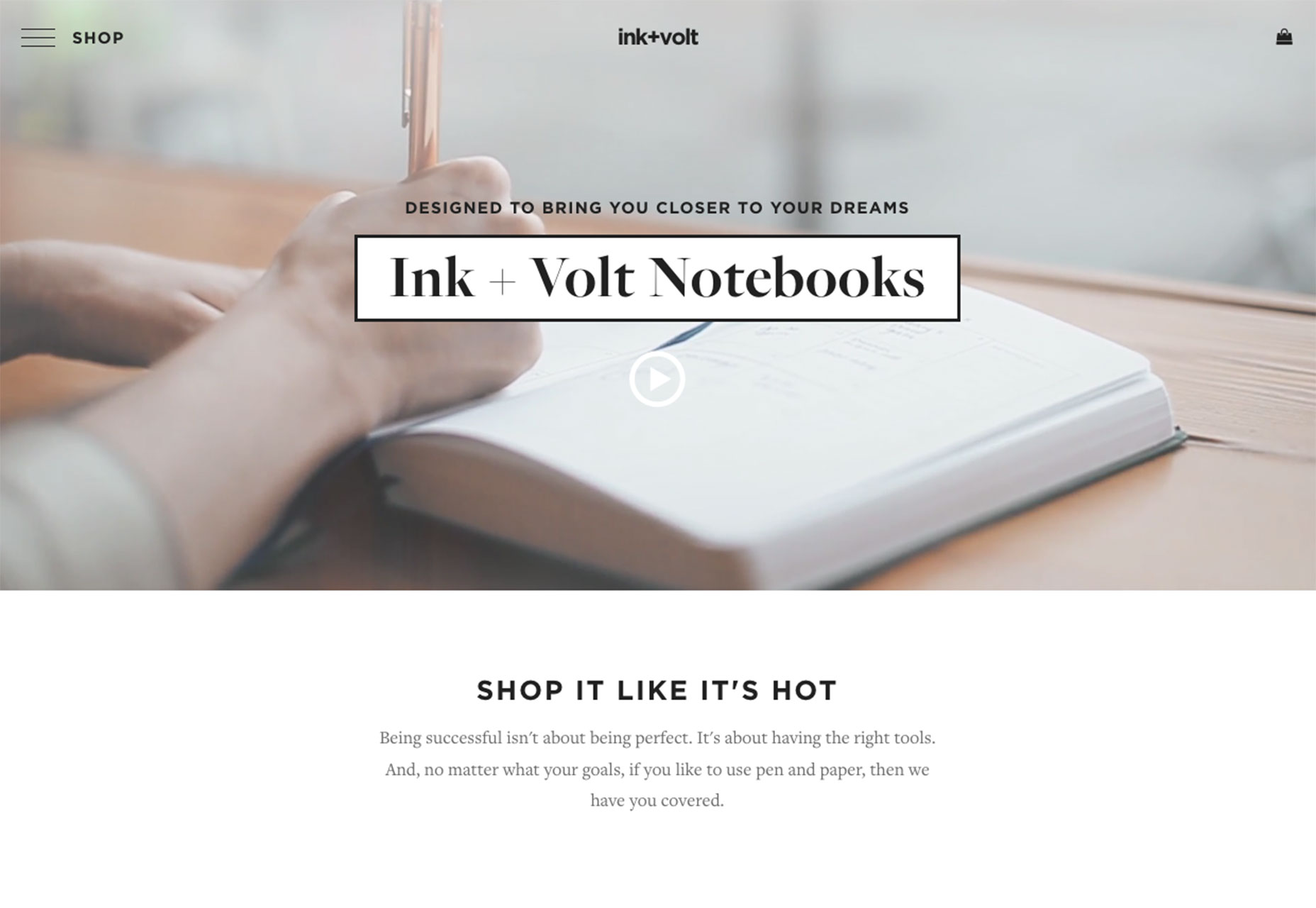
- Modern: This style of lettering is quite common in printed design, such as newspapers and magazines, but is just starting to make its way into web projects. Modern serifs have alternating thick and thin stroke widths in each letterform, sometimes with great amounts of contrast. Ink + Volt, below, uses a beautiful modern serif. But also note how the lettering is used. The type is inside of a white box so that the thin parts of each letter do not get lost in the video background, which would limit readability. This is the perfect solution for using a modern serif.
- Transitional: These letterforms look a lot like modern serifs with one big difference – letters have uniform stroke widths. This makes traditional serifs easier to use because they can be more readable in more design situations.
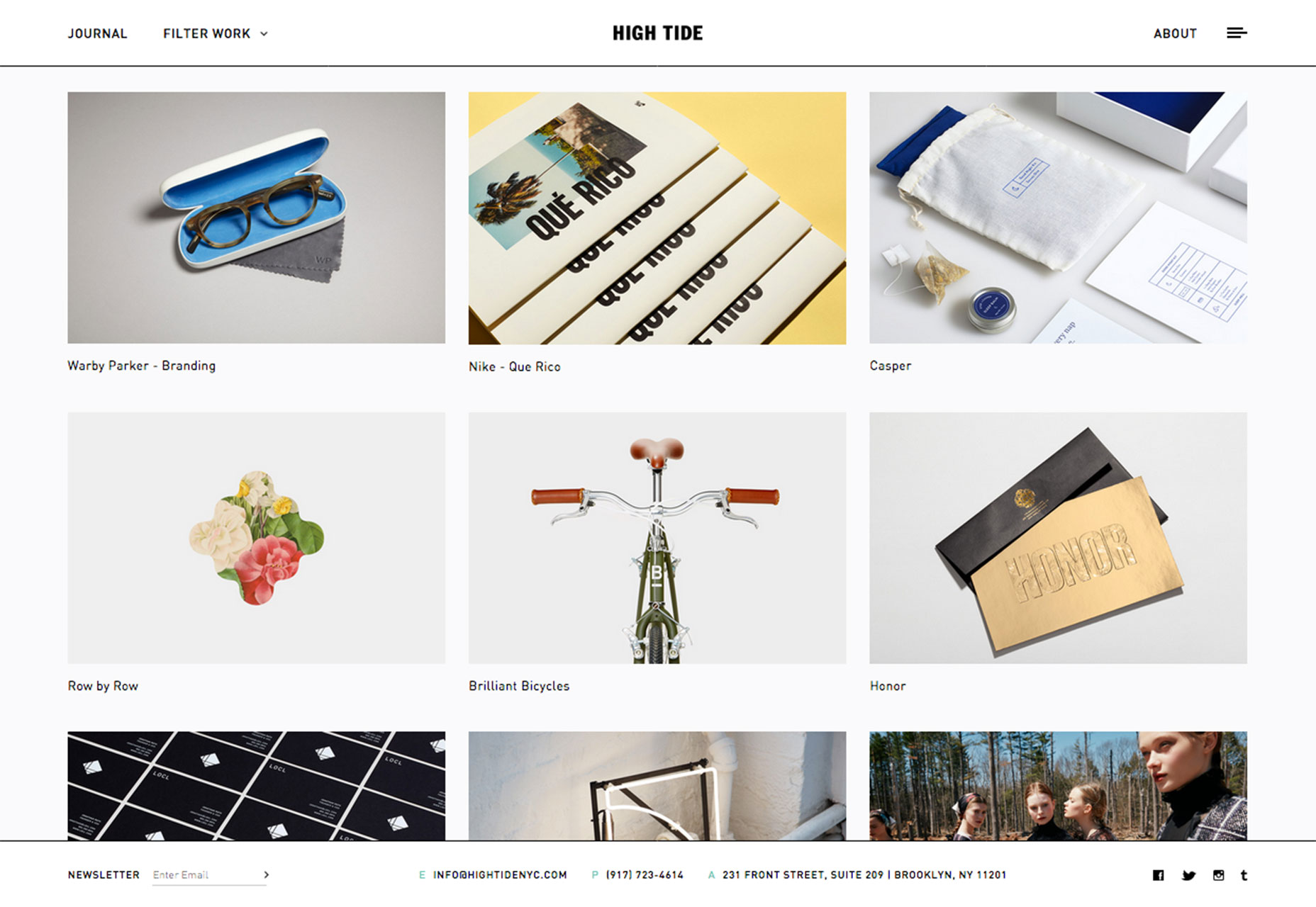
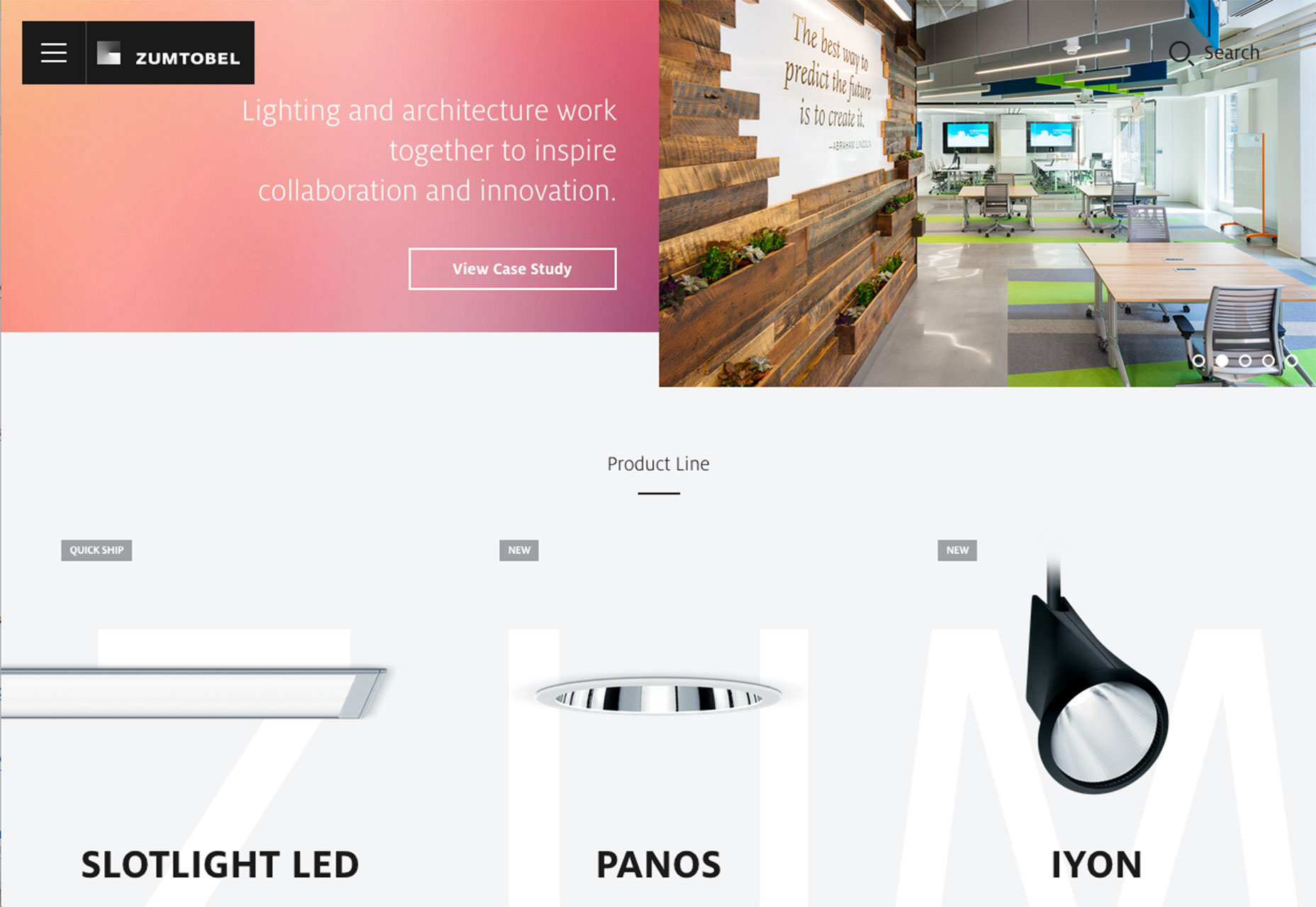
2. Defined grids
Sometimes you can see the grid, sometimes you can’t. Either way, a solid grid is the foundation for a design that’s clean organized and easy on the eyes. More defined grids are making a comeback. Part of it might be from the influence of Material Design, which features plenty of elements in neat columns and rows, and part of it might be the ease of moving and rearranging elements in responsive frameworks. Either way, defined grids can look amazing for a variety of projects on pretty much any screen. What’s nice about using a defined grid that is that it makes life really easy for the designer. Once you get the hang of working within a grid, placements, sizing and design options clearly present themselves to you. The trick to using defined grids is not to look too structured or overly-gridded. For many designers this means switching up sizes on different “screens,” such as having a full width hero image over a grid of elements. The Elegant Seagulls “Decade” page, below does this nicely. The website also features subtle gridding on the homepage in the picture, which is dark any mysterious, leading you into the mystery-themed grid pages. High Tide, below, does something similar with a cool intro video above grid blocks. But a grid can be well-defined and a little less boxed. Zumtobel, below, uses the letters in its named to create grid blocks for specific product information. Only on hover do you see the perfectly sized grid boxes, even though the placements are ideally spaced horizontally and vertically in a clean grid. The more you think about grids, the more you will start to see them through the eyes of the designer who created each one. You can start with some of the common web grids if you aren’t comfortable with the idea or create your own. The trick is that you have to use the grid consistently for real visual success.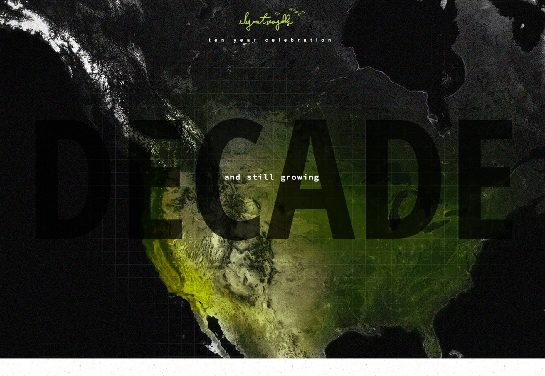
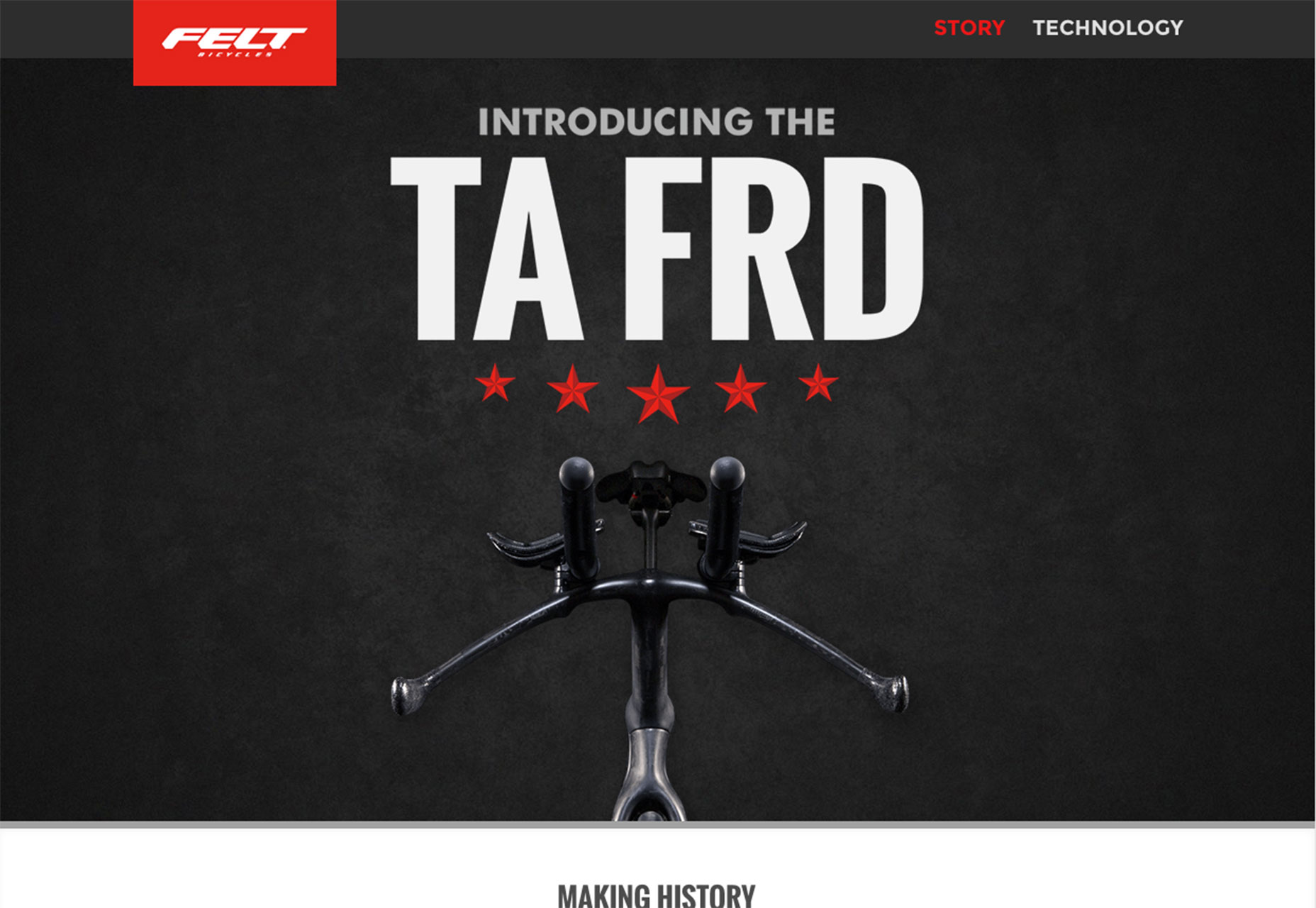
3. Minimal messaging above the “fold”
The question of the day is this: Is there enough information above the scroll to interest you enough to keep looking at the website? It can be tough to answer. But plenty of designers are betting on the idea that you will click or scroll, even if there is only one word on the screen. With other visuals such as video, scrolling sliders or enticing product displays, users might do just that. But it can be a gamble, especially with designs that don’t include a navigation menu with minimal messaging. Then there’s this: Plenty of users enter websites through pages other than the homepage, so why not take a risk there? Look at the data and clicks, see what happens. This is one of those trends that will be interesting to watch. It could vanish almost as quickly as it has appeared, but there are a lot of sites using this model.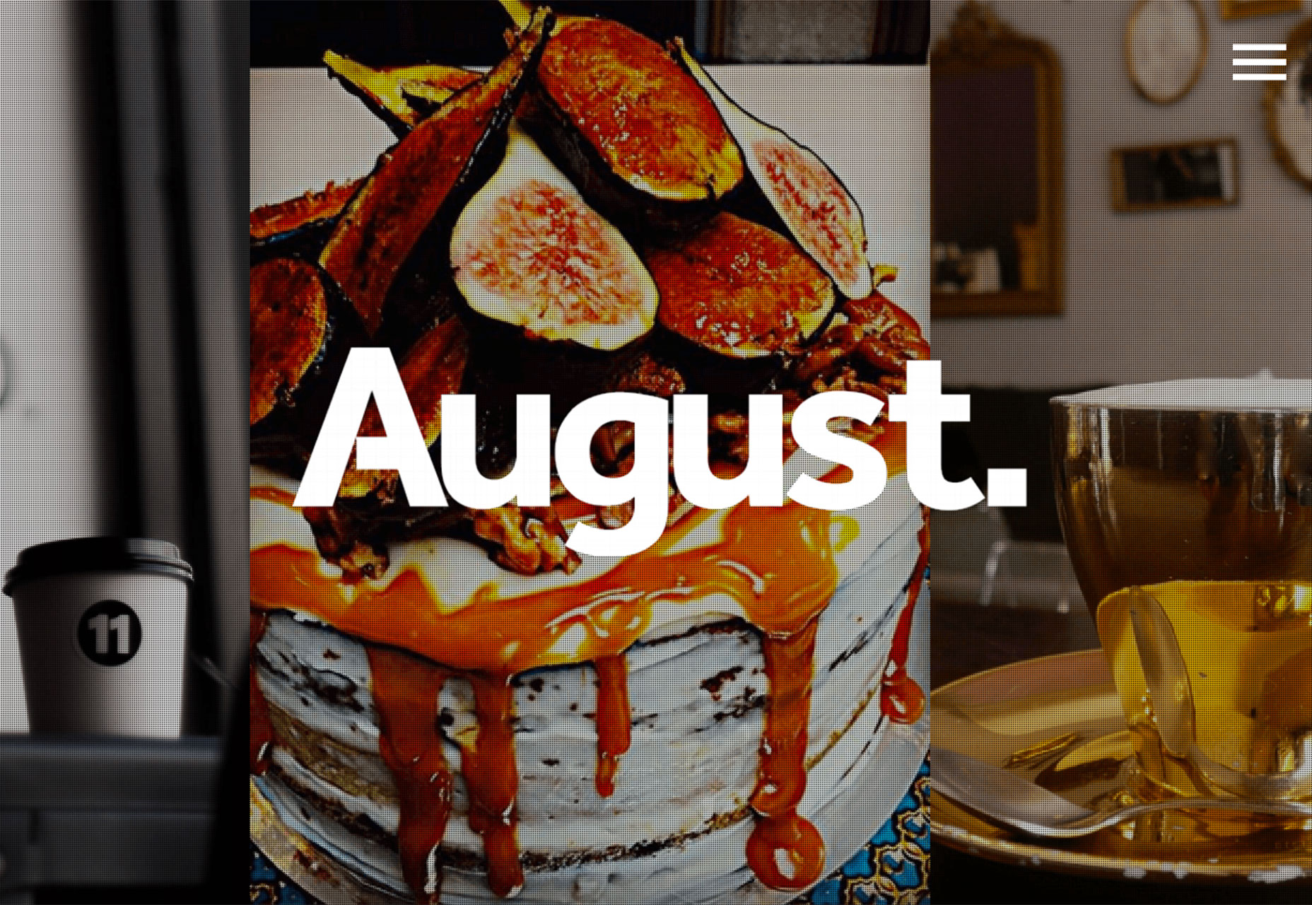
Conclusion
It’s a lot of fun to watch design trends cycle back into fashion. What’s nice about two of these trends — old-school typography and defined grids — is that they are highly usable in a number of design styles. What trends are you loving (or hating) right now? I’d love to see some of the websites that you are fascinated with. Drop me a link on Twitter; I’d love to hear from you.Carrie Cousins
Carrie Cousins is a freelance writer with more than 10 years of experience in the communications industry, including writing for print and online publications, and design and editing. You can connect with Carrie on Twitter @carriecousins.


Read Next

3 Essential Design Trends, May 2024
Integrated navigation elements, interactive typography, and digital overprints are three website design trends making…

20 Best New Websites, April 2024
Welcome to our sites of the month for April. With some websites, the details make all the difference, while in others,…

Exciting New Tools for Designers, April 2024
Welcome to our April tools collection. There are no practical jokes here, just practical gadgets, services, and apps to…

14 Top UX Tools for Designers in 2024
User Experience (UX) is one of the most important fields of design, so it should come as no surprise that there are a…
By Simon Sterne

What Negative Effects Does a Bad Website Design Have On My Business?
Consumer expectations for a responsive, immersive, and visually appealing website experience have never been higher. In…

10+ Best Resources & Tools for Web Designers (2024 update)
Is searching for the best web design tools to suit your needs akin to having a recurring bad dream? Does each…
By WDD Staff

3 Essential Design Trends, April 2024
Ready to jump into some amazing new design ideas for Spring? Our roundup has everything from UX to color trends…

How to Plan Your First Successful Website
Planning a new website can be exciting and — if you’re anything like me — a little daunting. Whether you’re an…
By Simon Sterne

15 Best New Fonts, March 2024
Welcome to March’s edition of our roundup of the best new fonts for designers. This month’s compilation includes…
By Ben Moss

LimeWire Developer APIs Herald a New Era of AI Integration
Generative AI is a fascinating technology. Far from the design killer some people feared, it is an empowering and…
By WDD Staff

20 Best New Websites, March 2024
Welcome to our pick of sites for March. This month’s collection tends towards the simple and clean, which goes to show…

Exciting New Tools for Designers, March 2024
The fast-paced world of design never stops turning, and staying ahead of the curve is essential for creatives. As…