

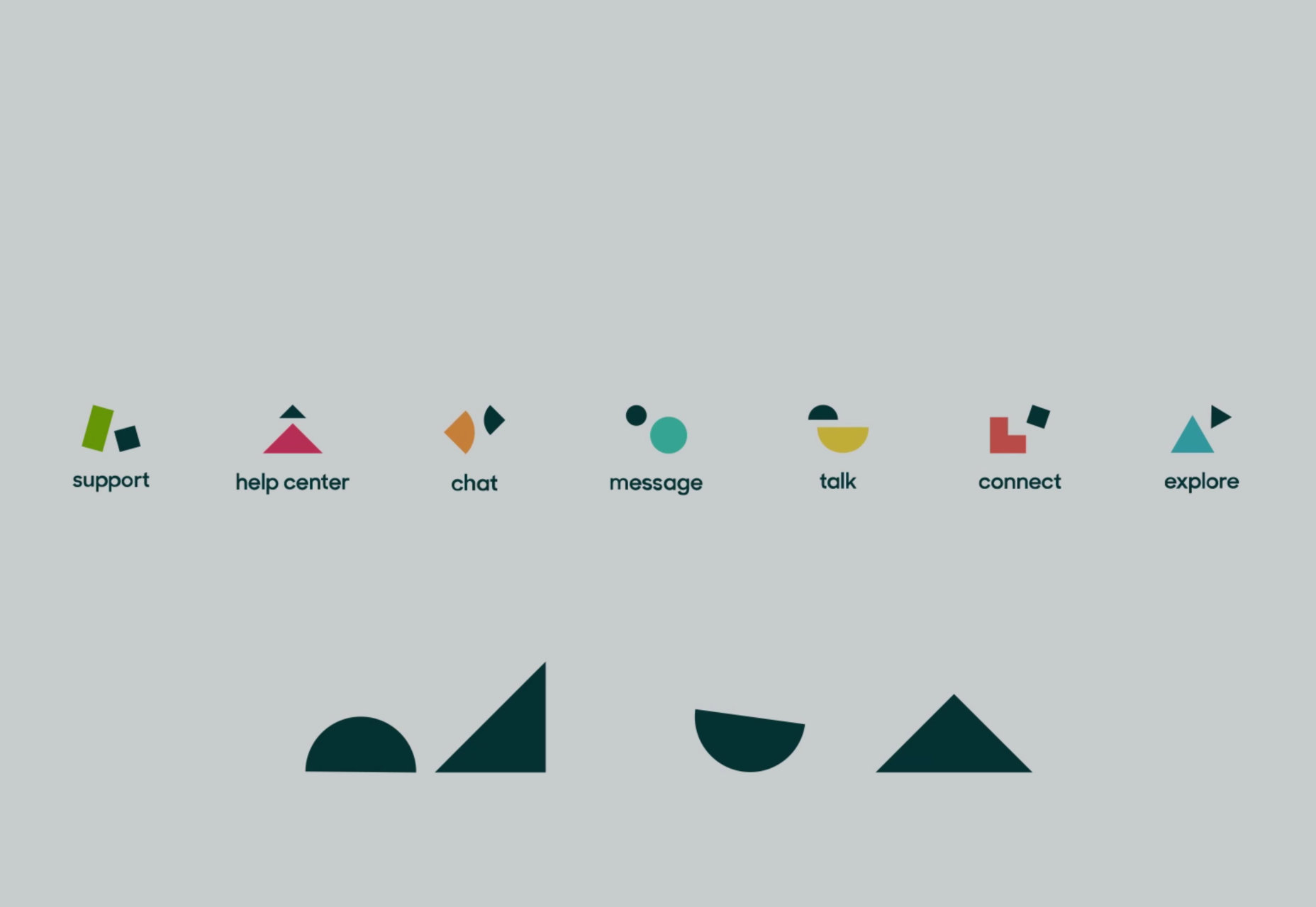
 The end result is a form of visual clarity and tastefulness with a modern twist, all firmly rooted in a very Dutch identity to communicate a looser feeling of Zen. Some would therefore argue that this new logo is more befitting of a serious tech company instead of the cartoonish Buddha character of old.
Here’s a short video about the journey to design their new identity:
The end result is a form of visual clarity and tastefulness with a modern twist, all firmly rooted in a very Dutch identity to communicate a looser feeling of Zen. Some would therefore argue that this new logo is more befitting of a serious tech company instead of the cartoonish Buddha character of old.
Here’s a short video about the journey to design their new identity:
Marc Schenker
Marc’s a copywriter who covers design news for Web Designer Depot. Find out more about him at thegloriouscompanyltd.com.


Read Next

3 Essential Design Trends, May 2024
Integrated navigation elements, interactive typography, and digital overprints are three website design trends making…

20 Best New Websites, April 2024
Welcome to our sites of the month for April. With some websites, the details make all the difference, while in others,…

Exciting New Tools for Designers, April 2024
Welcome to our April tools collection. There are no practical jokes here, just practical gadgets, services, and apps to…

14 Top UX Tools for Designers in 2024
User Experience (UX) is one of the most important fields of design, so it should come as no surprise that there are a…
By Simon Sterne

What Negative Effects Does a Bad Website Design Have On My Business?
Consumer expectations for a responsive, immersive, and visually appealing website experience have never been higher. In…

10+ Best Resources & Tools for Web Designers (2024 update)
Is searching for the best web design tools to suit your needs akin to having a recurring bad dream? Does each…
By WDD Staff

3 Essential Design Trends, April 2024
Ready to jump into some amazing new design ideas for Spring? Our roundup has everything from UX to color trends…

How to Plan Your First Successful Website
Planning a new website can be exciting and — if you’re anything like me — a little daunting. Whether you’re an…
By Simon Sterne

15 Best New Fonts, March 2024
Welcome to March’s edition of our roundup of the best new fonts for designers. This month’s compilation includes…
By Ben Moss

LimeWire Developer APIs Herald a New Era of AI Integration
Generative AI is a fascinating technology. Far from the design killer some people feared, it is an empowering and…
By WDD Staff

20 Best New Websites, March 2024
Welcome to our pick of sites for March. This month’s collection tends towards the simple and clean, which goes to show…

Exciting New Tools for Designers, March 2024
The fast-paced world of design never stops turning, and staying ahead of the curve is essential for creatives. As…