

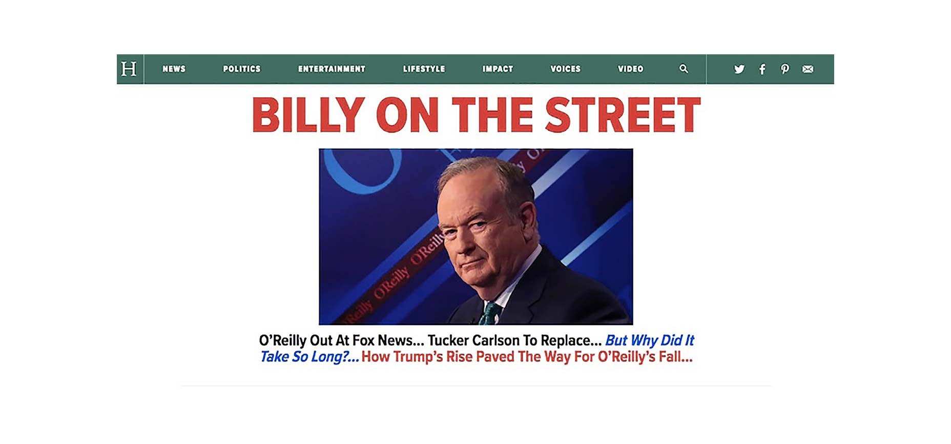
 The Old Huffington Post
All of that is gone now, replaced by a design that, when I first saw it, made me think of tabloids first and foremost. Upon further reflection, it feels like a cross between the tech blog and tabloid aesthetic, but with a super serious color scheme. It’s an odd duck.
Let’s be clear: I don’t think it’s a bad design. I even kinda like it. But is it the right design, and is this the right time for it?
The Old Huffington Post
All of that is gone now, replaced by a design that, when I first saw it, made me think of tabloids first and foremost. Upon further reflection, it feels like a cross between the tech blog and tabloid aesthetic, but with a super serious color scheme. It’s an odd duck.
Let’s be clear: I don’t think it’s a bad design. I even kinda like it. But is it the right design, and is this the right time for it?
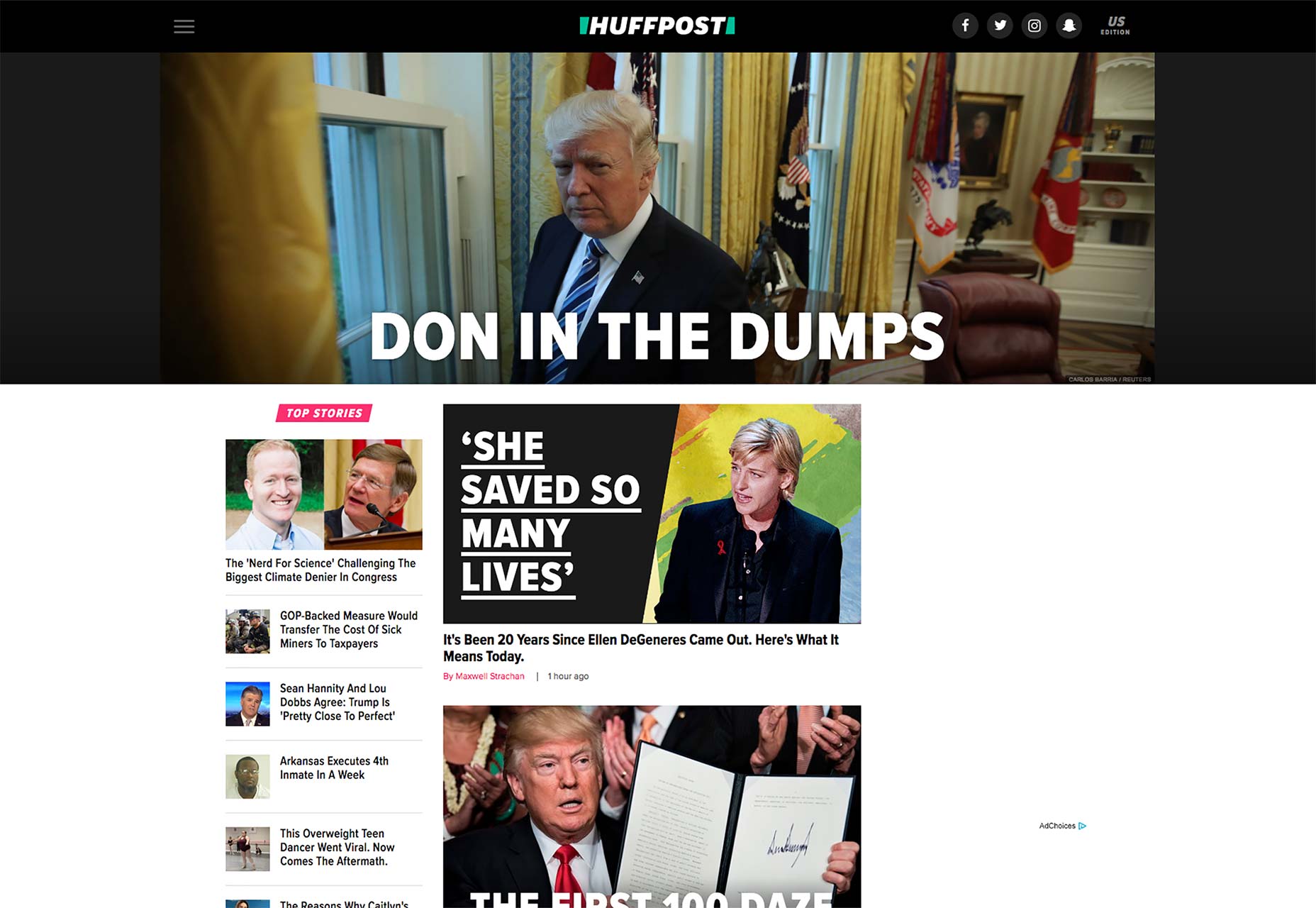 The New Huffpost
Reportedly it’s their attempt to appeal to a more working-class demographic, while they bank on their name brand to keep existing readers on board. Huffpost’s own post on the subject doesn’t do much to confirm or deny this theory.
I can’t help but recognize the influence of sites like Buzzfeed and Upworthy. I’d say that it’s more likely that Huffpost wants a piece of the “viral content” crowd. That crowd does include working-class people, but it includes pretty much every other class too. Most importantly, it includes a younger class of readers.
[pullquote]it’s more likely that Huffpost wants a piece of the “viral content” crowd[/pullquote]
However, they don’t want to go full tabloid to do it, as evidenced by the more serious, almost Silicon Valley tone of their UI. Now, is this going to work out for them? That’s the big question, isn’t it. The demographic they are targeting is just old enough to have read real newspapers, but young enough to wholeheartedly embrace new media. Moreover, they’re likely to have read the Huffington Post on and off for a while, and so have a vested interest in the brand. The general impression? That the new design feels “cheap” like the budget wasn’t there this time.
Knowing what we know about web design, they probably spent a lot more money on this redesign than people think. But this new design may make long-time readers worry about the future of the site. Meanwhile, readers who maybe never have touched a real newspaper themselves might feel right at home. It’s one of those instances where only time will tell.
The New Huffpost
Reportedly it’s their attempt to appeal to a more working-class demographic, while they bank on their name brand to keep existing readers on board. Huffpost’s own post on the subject doesn’t do much to confirm or deny this theory.
I can’t help but recognize the influence of sites like Buzzfeed and Upworthy. I’d say that it’s more likely that Huffpost wants a piece of the “viral content” crowd. That crowd does include working-class people, but it includes pretty much every other class too. Most importantly, it includes a younger class of readers.
[pullquote]it’s more likely that Huffpost wants a piece of the “viral content” crowd[/pullquote]
However, they don’t want to go full tabloid to do it, as evidenced by the more serious, almost Silicon Valley tone of their UI. Now, is this going to work out for them? That’s the big question, isn’t it. The demographic they are targeting is just old enough to have read real newspapers, but young enough to wholeheartedly embrace new media. Moreover, they’re likely to have read the Huffington Post on and off for a while, and so have a vested interest in the brand. The general impression? That the new design feels “cheap” like the budget wasn’t there this time.
Knowing what we know about web design, they probably spent a lot more money on this redesign than people think. But this new design may make long-time readers worry about the future of the site. Meanwhile, readers who maybe never have touched a real newspaper themselves might feel right at home. It’s one of those instances where only time will tell.
Ezequiel Bruni
Ezequiel Bruni is a web/UX designer, blogger, and aspiring photographer living in Mexico. When he’s not up to his finely-chiselled ears in wire-frames and front-end code, or ranting about the same, he indulges in beer, pizza, fantasy novels, and stand-up comedy.


Read Next

20 Best New Websites, April 2024
Welcome to our sites of the month for April. With some websites, the details make all the difference, while in others,…

Exciting New Tools for Designers, April 2024
Welcome to our April tools collection. There are no practical jokes here, just practical gadgets, services, and apps to…

14 Top UX Tools for Designers in 2024
User Experience (UX) is one of the most important fields of design, so it should come as no surprise that there are a…
By Simon Sterne

What Negative Effects Does a Bad Website Design Have On My Business?
Consumer expectations for a responsive, immersive, and visually appealing website experience have never been higher. In…

10+ Best Resources & Tools for Web Designers (2024 update)
Is searching for the best web design tools to suit your needs akin to having a recurring bad dream? Does each…
By WDD Staff

3 Essential Design Trends, April 2024
Ready to jump into some amazing new design ideas for Spring? Our roundup has everything from UX to color trends…

How to Plan Your First Successful Website
Planning a new website can be exciting and — if you’re anything like me — a little daunting. Whether you’re an…
By Simon Sterne

15 Best New Fonts, March 2024
Welcome to March’s edition of our roundup of the best new fonts for designers. This month’s compilation includes…
By Ben Moss

LimeWire Developer APIs Herald a New Era of AI Integration
Generative AI is a fascinating technology. Far from the design killer some people feared, it is an empowering and…
By WDD Staff

20 Best New Websites, March 2024
Welcome to our pick of sites for March. This month’s collection tends towards the simple and clean, which goes to show…

Exciting New Tools for Designers, March 2024
The fast-paced world of design never stops turning, and staying ahead of the curve is essential for creatives. As…

Web Tech Trends to Watch in 2024 and Beyond
It hardly seems possible given the radical transformations we’ve seen over the last few decades, but the web design…
By Louise North