

1. Good UI Animation is Natural
State changes in UI often involve hard cuts by default, which can make them difficult to follow. In the real world, most things don't just appear or disappear immediately. When something has two or more states, then changes between states will be much easier for users to understand if the transitions are animated instead of being instantaneous. Let’s look at an example below where the user selects an item in a list to zoom into its detailed view. During expansion, the small card moves in an arc towards its destination as it expands into a larger card. This movement is inspired by the real world forces.
2. Effective UI Animation is Staged
A well-staged animated transition guides your user’s attention and clarifies the change of states. This characteristic is directly related to the user focus and continuity. A good transition helps direct user’s focus to the right spot at the right time, it puts emphasis on the right elements depending on what the objective is. In the example below, the floating action button (FAB) transforms into header navigation elements comprised of three buttons. The first-time user cannot really predict an interaction that is about to happen, but a properly animated transition helps the user stay oriented and not feel that content has suddenly changed. This transition helps guide the user to the next step of an interaction.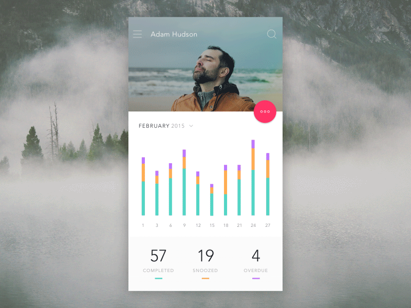
3. The Best UI Animations Are Associative
Transitions should illustrate how elements are connected. Good transitions associate newly created surfaces to the element or action that creates them. The logic behind associative connection is to help the user comprehend the change that has just happened in the view’s layout and what has triggered the change. Below you can see two examples of a layer transition. In the first example, the new layer appears far away from the touch point that triggered it, which breaks its relationship with the input method. In the second example, the new layer appears right from the touch point. Thus tying the element to the point of touch.
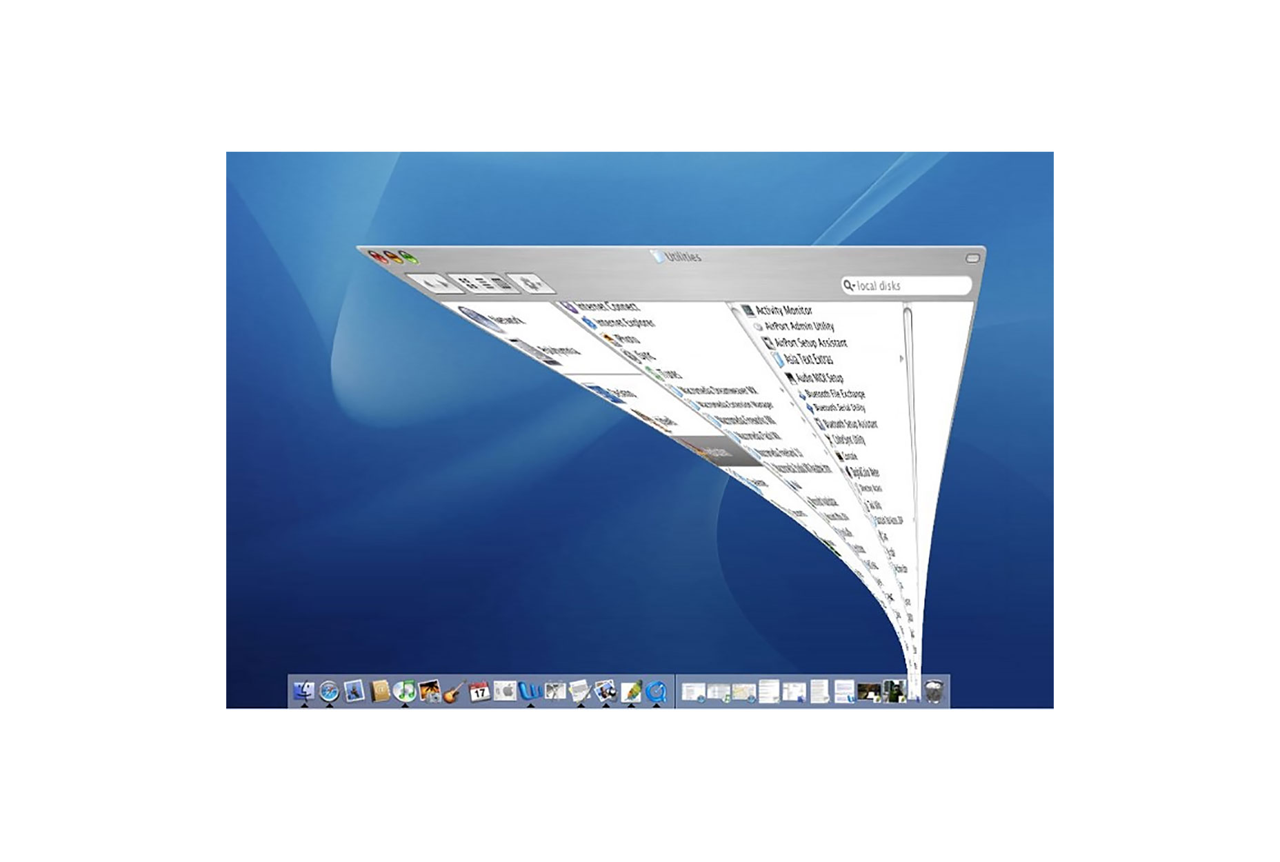
 Another example can be found in Mac OS which uses an animated transition when minimising a window. This animation connects the first state with the second state.
4. Popular UI Animation is Quick
If there’s only one principle of animation you care about it should definitely be timing. Timing is arguably one of the most important considerations when designing transitions. The animation should be quick and precise, with little or no lag time between the user’s initiating action and the beginning of the animation. Also, a user doesn’t have to wait for the animation to finish. In example below, slow animation creates unnecessary lag and lengthens the duration.
 When elements move between states, the movement should be fast enough that it doesn’t cause any waiting, but slow enough that the transition can be understood. For an animation to effectively convey a cause-and-effect relationship between UI elements, the effect must begin within 0.1 seconds of the initial user action to maintain the feeling of direct manipulation. Try to keep animation duration at or under 300ms as fast transitions waste less of the users’ time. Test it with your users to see what is tolerable.
5. The Best UI Animation is Clear
It’s a common mistake to overload UIs with animations or to create too complex interactions. Too much change in a user interface can leave a user disoriented and it takes time to recover from. Remember that every motion on the screen attracts attention, so too much animation at the same time creates chaos. Transitions should avoid doing too much at once because they can get confusing when multiple items need to move in different directions. Remember, less is more with regard to animation and transitions in particular. Anything that if removed would make a cleaner UI is almost certainly a good idea. When a surface changes shape and size, you have to maintain a clear path to the next view. Complex transitions should keep a single element visible. This helps keep the user oriented.Transitions and Accessibility
Since transitions are about visual communication, they by default are not accessible by users with visual impairments. You should provide alternate content for this group of users. webacessibility.com’s best practices for animation offers suggestions on when to provide alternate content for assistive technology.Conclusion
When designing transitions, focus only on the practical things they do for the user. Whether your app or site is fun and playful or serious and straightforward, using meaningful transitions can help you provide a clear and quick cohesive experience.Nick Babich
Fireart Studio is a design studio passionate about creating beautiful design for startups & leading brands. We pay special attention to nuances all the time to create professional while cool products that will not only meet all expectations, but exceed them.


Read Next

3 Essential Design Trends, May 2024
Integrated navigation elements, interactive typography, and digital overprints are three website design trends making…

20 Best New Websites, April 2024
Welcome to our sites of the month for April. With some websites, the details make all the difference, while in others,…

Exciting New Tools for Designers, April 2024
Welcome to our April tools collection. There are no practical jokes here, just practical gadgets, services, and apps to…

14 Top UX Tools for Designers in 2024
User Experience (UX) is one of the most important fields of design, so it should come as no surprise that there are a…
By Simon Sterne

What Negative Effects Does a Bad Website Design Have On My Business?
Consumer expectations for a responsive, immersive, and visually appealing website experience have never been higher. In…

10+ Best Resources & Tools for Web Designers (2024 update)
Is searching for the best web design tools to suit your needs akin to having a recurring bad dream? Does each…
By WDD Staff

3 Essential Design Trends, April 2024
Ready to jump into some amazing new design ideas for Spring? Our roundup has everything from UX to color trends…

How to Plan Your First Successful Website
Planning a new website can be exciting and — if you’re anything like me — a little daunting. Whether you’re an…
By Simon Sterne

15 Best New Fonts, March 2024
Welcome to March’s edition of our roundup of the best new fonts for designers. This month’s compilation includes…
By Ben Moss

LimeWire Developer APIs Herald a New Era of AI Integration
Generative AI is a fascinating technology. Far from the design killer some people feared, it is an empowering and…
By WDD Staff

20 Best New Websites, March 2024
Welcome to our pick of sites for March. This month’s collection tends towards the simple and clean, which goes to show…

Exciting New Tools for Designers, March 2024
The fast-paced world of design never stops turning, and staying ahead of the curve is essential for creatives. As…