

John Gall
John Gall is probably best known for his book cover designs, and his site plays on this. Instead of a standard menu, we get a grid of ‘paperbacks’, each of which is a clickable thumbnail that opens information on the selected project. The thumbnail with his initials opens information on him. [pullquote]If you want to use an approach like this, make sure the work being presented is of the highest quality[/pullquote] It is a very simple, basic design both visually and in behaviour. It has little text content beyond the very briefest information about each piece of work featured, and external and social media links. This site is all about the work; if you want opinions and explanations there are other places that have those. And yet it does not feel cold, overly formal, or lacking in personality. The navigation, such as it is, does not feel difficult or obscure. The content is the navigation, and this gives it a nice hands-on, immersive, feel. Sadly, it’s a little disappointing on mobile as the desktop behaviour is abandoned in favour of previous, next and index buttons at the top of the screen. Doubly disappointing, as the desktop behaviour would work perfectly well on mobile. This stripped back style is difficult to pull off well as it is entirely dependent on the caliber of the work. If you want to use an approach like this, make sure the work being presented is of the highest quality.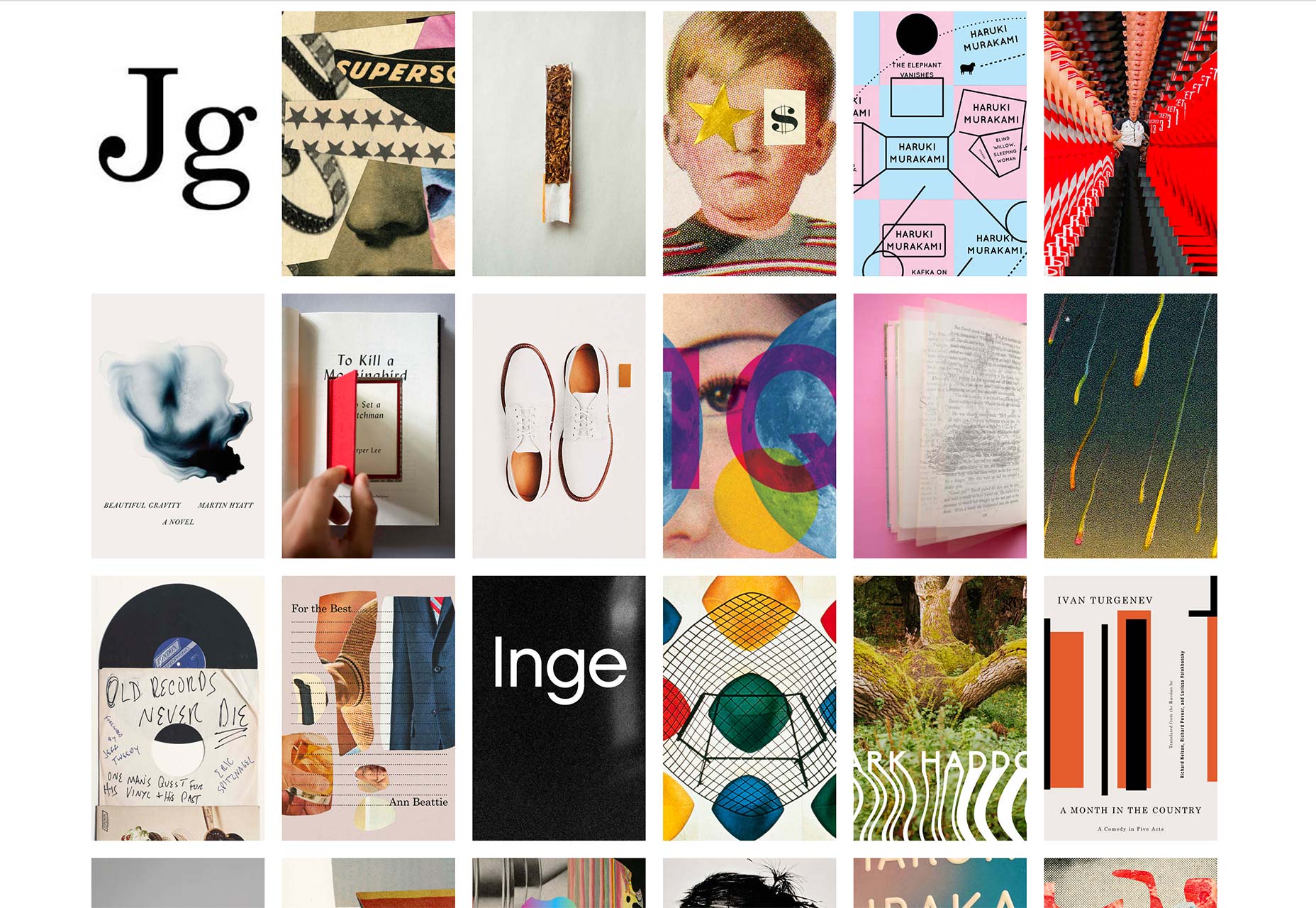
Jordan Sowers
Jordan Sowers’ portfolio site is another good take on thumbnails of work as navigation. Here, the images are layered on top of each other and the user scrolls to move through the stack. Clicking on any item opens a modal with more images and some details. Scrolling through to the bottom of the pile reveals the briefest of career and contact information. The behaviour on mobile is identical, at least as far as the user is aware, which is good to see. As each modal also contains links to all other content modals, as well as a close button, all content feels instantly available from anywhere. The navigation is simple and clear, easy to use but different from the usual, making the site memorable. It evokes a sense of user involvement beyond simply clicking a button, by mimicking the action of flicking through a stack of physical portfolio prints. In fact, the cleverness of the site’s design, and its polished execution, impress as much as any of the work it is showcasing.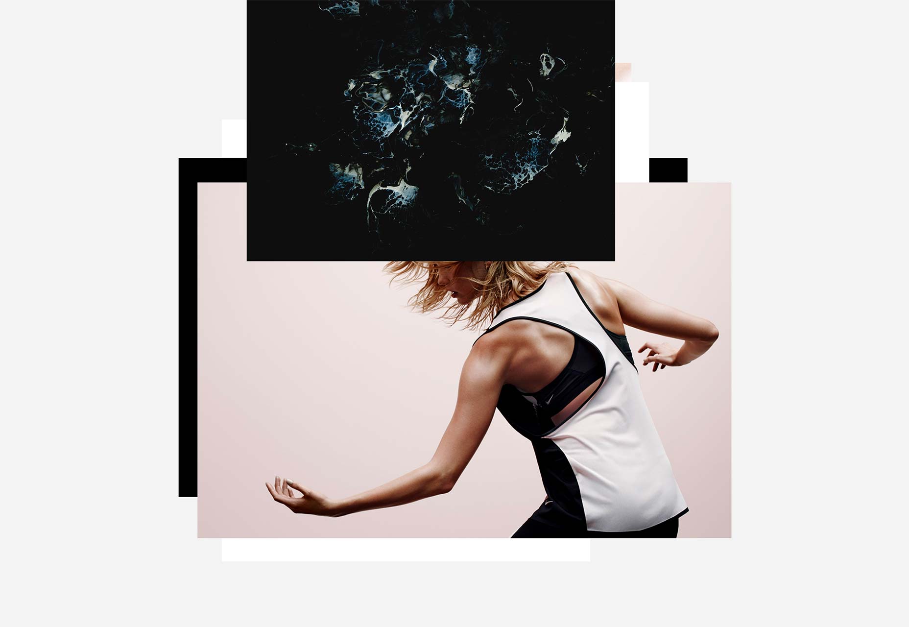
Open Continents
Open Continents is a collection of short films from around the world, and a slowly spinning globe forms the basis of the navigation. An icon in the top left switches views between the globe navigation and a simple horizontal list of links. The list offers the user a simpler process, but it seems lacking in confidence. Accessibility is a good reason to provide a simplified option, but there is very little difference between the two here as far as accessibility is concerned. The instruction below the globe also betrays a lack of confidence in the navigation design, or perhaps it’s a lack of confidence in the user’s intelligence. [pullquote]Navigation should never be so obscure that the user cannot work it out for themselves[/pullquote] This is disappointing. Navigation should never be so obscure that the user cannot work it out for themselves, and in this case it isn’t; the help isn’t necessary. The animated globe looks like it’s meant to be interacted with. In the absence of a traditional menu, the user will explore the screen. The mobile version does not use the spinning globe, just the—this time vertical—list of stories to be scrolled through and selected. On one level, the use of a globe here might seem rather obvious, but it works well and it’s nicely done. ‘Exploring’ the globe creates a sense of connection; the lights visible on the land, and the cloud layer above the earth are lovely details that pull the user in. The effect is to feel as though you are travelling to the countries the stories are from.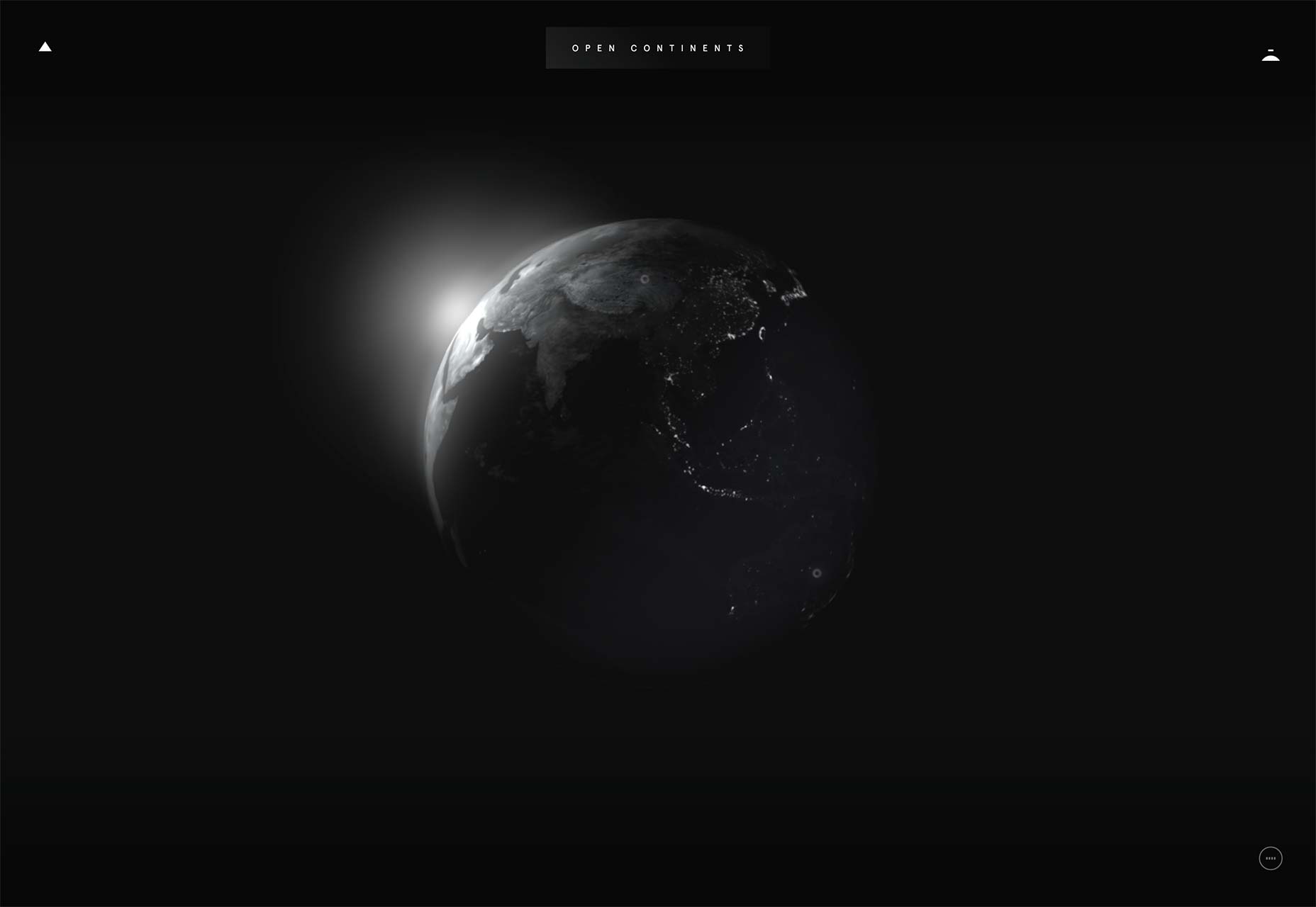
Glamuzina Architects
Glamuzina Architects use the whole home page as a menu with the three main section links spread out over the screen. The projects main page lists featured projects, as text links and as large thumbnails. Because the whole page is the menu, there is no need to resort to a hamburger menu on mobile. While there are some necessary differences in layout, the mobile experience is visually consistent with the desktop. Overall, the experience here is good, and the menu is interesting, integrating nicely with the overall look and feel of the site. However, there are a couple of issues that detract slightly. There is a disorganised feel to the navigation in places, and browsing through the different projects it’s easy to lose your bearings. This isn’t really a problem though, as each page has links to its parent section page, and the home page. More problematic is that external links and some (non menu) internal links open in the current window, with no means of returning except the browser back button. At best this interrupts the flow of content, causing a disjointed experience, and at worst takes the user away from the site. The user could tell the browser to open the link in a new tab or window, but really they shouldn’t have to. Despite this, it’s still a good site. The use of the dot paper background and monospace type creates a stripped back, skeletal feel, allowing the work to really stand out. The navigation and menu are bold and feel modern with an open, rather than linear, narrative.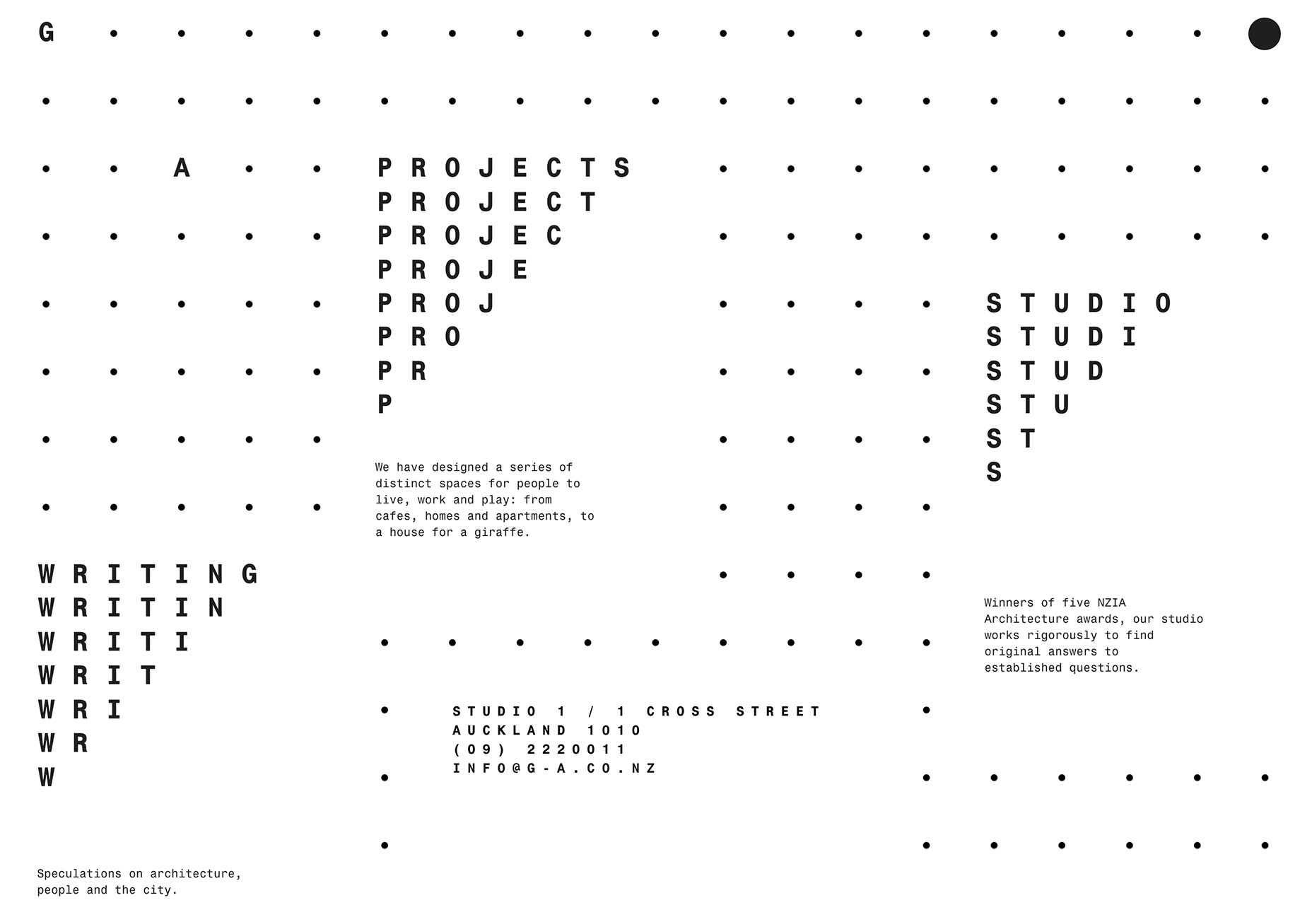
Navigating Responsibly
So far the sites featured have been for the presentation of creative work, which naturally allows, or even demands, a more creative approach. What about more corporate-style sites? Navigating Responsibly has been created for Danish Shipping to outline what its members are doing to lessen the impact of the shipping industry on the environment. As such it involves a lot of facts and figures, which while important, can make for pretty dry content. The site content is organised into a single page split into sections, with links to read more, or case studies. Each section can be scrolled to or accessed with the menu. [pullquote]the design achieves the often elusive effect of being corporate and human at the same time[/pullquote] The menu takes its visual cue from Danish Shipping’s logo, which represents the morse code for DK (the ISO 2 letter code for Denmark). The opening loading animation becomes the menu, indicating that the site is now ready to be explored. By turning to text on hover, and changing color in the down state, the menu dashes are both functionally clear and visually minimal. On mobile, a hamburger menu icon is used, but in this case it actually fits in with the overall visual style. This site does a really nice job of organising and presenting its content in an appealing way, with added interest from animation. Because the animation is used primarily to enhance the navigation—defining section headings and giving movement to the menu—it is purposeful, not just decorative. The architecture has been carefully worked out and the overall feel is well organised, businesslike and clear. The menu adds a playful element, with movement reminiscent of fish swimming, while the section heading animations resemble waves. As a result, the design achieves the often elusive effect of being corporate and human at the same time.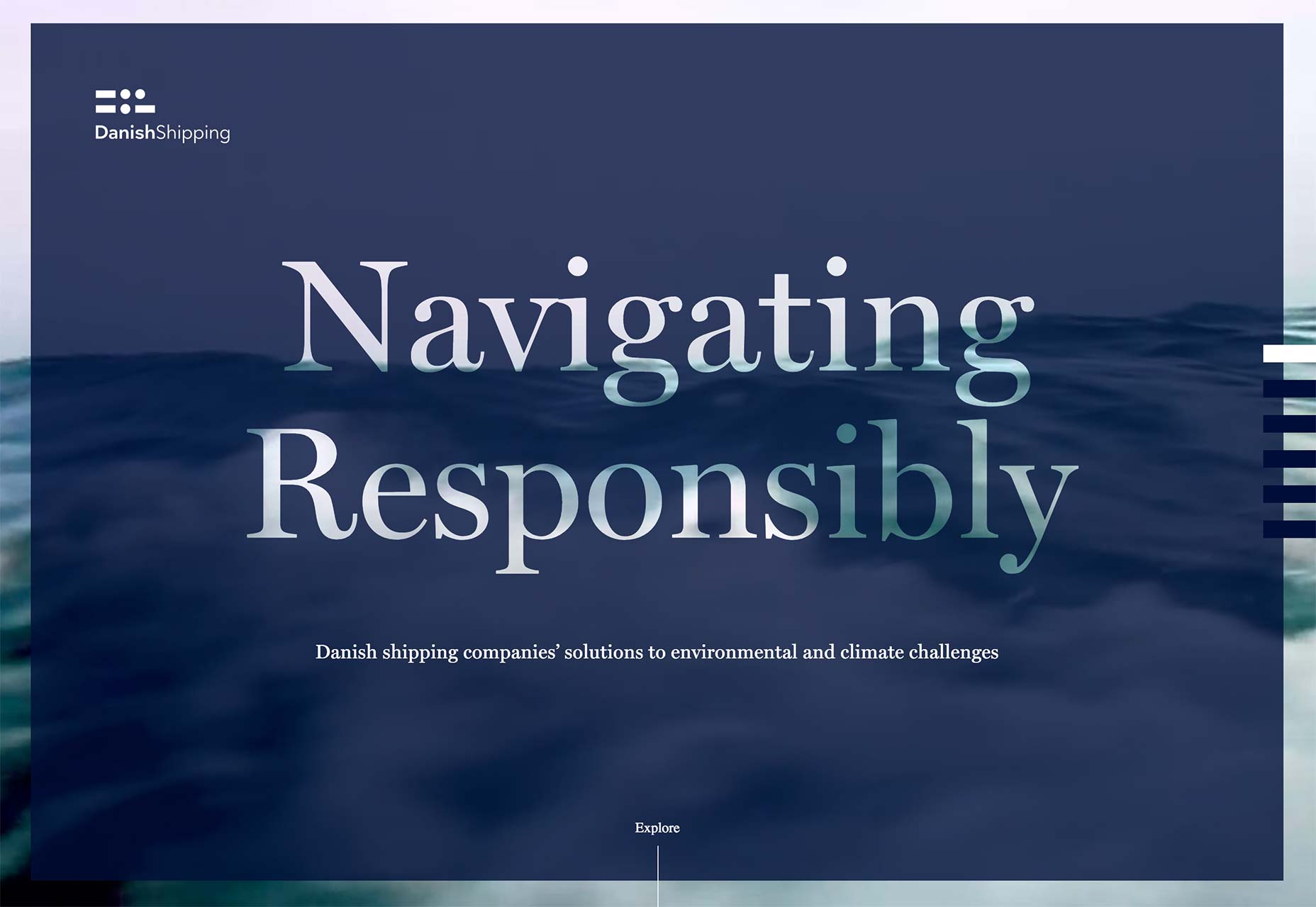
Sagmeister & Walsh
This last is not an example of innovative navigation, but it is oddly compelling nevertheless. For the most part this site employs a fairly bog standard horizontal menu in a sticky header, with a second level menu sliding down under it on those pages where it’s required. So far so ordinary, especially as it changes to hamburger-icon-opens-to-list on mobile. The fun/slightly weird and uncomfortable bit is on the homepage. There is a view of part of the Sagmeister & Walsh offices with what look, and work, like menu buttons added over the top. At least this is what it looks like if you first see this page at, say, 9:30am GMT. Look at it again at 11:30am EST and you will realise that those “buttons” are lit signs, and you are seeing real people working, live (almost). Clicking to the right changes the view to show another part of the office, with the menu painted on the front of the desks. It’s a gimmick, it doesn’t enhance the navigation at all, but it is memorable. Sitting at your desk in front of a computer watching somebody somewhere else sitting in front of a computer sounds just weird, but I guarantee you will do it, even just for 5 minutes. The previous sites all introduce a level of user involvement, but this is on a different level entirely. You are literally watching them work.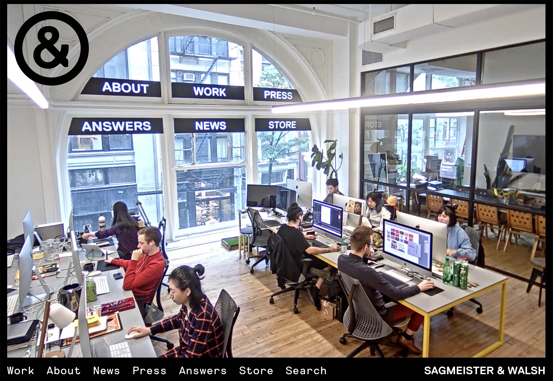
Conclusion
[pullquote]Good navigation is inconspicuous, great navigation creates a memorable user experience[/pullquote] Navigation is integral to the UX of a site, because the curation of the navigation creates the framework for the user’s experience. Navigation should guide the user through the content in a way that is either logical or narrative, depending on the site’s purpose. The sites examined here have all gone beyond simply ‘click here for x’, and have attempted to create an enjoyable, memorable, experience for the user. Good navigation is inconspicuous, great navigation creates a memorable user experience.Paddi MacDonnell
Paddi MacDonnell is a designer and entrepreneur from Northern Ireland, follow her on Twitter.


Read Next

3 Essential Design Trends, May 2024
Integrated navigation elements, interactive typography, and digital overprints are three website design trends making…

20 Best New Websites, April 2024
Welcome to our sites of the month for April. With some websites, the details make all the difference, while in others,…

Exciting New Tools for Designers, April 2024
Welcome to our April tools collection. There are no practical jokes here, just practical gadgets, services, and apps to…

14 Top UX Tools for Designers in 2024
User Experience (UX) is one of the most important fields of design, so it should come as no surprise that there are a…
By Simon Sterne

What Negative Effects Does a Bad Website Design Have On My Business?
Consumer expectations for a responsive, immersive, and visually appealing website experience have never been higher. In…

10+ Best Resources & Tools for Web Designers (2024 update)
Is searching for the best web design tools to suit your needs akin to having a recurring bad dream? Does each…
By WDD Staff

3 Essential Design Trends, April 2024
Ready to jump into some amazing new design ideas for Spring? Our roundup has everything from UX to color trends…

How to Plan Your First Successful Website
Planning a new website can be exciting and — if you’re anything like me — a little daunting. Whether you’re an…
By Simon Sterne

15 Best New Fonts, March 2024
Welcome to March’s edition of our roundup of the best new fonts for designers. This month’s compilation includes…
By Ben Moss

LimeWire Developer APIs Herald a New Era of AI Integration
Generative AI is a fascinating technology. Far from the design killer some people feared, it is an empowering and…
By WDD Staff

20 Best New Websites, March 2024
Welcome to our pick of sites for March. This month’s collection tends towards the simple and clean, which goes to show…

Exciting New Tools for Designers, March 2024
The fast-paced world of design never stops turning, and staying ahead of the curve is essential for creatives. As…