

- Matt Chwat, Director of User Experience at ThinkGeek. Matt’s been at ThinkGeek, the Internet’s #1 largest (and nerdiest) online store, for nine years. He’s as much a front end developer as he is a UX designer.
- Kevin Clark, Design Lead at Shopify. Kevin Clark is the Design Lead at Shopify’s Montreal-based purchase experience design team. He oversees the team responsible for the checkout experience across the ecommerce platform. As soon as a user clicks the cart icon, you’ve entered the domain of Kevin’s team. Everything from email receipts, merchant-customer interactions, to the live order status page—if you’re purchasing something on a Shopify site, odd’s are, Kevin and his team had a hand in it.
- Catherine Ho, Senior UX Designer at REI. Formerly at Intuit, Catherine’s been with REI for two years in Seattle. She loves UX because it focuses on people and it’s both technical and creative. Her role at REI is hybrid between research and design. Her projects have included in-store devices, such as an iPod touch for the POS system, iOS apps and membership and accounts, specifically redesigning the sign-in and wishlist experiences.
1. Shopify’s three gold standards of the checkout experience: easy to understand, simple, and fast
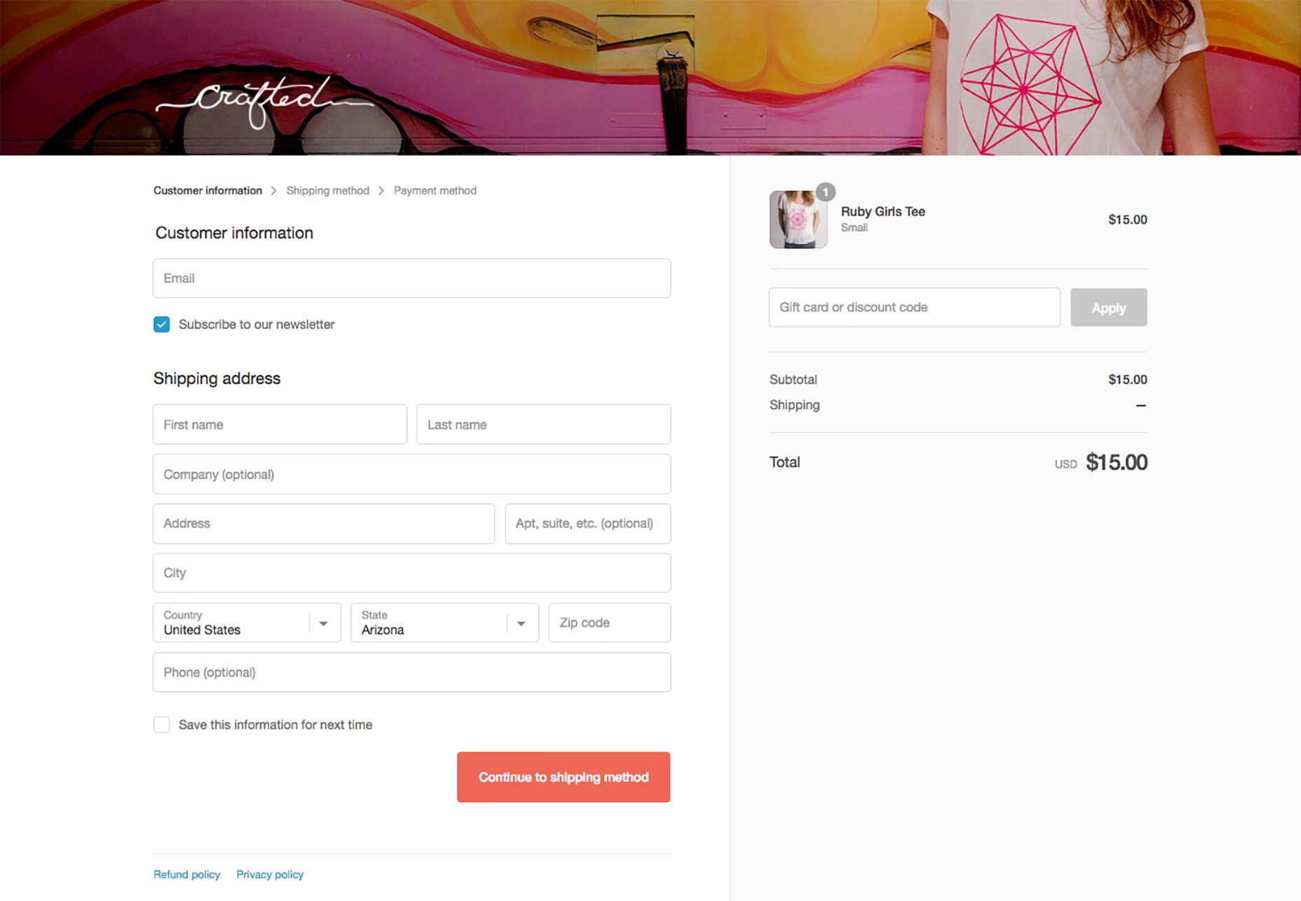
In 2016, Kevin Clark and his team were responsible for redesigning the checkout experience for all Shopify sites. That’s almost half a million stores. As a chart-topper in the ecommerce space, expectations were high. Working closely with the Themes team, Kevin and his team focused on the standardizing a universal Shopify checkout experience. It’s the same in all Shopify themes.Users need to feel secure and comfortable when dealing with money. The checkout experience needed to be consistent and familiar across all online stores.—Kevin Clark, Shopify Beyond the foundational sense of security, the Shopify purchase experience should be easy to understand, simple, and fast. The best way to design something as transactional and process-driven as the checkout is to test everything. For example, to test an assumption about how many steps should be in the checkout experience, he and his team conducted a test comparing one-page, two-page, and three-page experiences — each with the same information. Example of single page checkout:
 Example of a two-page checkout:
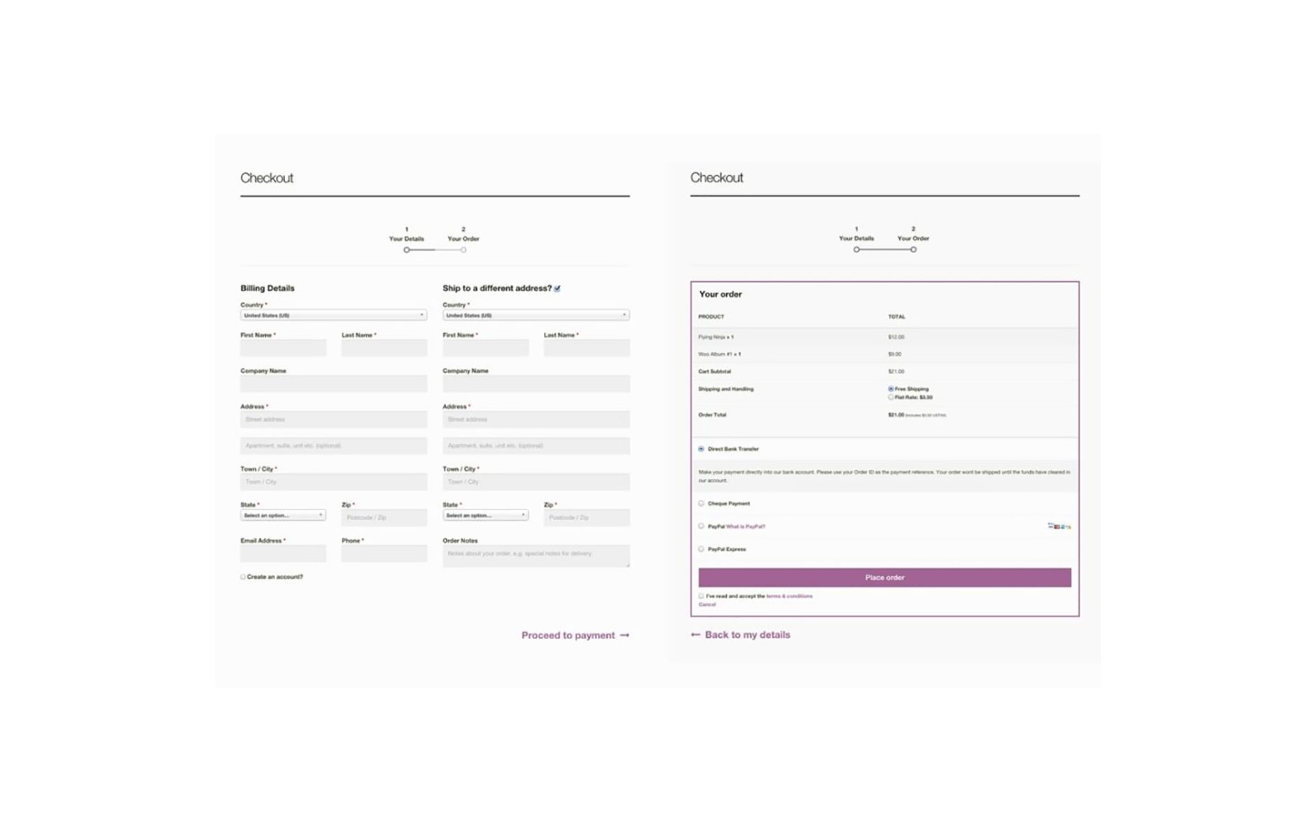 The results showed one page felt overwhelming to the user because it presented too much information on one page, two pages divided the steps awkwardly, and three pages felt simple and easy.
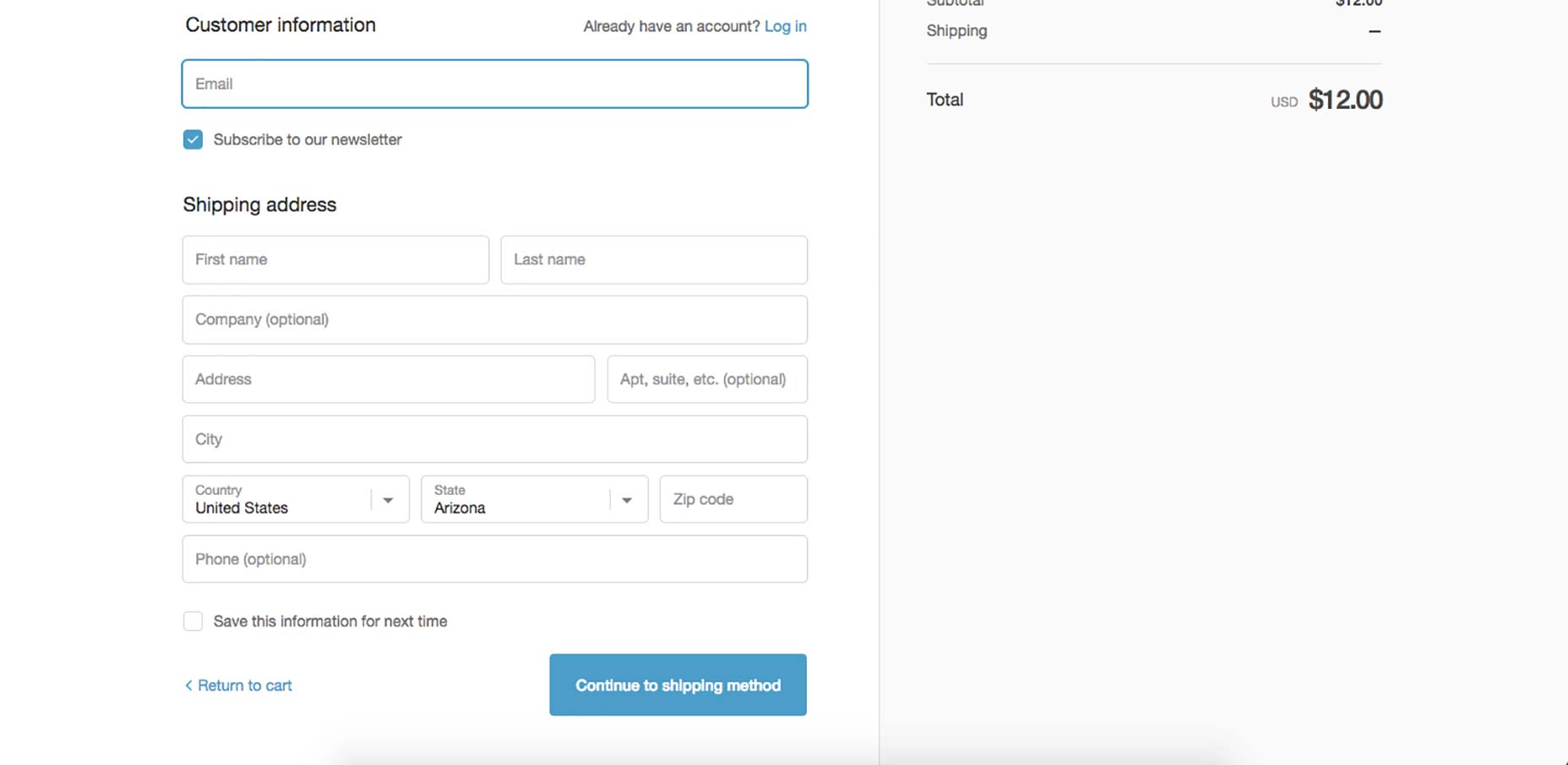
The three steps are Customer Information, Shipping Method, and Payment:
The results showed one page felt overwhelming to the user because it presented too much information on one page, two pages divided the steps awkwardly, and three pages felt simple and easy.
The three steps are Customer Information, Shipping Method, and Payment:
We learned that by grouping relevant information together in chunks, and putting it in a logical order, you allow the user to focus on one task at a time. There is, however, a limit. You don’t want to go too far, like having a ten step checkout experience.—Kevin Clark, Shopify These three steps are set in stone across all sites. But other than that, store owners are permitted a handful of customizations to match their brand.
We looked at thousands and thousands of stores and determined that we can replicate almost every store’s design by giving the user five default customization choices: fonts, accent colors, button colors, header image, and the logo.But with customizations, Kevin recommends not overdoing it:
Don’t give users so much rope that they hang themselves.Rather, there should be controls set in place to protect a baseline experience that is consistent, familiar, and secure. An example of this is the Shopify system knows which colors to use and not use based on a contrast algorithm (i.e., light text on dark background) and adjusts for readability. The checkout system Kevin and his team created laid the foundation for future work to be built on top of it. It’s a component-based system, so new components can be added, such as fields and button elements, and features can be modified or added, without overhauling the entire system.
2. The ultimate goal: “frictionlessness”
The father of Windows and Internet Explorer, former Microsoft-legend Steven Sinofsky currently advises companies like Product Hunt, Box, and sits on the board of Andreessen Horowitz. He is a designer at heart and a master of product development. In his post Frictionless Product Design, he pointed out the difference between minimalism and frictionless design. He wrote that while minimalist design reduces the surface area of an experience, frictionless design is about reducing the energy required by an experience. This is especially important in checkout design. He gives 6 principles of frictionless design:- Decide on a default rather than options
- Create one path to a feature or task
- Offer personalization rather than customization
- Stick with changes you make
- Build features, not futzers
- Guess correctly all the time
 The data analytics showed no difference in traffic or drop-offs, so they kept it. Visitors could sign in and continue shopping from the same page without losing their sense of place. This is an example of Sinofsky’s #2 principle: Create one path to a feature or task. Instead of creating a fork in the road to sign in or continue shopping, the user’s path is unilateral.
It’s worth mentioning Sinofsky’s #5 principle here as well: Build features, not futzers. What the heck is a “futzer?”
A futzer is the word “futzing” (which probably sounds more familiar to you) cleverly disguised as a noun. It’s a thing that causes pointless fiddling around and wasted time.
This is where designers get tripped up. How do you determine the difference between a feature and a futzer? As Sinofsky alludes, it requires a delicate balance of giving the user what they want but not so much that it overwhelms them.
A great way to illustrate this is to look at the top reasons shoppers abandon their shopping carts. I’d like to highlight two cart abandonment studies and pull insights from both.
In the first study (2013), payment processing company Worldpay surveyed why people left their online shopping carts without paying.
Six of the reasons given are related to this balance between features and futzers. Check it out:
The data analytics showed no difference in traffic or drop-offs, so they kept it. Visitors could sign in and continue shopping from the same page without losing their sense of place. This is an example of Sinofsky’s #2 principle: Create one path to a feature or task. Instead of creating a fork in the road to sign in or continue shopping, the user’s path is unilateral.
It’s worth mentioning Sinofsky’s #5 principle here as well: Build features, not futzers. What the heck is a “futzer?”
A futzer is the word “futzing” (which probably sounds more familiar to you) cleverly disguised as a noun. It’s a thing that causes pointless fiddling around and wasted time.
This is where designers get tripped up. How do you determine the difference between a feature and a futzer? As Sinofsky alludes, it requires a delicate balance of giving the user what they want but not so much that it overwhelms them.
A great way to illustrate this is to look at the top reasons shoppers abandon their shopping carts. I’d like to highlight two cart abandonment studies and pull insights from both.
In the first study (2013), payment processing company Worldpay surveyed why people left their online shopping carts without paying.
Six of the reasons given are related to this balance between features and futzers. Check it out:
- "Website navigation too complicated" ... Too many futzers.
- "Process was taking too long" ... Too many futzers.
- "Excessive payment security checks" ... Too many futzers.
- "Concerns about payment security" ... Not enough features.
- "Delivery options were unsuitable" ... Not enough features.
- "Price presented in a foreign currency" ... Not enough features.
The qualitative 1:1 moderated usability testing and eye-tracking research of the checkout study showed that an ideal checkout flow can be reduced to as little as 12 form elements (7 form fields, 2 checkboxes, 2 drop-downs, and 1 radio button interface).
How many form elements does your checkout have? Anything more than 12 may indicate the presence of futzers in your checkout flow. How do you cut down the number of form elements? Unique testing is the ultimate answer, but, for now, the next steps will suffice.3. Maintaining Data
Here’s a question to ask your checkout designers: how are you leveraging data throughout the checkout process? Matt at ThinkGeek believes the best checkout experiences collect only the necessary data and then maintain that data all the way through the end of the transaction:This is especially important for account holders. Don’t ask for email again, and pre-fill the name when you already have it.If your database has information about a customer, use it to reduce the number of fields he or she has to fill out. Amazon’s One-Click purchase feature is a prime example of this.
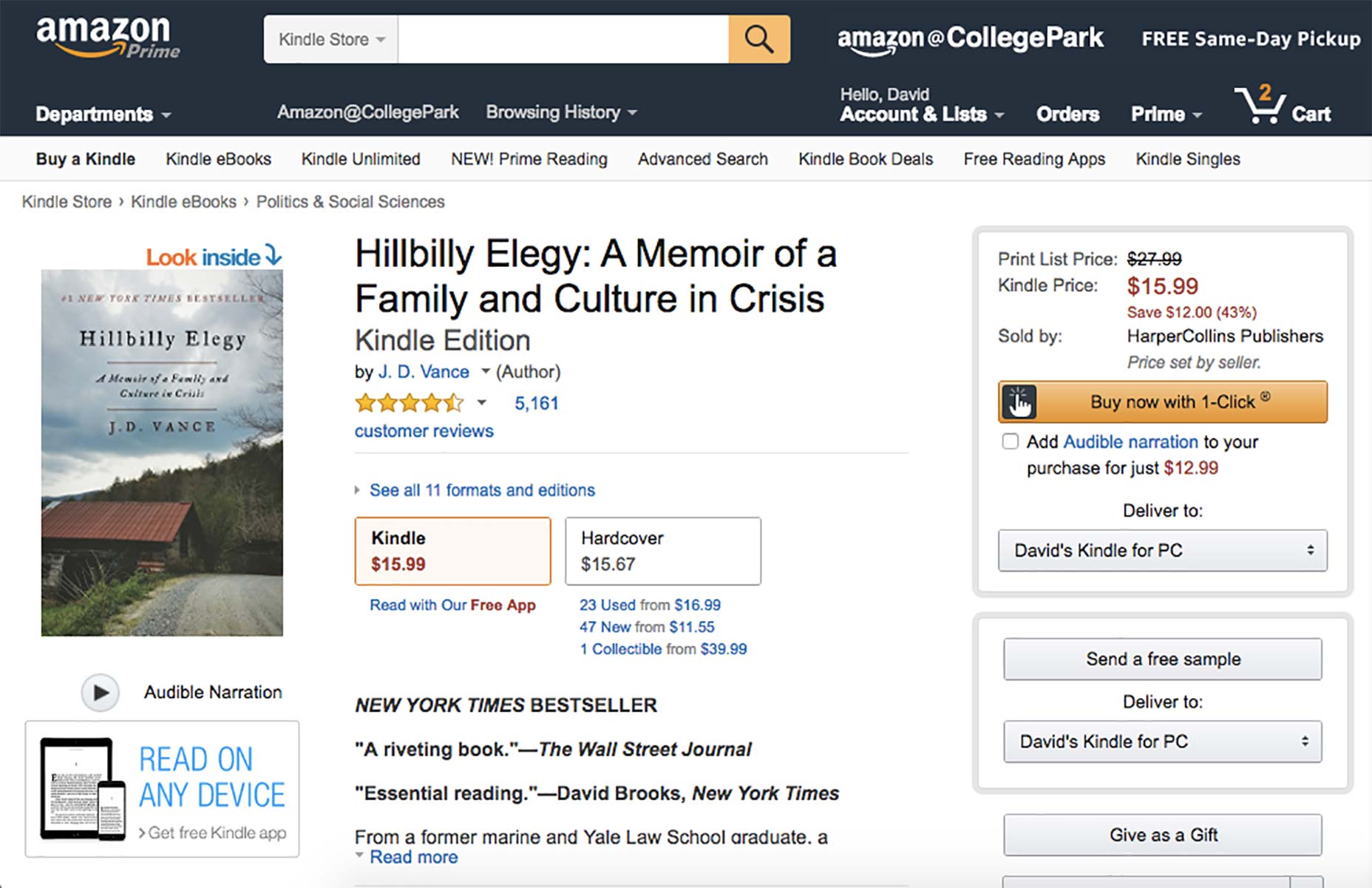 By knowing the customer’s data, it can correctly “guess” the user’s preferred shipping mode, address, and payment details with zero added effort from the user. With a one-click-one-sale checkout, there are no opportunities for chokepoints.
Shopify maintains data with “checkpoints.” Meaning, if a user proceeds through Shipping but drops out during Payment, the collected data is maintained and the user can pick up their journey right where they left off.
By knowing the customer’s data, it can correctly “guess” the user’s preferred shipping mode, address, and payment details with zero added effort from the user. With a one-click-one-sale checkout, there are no opportunities for chokepoints.
Shopify maintains data with “checkpoints.” Meaning, if a user proceeds through Shipping but drops out during Payment, the collected data is maintained and the user can pick up their journey right where they left off.
4. Forgiving Design
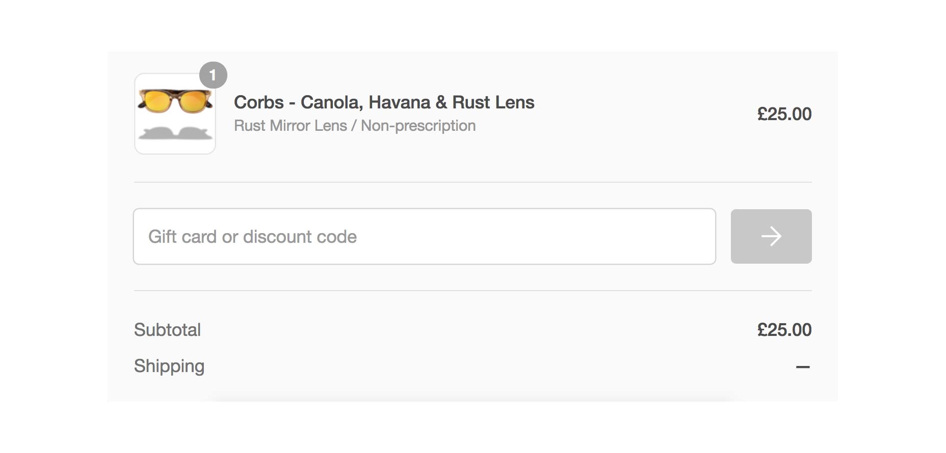
The final common thread between all three brands was the idea of “forgiving design”—where the designer’s goal is to prevent any mistakes in the checkout process. Instead of being strict on mistakes, great checkouts let users get away with being, for lack of a better word, lazy. Below are three examples of “forgiving design” in the checkout flow: 1) adding gift cards and discounts, 2) disabling the “Submit” button, and 3) inputting phone numbers. In the first example, all three brands have gift cards and discounts—well-established tools for closing sales online. But typically, it’s not always clear where to input the codes or redeem the cards. According to Kevin Clark:Usually, they’re two separate fields and people mismatch them all the time.At Shopify, a significant engineering effort allowed users to paste in a gift card or discount code into the same field and the system sorts it out automatically. It’s impossible to make a mistake.
 Second, sometimes shops will disable or “gray out” the submit/continue button until a user completes all required fields.
Should you do this? It’s a heated debate in the UX community about whether to leave the submit/continue button enabled, but according to the unofficial research of one user on Stack Exchange, around 5% or less of a small sampling of websites keep the submit/continue button disabled.
At Shopify, ThinkGeek, and REI, the submit/continue button is always enabled, even with missing information. Why? For three reasons:
Second, sometimes shops will disable or “gray out” the submit/continue button until a user completes all required fields.
Should you do this? It’s a heated debate in the UX community about whether to leave the submit/continue button enabled, but according to the unofficial research of one user on Stack Exchange, around 5% or less of a small sampling of websites keep the submit/continue button disabled.
At Shopify, ThinkGeek, and REI, the submit/continue button is always enabled, even with missing information. Why? For three reasons:
- It prevents user confusion. The “grayed out” button tells a shopper something is wrong but doesn’t indicate where exactly and sends the user on a blind hunt for the error. An active button would convey clickability which would then result in a simple message (often in red) on the field needing a valid input.
- It’s accessible. In some instances (rare), a user may have Javascript disabled in their browser which would prevent the dynamic state change of the button from disabled to enabled.
- It prevents developer error. A valid use case or input that should have activated the submit/continue button could have been missed (i.e., internationality), trapping the shopper with no options but to refresh or exit.
 Warby Parker does a great job in turning what would usually be an annoyance into a chance to cleverly express some brand personality.
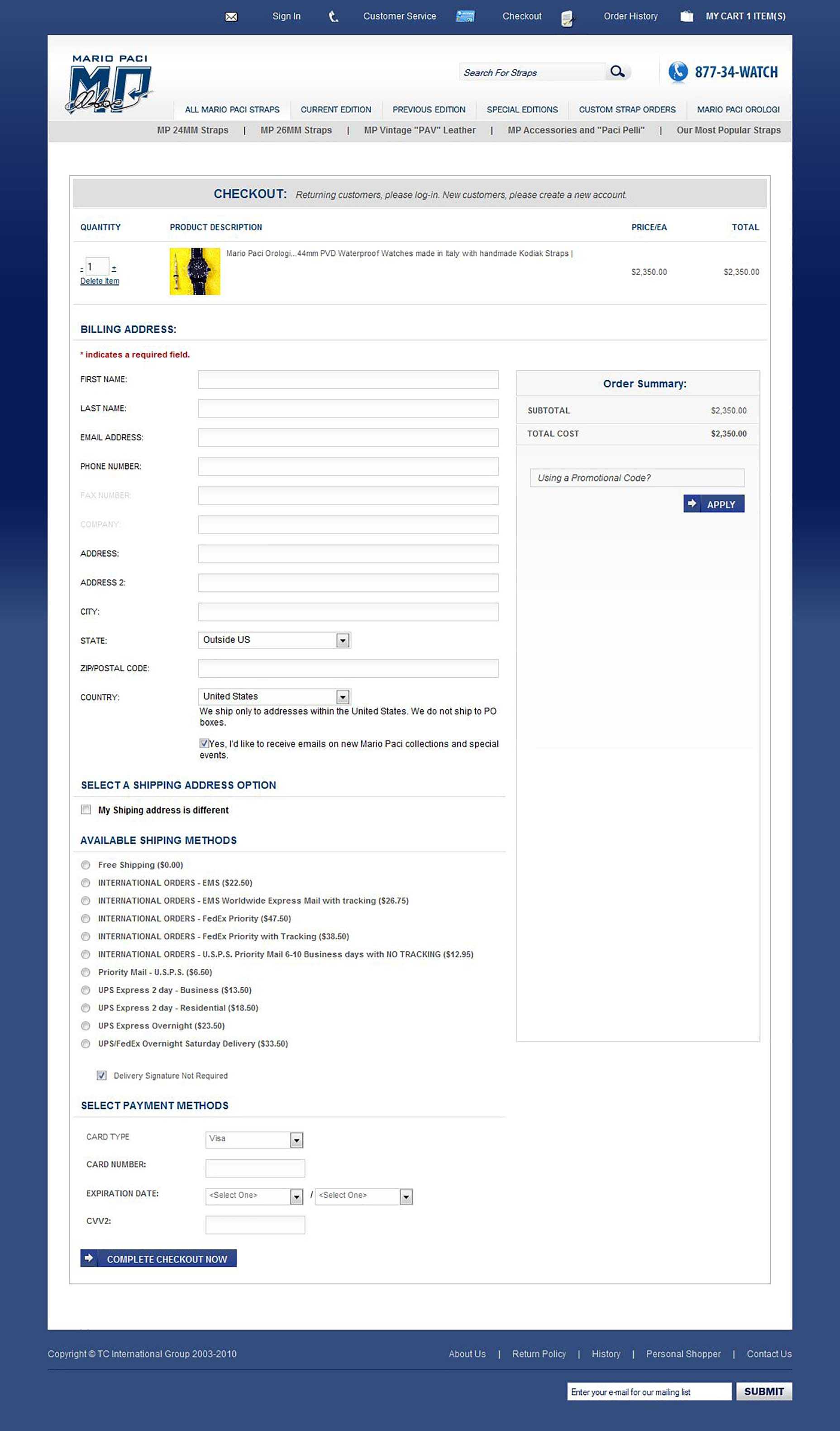
 The ThinkGeek checkout page maintains an active “Go to checkout” blue button even when fields are empty.
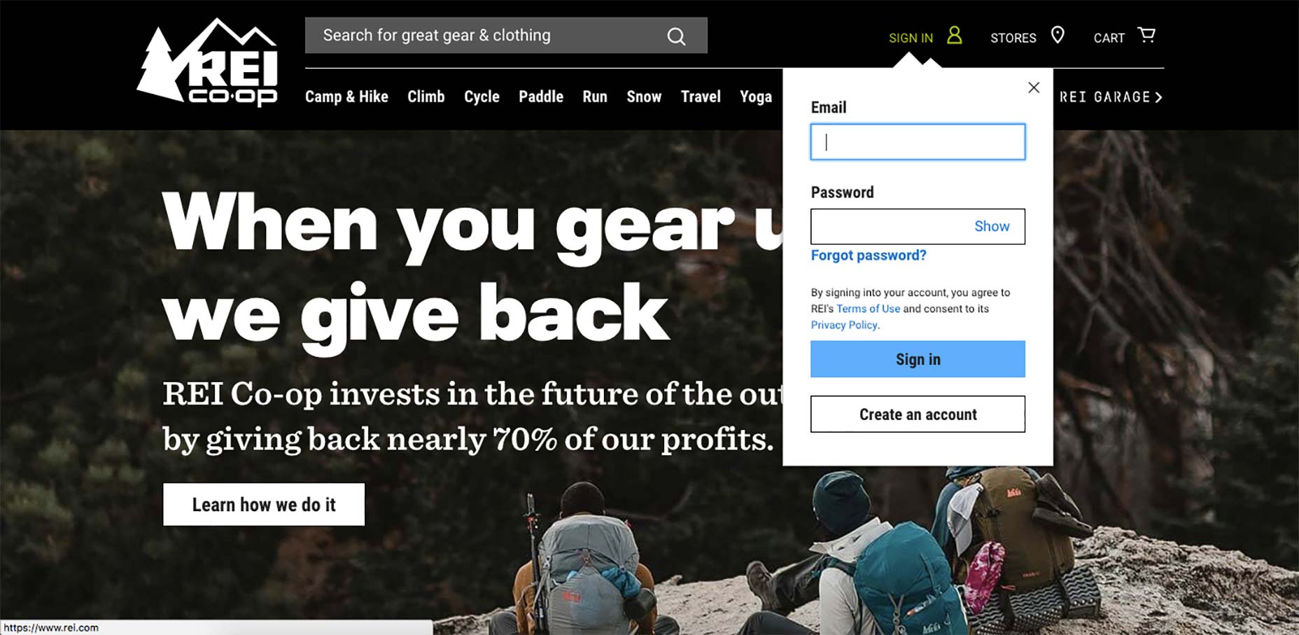
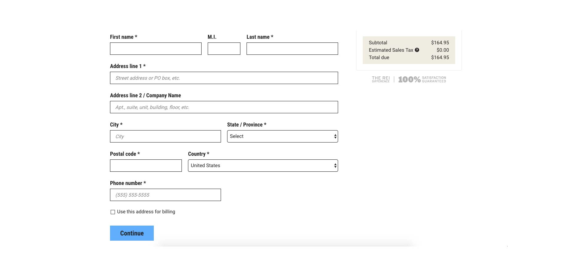 The “Continue” blue button is active on the empty REI checkout page.
 All Shopify stores keep the blue “Continue to shipping method” button active at all times.
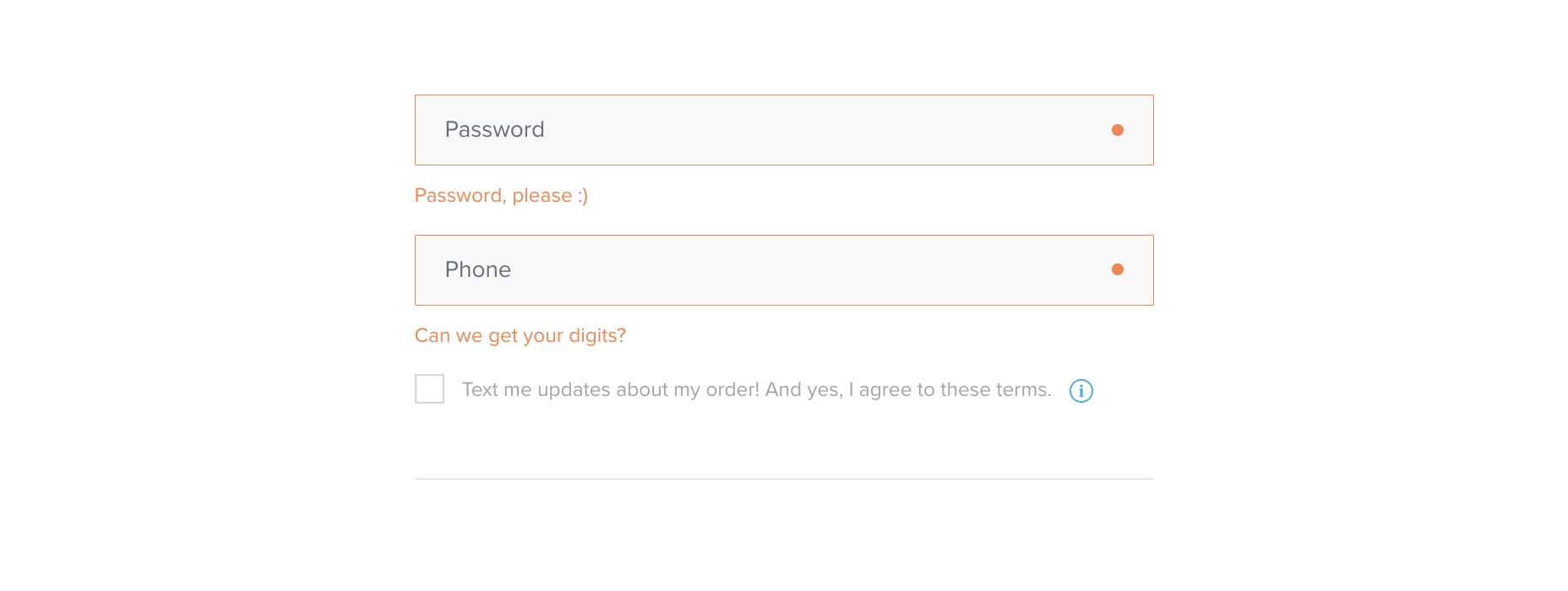
Lastly, the third example of forgiving design is phone numbers. One user posted the following problem on Stack Exchange:
Currently on my website users are required to input their phone number in a very specific format (555-555-5555). If you forget the dashes it breaks. Does anyone have a good suggestions for how to be more flexible with allowing users to input in any way they choose, but still allowing the system to validate if it is a real phone number. How are phone extensions handled?
Unforgiving design requires this specific format (i.e., number of characters, dashes vs. periods, spaces). Forgiving design allows users to input it how they want and let the system figure out what the number is.
By allowing for maximum flexibility in typing a phone number, the user is less likely to “make mistakes.”
Another user responded with how to fix this, using forgiving design:
The best approach for user experience is to let the user type in the phone number using the format they are most comfortable with. Don’t break it into separate fields, don’t force a mask, let it be typed freeform. Then, after the user has finished entering the field (by leaving the field for submitting the data), format the number into a standard format for your purposes.
Since you are talking about a Web site, you can do the format on the blur event using the Google libphonenumber http://code.google.com/p/libphonenumber/ project. This tool handles international phone numbers and a wide variety of formats.
The reason this approach is better for the user experience is that it allows the user’s mental model to remain unchanged and allows them to say, “Don’t Make Me Think.” Masking and separate fields force a mental model of phone numbers onto users and requires more thinking.
Similar to the gift cards example, phone numbers should be accepted in any format so that shoppers can proceed “without thinking” or wondering if they were correct.
Forgiving design allows you to reduce the number of fields in your checkout flow, thus helping to eliminate the complaint that 1 in 4 shoppers voiced in Baymard’s checkout usability study (too long / complicated checkout process)
All Shopify stores keep the blue “Continue to shipping method” button active at all times.
Lastly, the third example of forgiving design is phone numbers. One user posted the following problem on Stack Exchange:
Currently on my website users are required to input their phone number in a very specific format (555-555-5555). If you forget the dashes it breaks. Does anyone have a good suggestions for how to be more flexible with allowing users to input in any way they choose, but still allowing the system to validate if it is a real phone number. How are phone extensions handled?
Unforgiving design requires this specific format (i.e., number of characters, dashes vs. periods, spaces). Forgiving design allows users to input it how they want and let the system figure out what the number is.
By allowing for maximum flexibility in typing a phone number, the user is less likely to “make mistakes.”
Another user responded with how to fix this, using forgiving design:
The best approach for user experience is to let the user type in the phone number using the format they are most comfortable with. Don’t break it into separate fields, don’t force a mask, let it be typed freeform. Then, after the user has finished entering the field (by leaving the field for submitting the data), format the number into a standard format for your purposes.
Since you are talking about a Web site, you can do the format on the blur event using the Google libphonenumber http://code.google.com/p/libphonenumber/ project. This tool handles international phone numbers and a wide variety of formats.
The reason this approach is better for the user experience is that it allows the user’s mental model to remain unchanged and allows them to say, “Don’t Make Me Think.” Masking and separate fields force a mental model of phone numbers onto users and requires more thinking.
Similar to the gift cards example, phone numbers should be accepted in any format so that shoppers can proceed “without thinking” or wondering if they were correct.
Forgiving design allows you to reduce the number of fields in your checkout flow, thus helping to eliminate the complaint that 1 in 4 shoppers voiced in Baymard’s checkout usability study (too long / complicated checkout process)
5. Common checkout design mistakes to avoid
Finally, the three ecommerce experts each mentioned and cautioned against three simple errors they’ve encountered when designing checkouts: Mistake #1: Don’t include an order review. Put yourself in the shoes of a customer who tediously fills out their information only to find themselves doubting they ordered the right item or quantity. Not seeing a chance to review their order before purchase will lead them to bail and start over, or worse, give up. REI keeps the shopper informed throughout the entire checkout process with a floating "Order Summary" box and a clear opportunity to review before placing the order.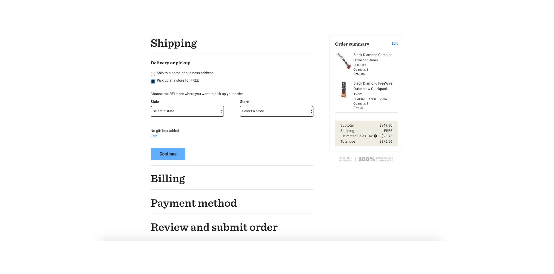 In addition to displaying the order summary on the right perpetually throughout the checkout process, REI incorporates a final review alongside placing the order.
Mistake #2: Unhelpful error messages. It’s easy for a customer to enter information incorrectly in the checkout forms. Rather than just displaying “Invalid” or similar unspecific copy, use adaptive error messaging. ThinkGeek’s error messages update live from “This field is required.” to “Please enter a valid [blank]” to show the customer where and why the error is occuring.
In addition to displaying the order summary on the right perpetually throughout the checkout process, REI incorporates a final review alongside placing the order.
Mistake #2: Unhelpful error messages. It’s easy for a customer to enter information incorrectly in the checkout forms. Rather than just displaying “Invalid” or similar unspecific copy, use adaptive error messaging. ThinkGeek’s error messages update live from “This field is required.” to “Please enter a valid [blank]” to show the customer where and why the error is occuring.
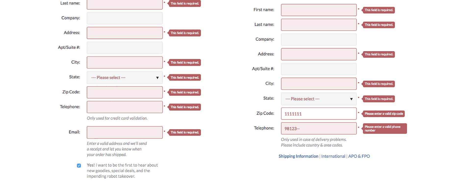 ThinkGeek adapts its error messages to indicate more specific instructions.
Mistake #3: Not mobile-friendly. If you’re selling online, this is a no-brainer. Please. If you have an online checkout, don’t put your customers through the pain of zooming in and out, panning around, and squinting at an unresponive checkout.
ThinkGeek adapts its error messages to indicate more specific instructions.
Mistake #3: Not mobile-friendly. If you’re selling online, this is a no-brainer. Please. If you have an online checkout, don’t put your customers through the pain of zooming in and out, panning around, and squinting at an unresponive checkout.
Takeaways and action items
Checkouts are a part of every ecommerce experience. As the final step before a product is purchased, you don’t want anything to go wrong. I was glad to hear from Matt, Kevin, and Catherine about the five principles they follow to design their customers’ online shopping path:- For the best checkout experience, make sure your checkout design is consistent, familiar, and secure. Does your checkout give the user a sense of familiarity and security?
- The ultimate goal is frictionlessness. Go over Sinofsky’s 6 principles and assess your checkout experience, paying special attention to #2 and #5. Are there any features missing or can any futzers be removed?
- As your user goes through the purchasing process, maintain their data to make it easy and intuitive. But remember, if you can’t guess correctly every time, don’t guess. What data do you already have that you can use to save the user keystrokes and streamline the purchase process?
- Use forgiving design so that users don’t feel like they’ve made a mistake. It’s worth the extra effort to build in forgiving functionality when you see increased conversions. Do you have analytics plugged into your checkout? Where is the greatest point of abandonment? How can you remove this obstacle?
- Avoid simple mistakes. Even the best designers are not invincible to overlooking details, especially when it comes to something as “boring” as checkout design. Periodically, go through the your site’s checkout process in incognito mode on a desktop, tablet, and mobile device and ask yourself, “Could this be easier? Simpler? More intuitive?”
Dave Schools
Dave Schools is a self-published author of Runaway Millionaire, founder of the top Medium publication Entrepreneur's Handbook, creator of the Party Qs questions app, and columnist for Inc.com. He moves to a new city in the United States every three months, working out of local coffee shops and rock climbing gyms. He enjoys imaginative word juxtapositions and tries to write witty jokes on Reddit. Follow Dave on Twitter @DaveSchoools.


Read Next

20 Best New Websites, April 2024
Welcome to our sites of the month for April. With some websites, the details make all the difference, while in others,…

Exciting New Tools for Designers, April 2024
Welcome to our April tools collection. There are no practical jokes here, just practical gadgets, services, and apps to…

14 Top UX Tools for Designers in 2024
User Experience (UX) is one of the most important fields of design, so it should come as no surprise that there are a…
By Simon Sterne

What Negative Effects Does a Bad Website Design Have On My Business?
Consumer expectations for a responsive, immersive, and visually appealing website experience have never been higher. In…

10+ Best Resources & Tools for Web Designers (2024 update)
Is searching for the best web design tools to suit your needs akin to having a recurring bad dream? Does each…
By WDD Staff

3 Essential Design Trends, April 2024
Ready to jump into some amazing new design ideas for Spring? Our roundup has everything from UX to color trends…

How to Plan Your First Successful Website
Planning a new website can be exciting and — if you’re anything like me — a little daunting. Whether you’re an…
By Simon Sterne

15 Best New Fonts, March 2024
Welcome to March’s edition of our roundup of the best new fonts for designers. This month’s compilation includes…
By Ben Moss

LimeWire Developer APIs Herald a New Era of AI Integration
Generative AI is a fascinating technology. Far from the design killer some people feared, it is an empowering and…
By WDD Staff

20 Best New Websites, March 2024
Welcome to our pick of sites for March. This month’s collection tends towards the simple and clean, which goes to show…

Exciting New Tools for Designers, March 2024
The fast-paced world of design never stops turning, and staying ahead of the curve is essential for creatives. As…

Web Tech Trends to Watch in 2024 and Beyond
It hardly seems possible given the radical transformations we’ve seen over the last few decades, but the web design…
By Louise North