

- Ugly sites outperform beautiful ones
- To make our sites uglier
- Pretty pages suck
- Ugly products sell better
- Food manufacturers used beautiful designs to create iconic brands. These designs helped them sell more products at a time when competition was brutal and fierce. Case in point? Coca-Cola. Coca-Cola has always had stiff competition, but it’s their iconic bottle design that helped them come out on top.
- People buy more from design-driven companies. The good news? Research shows Design-driven companies outperform the S&P by 228% over 10 years. The bad news is that out of a pool of 75 publicly traded U.S. companies, only 15 meet the criteria to be considered design-driven
- People form first impressions about websites, people, etc. in 1/10th of a second or 50 milliseconds. This first impression is based entirely on visuals and it utilizes emotion. These snap judgments bypass logical reasoning completely and once made, are incredibly difficult to shake.
- Research shows physically attractive people are viewed as more sociable, dominant, sexually warm, mentally healthy, and intelligent.
- Tangible factors like typography, color, layout, quality, imagery, etc. Things users can see.
- Intangible factors like clarity, ease-of-use, trust, values, credibility, uniqueness, risk, the UX, etc.
- A tangible/intangible conflict
- Design expectations that miss the mark
- Beauty without benefit
1. A Tangible/Intangible Conflict
Have an ugly tub? Bath Magic wants you to make it beautiful with their re-glazing products. On their website they focus on the downsides of an unsightly tub. From their perspective ugly = bad. So why does their website look like this?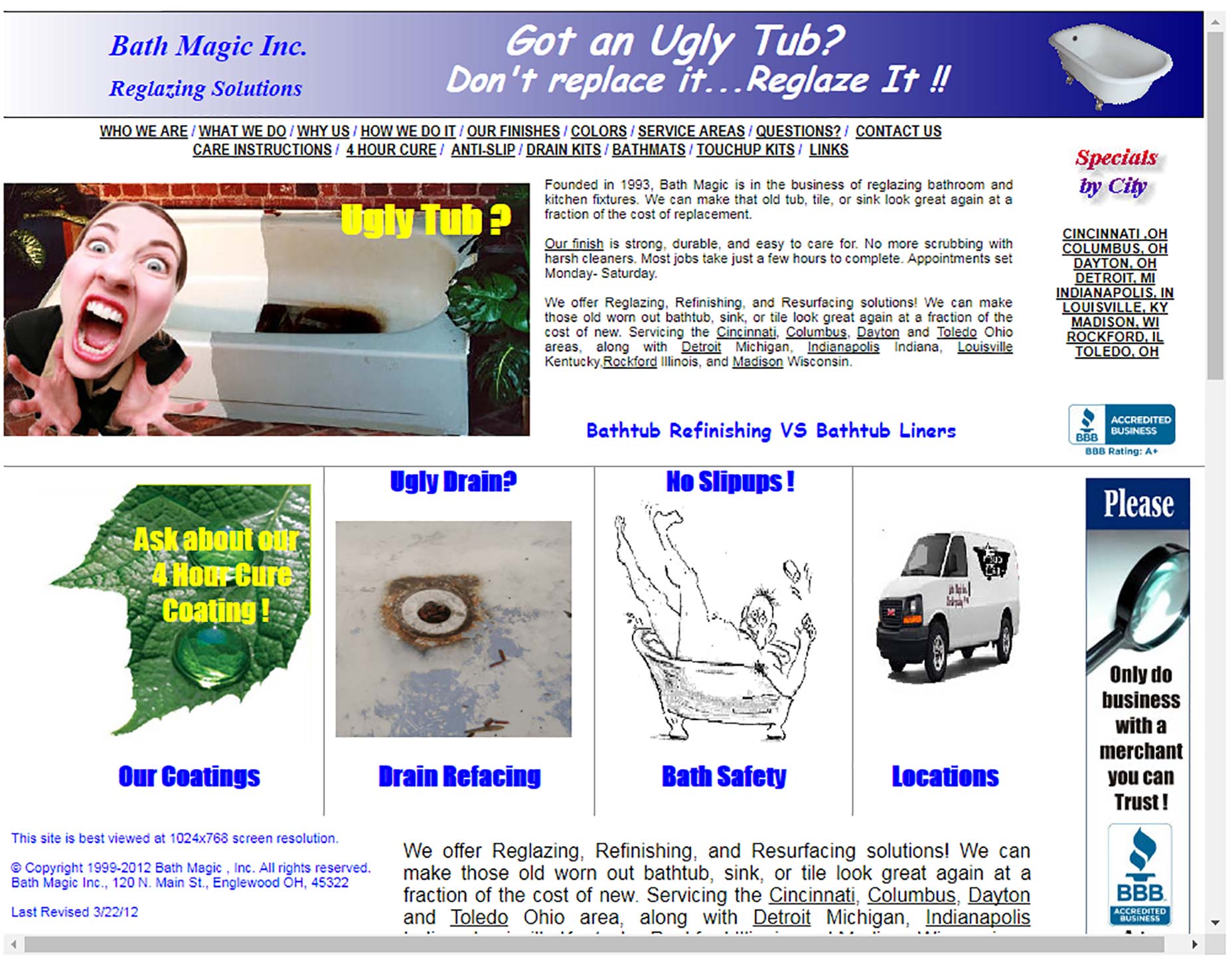 This is an intangible/tangible conflict. It’s the elephant in the room, the unspoken assumption almost every user will make. You make bathtubs beautiful, why is your website so ugly?
This tangible/intangible conflict increases user resistance. This inconsistency means people are far less likely to buy, read, invest, etc.
This is an intangible/tangible conflict. It’s the elephant in the room, the unspoken assumption almost every user will make. You make bathtubs beautiful, why is your website so ugly?
This tangible/intangible conflict increases user resistance. This inconsistency means people are far less likely to buy, read, invest, etc.
2. Design Expectations That Miss the Mark
Users expect artists to understand design. Users expect an artist’s website to be beautiful, creative and appealing. Most designers would agree. The Visual Arts League decided against creating a beautiful website.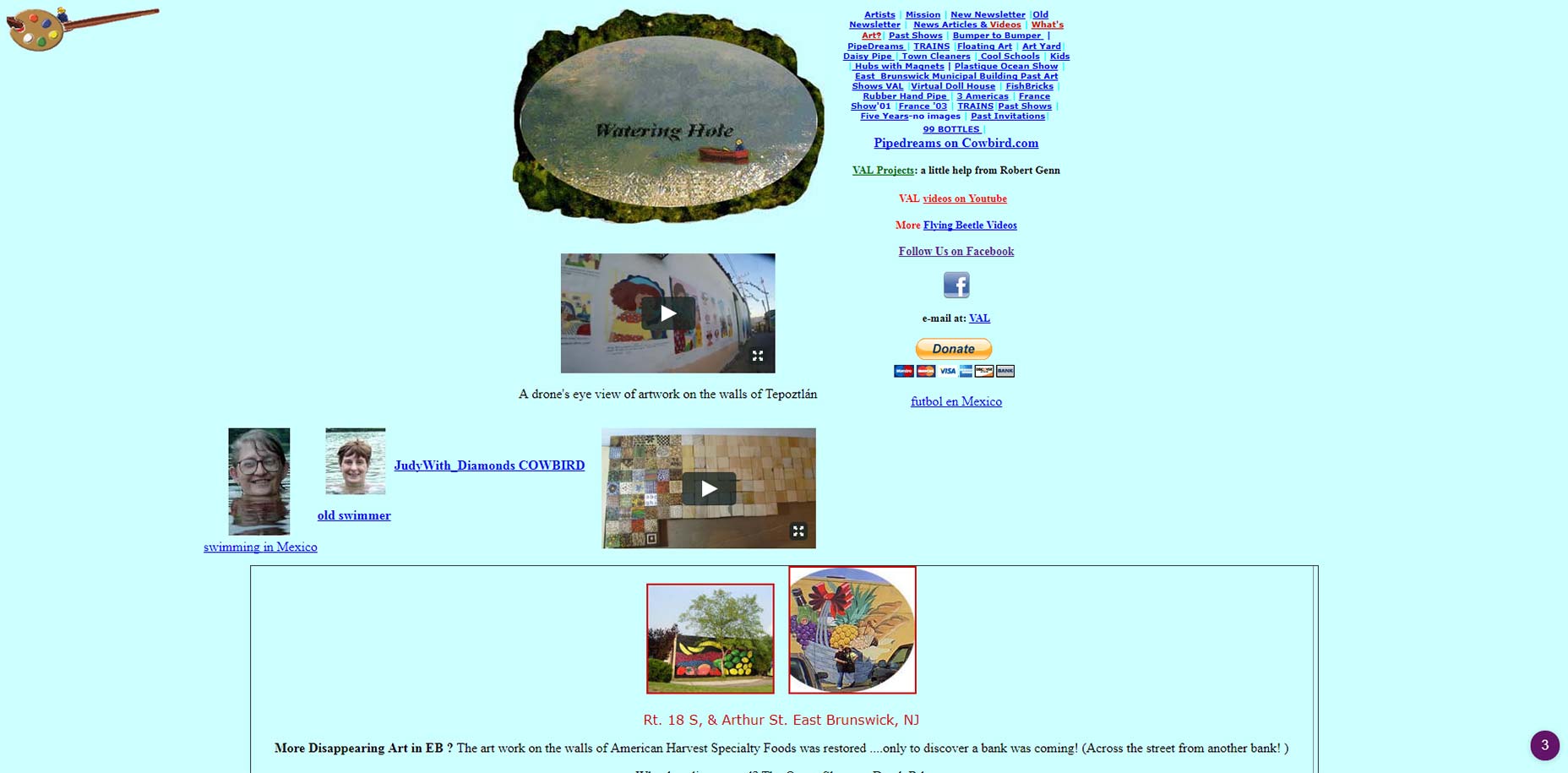 Users who are unfamiliar with their organization find the experience jarring. Aren’t artists supposed to create beautiful, functional things? The site is ugly and it’s difficult to use.
3. Beauty Without Benefit
Take a look at this micro site for Toyota. It’s clear from the design that someone spent a lot of time on this.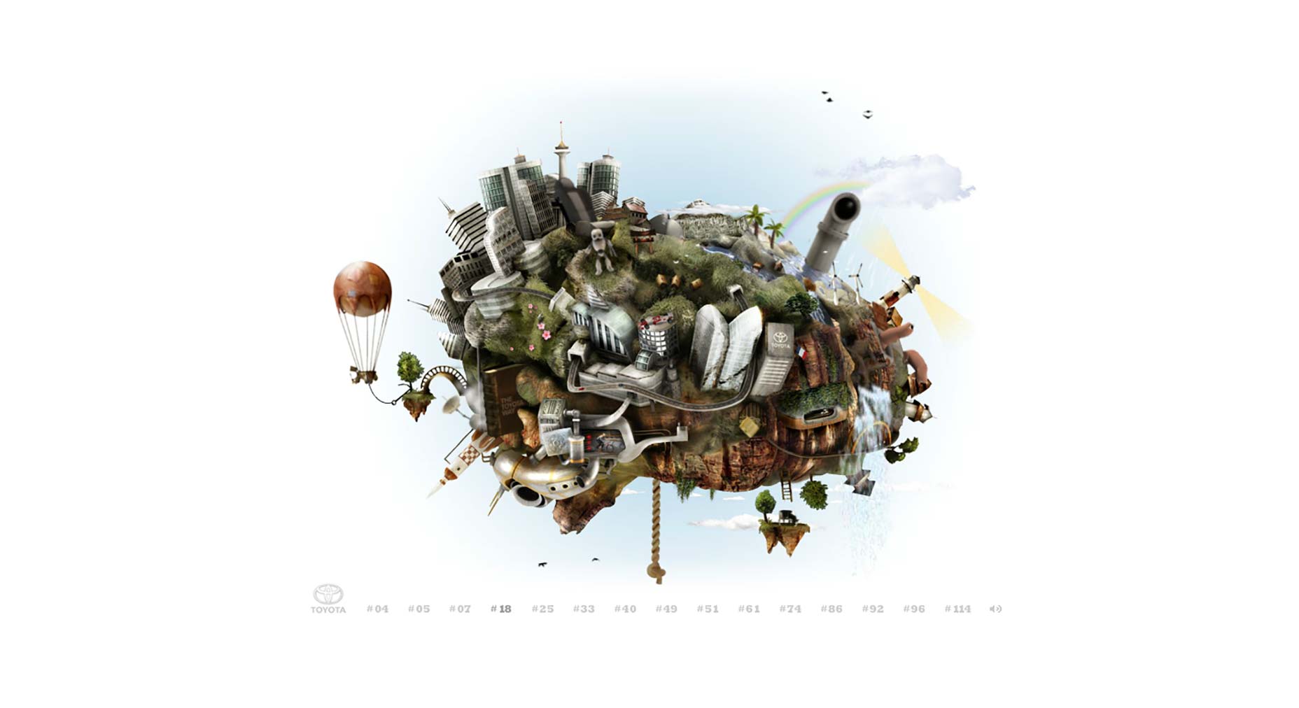 From an artistic standpoint it’s appealing. What’s not clear is what users are supposed to do. Click on any of the details on the screen and a portion of the site animates, but that’s pretty much it.
As far as designs go, it’s difficult to use. There’s no obvious purpose, plan or intention behind it, it’s an art piece.
As far as designs go, these aren’t the only mistakes. This also doesn’t solve our problem. The vast majority of ugly designs are dramatic failures.
From an artistic standpoint it’s appealing. What’s not clear is what users are supposed to do. Click on any of the details on the screen and a portion of the site animates, but that’s pretty much it.
As far as designs go, it’s difficult to use. There’s no obvious purpose, plan or intention behind it, it’s an art piece.
As far as designs go, these aren’t the only mistakes. This also doesn’t solve our problem. The vast majority of ugly designs are dramatic failures.
What About the Ugly Success Stories?
Marketers reference a few ugly websites citing these as proof that “ugly is best.” They swear by these sites and they tell everyone that ugly is more profitable.Craigslist
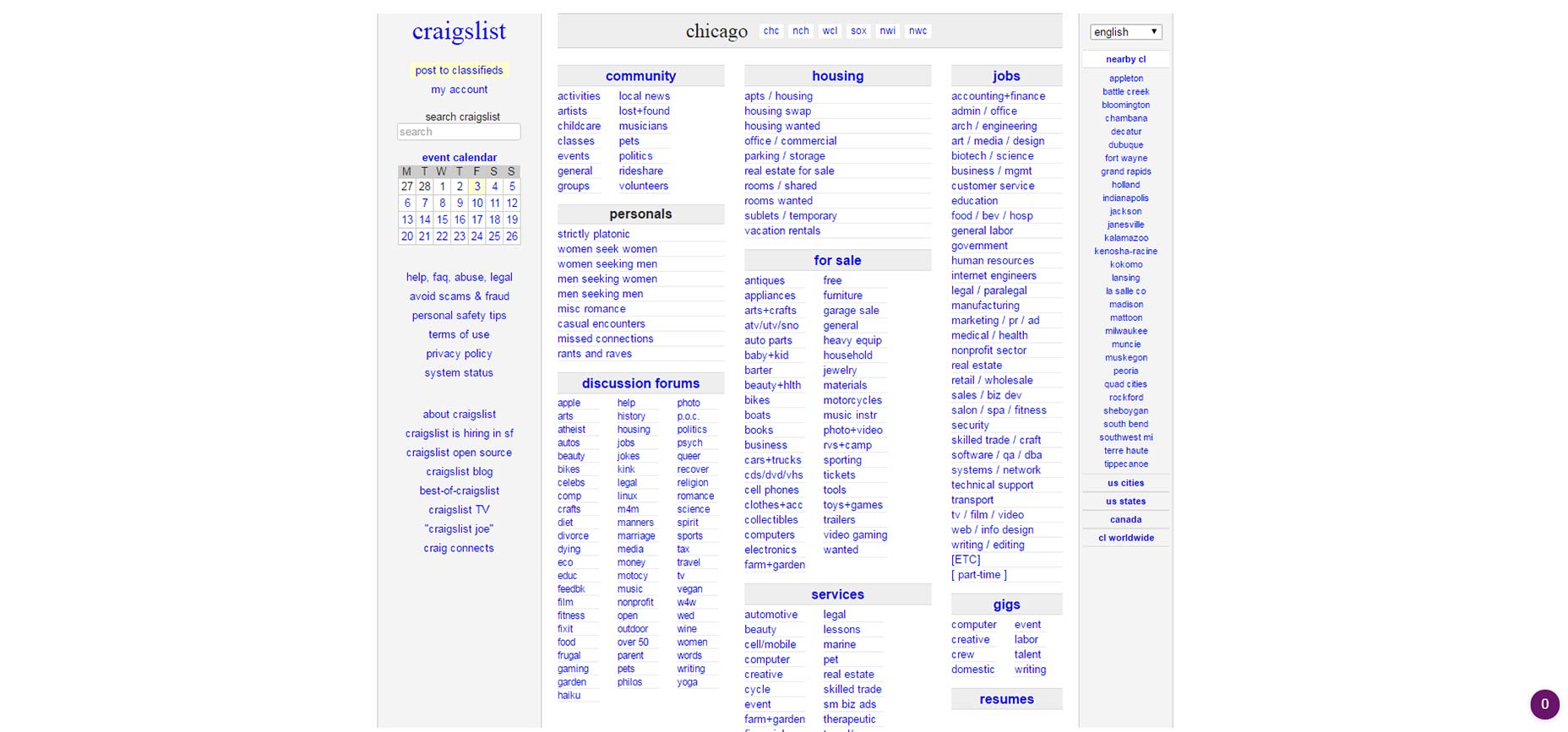 Launched in 1995, Craigslist is viewed by many as the poster boy of the “ugly is best” campaigns. A 2016 estimate listed their annual revenue at 694 million.
Drudge Report
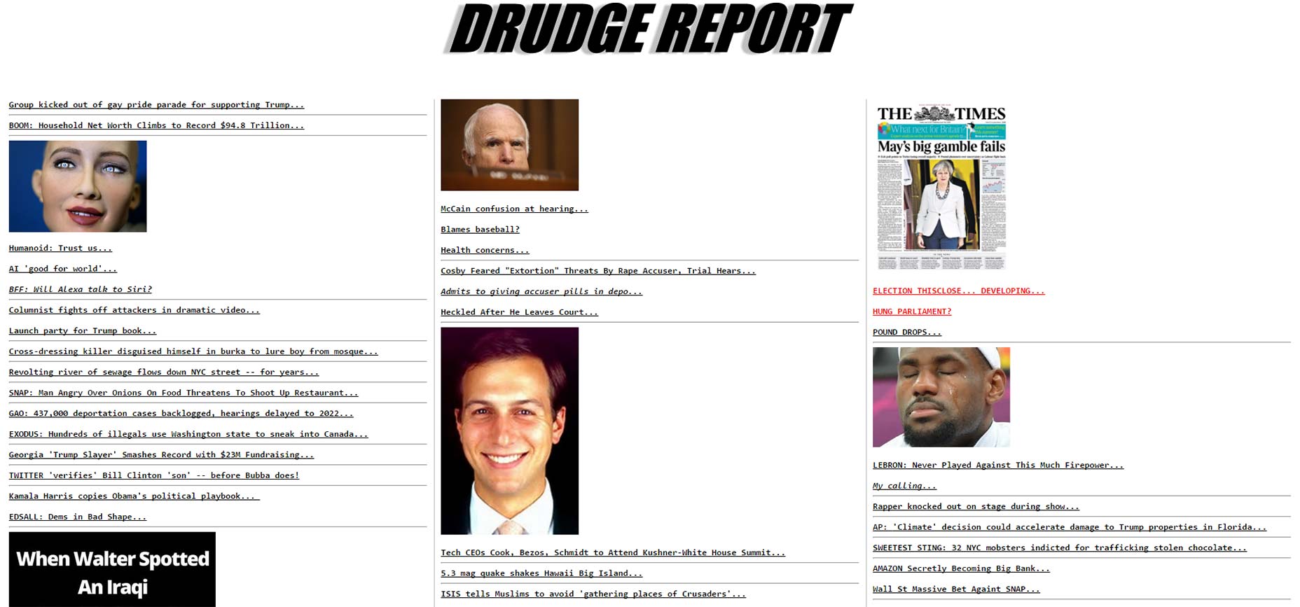 The Drudge report is a one page political site with no onsite “content.” The site is heavy on headlines (links) with a sprinkling of images throughout. The site was also launched in 1995.
Basecamp’s Jason Fried has argued that Drudge Report is one of the best designed sites on the web.
The Drudge report is a one page political site with no onsite “content.” The site is heavy on headlines (links) with a sprinkling of images throughout. The site was also launched in 1995.
Basecamp’s Jason Fried has argued that Drudge Report is one of the best designed sites on the web.
Lingscars.com
Our worst offender comes from Ling Valentine, owner of Lingscars.com, a UK based car dealership. Ling wanted publicity for her website but she didn’t have a sizeable marketing budget. So, she built her business using social media, publicity stunts and a website that looks like this: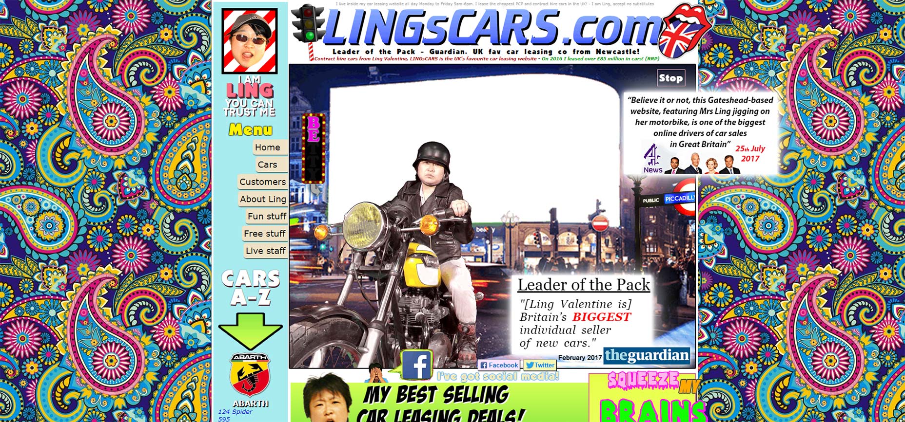 Lingscars was hailed as the biggest individual seller of cars, selling £85 million in 2016.
These designs are terrible, what gives?
These websites are successful in spite of their terrible design, not because of it. They’re the exception, not the rule.
Craigslist and Drudge Report are layovers from 20 years ago.
These sites built an audience around their design. They chose to leave things as they were and their audience stayed with them. Lingscars.com uses her terrible website as a prop. It’s intentional but it’s also unsustainable.
How do I know?
Look at Ling’s website when she started. Her first website is actually an improvement on what she has now.
The ugly websites I’ve mentioned (and the ones I haven’t) use tangible and intangible presentation factors to attract users, customers and sales. Ling’s publicity stunts work in automotive sales. Would they work in the high fashion, cosmetics or tech industries?
Not a chance.
Because the user expectations, the intangible aspects present in their industry, won’t allow it.
Lingscars was hailed as the biggest individual seller of cars, selling £85 million in 2016.
These designs are terrible, what gives?
These websites are successful in spite of their terrible design, not because of it. They’re the exception, not the rule.
Craigslist and Drudge Report are layovers from 20 years ago.
These sites built an audience around their design. They chose to leave things as they were and their audience stayed with them. Lingscars.com uses her terrible website as a prop. It’s intentional but it’s also unsustainable.
How do I know?
Look at Ling’s website when she started. Her first website is actually an improvement on what she has now.
The ugly websites I’ve mentioned (and the ones I haven’t) use tangible and intangible presentation factors to attract users, customers and sales. Ling’s publicity stunts work in automotive sales. Would they work in the high fashion, cosmetics or tech industries?
Not a chance.
Because the user expectations, the intangible aspects present in their industry, won’t allow it.
When it Comes to Design, Beauty is the Default
Beauty is a subset of design. But design is focused around purpose, on planning. That purpose is determined by the tangible and intangible presentation factors around you. [pullquote]Beauty is a subset of design[/pullquote] In the right industry, an ugly and difficult design can work. But ugly and difficult work in spite of the poor design, not because of it. Because great designs consistently outperform bad ones.What makes a design successful?
- It has a purpose and a plan
- It’s crafted around and serves your users
- It aligns with tangible /intangible presentation factors
- It’s iterative, continuing to evolve around users
- It isn’t a cute, clever or trendy art piece
Your Designs Should be Purposeful and Clear
Ugly and difficult isn’t best. You don’t have to be blindsided by the lie. Marketers may not understand why good design matters, but you do. It’s up to you to show them. This irritating deception gets lobbed at designers repeatedly and most of the time, designers are completely unprepared. You’re ready. You understand the tangible and intangible elements of design. Share it with your team. Give them the education and resources they need to combat the lie and you’ll find it stops mattering.Andrew McDermott
Andrew McDermott is the co-founder of HooktoWin.com. Want an unlimited supply of free leads for your freelance business? Download your copy of The Dragnet Method.


Read Next

3 Essential Design Trends, May 2024
Integrated navigation elements, interactive typography, and digital overprints are three website design trends making…

How to Write World-Beating Web Content
Writing for the web is different from all other formats. We typically do not read to any real depth on the web; we…
By Louise North

20 Best New Websites, April 2024
Welcome to our sites of the month for April. With some websites, the details make all the difference, while in others,…

Exciting New Tools for Designers, April 2024
Welcome to our April tools collection. There are no practical jokes here, just practical gadgets, services, and apps to…

How Web Designers Can Stay Relevant in the Age of AI
The digital landscape is evolving rapidly. With the advent of AI, every sector is witnessing a revolution, including…
By Louise North

14 Top UX Tools for Designers in 2024
User Experience (UX) is one of the most important fields of design, so it should come as no surprise that there are a…
By Simon Sterne

What Negative Effects Does a Bad Website Design Have On My Business?
Consumer expectations for a responsive, immersive, and visually appealing website experience have never been higher. In…

10+ Best Resources & Tools for Web Designers (2024 update)
Is searching for the best web design tools to suit your needs akin to having a recurring bad dream? Does each…
By WDD Staff

3 Essential Design Trends, April 2024
Ready to jump into some amazing new design ideas for Spring? Our roundup has everything from UX to color trends…

How to Plan Your First Successful Website
Planning a new website can be exciting and — if you’re anything like me — a little daunting. Whether you’re an…
By Simon Sterne

15 Best New Fonts, March 2024
Welcome to March’s edition of our roundup of the best new fonts for designers. This month’s compilation includes…
By Ben Moss

LimeWire Developer APIs Herald a New Era of AI Integration
Generative AI is a fascinating technology. Far from the design killer some people feared, it is an empowering and…
By WDD Staff