How Spoiling the Ending Improves UX

Storytelling is about the unknown becoming known. But designers aren’t storytellers, and the destinations they design should always be clear to the user. By inserting small spoilers into our UI designs, and spoiling the surprise, we design for much improved user experiences.

Designers Aren’t Story-Tellers
Numerous designers have referred to themselves as story-tellers, but this is simply a kitsch way of referring to communication. To tell a story, we have to foster the unknown in preparation for a big reveal, and the major obstacle to this approach is that web experiences—and I would argue most encounters with design—are non-linear and open-ended. Design is in fact far closer to poetry. Poetry typically exists in bite-sized chunks, and in which themes are explored that are open to interpretation. Far from constructing a story, a designer’s job is to clarify as unintrusively as possible.Using Spoilers in Microinteractions
What’s the most engaging element in Jaws? Is it Brody arguing with the mayor? Is it Quint telling the story of the Indianapolis? Is it Hooper’s affair with Ellen Brody (yes really, read the book!)? No. It’s the music. As soon as that shark starts playing the cello we know it’s coming, its arrival is literally heralded. [Incidentally, Jaws is an interesting example of a film in which both a stranger (the shark) comes to town, and then a man goes on a journey (to sea).] We can create engagement in design by continually dropping spoilers, hinting at what’s coming, with cello music of our own. To do so, we use microinteractions—simple UI components, featuring a trigger and feedback. The feedback portion of the microinteraction is the place to insert your spoiler. It works by previewing data that would, in a linear experience, be introduced at a later stage. The key is to bring data forward.Thumbnails
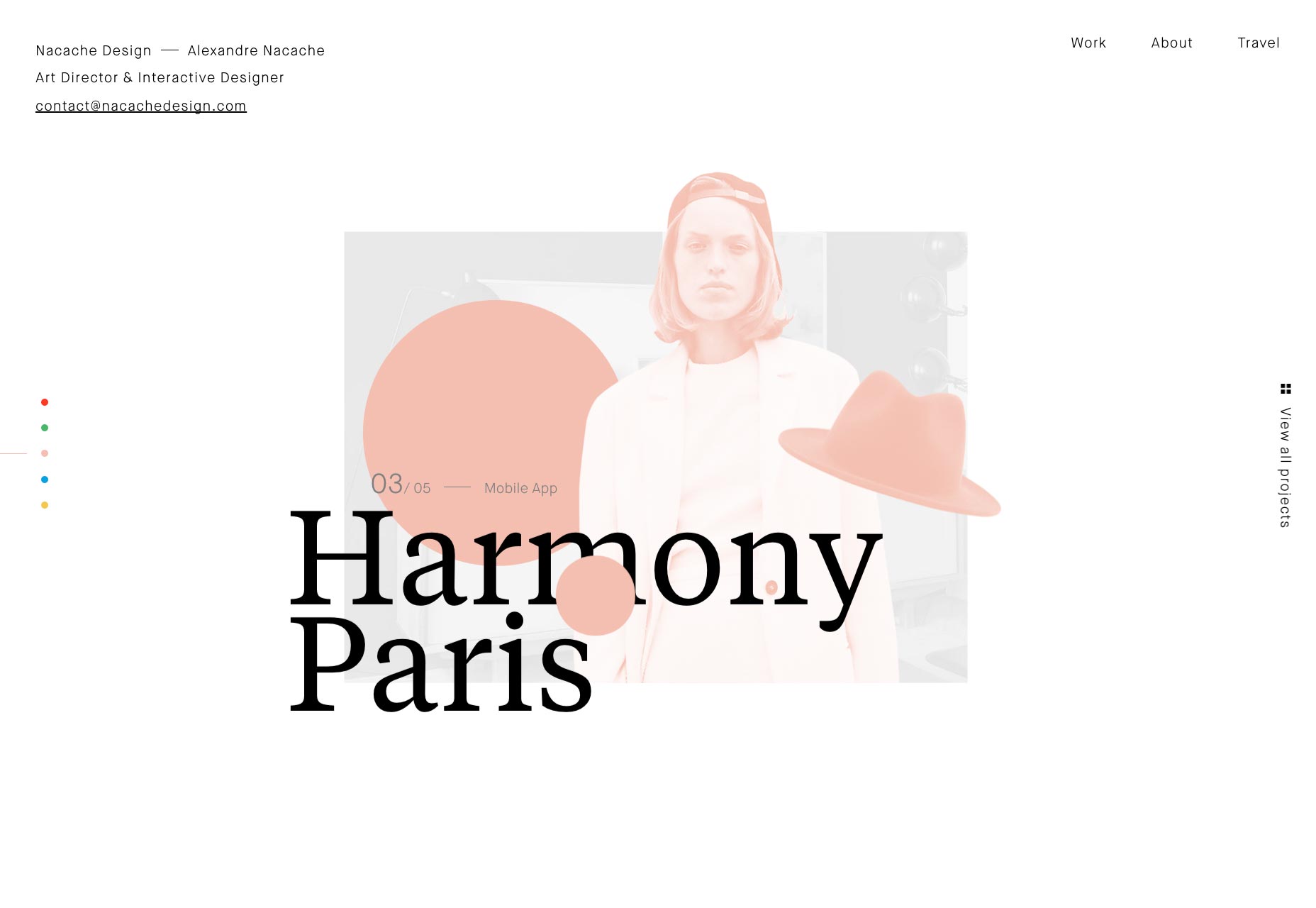
Let’s start with something familiar: the classic example of bringing information forward is the thumbnail. A thumbnail is a preview of a larger element, a visual guide to what to expect on the other end of a link. Jacky Winter is a talent agency for artists, illustrators, and animators. With a diverse range of talent, the best way to browse work is with traditional thumbnails.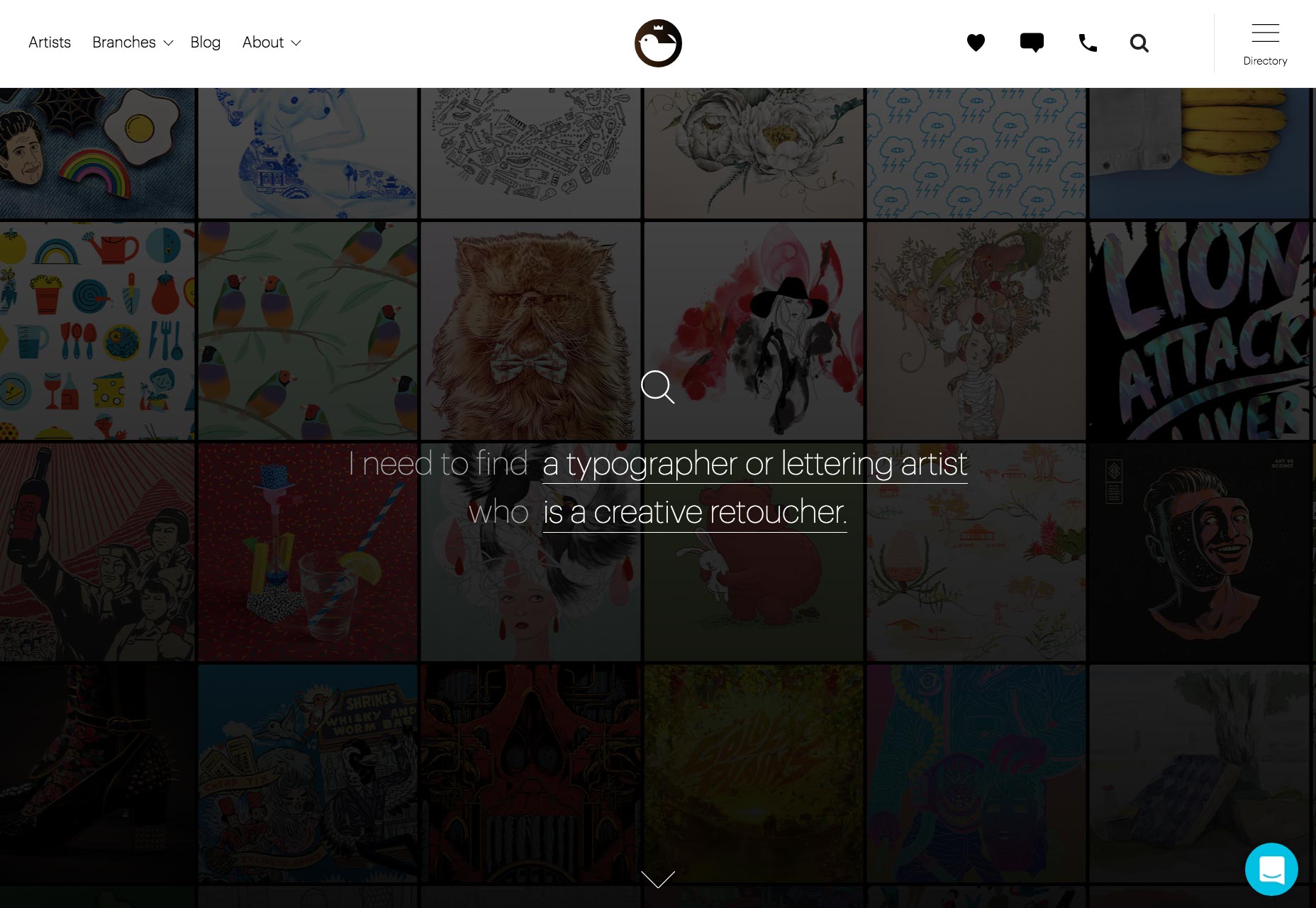 Thumbnails don’t have to be traditional. Alexandre Nacache is an art director and interactive designer whose site uses previews of project elements, rather than reproductions of a design in miniature.
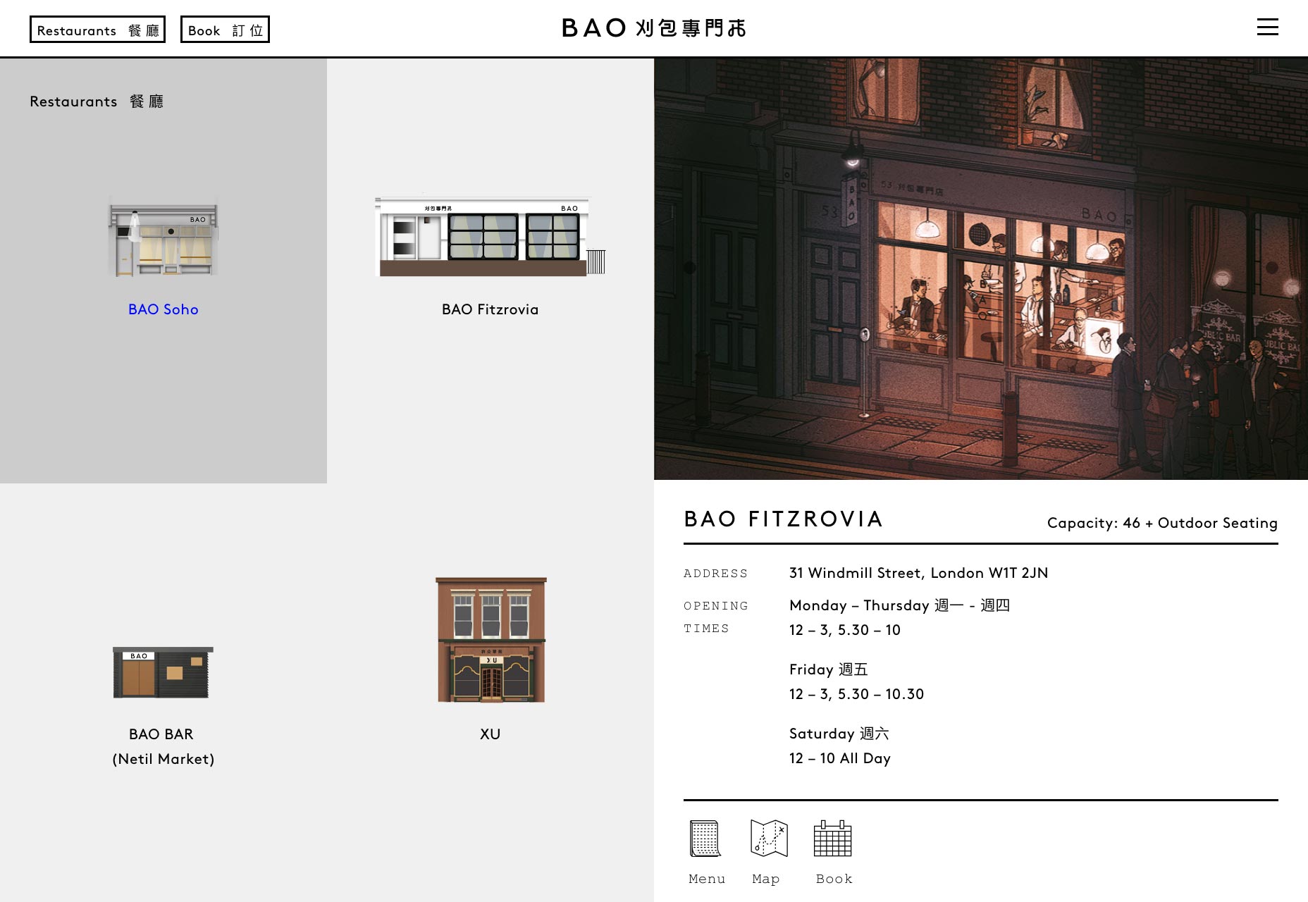
 Bao is a Taiwanese restaurant with three locations in London. Their location illustrations act like thumbnails, suggesting not just a look for the restaurant, but a possible experience.
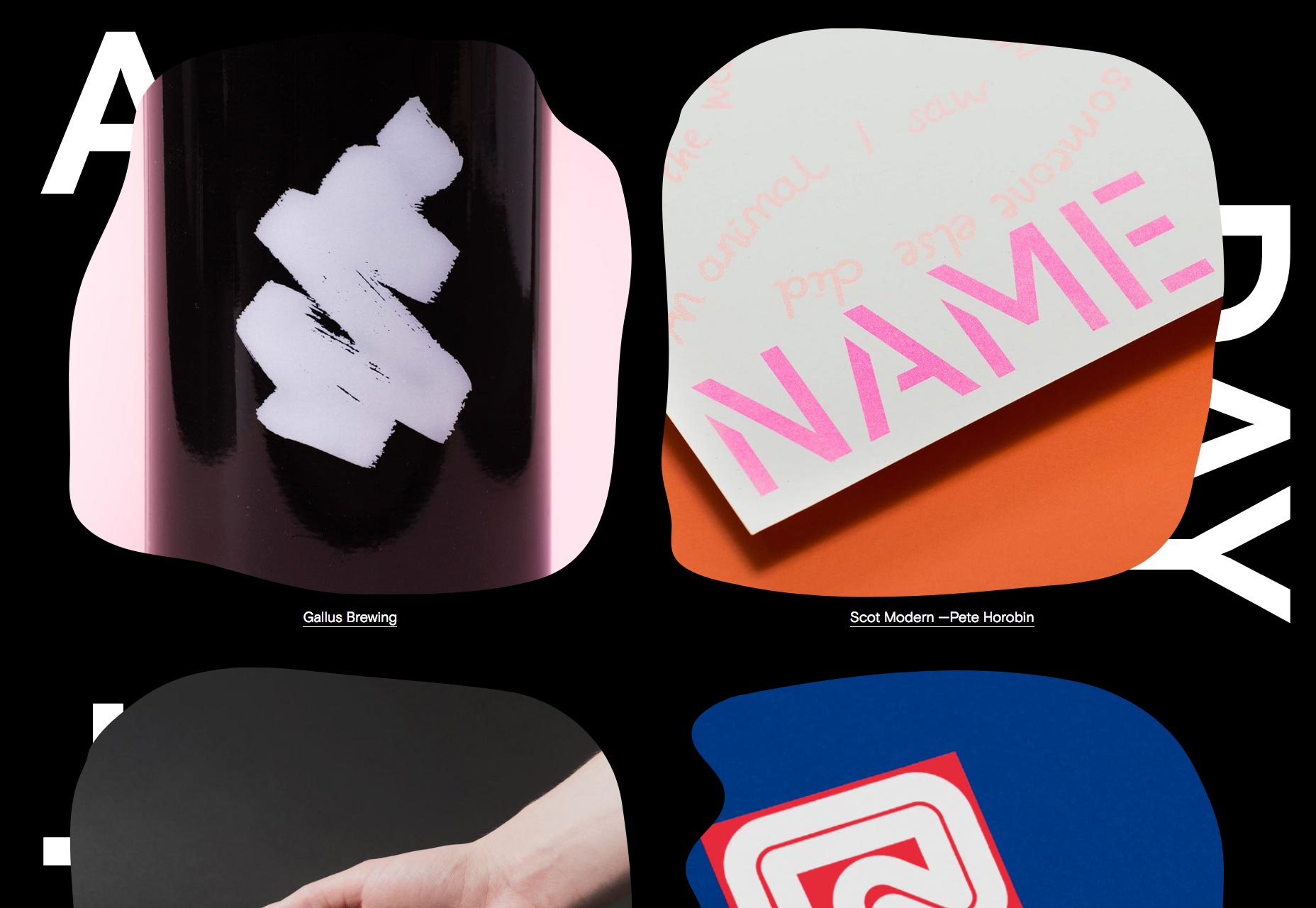
 A Day Out is a Glasgow-based design studio. The thumbnails on their site form a major component of the art direction and establishes their own brand aesthetic.
The 5 Minute Read
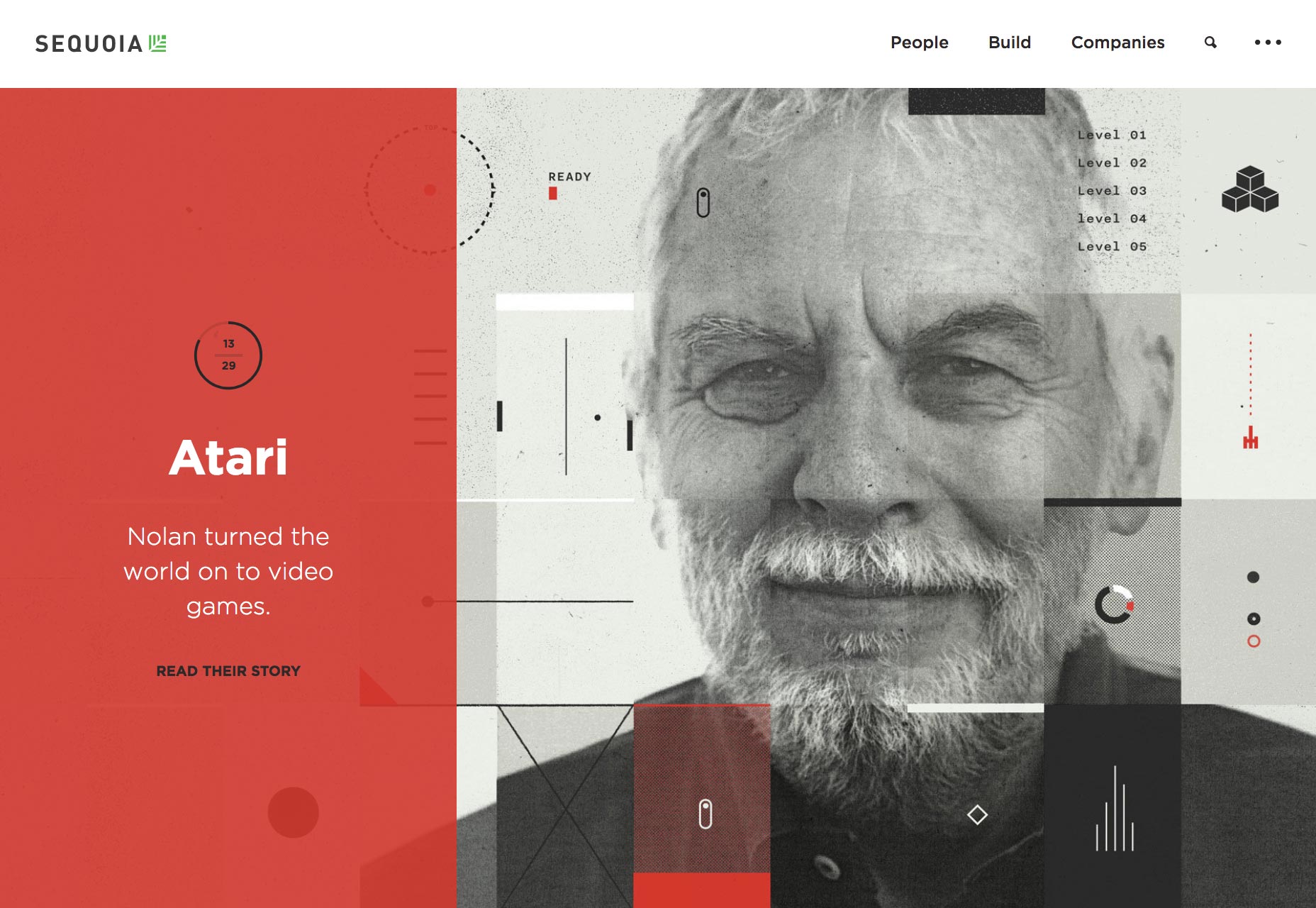
Back in the day, the only way to know how long reading an article like this would take, was to check the time, read the article, and check the time again. Based on its uptake, one of the most successful UI elements of recent years is the helpful little indicator that tells us how long an article will take to read. Popularised by sites like Medium, there’s no eye tracking involved, or reading speed calculated, the “5 minute read” estimate is based on word count—125 words is expected to be read in 30 seconds or thereabouts. But even this grossly generalized data is sufficient to allow users to make informed decisions about their commitment to a site, article, or product. The monotone of Australian Design Radio is broken only by the contrasting red used for hover states. The only element that employs the red without interaction? The playhead that features position, and total length.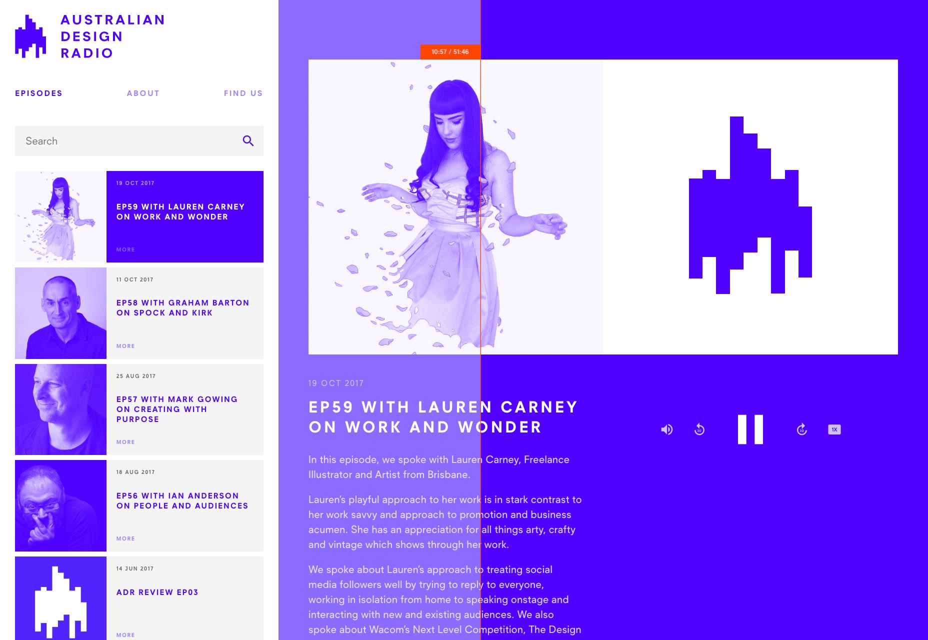 Sequoia is a California-based venture capital firm. Profiles of tech companies occupies their landing page. Each profile features a numbered position, and the slider’s animated timer draws your attention to exactly where you are in the process.
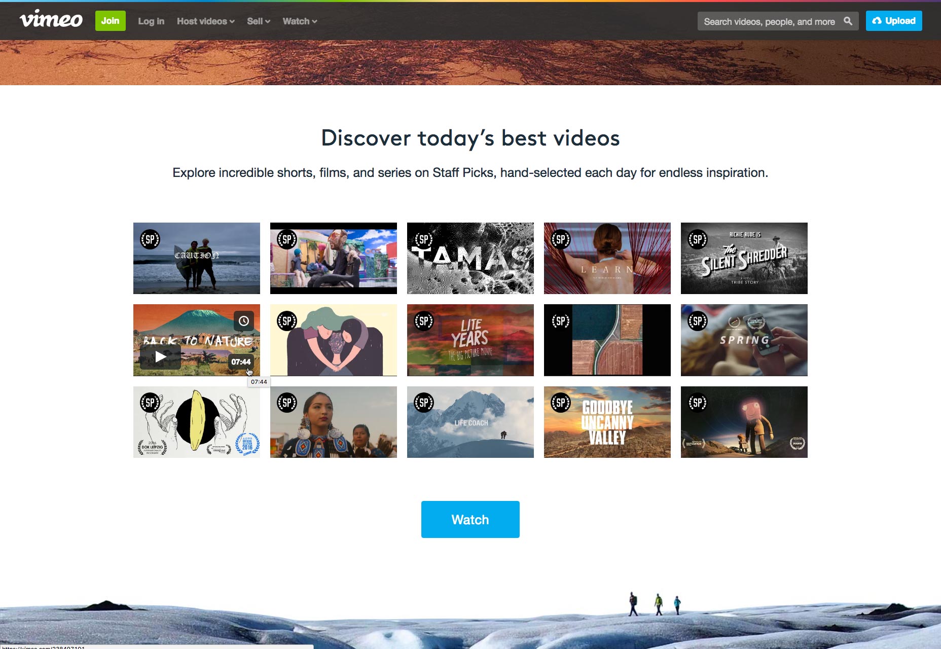
 Vimeo features some of the best videos on the web. They could have displayed any information they wished—producer, subject, title—when hovering over their thumbnails. They chose duration.
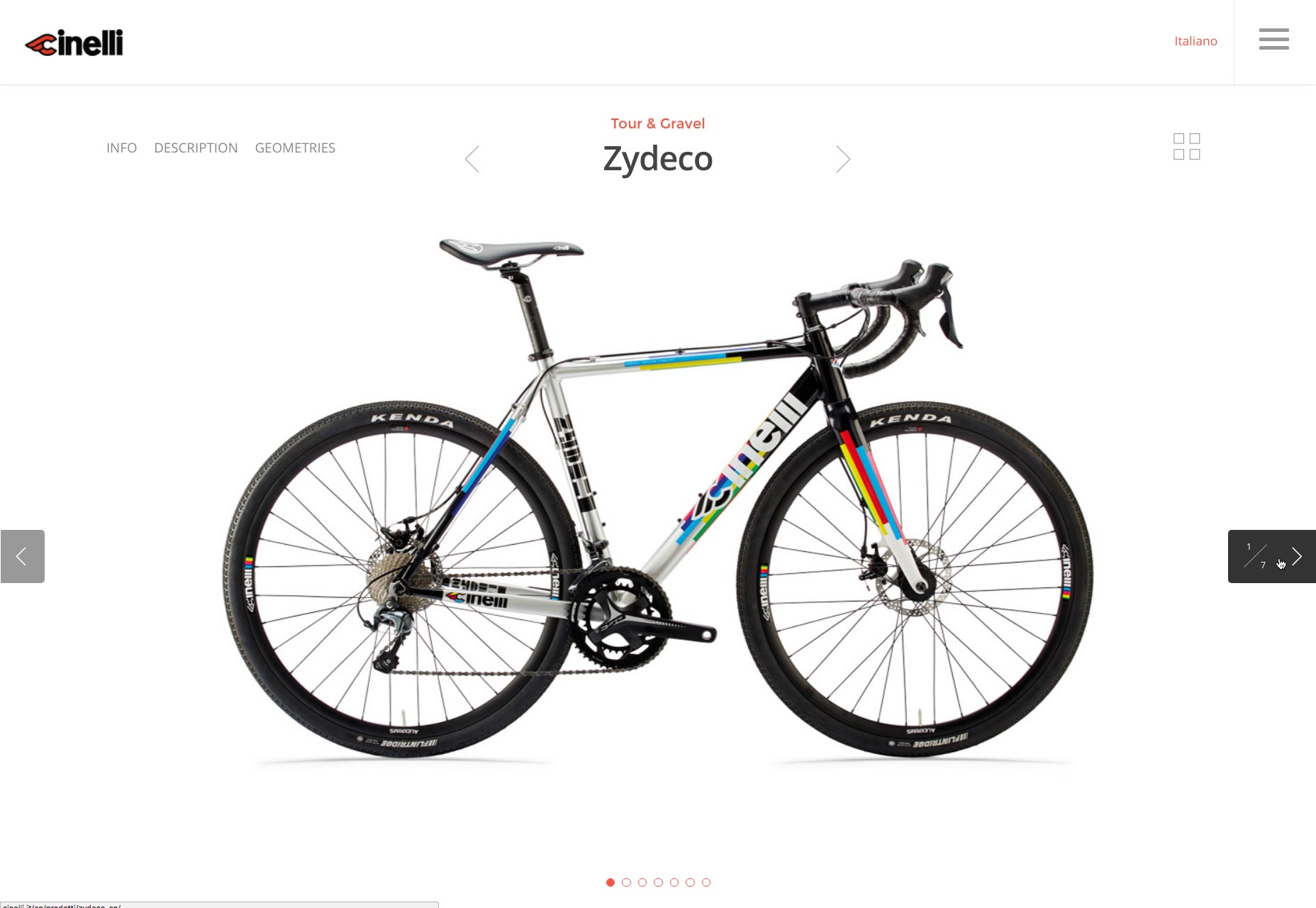
 Cinelli is Italy’s coolest bike brand. Their product slider features numbered ‘next’ and ‘previous’ buttons. Arrows alone would be enough to convey meaning, but the designers brought data forward with a simple addition to the buttons.
Qualifying Data
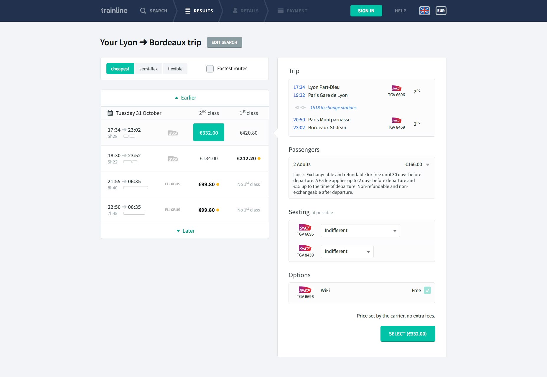
One of the simplest ways of enhancing an interface, is to qualify data with a meaningful context. The key to this is not deliver too much information, just a simple summary that can be read at a glance. Help Scout is a customer service SaaS. Their dashboard displays key metrics like total conversations, which would be meaningless without the addition of an arrow and a percentage indicating whether that’s an improvement, or a setback.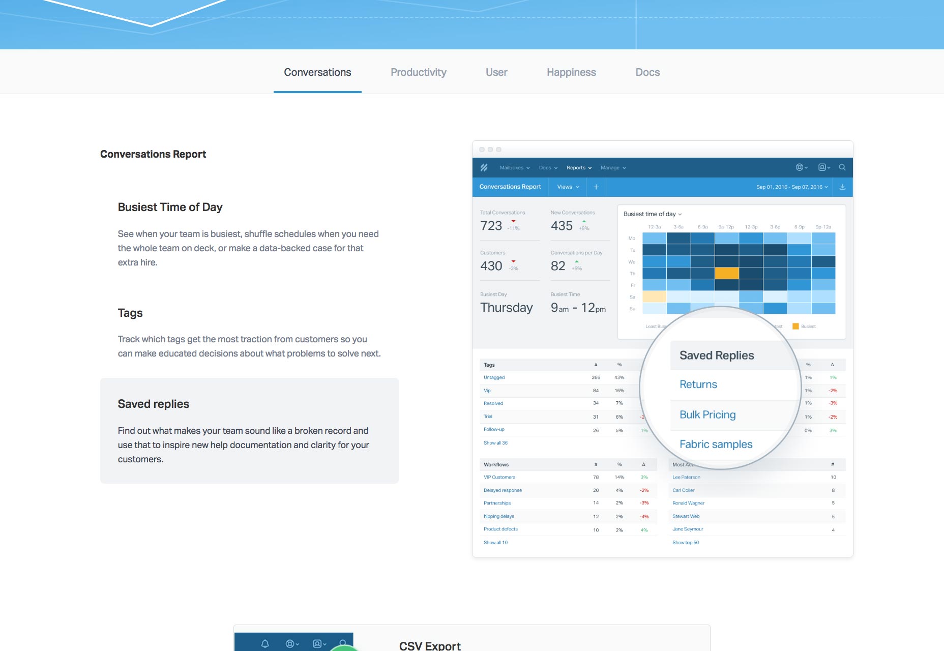 Booking a ticket from Lyon to Bordeaux is made simpler when Trainline displays a bar beneath the journey time, to give a visual indication of both duration, and the number of changes.
Maps and Reassurance
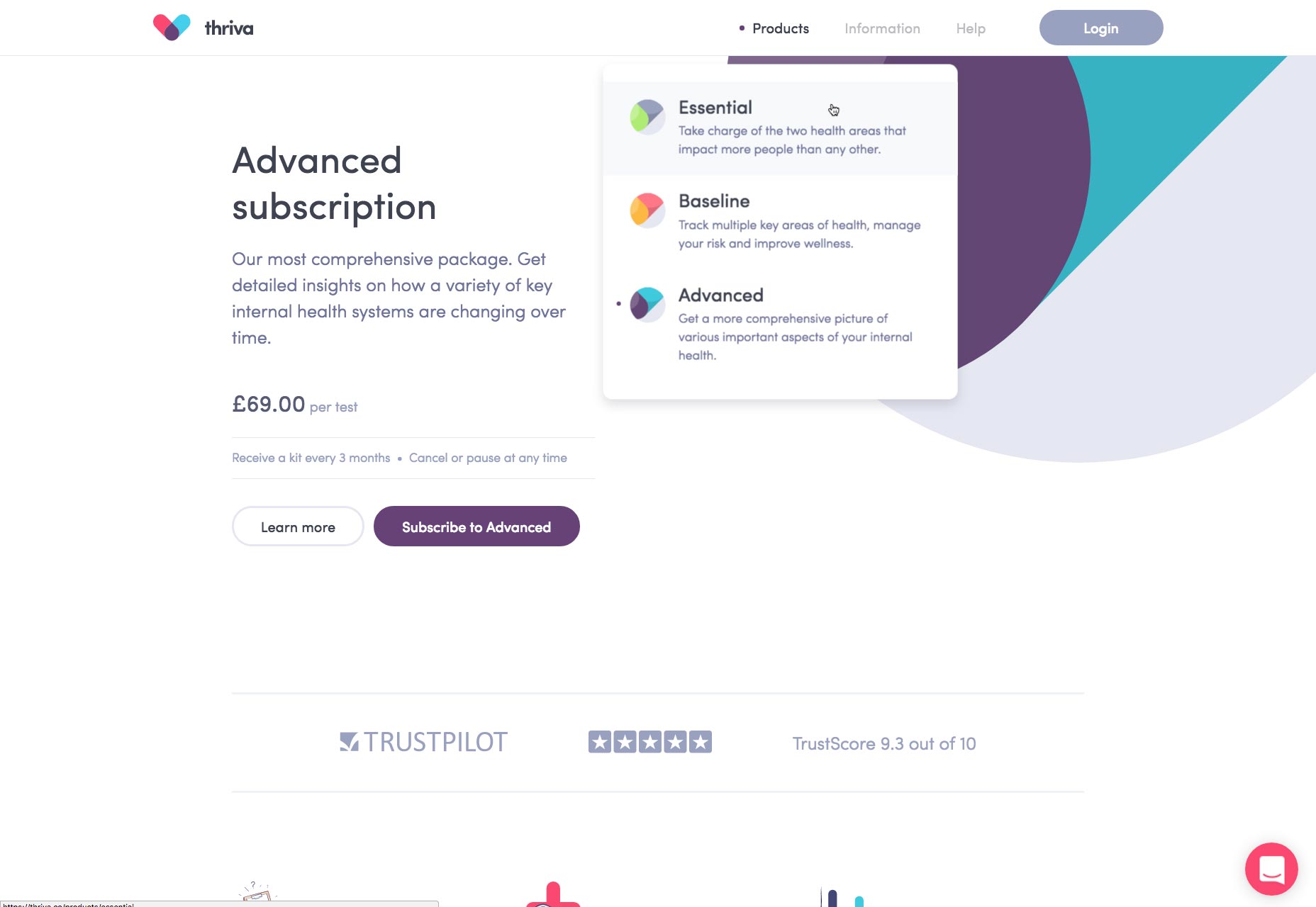
When we anticipate journeys, especially a journey into the unknown, we often demystify the experience with a map. In the real world, a map is very much like a thumbnail of a destination. In user interface design, the maps we use clarify information architecture. Labels are one of the most complex areas of information architecture because they tend towards jargon, often company-exclusive jargon. Adding jargon-free microcopy previews the destination for users, and helps them find their way to the right information. Lattice is a performance management SaaS, but their products are very company-centric. They solve this problem by signalling the key feature of each product in their menu.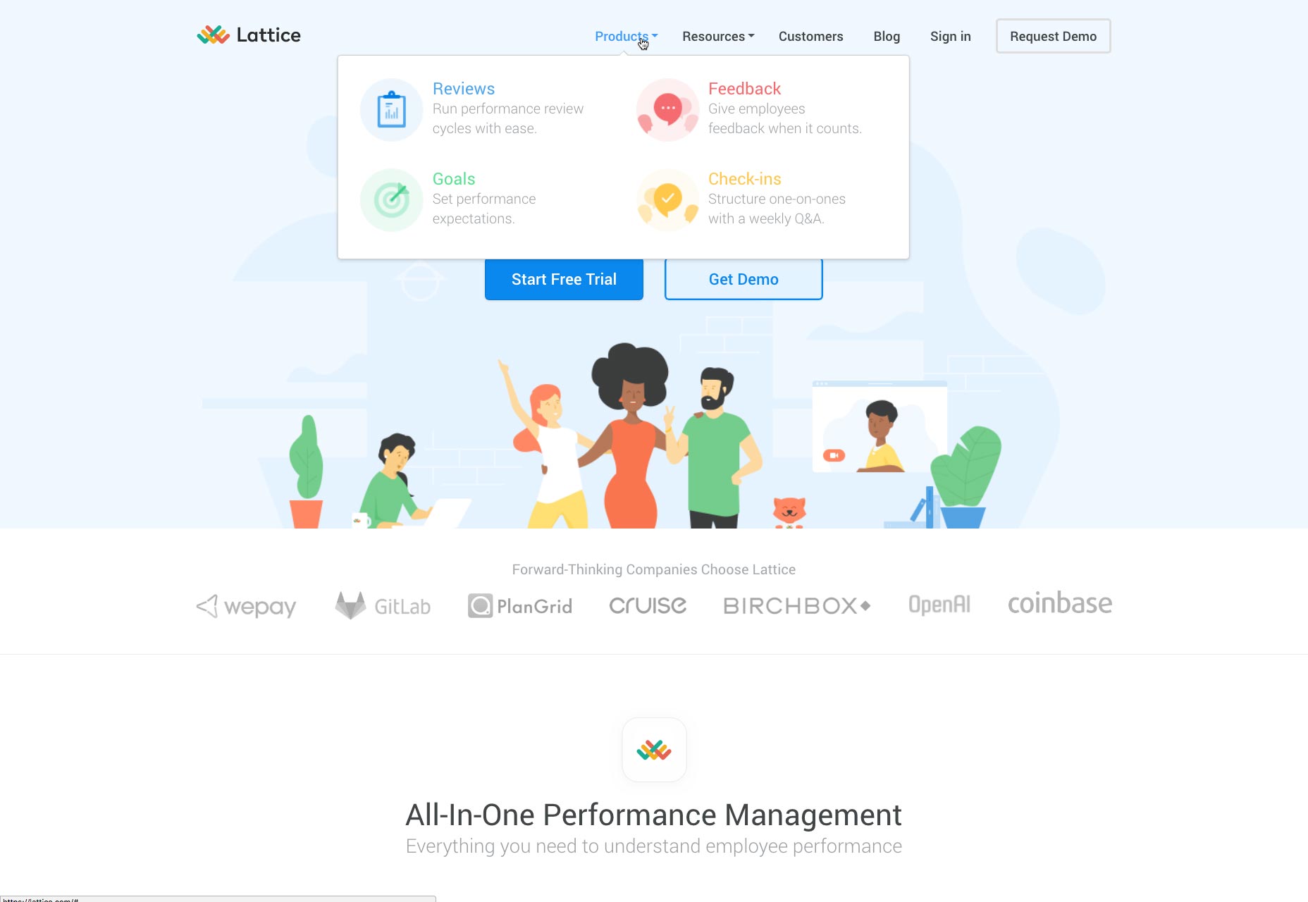 Thriva helps you track your health with blood tests you can take at home. They have three levels of product that are clearly explained in their menu.
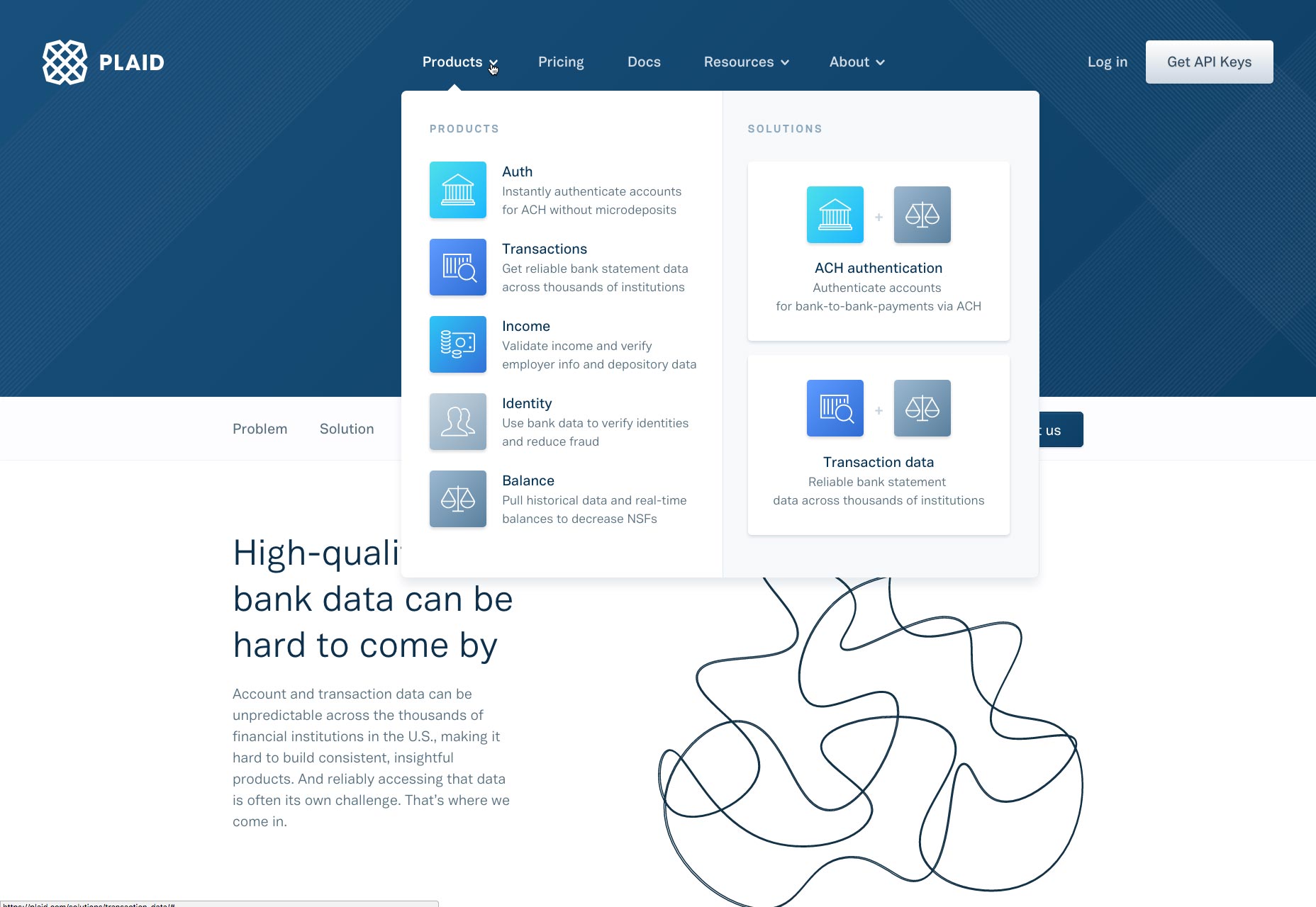
 Financial transactions are technically complex. Plaid offers a variety of API products for developers. Their menu not only explains the key feature of each product, but previews two potential solutions based on product combinations.
The Key to Effective UI Design Is Spoilers
Telling stories is the antithesis of effective design, because stories by their nature, pander to the unknown elements in an experience. Design, by contrast, seeks to eliminate the unknown by clarifying. When we bring data forward in a design, we typically do so in a simple fashion. A single piece of well selected data can clarify an entire process. Microinteractions are the ideal way to insert these ‘spoilers’, which empower users to create their own experience, whilst always knowing precisely where they are within the wider context. By revealing more than a linear story would, we engage users far more effectively, and design experiences that are robust, and enjoyable to use.Ben Moss
Ben Moss has designed and coded work for award-winning startups, and global names including IBM, UBS, and the FBI. When he’s not in front of a screen he’s probably out trail-running.


Read Next

20 Best New Websites, April 2024
Welcome to our sites of the month for April. With some websites, the details make all the difference, while in others,…

Exciting New Tools for Designers, April 2024
Welcome to our April tools collection. There are no practical jokes here, just practical gadgets, services, and apps to…

14 Top UX Tools for Designers in 2024
User Experience (UX) is one of the most important fields of design, so it should come as no surprise that there are a…
By Simon Sterne

What Negative Effects Does a Bad Website Design Have On My Business?
Consumer expectations for a responsive, immersive, and visually appealing website experience have never been higher. In…

10+ Best Resources & Tools for Web Designers (2024 update)
Is searching for the best web design tools to suit your needs akin to having a recurring bad dream? Does each…
By WDD Staff

3 Essential Design Trends, April 2024
Ready to jump into some amazing new design ideas for Spring? Our roundup has everything from UX to color trends…

How to Plan Your First Successful Website
Planning a new website can be exciting and — if you’re anything like me — a little daunting. Whether you’re an…
By Simon Sterne

15 Best New Fonts, March 2024
Welcome to March’s edition of our roundup of the best new fonts for designers. This month’s compilation includes…
By Ben Moss

LimeWire Developer APIs Herald a New Era of AI Integration
Generative AI is a fascinating technology. Far from the design killer some people feared, it is an empowering and…
By WDD Staff

20 Best New Websites, March 2024
Welcome to our pick of sites for March. This month’s collection tends towards the simple and clean, which goes to show…

Exciting New Tools for Designers, March 2024
The fast-paced world of design never stops turning, and staying ahead of the curve is essential for creatives. As…

Web Tech Trends to Watch in 2024 and Beyond
It hardly seems possible given the radical transformations we’ve seen over the last few decades, but the web design…
By Louise North