- Prevent edge cases from happening
- Support edge case scenarios
1. Combat Delayed Loading
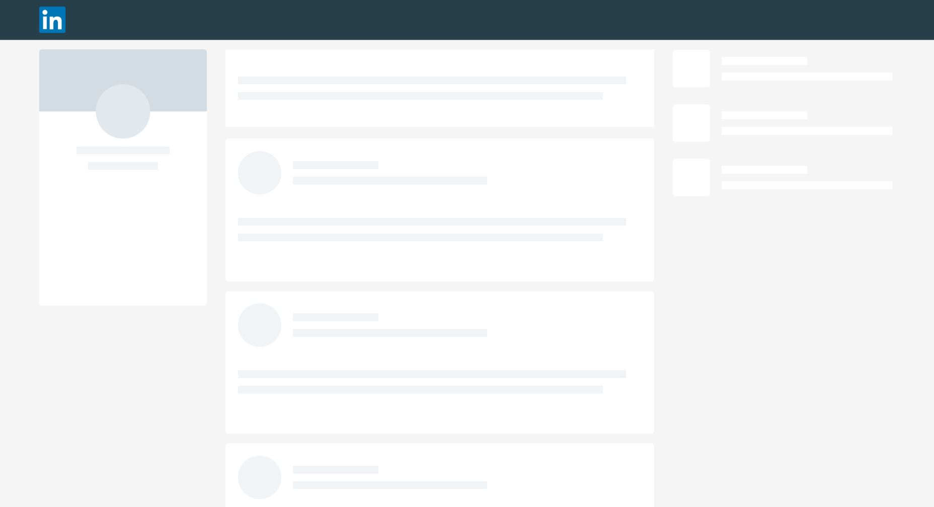
As technology enables faster experiences, users’ willingness to wait has decreased. According to the latest Google survey, 2/3 of mobile web users say that the speed it takes to load a page has the most impact on their overall experience. To satisfy users’ expectations, you should do everything you can do to make your app/website load as fast as possible. But no matter how hard you try, there’ll be situations when you won’t be able to comply with speed guidelines. Slow loading time might be caused by limited internet connection. If you can improve the actual performance, at least try to create a perception of speed — how fast something feels is often more important than how fast it actually is. One technique that can help you with that is called skeleton screens. A skeleton layout is a version of your page that displays while content is being loaded. Skeleton screens give users the impression of speed (most users will believe that loading is happening more quickly than it really is). LinkedIn use skeleton screens to give the impression of speed.
Check this Codepen example of skeleton effect in pure CSS. The effect of pulsation gives a user the feeling that a website is alive and content is loading.
2. Design Empty States
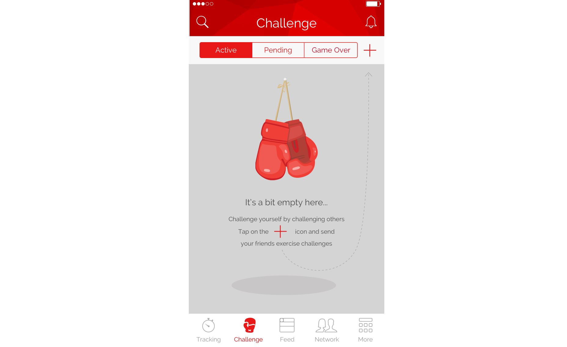
It’s possible that individual screens in your app or website that should be populated with data will have nothing to display in some instances. For example, a screen with user challenges in a fitness app will be empty during the first-time experience (simply because users won’t have any challenges yet). As designers, we need to think about how the page looks like in this case. Showing a blank page isn’t the right thing to do. Instead, we can provide instructions on how to populate the page with data. Khaylo Workout for iOS is an excellent example of how empty space can be used to create context. Empty space on the page can be used to give clear instructions on how to get started.
3. Address User or System Errors
Every user interaction with a system can be a potential source of error. Error states are especially common when users need to provide data input. I’ve already mentioned that it’s better to prevent errors from happening in the first place and this rule should be applied to user input. But when it comes to user input we should focus on handling the following potential problems:- The data entered by the user isn’t valid. For example, a user might mistype a credit card number during checkout. In this case, an app should provide detailed error messages that will help users to detect the source of a problem.
- A system is unable to proceed due to the technical problem. In this case, an error message should state the fact that it’s system problem, not the user’s. This will prevent users from re-submitting the data.
4. Zero Results Found
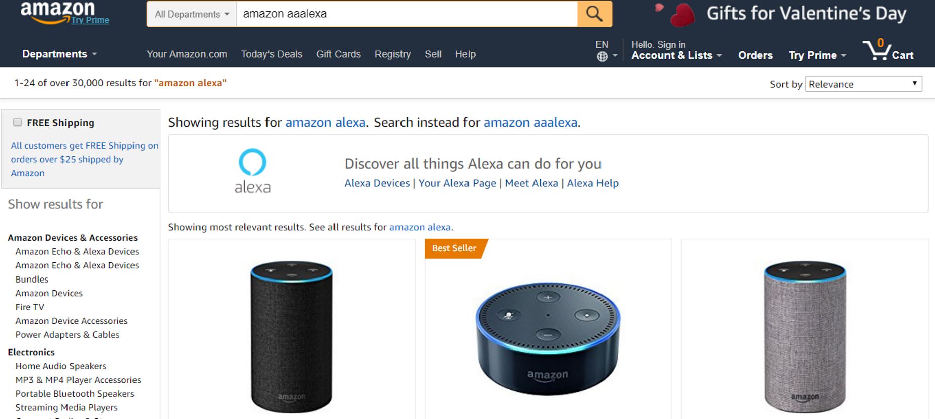
Most e-commerce websites and apps provide a search feature. And one of the most common usability issues with a search feature is when user sees a blank page with “0 results found.” Dropping someone on a page with no results can be frustrating. Especially if they have tried the search a couple of times. If you design your search feature consider using following techniques:- Spell check and suggestions. Sometimes users get no results simply because they mistyped a search query. It’s really helpful when the system detects a mistyped item and provides search results based on the most probable query. Another useful technique that will be really helpful for your users is autocomplete suggestions. This reduces user effort for typing and prevents them from entering an incorrect query in the first place.
 Amazon understands that the user meant “Amazon Alexa” in this query
- Provide valuable alternatives. When there are no matching search results, you can provide featured content or any other valuable alternative. For example, in the context of an e-commerce site this might be products from the similar category.
 Simply compare zero search results page from HP and Amazon. HP’s zero results page is a dead-end for the user. In contrast, Amazon provides suggestions for further searching, and promote related products.
How to Find Edge Cases
Some designers believe that designing for edge cases is similar to expecting the unexpected. But in fact, a vast majority of edge cases can be predicted before the product release. Two techniques can help you with that:- Design review: To create great design, you should pro-actively seek for edge cases. Design review is a very useful technique that can help product team find many potential edge cases. Conduct a design review early on in product design process. For better results, it’s good to invite developers and other team members to participate in such sessions.
- Testing with real users: While seeking edge cases early on with the help of other team members is an excellent approach it won’t guarantee that you’ll find all potential sources of friction. Only testing with real users will help you find out how people actually use your product and what problems they face. At the same time, it’s worth saying that strictly moderated usability testing won’t reveal a lot of edge cases simply because users are often instructed what to do and in what order. So it’s better to give users an opportunity to experiment with a system by giving them more time and more flexible tasks.
Conclusion
When we design products we often apply the Pareto principle to our design; we focus on the needs of the majority of users, apply the 80/20 rule and develop the user experience for the most probable scenario of interaction. In most cases this allows us to create a good user experience for our users. But attention to detail is what really separates excellent design from good design. Designing for edge cases is a great example of attention to details.Nick Babich
Fireart Studio is a design studio passionate about creating beautiful design for startups & leading brands. We pay special attention to nuances all the time to create professional while cool products that will not only meet all expectations, but exceed them.
Read Next
20 Best New Websites, April 2024
Welcome to our sites of the month for April. With some websites, the details make all the difference, while in others,…
Exciting New Tools for Designers, April 2024
Welcome to our April tools collection. There are no practical jokes here, just practical gadgets, services, and apps to…
14 Top UX Tools for Designers in 2024
User Experience (UX) is one of the most important fields of design, so it should come as no surprise that there are a…
By Simon Sterne
What Negative Effects Does a Bad Website Design Have On My Business?
Consumer expectations for a responsive, immersive, and visually appealing website experience have never been higher. In…
10+ Best Resources & Tools for Web Designers (2024 update)
Is searching for the best web design tools to suit your needs akin to having a recurring bad dream? Does each…
By WDD Staff
3 Essential Design Trends, April 2024
Ready to jump into some amazing new design ideas for Spring? Our roundup has everything from UX to color trends…
How to Plan Your First Successful Website
Planning a new website can be exciting and — if you’re anything like me — a little daunting. Whether you’re an…
By Simon Sterne
15 Best New Fonts, March 2024
Welcome to March’s edition of our roundup of the best new fonts for designers. This month’s compilation includes…
By Ben Moss
LimeWire Developer APIs Herald a New Era of AI Integration
Generative AI is a fascinating technology. Far from the design killer some people feared, it is an empowering and…
By WDD Staff
20 Best New Websites, March 2024
Welcome to our pick of sites for March. This month’s collection tends towards the simple and clean, which goes to show…
Exciting New Tools for Designers, March 2024
The fast-paced world of design never stops turning, and staying ahead of the curve is essential for creatives. As…
Web Tech Trends to Watch in 2024 and Beyond
It hardly seems possible given the radical transformations we’ve seen over the last few decades, but the web design…
By Louise North


