

1. Enhance Performance
Whenever someone thinks about images on the web, their content, resolution, and style immediately come to mind. But the most important factor for delivering superior UX of images is actually performance, which is even more important than the image itself. That’s because most visitors to your site won't bother to wait for your images to load. [pullquote]a slow-loading ecommerce website that clocks $1,000 in revenue per day loses $250,000 in sales every year[/pullquote] In short, image-rich websites can’t afford to be slow. For every second of increase in load time, there’s a 7-percent reduction in conversions. That means that a slow-loading ecommerce website that clocks $1,000 in revenue per day loses $250,000 in sales every year. Big companies like Ryanair and Marks & Spencer had massive website redesigns that failed abominably because of critical performance issues. So be sure to keep in mind that a user-centered website is, first and foremost, performance based. You can enhance performance in many ways, here’s a good place to start. Use optimized and responsive images. Show the users the image only when and exactly how they need it. Below are three essential tips.Tip 1: Use Sprite Sheets
One of the oldest tricks for speeding up load times on the web. Loading multiple images takes time and resources. However, loading a single image and displaying its components is much faster because doing so reduces the number of server requests and optimizes bandwidth. With Cascading Image Style Sheet (CSS) sprites, the browser loads just one image, say, a row of social-media icons, displaying only portions of it in the relevant places. A good recent example of such a technique is The Guardian’s World Cup 2018 infographic. At the outset, the page ran into a problem with the large amount of images to show: 32 competing teams, each with over 20 players. As a solution, the website leverages CSS sprites to show the players for each of the teams. See the page below that displays all 23 players of the Spanish team, the page source being only one single image, which loads superfast.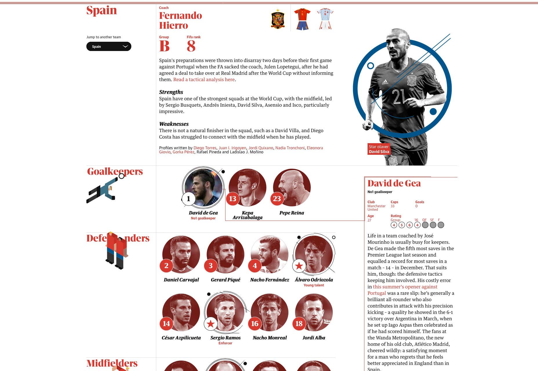
Tip 2: Lazy-Load Images
Another critical issue, especially in the case of a multitude of images, is lazy loading. The principle is simple: Load an image only when it is visible in the viewport of the browser instead of having the visitor wait by loading the entire collection of images. For a classic example, scroll down the Unsplash home page.Tip 3: Load a Site Skeleton First
Images never show up in advance, which is why you must account for perceived performance. Loading a basic skeleton version of a website before its images creates a better experience for visitors. They are then aware of what to expect and, in some cases, can even start to interact with the site (before images load). Consider the loading sequence of Klook: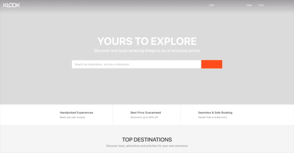 Here, for each image, the browser first loads a light version of the site (with a white backdrop) and then the actual background image. Such an approach might seem fast or trivial to some, but keep in mind that performance varies across connections and devices.
(If you are working with React or Vue, you can use this cool tool to create skeleton components.)
Here, for each image, the browser first loads a light version of the site (with a white backdrop) and then the actual background image. Such an approach might seem fast or trivial to some, but keep in mind that performance varies across connections and devices.
(If you are working with React or Vue, you can use this cool tool to create skeleton components.)
2. Treat Images as Part of the Design
This rule might seem obvious but is frequently overlooked. Images are an integral part of the design and, as such, must be taken into account. Because designs serve a goal, the related images and composition of the page must support that goal.Design Images to Complement
Remember to identify and prioritize the goals of the page. Whether your objective is to solicit newsletter signups or offer a catalog for browsing, your images must complement the intended purpose. As an example, Essential Phone’s landing page displays a single, eye-catching image of the product. The yellow Buy Now button prominently stands out, steering the visitor’s attention to the intended action. Because the image shows the product itself, it’s never cut off, nor does it serve as a background to the text.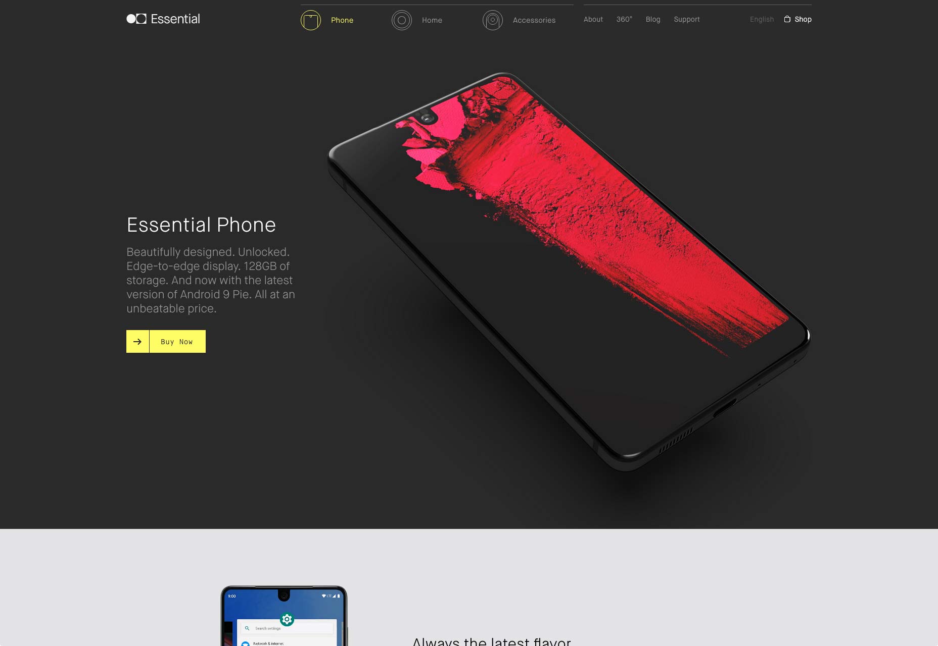
Have Images Take the Back Seat
Even though image-focused designs often deliver better results, be sure to follow the basic usability principles because those designs do not guarantee success. For example, you might overlook the visual hierarchy by assigning equal weightage to both the primary and secondary elements. MetaLab is a design agency that specializes in designing interfaces. When first displayed, its single-fold landing page shows only a solid-color background with minimal text, mainly the names of its clientele. However, as soon as you mouse over a company name, the background subtly changes, displaying a contextual image. That means no more suffering through context switching each time. Such a home-page design ably conveys the message that MetaLab’s clientele is impressively extensive.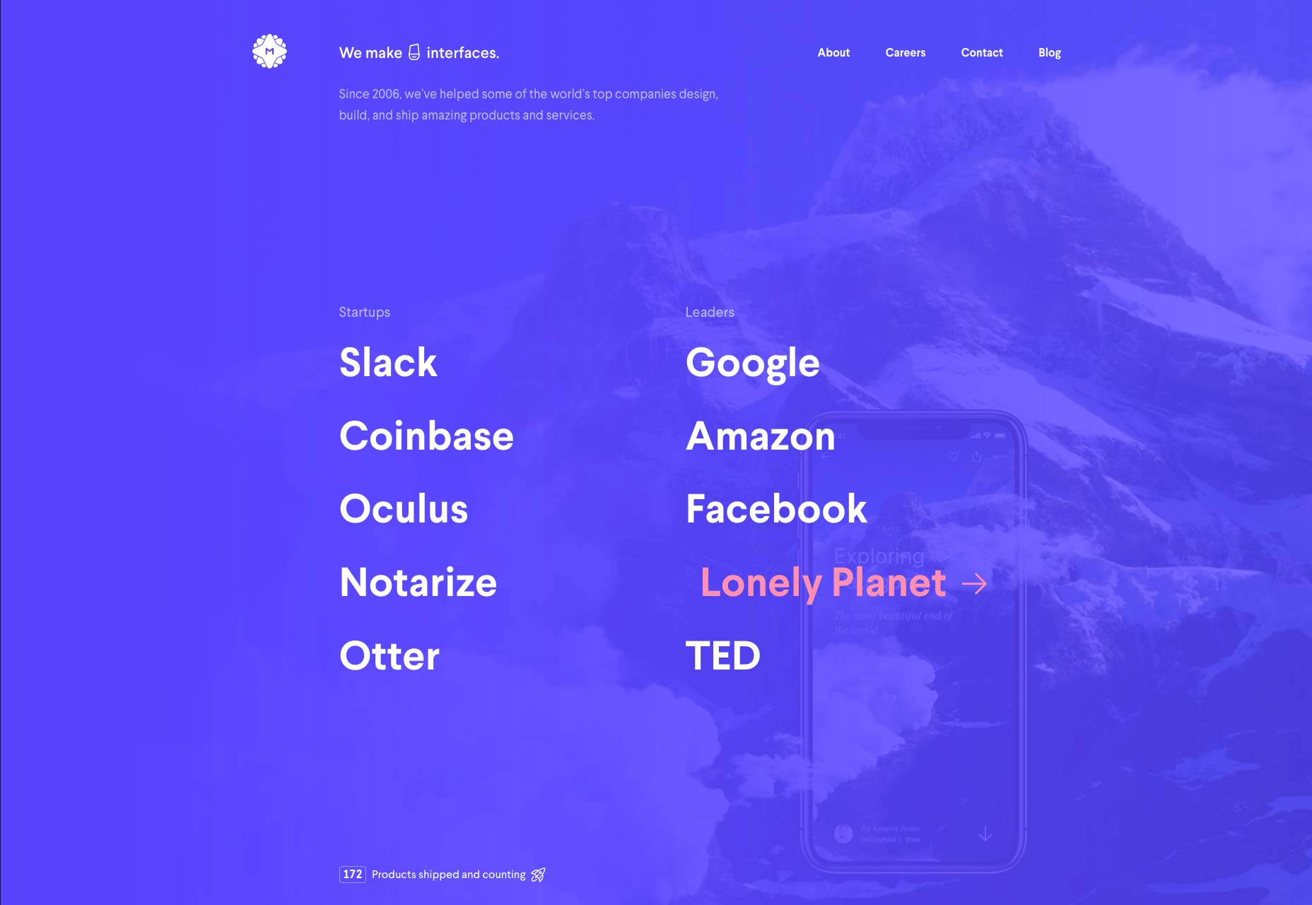
3. Let Text and Images Be Friends
Displaying both text and images on the same page can be a tricky business. The challenge is to find that perfect balance of text and imagery for your website.Place Text on a Soft Background Overlay
Placing text on a soft background overlay is one of the simplest techniques for presenting contrasting images and text. Indiegogo’s landing page is a vintage example, on which the title and description are displayed atop a soft, dark overlay on an image of each of the products offered on the site. The text is easy to read with no sacrifice in visual appeal.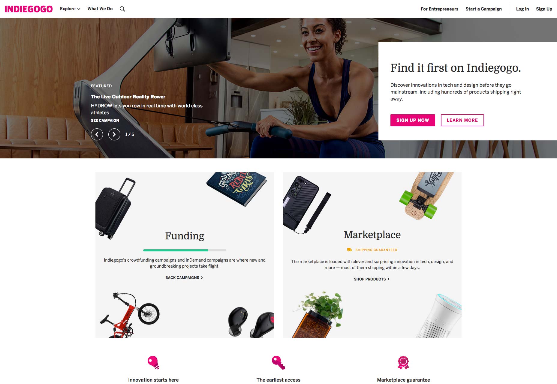
Blend Text and Images
Airbnb adopts a fantastic visual blend of text and images for their home-listing page. The images for the home categories contain the wording inside the images themselves, enabling the designer to play with hiding the text between overlay objects in the photographs. (See “Family”) Such an approach works seamlessly, demonstrating that text and image need not be separate entities. (A side note on accessibility: Keep in mind that using text in images also means no keywords for search engines except for those specified in the images’ alt tags, causing problems in accessibility unless you use the aria-label tags. Your final choice depends on the design context and your page’s objective.)Combine Text and Images as a Single Interactive Unit
The landing page of the 2018 film Sorry to Bother You shows the image of each member of the cast only on a mouseover of the member’s name, simultaneously lazy-loading the image. Although the text is composed of live text (list element), it uses a styled font and color along with the images’ drop shadow to make the presentation look like one piece of art (or movie). The line between image and text is blurry. Showing the right image at the right time embodies a playful and engaging user experience.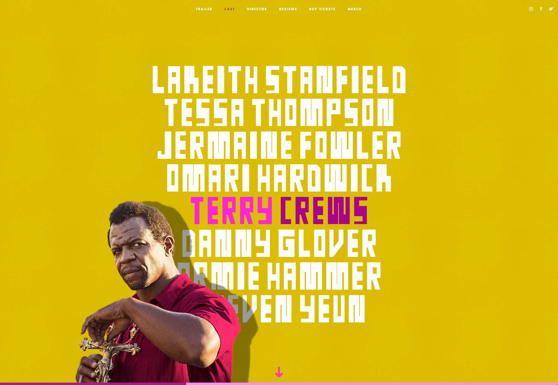
4. Apply the Right Layout
As we’re aware, user experience largely hinges on the layout of the website. For media-rich websites, the common layout choice is usually the grid. That’s because the grid’s pattern immaculately shows a list of images, also each one of them side by side. The sections below describe the three main grid types with an example for each of them.Apply a Classic Grid
A classic grid is one that contains square image-thumbs in equal sizes. It brings forth a sense of balance and harmony and is suitable for pages in which images are not the lead items for scanning. A list of cards is an option for a classic grid. Think of common use cases like YouTube and Dribbble.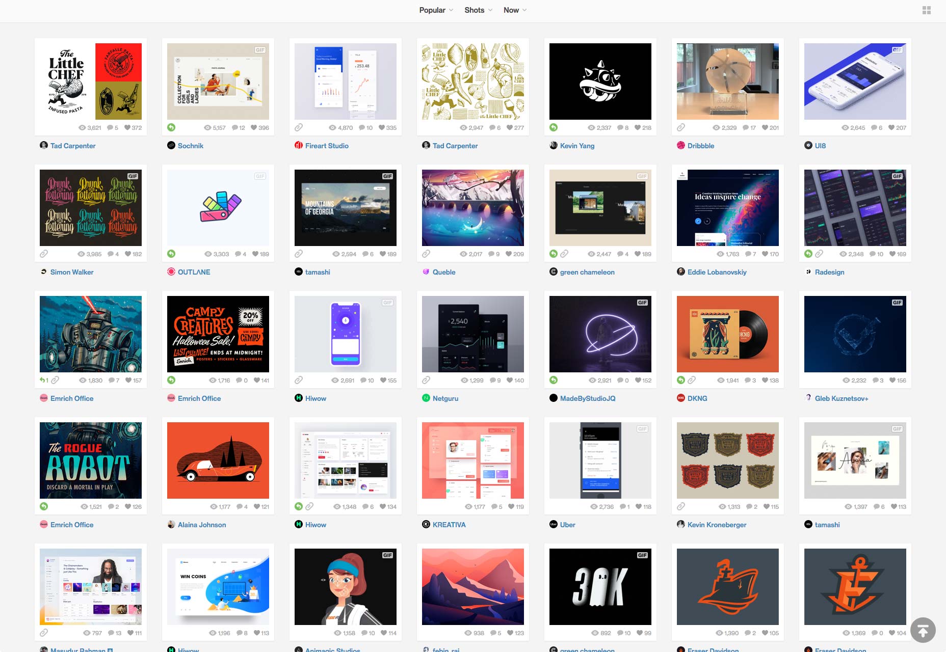
Apply a Brutalist Grid
Below is an example of a portfolio site that does not adhere to the all-too-familiar grid layout while still focusing on content. Marcus Eriksson is a sought-after photographer whose clientele includes top brands like Nike and ESPN. His website features an unconventional grid layout that draws the viewer’s attention to the content without sacrificing usability. The site also lazy-loads pretty nicely. Use this pattern if you want your visitors to focus on several individual images. The chaotic layout is very engaging and has an element of surprise. Beware, however, that some images might “get lost on the way” from all the racket.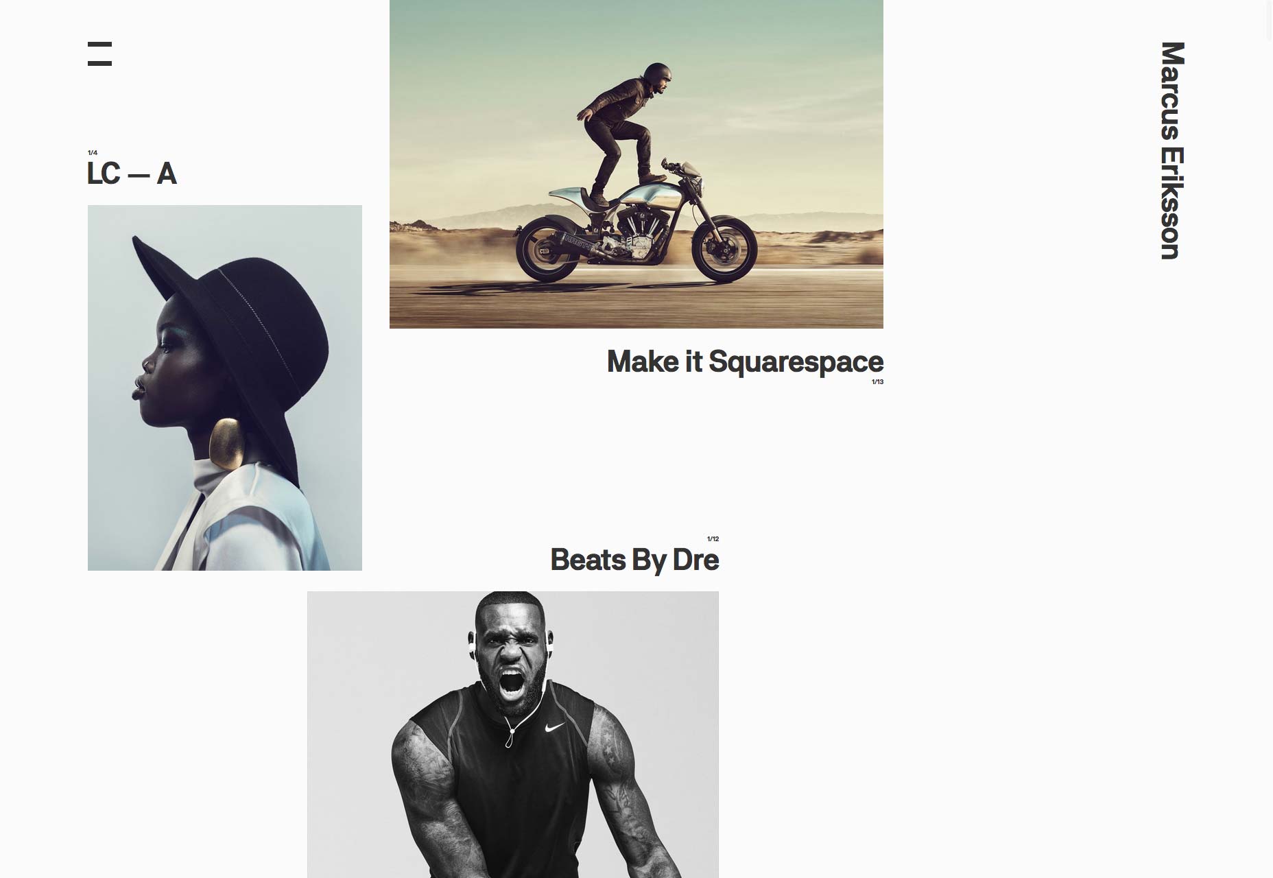
Apply a Masonry Grid
The Art Palette experiment from Google Art & Culture breaks down popular artwork into their fundamental color palettes. Inversely, it can also display artforms based on a color palette of your choice. For our purpose, the Art Palette site is inspiring. It’s a good example of a masonry grid, showing different sizes of images while keeping them “in order.” That’s an optimal way of displaying numerous images while keeping their original aspect ratio.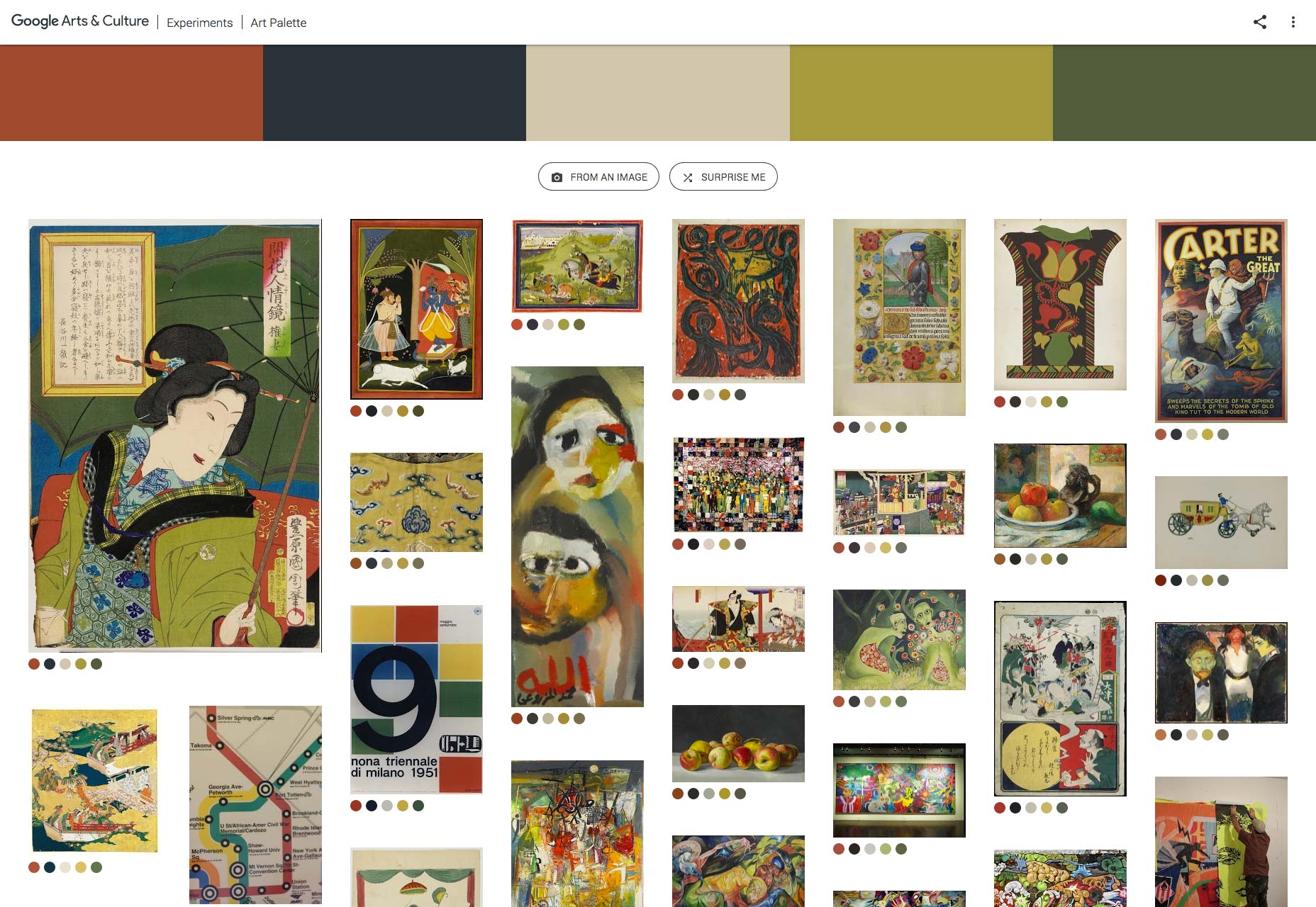 (You can build your own masonry grid with this plugin.)
A side note on performance: Remember the skeleton technique mentioned earlier? The Art Palette site takes it up a notch by initially loading a lazily-loaded, dominant color block and then progressively loading low quality image placeholders (LQIP). A highly recommended move!
(You can build your own masonry grid with this plugin.)
A side note on performance: Remember the skeleton technique mentioned earlier? The Art Palette site takes it up a notch by initially loading a lazily-loaded, dominant color block and then progressively loading low quality image placeholders (LQIP). A highly recommended move!
5. Add Motion for a Purpose
The element of motion adds to a website’s visual flair. However, just like with text, when tackling a large quantity of images, ensure that both motion and images work together. Some best practices of motion design principles are noted in Google’s Material Design. Below are some examples of how to employ animation to support UX in websites.Announce Layout Changes
In many cases, layout changes are unsettling for visitors, as if the ground was shifting as everything on the page changes location. Animation can help soften the changes for your visitors. Consider this example, which displays images in a classic grid. On a mouseover of an image, a subtle motion gently nudges the visitor’s attention to that element. In other words, the animation deftly steers the visitor from the grid layout to a single-image one. Simple, yet brilliantly effective.Load With Ease
Another interesting example is Uber’s design website. Because the main user action is simply scrolling down the page, which triggers image loading, the website enriches the browsing experience with smooth transitions and subtle animations, concurrently presenting the related information in a clear, easily-accessible manner.Switch Images
Fubiz softens switches between images in an image gallery with animation techniques, displaying a peek inside each and every image on the post.Incorporate Animation to Tell a Story
A final example: Avocode’s 2017 design report, in which each page has a story to share along with illustrations created by some of the world’s top design talent. The report acts as a comic strip, with each illustration built and animated to reinforce the key findings of the report.Don't Forget the Advantages of Video
Here is a good rule of thumb: If you can post videos instead of images, do it. See this example of a Nike product gallery, in which one of the items, disguised as an image, is, in fact, a video. An image is shown until the video is loaded so the shopper’s experience is not abstracted.Conclusion
Having to tackle the display of a massive amount of images or visual media doesn't mean that you should ignore design principles. Designing a trendy website without taking into account user experience invariably fails. Planning images as part of your website’s goal, enforcing performance, and incorporating animation can make all the difference between a spectacular experience and a boring one. [Special thanks to Sourav Kundu and Mickey Aharony for helping with this article.]Boaz Lederer
Boaz Lederer is the lead product designer at Cloudinary with over 10 years of experience in graphic design and animation. He's passionate about drawing and innovation and can definitely tell you the difference between UX and UI.


Read Next

3 Essential Design Trends, May 2024
Integrated navigation elements, interactive typography, and digital overprints are three website design trends making…

How to Write World-Beating Web Content
Writing for the web is different from all other formats. We typically do not read to any real depth on the web; we…
By Louise North

20 Best New Websites, April 2024
Welcome to our sites of the month for April. With some websites, the details make all the difference, while in others,…

Exciting New Tools for Designers, April 2024
Welcome to our April tools collection. There are no practical jokes here, just practical gadgets, services, and apps to…

How Web Designers Can Stay Relevant in the Age of AI
The digital landscape is evolving rapidly. With the advent of AI, every sector is witnessing a revolution, including…
By Louise North

14 Top UX Tools for Designers in 2024
User Experience (UX) is one of the most important fields of design, so it should come as no surprise that there are a…
By Simon Sterne

What Negative Effects Does a Bad Website Design Have On My Business?
Consumer expectations for a responsive, immersive, and visually appealing website experience have never been higher. In…

10+ Best Resources & Tools for Web Designers (2024 update)
Is searching for the best web design tools to suit your needs akin to having a recurring bad dream? Does each…
By WDD Staff

3 Essential Design Trends, April 2024
Ready to jump into some amazing new design ideas for Spring? Our roundup has everything from UX to color trends…

How to Plan Your First Successful Website
Planning a new website can be exciting and — if you’re anything like me — a little daunting. Whether you’re an…
By Simon Sterne

15 Best New Fonts, March 2024
Welcome to March’s edition of our roundup of the best new fonts for designers. This month’s compilation includes…
By Ben Moss

LimeWire Developer APIs Herald a New Era of AI Integration
Generative AI is a fascinating technology. Far from the design killer some people feared, it is an empowering and…
By WDD Staff