

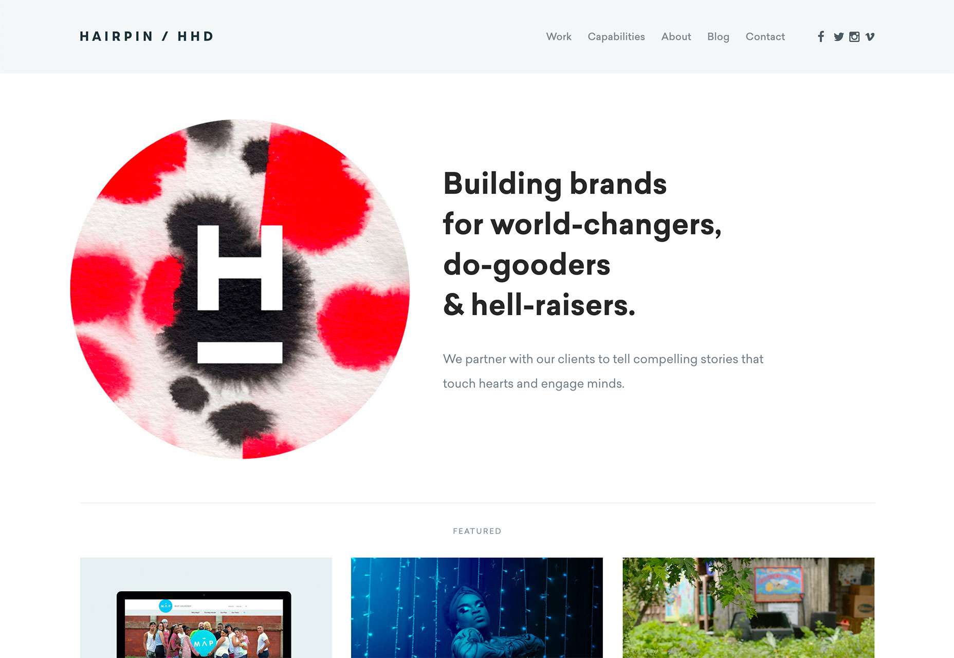
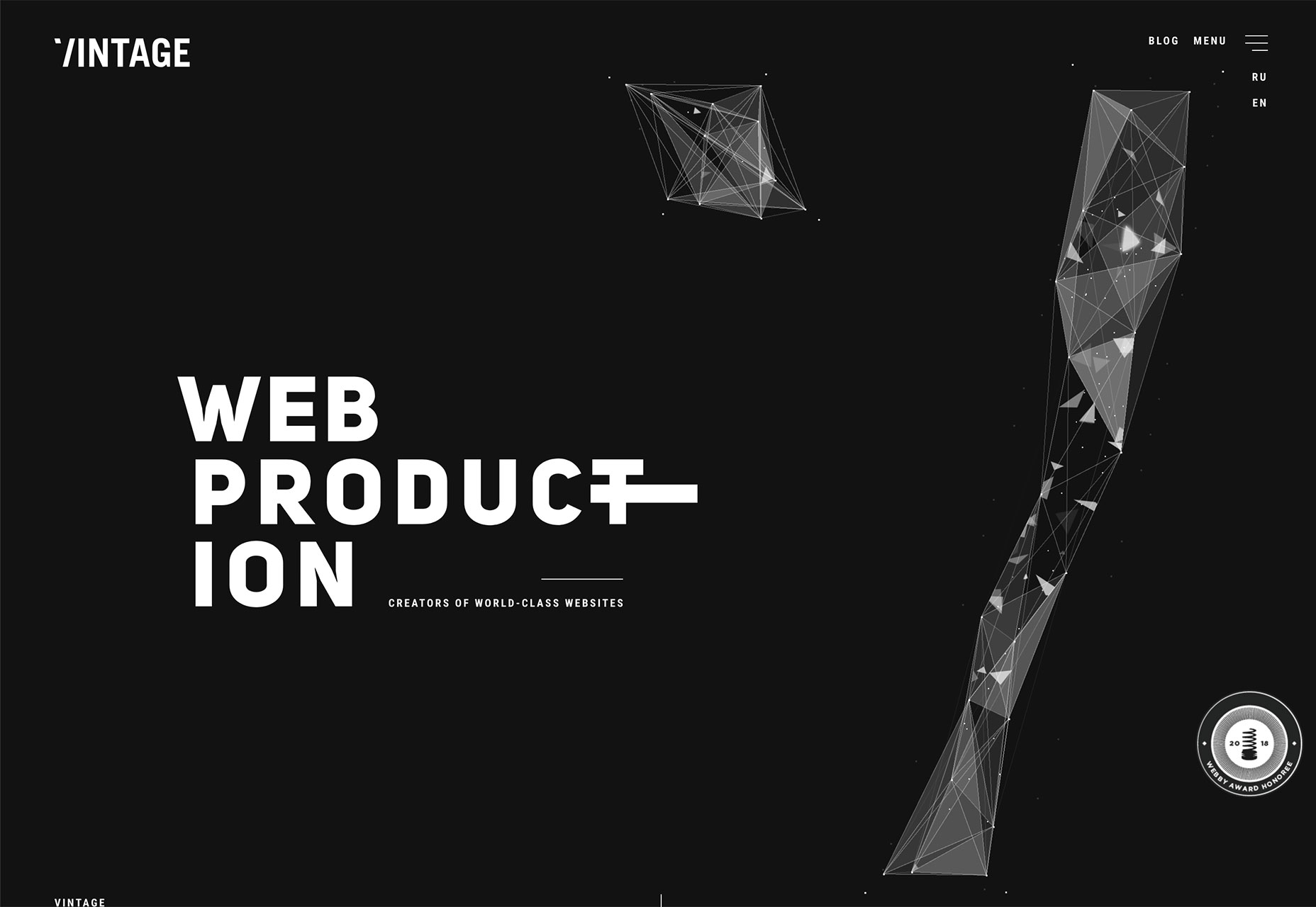
1. Stacked Text
The days of the oversized, three-word homepage headline are numbered. Designs are moving toward blocks of stacked text on the homepage. Visually, the weight of an oversized headline is still there. Informationally, there’s a lot more room for messaging. (Just don’t pack these headlines with unnecessary words.) The key to making this design trend work is typeface selection. You need a font that’s easy to read and gives you plenty of room between lines (but not too much room). Typefaces with exceptionally long ascenders or descenders can be an issue here. While designers are experimenting with all kinds of different typefaces, number of lines of stacked text, and alignments, there are plenty of all caps variations (that gets rid of the descender problem) and sans serifs. But don’t feel like this is a rule. Upper- and lowercase letters can look great in stacked blocks, as can serif typefaces. When picking a typeface for this treatment, look for the following:- Standard or medium x-height without long or elaborate swatches or flourishes. These characters can cause readability concerns in blocks of text.
- Regular shapes that aren’t too condensed or flattened. You know you are close when the bowls of each “o” is fairly round.
- Lettering with a style that seems to take on the mood of its surroundings. A font with too much personality here could overpower the actual words.
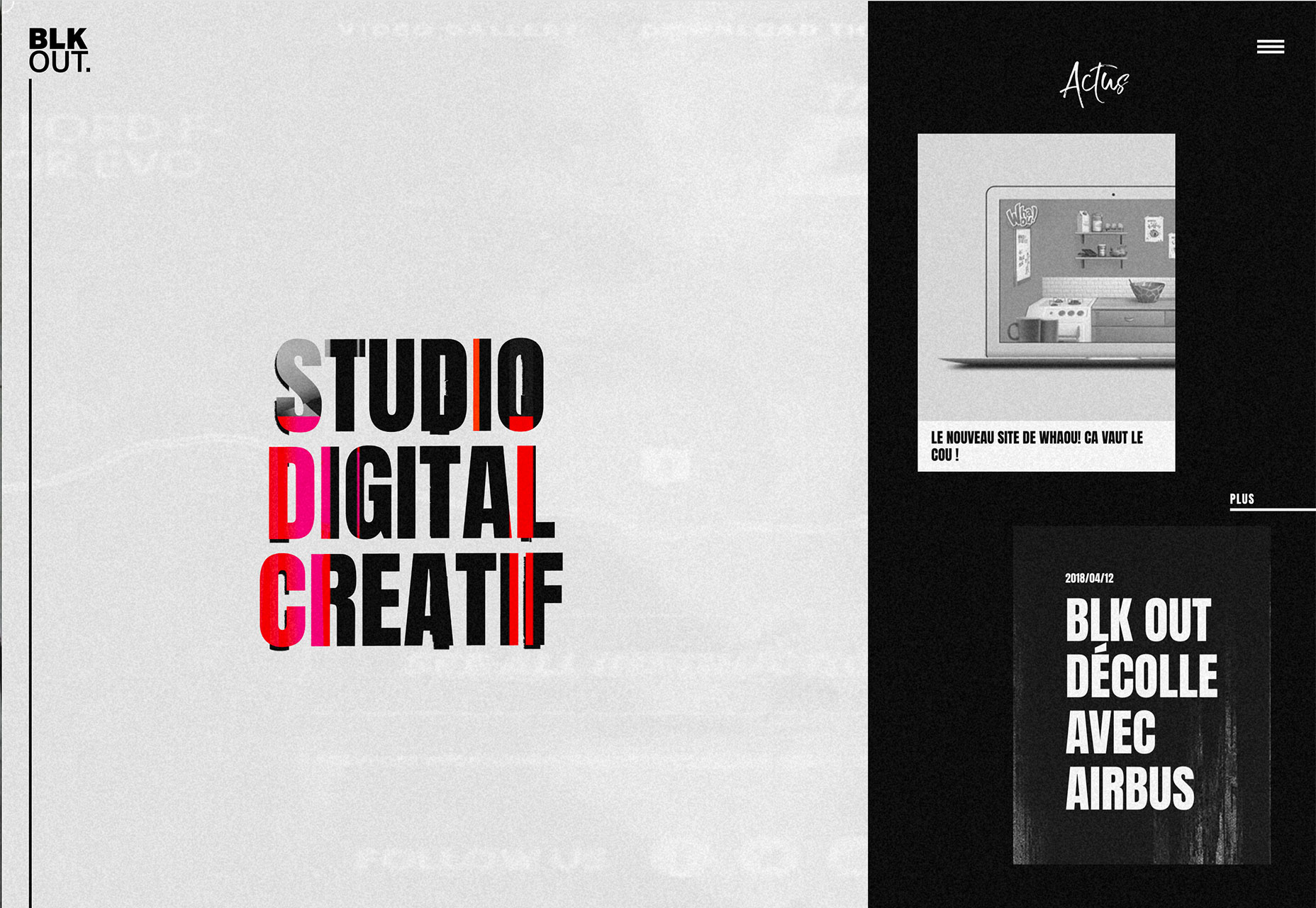
2. Glitchy Video
Wait…that video is glitchy…on purpose? While it used to be that glitchy video was a result of a slow internet connection or page load speed, glitchy video is a trend. Maybe we can attribute it to things like TikTok, a growing social media platform that uses this technique. Maybe we can attribute it to the fact that it stops users and makes them look. (Even if they might ask if that’s supposed to happen or not.) Either way, glitchy video effects are a definite web design trend. They might happen in the form of background video with distortions or glitch effects, animations that are activated by a hover or click with the same jerky movements or can seem totally random in a full-screen video. The evolution of glitch effects might also trace to the rise of brutalism. This “harsh” design technique has a similar feel as many of the brutalist designs that we’ve seen. When planning to use video in a way that’s glitchy or distorted, it’s important to use the trend in a way that has some purpose or intent. If the video just looks poorly created or bad, users will be turned off rather than intrigued by the design. It also takes a certain type of content for this effect to really have an impact. It is a gritty visual. It won’t mesh with soft content. The effect is often paired with more minimalist design frameworks and often doesn’t include a while lot of color. (Probably because the “trick” in the design is the glitch effect. With too many other things going on, it could turn into a design disaster quickly.) If you want to try a glitch effect, opt for a simple design pattern and use it in a way that matches content. (My favorite of the examples below is Studio Digital Creatif, which has a very old-school feel where the glitchy video seems like a television screen from decades past.)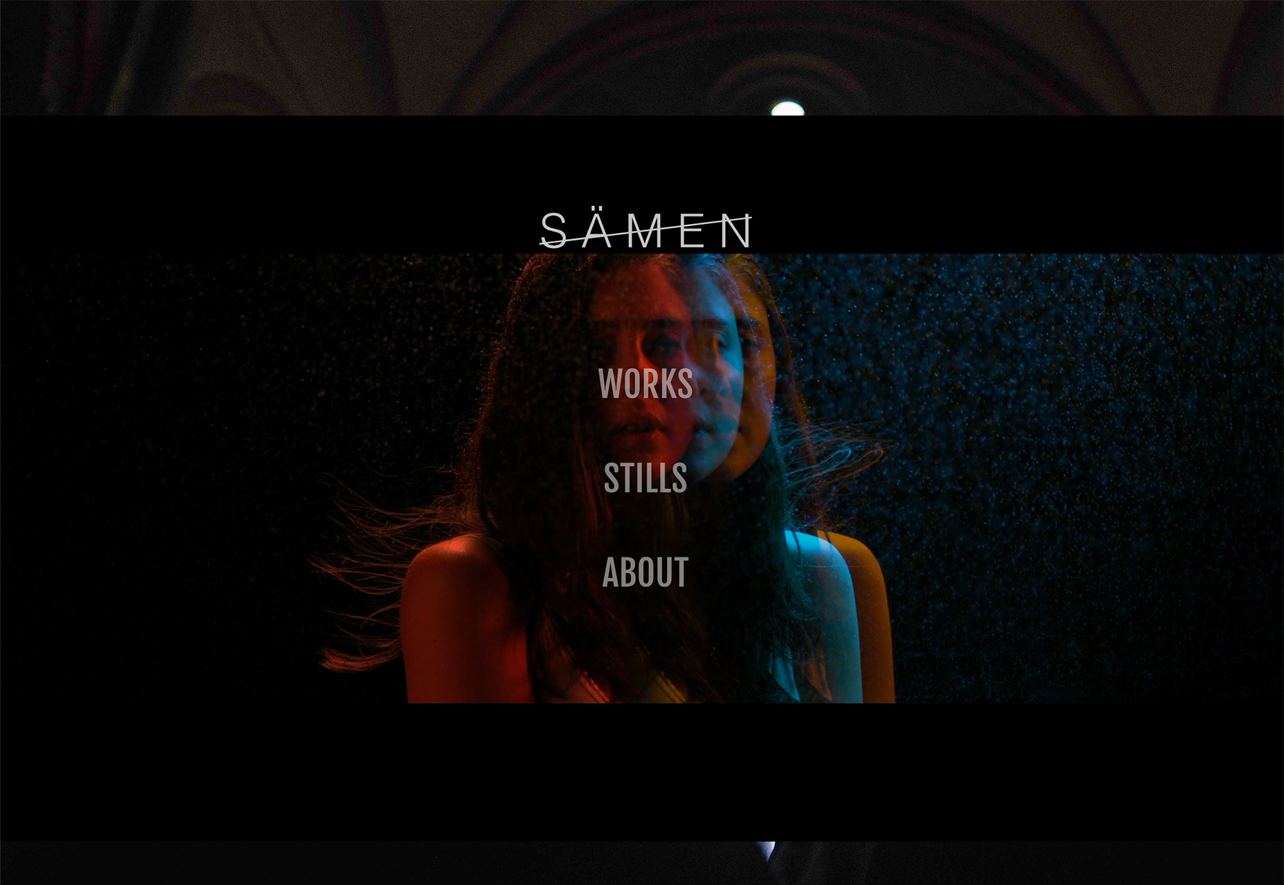
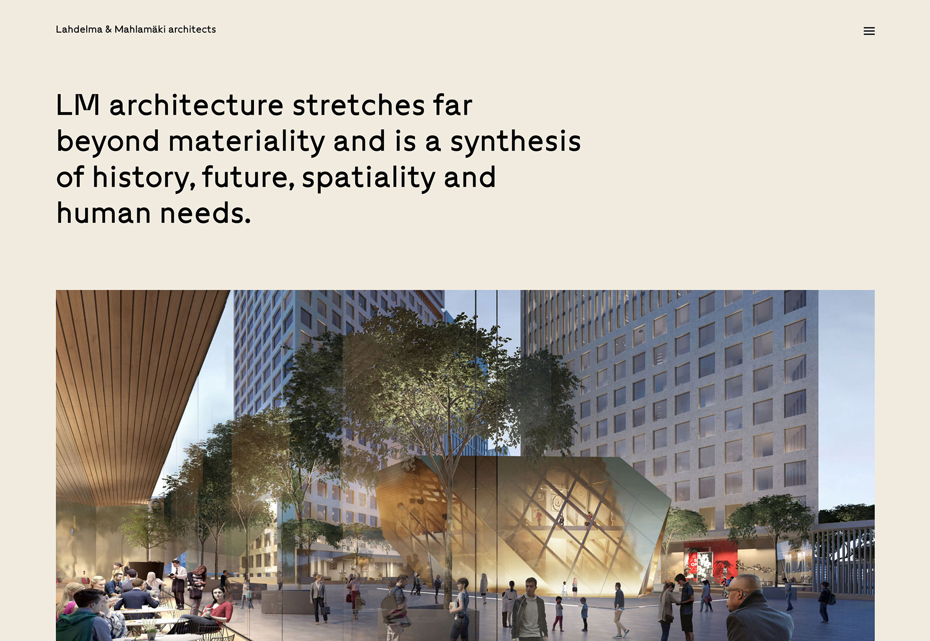
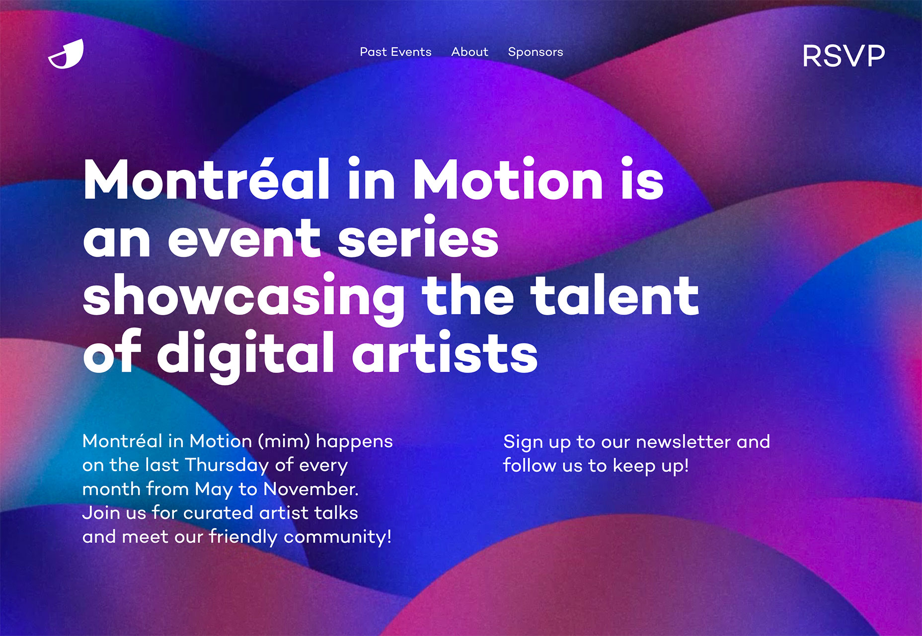
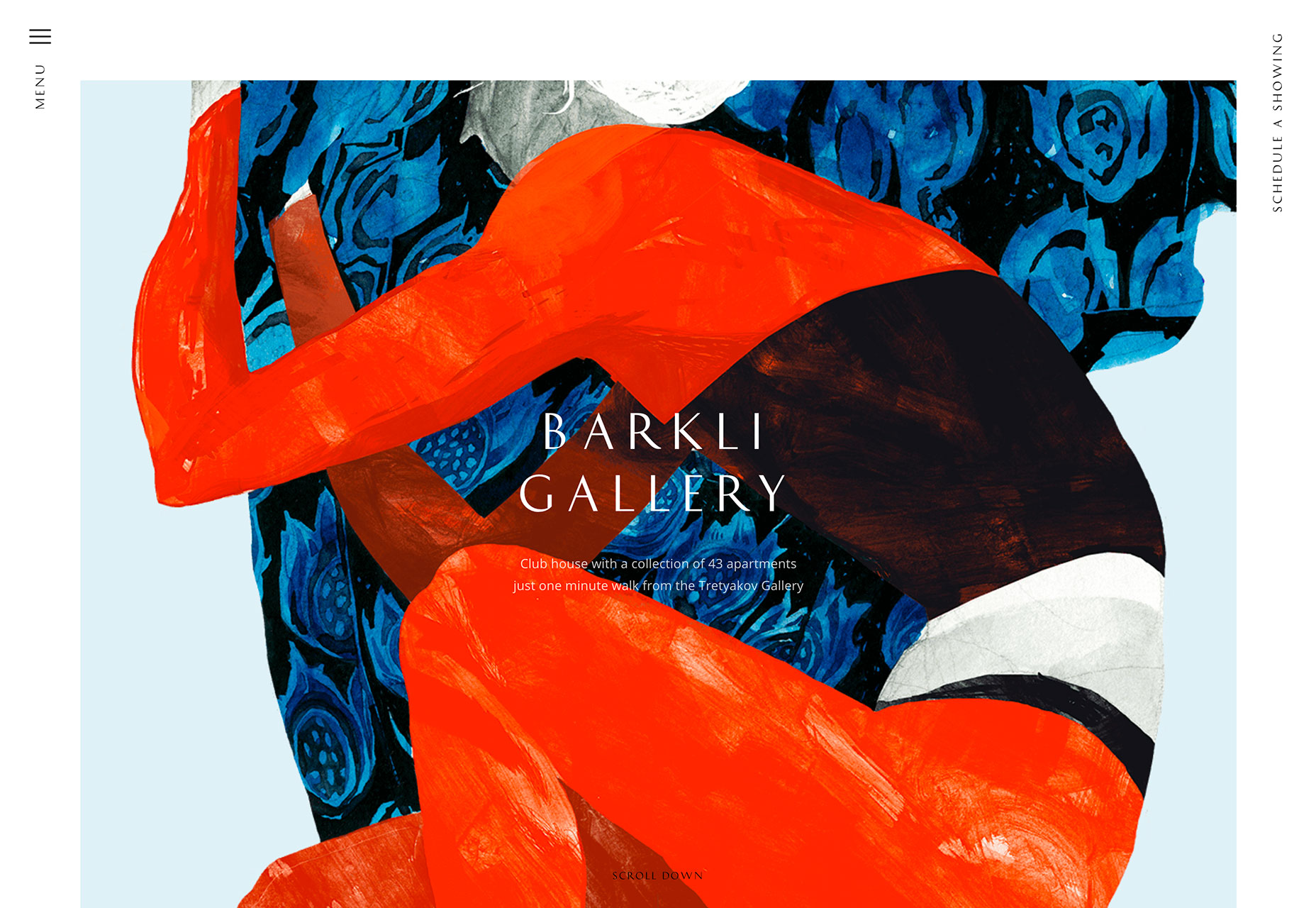
3. Almost Abstract Art
Exercise your creative muscles with more artistic representations on website homepages. While these designs might seem best suited for art galleries, abstract art is finding its way into a number of projects. (And it’s a trend we can get onboard with.) What’s nice about this trend–and concept–is that it can be accomplished in so many different ways. Each of the examples below takes a different approach to using almost abstract art in the design.- Montreal in Motion uses moving colored blobs to pull you into the design. It looks a little like water moving or maybe colors in the evening sky. Either way the artistic quality of the background draws users in.
- Barkli Gallery uses an actual piece of art to draw users into the design. This is an appropriate use for a gallery, but what’s nice is that the art isn’t showed full-screen in its entirety. You only see a portion of the image, giving it an even more abstract feel.
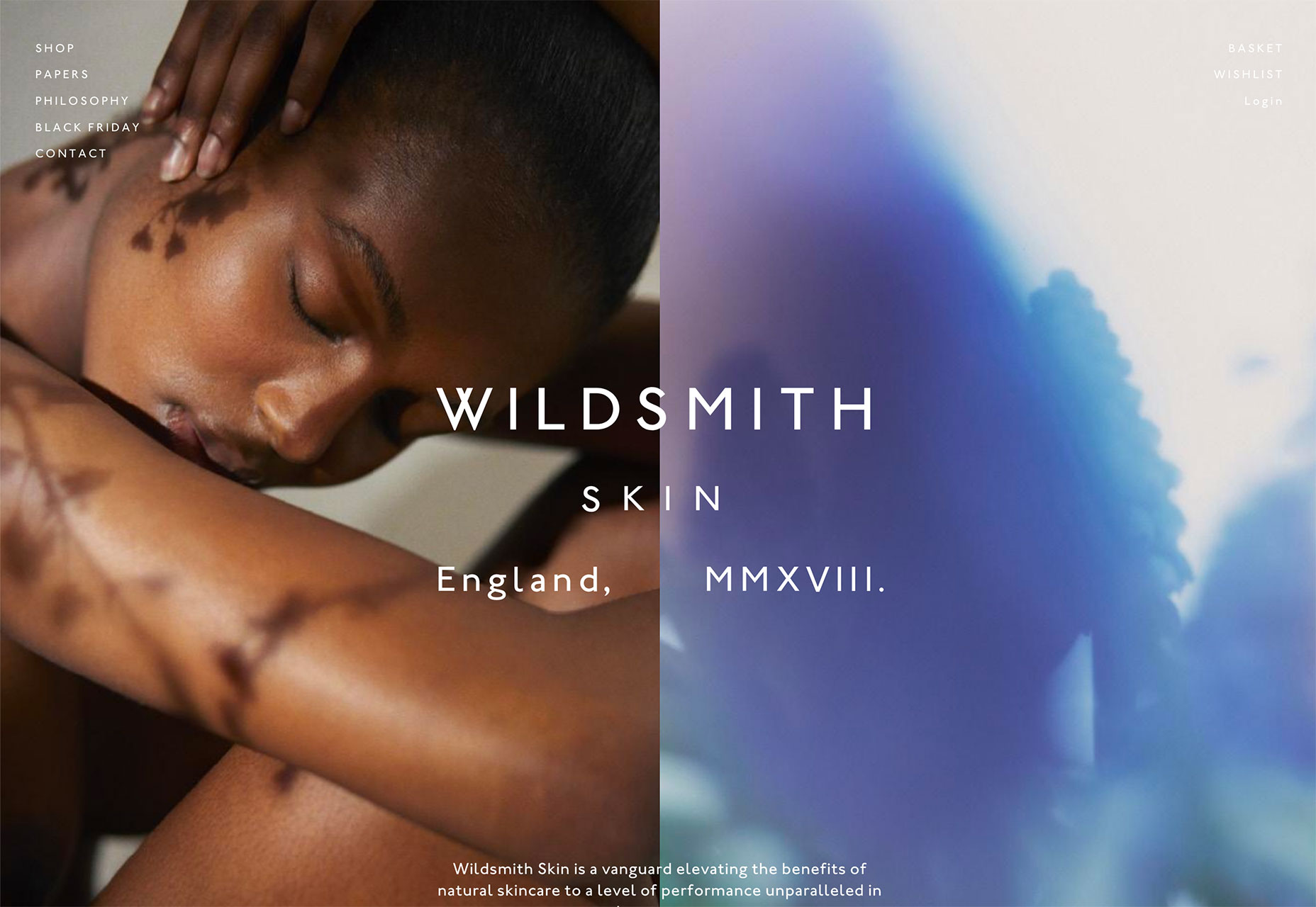
- Wildsmith Skin uses a split screen design with a person on the left and an abstract image for balance on the right. You might think the abstract image is a cellular-level view of skin or maybe a look at the product under a magnifying glass. Either way it creates a nice harmony with the main image and generates a lot of visual interest.
Conclusion
When in comes to design trends, do you like to be ahead of the curve or a little behind it? The examples above are pushing some of the boundaries of what has been popular visually for a while, with fresh takes on everyday ideas. What trends are you loving (or hating) right now? I’d love to see some of the websites that you are fascinated with. Drop me a link on Twitter; I’d love to hear from you.Carrie Cousins
Carrie Cousins is a freelance writer with more than 10 years of experience in the communications industry, including writing for print and online publications, and design and editing. You can connect with Carrie on Twitter @carriecousins.


Read Next

20 Best New Websites, April 2024
Welcome to our sites of the month for April. With some websites, the details make all the difference, while in others,…

Exciting New Tools for Designers, April 2024
Welcome to our April tools collection. There are no practical jokes here, just practical gadgets, services, and apps to…

14 Top UX Tools for Designers in 2024
User Experience (UX) is one of the most important fields of design, so it should come as no surprise that there are a…
By Simon Sterne

What Negative Effects Does a Bad Website Design Have On My Business?
Consumer expectations for a responsive, immersive, and visually appealing website experience have never been higher. In…

10+ Best Resources & Tools for Web Designers (2024 update)
Is searching for the best web design tools to suit your needs akin to having a recurring bad dream? Does each…
By WDD Staff

3 Essential Design Trends, April 2024
Ready to jump into some amazing new design ideas for Spring? Our roundup has everything from UX to color trends…

How to Plan Your First Successful Website
Planning a new website can be exciting and — if you’re anything like me — a little daunting. Whether you’re an…
By Simon Sterne

15 Best New Fonts, March 2024
Welcome to March’s edition of our roundup of the best new fonts for designers. This month’s compilation includes…
By Ben Moss

LimeWire Developer APIs Herald a New Era of AI Integration
Generative AI is a fascinating technology. Far from the design killer some people feared, it is an empowering and…
By WDD Staff

20 Best New Websites, March 2024
Welcome to our pick of sites for March. This month’s collection tends towards the simple and clean, which goes to show…

Exciting New Tools for Designers, March 2024
The fast-paced world of design never stops turning, and staying ahead of the curve is essential for creatives. As…

Web Tech Trends to Watch in 2024 and Beyond
It hardly seems possible given the radical transformations we’ve seen over the last few decades, but the web design…
By Louise North