

1. No User Onboarding at all
As a part of the team that created a product, you’ve probably spent hundreds of hours going over its features and the most minute detail. Naturally, you know the product like the back of your hand. The user does not. [pullquote]Naturally, you know the product like the back of your hand. The user does not[/pullquote] We may believe that the app we’ve worked on is straightforward and that user onboarding is probably overkill — but that’s almost never the case. Guiding our users through a product will help with retention, conversion, and their overall satisfaction. However, there are very rare cases when you can do without user onboarding, here are a few:- Your product is too straightforward to cause any confusion;
- Your product has a formulaic structure, similar to that of other products’ in your category, i.e., social media or e-commerce;
- Your product relies heavily on Google or iOS design guidelines with common design patterns;
- Your product is too complex (enterprise or business-oriented) — in such cases, users need special training, rather than just an onboarding;
2. Assuming That Users “Get It”
One of the vital UX mottos we should always be mindful of is that “we are not our users.” When onboarding them, we always need to assume that they’re at square one. We should communicate with them as if they have no prior knowledge of our product, its terminology, and the way it works. Providing freshly-registered users with highly contextual information will most likely confuse them. As a result, this will render your attempts to create a helpful onboarding process useless.3. Onboarding Users on a Single Touchpoint
[pullquote]it’s tempting to brainstorm which features should make it into the onboarding, then design and code them; that’s a very bad idea[/pullquote] The main problem with the previous point is that it’s too contextual for new users. However, providing no context altogether can be problematic as well. This is commonly found in onboarding processes that focus on a single touchpoint while leaving out the rest of the product. By choosing to inform users of our product’s features, we force them to detour from their “normal” course of action. This comes at the cost of the user’s frustration. Since we’re asking people to pay this price, it’s best to provide them with information that will also help them navigate the entire product. As a result, this will decrease the number of times we’ll have to distract them from their ordinary flow.4. Forcing Users Through Onboarding
We’ve previously mentioned that we mustn’t assume that users have any background knowledge about our products. The opposite argument can be made — experienced users don't need a basic onboarding process. It will most likely frustrate them, and it won't provide them with any real value. Also, forcing users through this process will most likely take the onboarding frustration to a whole other level. This is why it’s essential that we allow them to skip the parts they don’t find useful. This way, we’ll address the knowledge gaps of the people who really want it and need it.5. Onboarding Based Purely on Assumptions
This is yet another point that’s implicit in “we are not our users”. Oftentimes, it’s tempting to brainstorm which features should make it into the onboarding, then design and code them; that’s a very bad idea. Here’s what every designer should do instead:- Do user interviews: You should conduct these before having anything designed; user interviews will help you shortlist and prioritize features in terms of their significance, so that the onboarding is focused around the features that matter most.
- Do usability testing: Once you have a good idea of what features your users consider most important, design onboarding that reflects that; having completed your design, make sure to conduct at least 5 usability testing sessions with users, so that you can make sure that your design works.
6. Just Letting Users Quit
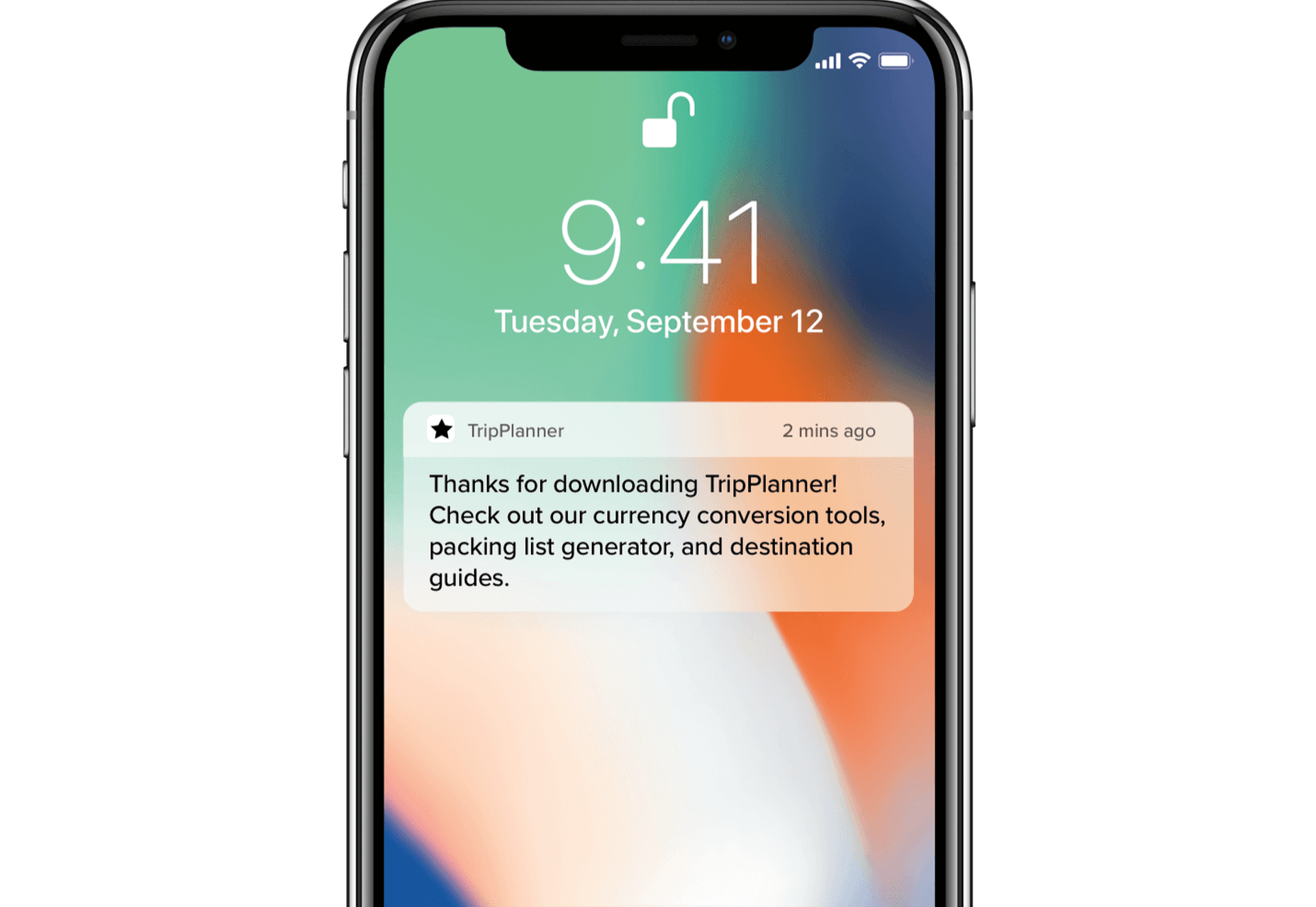
While we shouldn’t force people to go through onboarding, it doesn’t mean we shouldn’t nudge them in the right direction. [pullquote]find that sweet spot between being front of mind and annoying[/pullquote] People choose not to onboard for many reasons, but showing them around will benefit both parties. Therefore, it’s never wrong to remind them that they can always resume onboarding via email or push notifications (unless you’re too pushy). Make sure to find that sweet spot between being front of mind and annoying. Similarly, these two mediums are a great way to deliver valuable information as well. Here’s a great example of an onboarding email from InVision: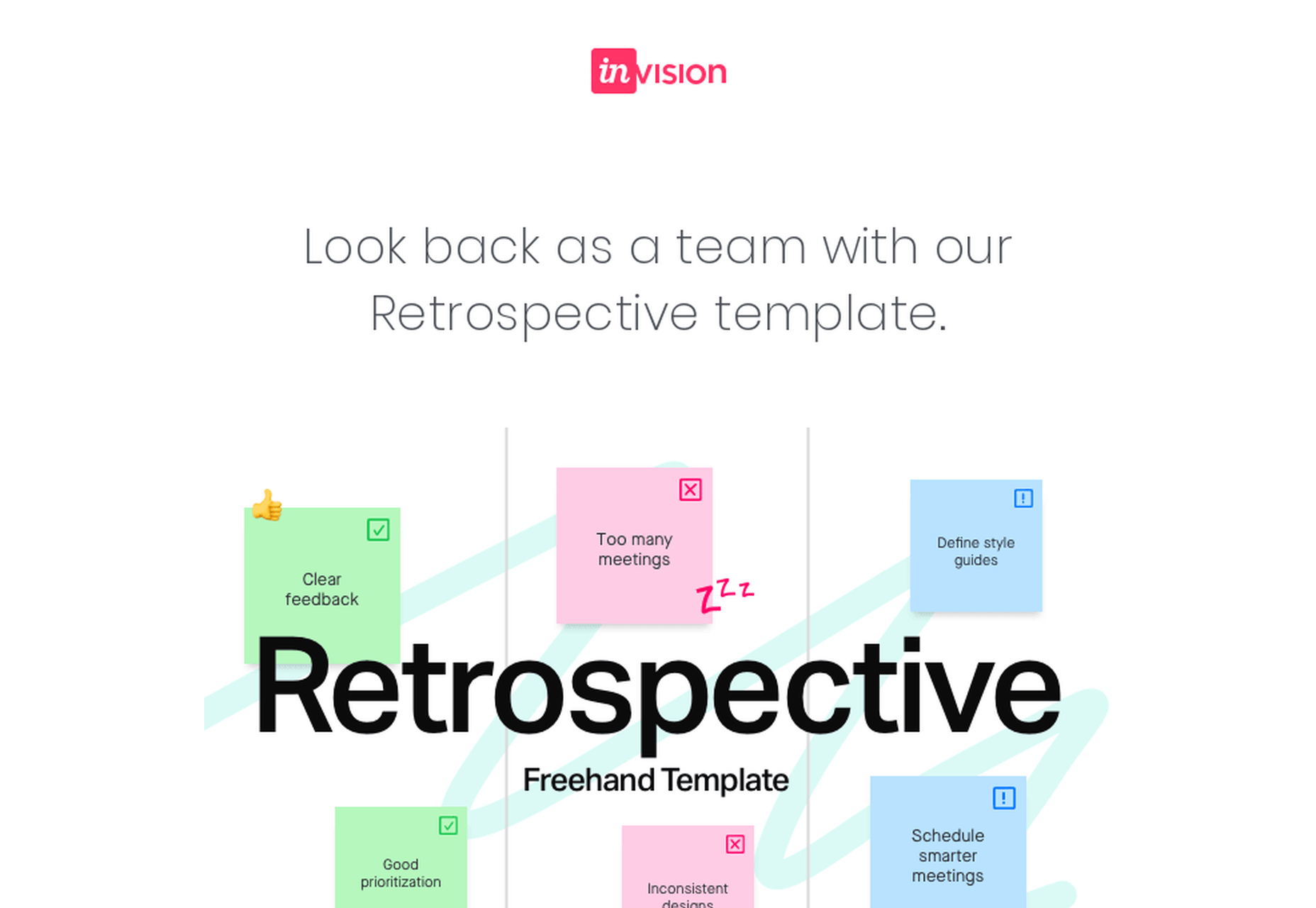 And here’s a clever notification from TripPlanner:

 Source: clevertap.com
7. Asking For Too Much Information
We need to always be mindful of the fact that the product’s spokesperson should act as a guide during onboarding. Its goal at the very beginning is to build trust. [pullquote]We can ask for small favors when we’ve built a solid and lasting relationship[/pullquote] Not only is asking for too much information from the get-go unproductive, but it will also undermine the trust that the user already gave us. It’s best to abstain from asking freshly-registered users for their credit card information. Nearly 100% of businesses care about profits — and there’s no shame in it. However, today’s most successful companies make money by providing users with value. So it’s best to stimulate users to share their financial data in subtler ways while focusing on customer experience. The same can be said about subjecting the people using your service to extensive questionnaires. At the first steps of our interaction, it’s all about giving and gaining trust. We can ask for small favors when we’ve built a solid and lasting relationship.8. Onboarding for the Sake of Onboarding
While there are dozens of reasons why you should guide your users through your product, it needs to be done well. A pointless onboarding process that doesn’t provide users with value is more frustrating than the lack thereof. Onboarding can be a bit frustrating at times. Pointless onboarding will just raise eyebrows. It will slow users down and disengage them, which is exactly the opposite of what we want.Conclusion
The process of introducing your users to your product is one of the factors that will define its success. A critical aspect of user onboarding that we need to always take into account is value. Is this detour from our user’s ordinary course of action valuable to them? Will this improve their experience with the product? Onboarding demands careful and continuous tailoring. Once perfected, this process will help you win new users' hearts and help you build brand loyalty. Featured image via Unsplash.Adam Fard
Founder and senior UX/Product designer at AdamFard a UX Design Agency in Berlin and Vienna. Among numerous inspiring business wins, he has helped to double the in-app purchases of a Global 500 company; and got another app promptly featured on the App Store, resulting in 10M+ downloads and a 4.7+ average user rating. He loves to collaborate with teams and startups from diverse industries and verticals to work on innovative products and technologies. As an industry thought leader, he enjoys traveling around the world, and helping entrepreneurs and businesses succeed in their projects.


Read Next

3 Essential Design Trends, May 2024
Integrated navigation elements, interactive typography, and digital overprints are three website design trends making…

20 Best New Websites, April 2024
Welcome to our sites of the month for April. With some websites, the details make all the difference, while in others,…

Exciting New Tools for Designers, April 2024
Welcome to our April tools collection. There are no practical jokes here, just practical gadgets, services, and apps to…

14 Top UX Tools for Designers in 2024
User Experience (UX) is one of the most important fields of design, so it should come as no surprise that there are a…
By Simon Sterne

What Negative Effects Does a Bad Website Design Have On My Business?
Consumer expectations for a responsive, immersive, and visually appealing website experience have never been higher. In…

10+ Best Resources & Tools for Web Designers (2024 update)
Is searching for the best web design tools to suit your needs akin to having a recurring bad dream? Does each…
By WDD Staff

3 Essential Design Trends, April 2024
Ready to jump into some amazing new design ideas for Spring? Our roundup has everything from UX to color trends…

How to Plan Your First Successful Website
Planning a new website can be exciting and — if you’re anything like me — a little daunting. Whether you’re an…
By Simon Sterne

15 Best New Fonts, March 2024
Welcome to March’s edition of our roundup of the best new fonts for designers. This month’s compilation includes…
By Ben Moss

LimeWire Developer APIs Herald a New Era of AI Integration
Generative AI is a fascinating technology. Far from the design killer some people feared, it is an empowering and…
By WDD Staff

20 Best New Websites, March 2024
Welcome to our pick of sites for March. This month’s collection tends towards the simple and clean, which goes to show…

Exciting New Tools for Designers, March 2024
The fast-paced world of design never stops turning, and staying ahead of the curve is essential for creatives. As…