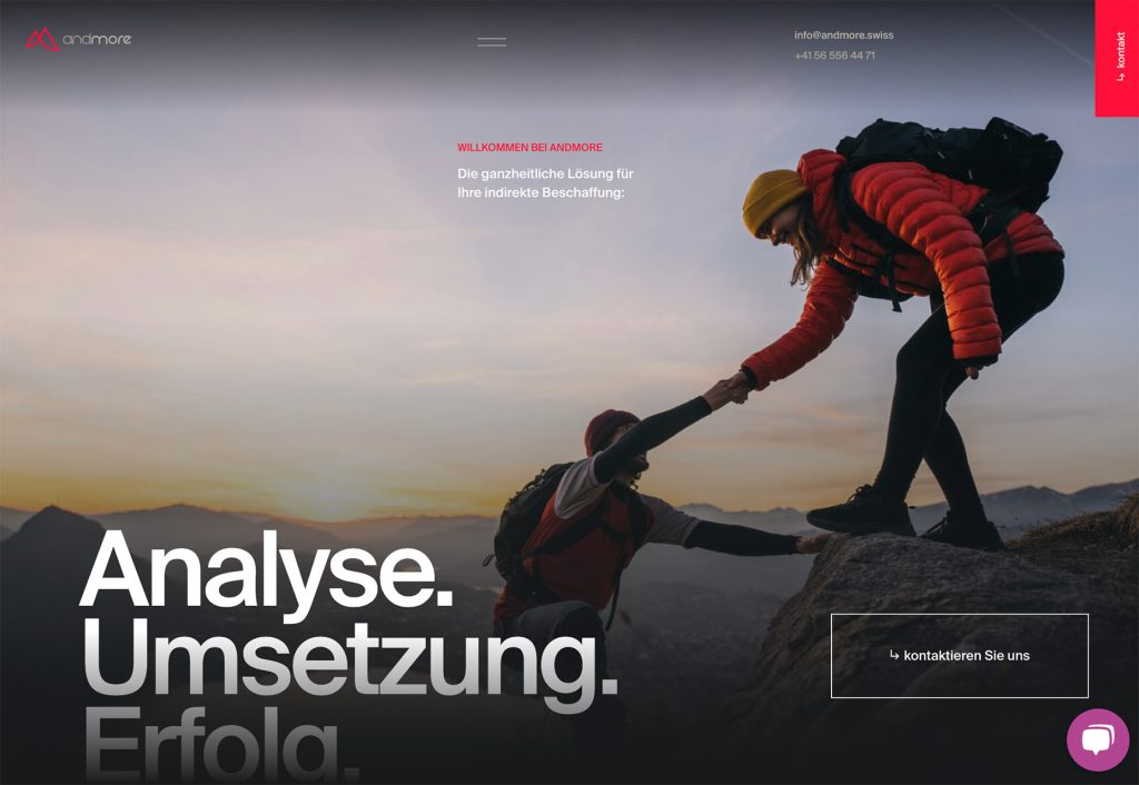
1
There’s no simple answer to that, it can be any of these things, or any combination of them. Hitting the right note with the design so it fits the subject is always important, but challenging expectations can also work.
Over the past year we’ve shown you more than 200 websites that we think have excelled. Some are selling products or services, some are experiments, some are informative or educational, some are political, and some are just really enjoyable experiences.
Today we’ve whittled those down to the best 40 to be inspired by, analyze for trends, or merely to view as a time capsule of web design in 2023. Enjoy!
Millor Creative Office
Millor Creative Office’s starts with basic black on white, then as the user scrolls color clouds appear, bursting and swirling together to forever changing gradients. If you like gradients, this is heaven.

Summer Afternoon
Summer Afternoon is an experiment in 3D, and the illustration style, gentle soundtrack, and details like the chirping of birds, all combine to make this a charming experience.

Monokel Eyewear
Great photography and a magazine editorial style layout give this a strong indie fashion edge. Add the easy navigation and this is a surefire winner for Monokel Eyewear.

Kora Living
Kora Living offers short and long terms in sustainable, co-living spaces. Curved image masks are used to good effect here, and the ‘arched window’ effect is particularly pleasing.

Studio Kleiner
As you would expect for a creative agency, the photography is great here but what really stands out in Studio Kleiner’s site is the navigation. Work can be selected to view based on a whole bunch of different tags, swells by project, medium, or skill.

Give a Hand
Give a Hand is a project by the American Society for Deaf Children to create an open source image library of human hands, which can be used to train AI to detect sign language. The site is simple, but still nicely done.

Saint Urbain
One of the perennial problems faced by designers is how to make sure text over an image is always readable, when the image may change. Creative agency Saint Urbain’s solution is to turn the text into a color negative image mask.

Plantica
The beautiful flower photography is what strikes the user first about Plantica, but a closer look will reveal an exemplary attention to detail. The complementary color image placeholders and the occasional flowering cursor trail are especially pleasing.

CoLabs
A well designed site usually employs a unifying visual element, the obvious ones being type and color scheme. On CoLabs’ site, the unifying element is the curved image masks, with an inverted corner. They create a modern, but comfortable feel.

United Sodas of America
United Sodas of America doesn’t have branding colors as such: each drink flavor has its own color. The website is entirely black and white except for the product shots and individual product pages. It is really strong, and very memorable.

Sculpting Harmony
This immersive site by Getty on the design of the Walt Disney Concert Hall in LA, is both educational and entertaining. An inspirational way to spend a break at your desk.

Viens-La
With its candy colors, curved corners, and informal copy, this site for Viens-La is friendly, fresh, and reassuring.

Opening Line
Opening Line is a really simple site, with some lovely details. The use of blue instead of black, softens the tone, and the occasional illustrations add character without becoming too casual.

Madre Mezcal
Warm, earthy colors, and woodcut style display type and illustrations are used well here, to reflect the artisan nature of Madre Mezcal’s products.

Duality
The Duality of the title refers to the concept behind this project: the relationship between nature and technology. But it could also apply to the fact that it functions as an effective showcase for the illustrators and motion graphics designer involved in creating it.

Shinbu Dojo
The masonry blocks as menu layout of the homepage here foreshadows the Bento trend that would emerge in full force later in the year.

Ekrem Elmas
It’s rare these days, to find an original concept when it comes to portfolio design, but (we think) Ekrem Elmas hs managed it. Click and drag to see examples of work, personal projects and scattered random personal facts: it’s fun and memorable.

Charlie Pite
This is a really simple, to the point, single pager for copywriter Charlie Pite. The hero video is engaging, but more importantly, the bit that really matters – the copy – is spot on.

Garonzi
From its opening video to its case studies full of great photographs and evocative copy, Garonzi’s website immerses the user in the quality of the craftsmanship on display.

East Side Paddle Club
East Side Paddle Club’s site effectively employs a vintage style to create a sense of nostalgia for community sports and leisure facilities (like lidos, and public tennis courts). It’s a different, and more engaging approach than private luxury.

ÖBB History
Trains are famously not interesting to all but a certain kind of person, and yet this site exploring the history of ÖBB (Austrian Federal Railways) is certainly not dull. The concept of choosing a ticket to travel to a particular time period is nice, and the information is presented in an engaging way. It is admirable that the darkest period in the company’s past is not glossed over.

Mirage
At first, this appears to be simply a collection of – albeit rather beautiful – photographs of the Mirage glass installation in Apple Park. It contains a wealth of information too, about the sand used to make the glass and the deserts it comes from.

Studio Museum in Harlem
With a brand new bespoke font, easy navigation, and crisp layout, The Studio Museum in Harlem’s site redesign is both striking, and appealing.

OpenBook
OpenBook is all about dreams, and analyzing the themes and symbols within dreams. This is reflected in a design theme where elements reveal text on scroll – titles splitting and diverging , and images ‘dispersing’ outwards for example.

Little Clothbounds
This microsite from Penguin books featuring its Little Clothbound Classics series of shorter, or lesser known works by famous authors, is a lovely piece in its own right. Each book has a fullscreen section with a description, each a variation of the same visual template.

Hotel 23
Our top criteria when it comes to judging hotel websites is: do we want to go there, irrespective of where in the world it is. The answer for Hotel 23 is a definite yes. It’s not just the excellent photography, it’s the various shaped image masks, and the circular visual theme appeal too.

A Drum Machine With Congenital Heart Disease
CHD4 is a drum machine that has been programmed with the heartbeats of 4 infants with congenital heart disease. The machine itself has already been sold at auction, raising money for the Swedish Heartchild Foundation, but you can still have a play with the digital version, as well as reading about the project and the children whose heartbeats were used.

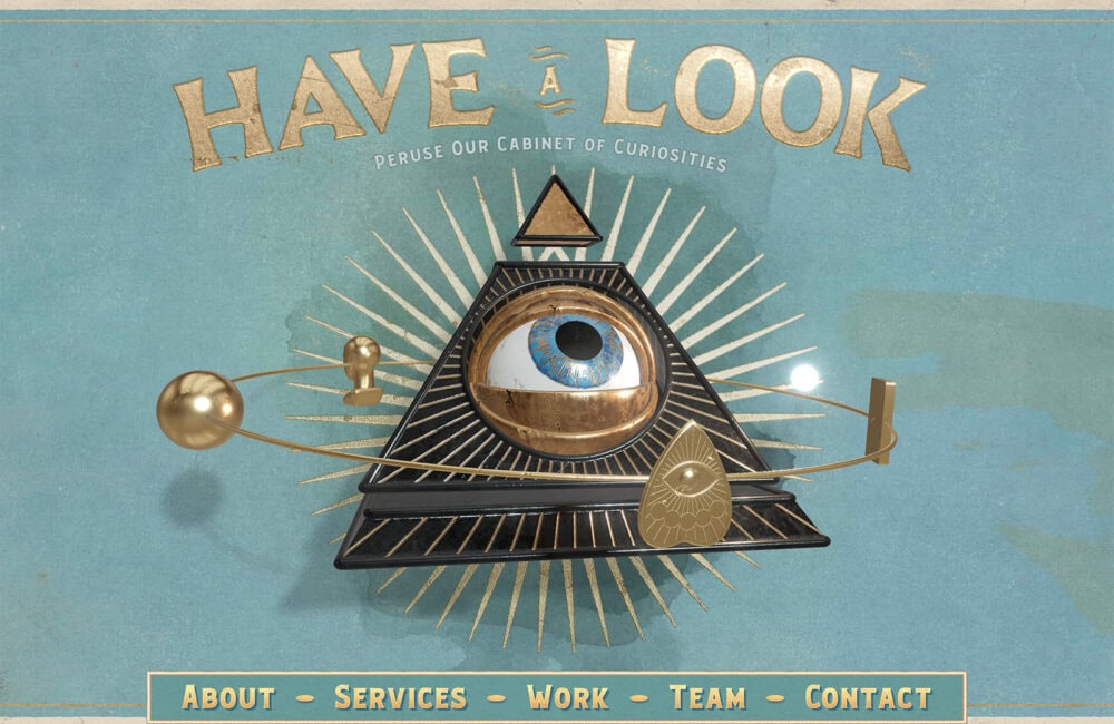
Curious & Company
Curious & Company creative agency has created a themed site based on a late 19th century occult aesthetic. It’s playful and immersive, while at the same time showing off real professional skills.

Express Shoe Repair
This simple, single page site is much more elegant than you might expect from the average shoe repair business. It is to the point, and looks good, a combination that inspires trust.

Boba Ice Cream
Stated aims of Boba Ice Cream include to deliver happiness, and unite people through food. The site certainly gives off a happy vibe, with ice cream backgrounds, and complementary toned display text. The Asian inspired flavours sound amazing too.

QiQi
QiQi develop high end haircare products mostly for salons, and this site is aimed primarily at professional stylists. It is glossy, with great photography, and the technical information is clear enough for a non pro to understand the gist.

Tigermilk
Tigermilk is vibrant and fun, with lots happening on the screen – video layered images, random illustrations and scrolling animations. This is a difficult trick to pull off, as it often ends up being cluttered and overly busy, but it works really well here.

Spring/Summer
Despite the fashion overtones, Spring/Summer is a digital creative agency, celebrating 10 years in the industry. Bright red text is clean but warm, and smooth transitions add to the well presented case studies.

Outline
Outline’s website is a beautifully minimalist portfolio, with a wide-spaced thumbnail grid, and helpful scope filters. The green background and large images create a lush contrast for the Studio section. Looks just as good on mobile too.

Middle Name
Middle Name is another minimalist design portfolio, that makes good use of large images and well presented case studies. The understated color coding of the menu is an appealing detail.

La Fantaisie
La Fantaisie hotel in Paris is presented here as a secret garden hideaway in the heart of the city. Arched image masks are a recurring theme throughout the site, creating a sense that the user is looking through a window to somewhere wonderful.

Ariga
Ariga’s site takes something which is quite technical, and a bit dry, and makes it appealing with comforting colors and little illustrated characters that are the right side of cute.

Pudding Studio
Pudding Studio is bold, and brash in a good way. It adheres to the brutalist trend from a few years ago, but manages not to appear dated. It’s playful with plenty of character, but has a serious, professional undertone.

Agropole
Agropole is a high tech hub for the agri-food sector. The fresh, juicy colors create a modern, bright, positive feel in a site designed to attract start ups.

Wildlife Luxuries
Wildlife Luxuries is a sustainable, luxury, safari resort that aims to provide a unique, tailored experience for each visitor. The sense of luxury is almost tangible on the website, with beautiful photography, and tones of brown and cream.


20 Useless Websites to Waste Your Time
The internet is usually a place for “getting things done,” but sometimes the soul just needs a little bit of high-quality nonsense. These websites aren’t trying to sell you a…
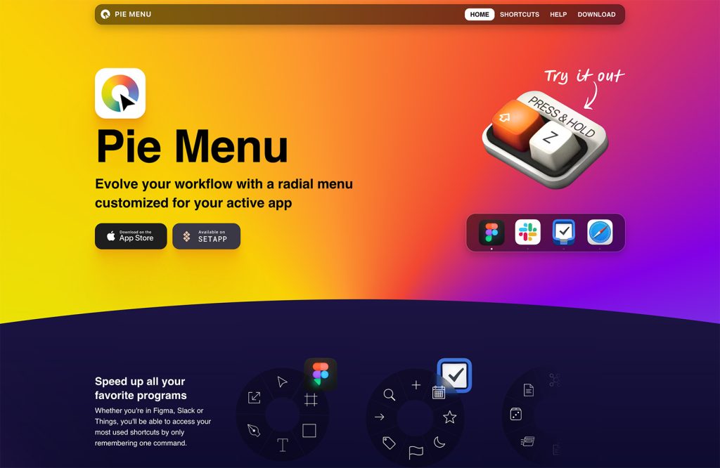
Exciting New Tools for Designers, February 2026
There are so many new – and good – tools for designers out there right now. From tiny bits of artificial intelligence to icons that delight, there’s something to help…
Exciting New Tools for Designers, March 2025
Spring into action this season with new tools to boost your workflows, facilitate creative thinking, and help you be a more efficient designer. This roundup is packed with new goodies…
Compilation: 15 Hilarious Google Flops
When it comes to tech, Google has been synonymous with innovation, success, and world domination (hello, Android and Chrome!). But even the mightiest giants trip over their own feet from…
3 Essential Design Trends, January 2025
Happy New Year! If the website design trends we are already seeing are any indication, 2025 is going to be a great year for visual communication. This month’s collection of…
Exciting New Tools For Designers, January 2025
Welcome to our first tools round up of 2025. It’s the first Monday of a new year, and many of you are back at work after a much needed break….