1
A good portfolio can mean the difference between landing a client and not, which makes it one of the most important creative jobs you will ever do. There are different ways to approach it, from simply letting your work speak for itself, to letting rip and showing off your skills.
As important as a portfolio is, working for yourself can be the hardest client you’ll ever have, so we’ve gathered together some outstanding portfolio sites for you to grab inspiration from. We’ve included portfolios from creatives in different fields, and from individuals, small studios, and larger agencies.
Studio Feixen
Studio Feixen’s portfolio is a strong example of how to cram in lots of vibrance, without overwhelming the user. There is a great balance between fun and serious, implying an ideal blend of individual character and high quality work.

Made Thought
Made Thought is a very successful agency with some high profile clients, but that doesn’t mean they don’t need to make the effort with their portfolio. This opens with a slider of selected work, each of which links to a detailed case study. There is a lot of content on this site, but it is very well organized.

Studio Thomas
The website for Studio Thomas appears to be simple but also has a sophistication to it, it feels considered and calm. Navigation is good, contributing to positive UX and there are some nice details, like the randomized mask shape and colors on the landing page.

Raw Materials
Raw Materials are a little unusual in that while there is a link to jump straight to examples of work, they do not put images of work above the fold on this single-page site. In fact, you have to scroll down quite far to get to the work section. The bright colors and large type works well to express the ethos behind their approach.

Gus
Gus’s portfolio site opens with an entertaining—if slightly odd—homepage, full of randomized on-scroll animations. The whole site is fun but with a serious and businesslike purpose underneath.

Steve Wolf
With its borderless grid and crisp images, the home page for this portfolio invites further investigation. More detail on each project is linked to from the corresponding image. This feels like it’s a template, but one that has been used effectively.

Sophie Brittain
Sophie Brittain’s portfolio is very simple and very clean, information is brief and to the point. Case studies offer more detail as you are guided through the design process, ending with a link to the finished product.

Joao Verissimo
The core of Joao Verissimo’s portfolio is a showreel, which given that he is a motion graphics and animation designer, is apt. Colors are kept simple but bold.

Good Habit
Good Habit’s portfolio starts with a rather stark homepage. It is almost entirely black on white, with just a little bit of grey, and features a grid of simple icons representing clients. The only color on the site appears in the showcase section for each brand. This succeeds at making a clear distinction between information about the work, and the work itself.

Bruno Simon
This portfolio is definitely of the showing-off skills variety. You navigate the site by ‘driving’ a little jeep around it. There is the option to click and drag, as a backup if that gets a little frustrating. It’s playful and memorable.

Buzzworthy
Buzzworthy is a digital studio and its portfolio site shows off its abilities with smooth transitions and lots of animated interactions. Overall, it is bold, and slick and should impress potential clients.

Ana Leovy
Ana Leovy is an artist and illustrator who displays no images on her homepage. While this might seem like an odd choice it works well by keeping images and text largely separate, allowing the images to stand out. The copy has a personal tone, which is welcoming and engaging.

Merijn Hos
Merijn Hos, also an illustrator, adopts a very different approach from the previous example. A large grid of thumbnails, each linking to more information, makes up the main body of this site, and the copy for his ‘about’ information is written in the third person.

Julia Dziubina
Previous work is well-presented here in mock-ups, along with details on the designer’s process, and links to more in-depth case studies. Client testimonials also feature prominently. Most importantly as this is a UX/UI designer, the interface is pleasing and intuitive.

Thai Pham
Thai Pham’s portfolio site is entirely images. There is no ‘about’ section or personal information beyond contact info and social media links. This is a bold approach, but if you have the quality of work, and enough of it, then why not let it speak for itself?

Yul Moreau
The portfolio site for digital art director Yul Moreau is a single page, with no menu. You simply scroll through the various presentations of selected work to a skills list, a client list, and some contact links. Simple, but effective.

Mason Wong
Mason Wong is a full-stack developer with an obvious interest in interactive sites. For his own site, he has created an immersive experience that shows off his skills as much as it does the selected work being presented.

RoAndCo
RoAndCo opens with a well spaced grid of thumbnails, mostly rectangular, but with an occasional oval or elongated octagon to add a bit of extra interest. Larger images further down the page have rollovers offering in-a-nutshell explanations of the project aims, and link to full-page presentations. Everything is beautifully presented on this site and it has a graceful feel to it.

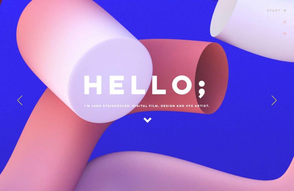
Lena Steinkühler
Following on from a striking hero slider, Lena Steinkühler’s site makes great use of an uneven grid to show teaser images that make you want to click for more. Text is kept to a minimum, even on the presentation pages, but that’s okay because the work on show is so visually appealing.

Locomotive
Locomotive has chosen a brutalist look to present its portfolio. But while the overall look is basic, there are lots of touches, like animated interactions, and image pixelations that create an engaging experience for the visitor.

Malika Favre
Artist and illustrator Malika Favre’s portfolio site is another that uses a grid of thumbnails on the home page. The option on desktop to filter by subject or color is a nice touch, as is the info button on the project pages. Everything about the site is in keeping with the style of her work, from the modernist type to the complementary color backgrounds.

Active Theory
Active Theory has gone for atmosphere, with moody, almost murky, color overlays. Experiments appear alongside client projects, and these combine to create an impression of a highly professional team that likes to push the boundaries of what is possible.

David Milan
David Milan’s work is presented in a simple gallery, with contact information at the bottom of the page. Images all have like and share buttons over them. It’s as straightforward as can be.

Robin Mastromarino
Robin Mastromarino is an interface designer with a clear interest in user interaction. The site has a playful feel, with projects appearing to be on a clickable wheel. When you click on a project to view, you see the header image straighten, but there is no sense of another page loading. It makes for a pleasing experience.

12 Tips for Designing a Great Portfolio Site
In many ways, designing your portfolio site is no different from any other site. You need to identify your target audience, know your client’s objectives, and so on. What is different here is that you are the client, and that can make things both easier and more tricky.
1. Check Out the Competition
Take a look at what other, successful, people in your field are doing for their portfolios. While you shouldn’t get too hung up on someone else’s ideas, it can be helpful to see what generally seems to work in your field. Looking at how others approach their portfolios can show you what is likely to catch a potential client’s attention.
It may also spark an idea for how to not do what everyone else is doing and so stand out from the crowd. Be very careful with this however — it could go badly wrong.
2. Quality Over Quantity
Only showcase your best work, even if that means you don’t have lots to show. Sometimes even good projects don’t work well in portfolios because they don’t have a strong visual element. Consider using these for in-depth case studies instead of displaying them on your home page.
3. Keep it Current
Put more recent work above older projects as you want to show that you are currently active and getting work. Take out any very old projects, especially if they look dated. You can still mention clients you did work for years ago, but they should not be featured as this will give the impression that you haven’t done much since.
4. Aim for Variety
Try to cover as many of your skills as possible in your choice of showcases. Include different types of project if applicable, and clients from as many fields as possible. (Of course, this doesn’t apply if you are deliberately focused on one field or skill by choice.)
5. Keep it (Mostly) Professional
Putting in some personal projects and experimental work can help round out the picture as they are where you can really let rip with your creativity and your technical skills. But be careful not to put in too much. If more than a third of the projects you display are personal, it will give the impression that you can’t get clients.
6. Show, Don’t Tell
While outlining why you have made certain design decisions can offer insight into how you work, no one wants to read a whole essay on every single piece of work you have ever done. Too much explanation can give the impression that you don’t have confidence in the work. Keep explanatory text to a minimum for the most part, but include case studies that dive deep into a few of your projects, illustrating your thought process, research, and development phases. Rotating which projects have case studies will help keep the site feeling fresh.
7. Think of it as Your Guggenheim
As a designer your portfolio isn’t just a vehicle to showcase examples of your work, it’s an example of your work in itself. No matter how impressive your projects are, if your own site is badly designed, with confusing navigation, poor UX or an unappealing UI, a visitor will leave with a negative impression of your work.
8. Sell Yourself
Your site isn’t only about your work, it’s about you. Prospective clients will be looking to get a sense of what you are like to work with, so don’t be afraid to let your personality come across. It’s ok to have fun with your design, and if you are a freelancer it’s ok to use the first person when talking about your work.
9. Brand Identity
You need to create a brand identity for yourself, that is consistent with any other material you have for your business — letterheads on invoices for example, or business cards. As you would for a client, choose type, colors and a logo that reflect who you are and how you wish to be seen.
10. Be Reachable
It sounds obvious, but it’s worth saying: provide clear, easy-to-access contact information. Some portfolio sites have contact forms with dropdowns for subject and details about the proposed project. This might be fine if you are a big, high-profile studio that doesn’t look at work under $50k, but for smaller studios and freelancers, it’s better to keep things simple. A contact form is fine, but don’t overcomplicate it.
11. Write a Brief
While we all at some time or another find ourselves railing against the ‘oppression’ of client opinions and longing for total creative freedom, when you are faced with it, it can be a bit scary. If you are used to working to a brief, and then find yourself in the position where you can do whatever you choose, it can be hard to make a decision. So be the client; write yourself a brief. Recreate the process you use with your clients. You might even find yourself refining and improving that process.
12. Get a Second Opinion
Curating your own work requires objectivity, and that can be hard. You may need to be a bit ruthless here. That site you made in college for your roommate to sell their homemade soaps 8 years ago may bring back fond memories, but it’s not likely to land you a project for Aveda. If you are having difficulty choosing work to include, or you aren’t sure you can be objective, ask someone whose opinion you trust to take a look. It doesn’t have to be another designer.
FAQ: Creating A Great Design Portfolio Website
1. What makes a design portfolio “great”?
A great design portfolio not only showcases your best works but also reflects your personality, style, and unique approach to design. It should have a cohesive and intuitive layout, high-quality visuals, and detailed descriptions of your projects, illustrating your thought process and expertise.
2. How many projects should I include in my portfolio?
It’s better to focus on quality over quantity. Include a well-curated selection of your best projects that demonstrate a range of skills and experiences. Typically, 8 to 12 projects should suffice to give an insight into your capabilities, with in-depth case studies of 3 to 4 of them.
3. Should I include personal projects in my portfolio?
Absolutely, personal projects can often showcase your style and passion even better than client work. They demonstrate initiative and can highlight your skills and creativity in a more personal and unrestricted manner. But remember, you should include a 2:1 ratio of client projects to personal projects if possible.
4. How often should I update my portfolio?
You should aim to update your portfolio regularly, ideally after the completion of a significant project. Regular updates not only add fresh content but also help in demonstrating your growth and evolving skill set.
5. Should I include a resume?
A stripped-down list of previous employers and clients along with a list of skills is enough for a portfolio site. Consider having a more traditional style resume (or CV if you are aiming at European clients) available as a PDF.
6. Should I include client testimonials and references?
Yes, including testimonials and references can add credibility to your portfolio. They provide social proof of your skills and professionalism, which can be very persuasive to potential clients or employers.
7. Is it necessary to have a blog section on my portfolio site?
While not strictly necessary, a blog section can be a valuable addition. It allows you to share your thoughts on industry trends, showcase your expertise, and can help with SEO (Search Engine Optimization) to increase your site’s visibility. But keep in mind that if you have a blog, you are committed to keeping it up to date. You will need to post something at least every few weeks. A neglected blog is worse than no blog.
8. How can I make my portfolio site SEO-friendly?
To make your portfolio SEO-friendly, ensure to use relevant keywords in your project descriptions, maintain a mobile-friendly design, and integrate social media platforms. Also, consider having a blog section where you can create content around industry keywords to boost your site’s SEO. But remember, you need to keep posting to your blog.
9. How do I handle projects with confidential information in my portfolio?
For projects with confidential information, consider showcasing them in a manner that doesn’t breach any non-disclosure agreements. You might create generalized case studies that focus on your role and the skills utilized, without divulging specific details or client information.
Designing your own site is possibly the most important project you will do in terms of advancing your career, and that puts a lot of pressure on to get it right. But, it can also be a lot of fun. So enjoy the process, and if you don’t like the first version, you can always ditch it and do another. In fact, you probably should change it every few years anyway.

Exciting New Tools for Designers, March 2025
Spring into action this season with new tools to boost your workflows, facilitate creative thinking, and help you be a more efficient designer. This roundup is packed with new goodies…

Compilation: 15 Hilarious Google Flops
When it comes to tech, Google has been synonymous with innovation, success, and world domination (hello, Android and Chrome!). But even the mightiest giants trip over their own feet from…

3 Essential Design Trends, January 2025
Happy New Year! If the website design trends we are already seeing are any indication, 2025 is going to be a great year for visual communication. This month’s collection of…

Exciting New Tools For Designers, January 2025
Welcome to our first tools round up of 2025. It’s the first Monday of a new year, and many of you are back at work after a much needed break….

40 Best New Websites, 2024
As regular readers will know, each month we roundup the best new designs of the previous 4 weeks. And now, at the end of the year, we’ve selected our 40…

The 30 Best Fonts of 2024
2024 has been a great year for type design. Over the past few years geometric sans have been less apparent, with cursive and serifs having something of a renaissance; that…