1
From vintage aesthetics to innovative new color schemes, we’ve seen a lot of creative logo designs this year. In this list, we’re counting down the ten best. Let’s get into it.
We’ve witnessed a plethora of exciting logo designs in 2023. Some have been absolutely awful (we’ll miss you, Twitter). Others have been incredible and a much-needed breath of fresh air amidst minimalist trends and responsive designs.
It seems as though companies are finally realizing that not every logo needs to look the same (who’d have thought?). We’ve seen brands returning to their roots to appeal to our nostalgia. Likewise, we’ve seen a range of companies take a much-needed leap into the future with bold, contemporary designs.
Whether you’re yearning for vintage designs or love seeing companies modernize their brand, this list has something for everyone. Join us as we count down the ten very best logo designs from 2023.
10) Bolt – Boring blues to head-turning hues

Fintech brand Bolt launched its redesign (right) early this year, and it’s fair to say the new logo has a lot going for it.
Firstly, just look at that color! It’s refreshing to see a household e-commerce brand opt for a striking palette that doesn’t center around blue and dark green hues.
Second, who doesn’t love clever use of negative space? Bolt opted to strategically place the lightning bolt between the ‘L’ and the ‘T’. It even looks energized. What’s not to love?
This is an excellent example of a brand that really pushed the boat out with its logo redesign. And, in a sea of boring typefaces and repetitive color schemes, we couldn’t be more grateful.
9) Nickelodeon – The return of the splat

Children’s TV company Nickelodeon really hit the mark with its latest vintage logo redesign. The brand famously removed its iconic splat mark back in 2009, much to the frustration of dozens of nostalgic millennials.
Now, the splat is back, albeit in a different form. The new design has softer edges and a warmer tone. It feels considerably more modern than the brand’s pre-2009 variant but still maintains the vibrancy and lightheartedness many felt the previous logo lacked.
8) Sundance – The perfect ratio

We know what you’re thinking. The new Sundance logo (right) isn’t particularly exciting. In fact, it’s a little bit boring
But the design’s simplicity belies a whole lot of symbolism and nuance. The proportions of the logo are exactly the same as those of a 16:9 cinematic widescreen. With this crucial context in mind, the minimalist design transcends the ordinary to become a love letter to the importance of film.
It’s refreshing to see brands injecting meaning into their logos rather than just opting for clean, minimalist designs.
Plus, with the bold monochromatic color scheme and Monument Grotesk typeface, it’s the perfect, eye-catching fit for a variety of contexts. We’re fans of this one, even if you have to understand it to enjoy it.
7) Mozilla Thunderbird

Mozilla’s logo redesign for its Thunderbird email client is one of the cleverest we’ve seen all year. It’s suitably different from the original Firefox design and yet instantly recognizable as part of the brand’s products.

Mozilla has taken the stylistic elements of the previous logo—a curled animal, intelligent color shading, and flame effect—and cleverly redesigned them to fit a different context. The new logo swaps the fox for a bird, adds the email icon into the center and substitutes the fiery orange hues for cool blue tones. It all feels very yin and yang.
The Mozilla brand has been no stranger to design mockery over the years. The progressive simplification of their iconic Firefox logo has copped them a great deal of criticism. But this new design feels like a step in the right direction.
6) Hodder and Stoughton

UK publishing house Hodder & Stoughton did something truly remarkable when it redesigned its logo in 2023. Can you guess what it is?
In short, the designer incorporated a stoat mascot into the design for the sole purpose of helping people pronounce the word ‘Stoughton’. Because, apparently, it’s pronounced ‘stoat-on’. Who knew?
We’re unsure how many times the company had to endure people mispronouncing its name to warrant an entire rebrand, but we’re certainly happy to see brands trying something new with their designs. Plus, we’re sure this excellent logo garnered them a bit of extra publicity. Win-win.
Of course, the success of this redesign relies on the majority of the population knowing that the animal in the image is a stoat. In reality, many people will probably believe it’s an otter. Ah, well, you can’t always win. At least people will know exactly how to pronounce ‘Hodder’ now, too.
5) Jell-O – Surgical health food to nostalgic fun

Remember Jell-O? The one true king of American dessert brands has somewhat lost its luster over the years. Sadly, the company’s previous logo didn’t do a great deal to capture the hearts of the younger generation.
Now, however, Jell-O has returned to claim its crown. The brand’s new logo design (right) is exciting, striking, and, most importantly, a whole lot of fun. Enormous drop shadows have injected a bit of personality back into the brand. It’s all quite nostalgic.

In truth, the old logo didn’t take much beating. Jello’s former design (left) looked more like a low-cal meal replacement than it did a fun, playful dessert.
It’s evident that the Kraft Heinz Company had previously wanted to position Jell-O as a health food. Sadly, this simply made the brand look old-fashioned—not the impression you want to portray when your entire offering is kid-friendly desserts.
Now, however, the brand is fully embracing the kitschy playfulness that captured America’s hearts back in the 1960s. The new design looks infinitely better. There may be some jiggle left in Jell-O after all.
4) Nokia – Charging forward into the modern day

Everyone is familiar with the famous Nokia typeface. The brand made a name for itself with its unbreakable phones back in the 1990s and early 2000s, and the company’s bold logo design was a reflection of this.

Sadly, Nokia’s iconic history came back to bite them in the 2010s, with many consumers seeing the brand as a relic of the past. And, when you’re trying to compete with Apple and Samsung for a slice of the smartphone market, perceptions matter.
For fans of continuity (and for those who remember Nokia fondly from their childhood), this new logo design may feel like a cop-out. But consider it this way.
Like the durable brick phones the brand is famed for, Nokia’s former logo felt outdated in the modern day. A redesign was a necessary way for Nokia to wave its flag and say, “Hey guys, I’m still here.”
Is the new logo a groundbreaking design? That’s up for debate. Is it exciting and intriguing? Absolutely. And if there’s one thing Nokia needs right now, it’s a little bit of hype. For that reason, this redesign is a win.
3) 7Up – Putting the ‘7’ up

If there was ever an incredible example of minimalism done right, 7up takes the cake.
The new design hones in on the core elements that consumers know and love while shedding unnecessary information. For a real insight into why this change is so impactful, compare the old product design (left) with the new (right).

The old logo felt like an afterthought on the previous can. Now, it’s front and center. The enormous 3D drop shadows and high-contrast color palette make the new design feel more exciting and alive. All of the things people don’t really need to know are left out. After all, does anyone honestly care that you can get 7Up on Uber Eats?
We see a lot of similarities between this logo revamp and the new Jell-O redesign. Both have leaned away from the ‘health food’ stance and have instead opted to highlight precisely what these products are supposed to represent—delicious, tasty fun.
This is really one of those design changes where you state, “I can’t believe they didn’t think of this sooner”.
2) Burberry – It’s okay to be different

British clothing powerhouse Burberry has experimented with a lot of different typefaces over the years. Once famed for its iconic Equestrian Knight logo, the brand made the somewhat predictable jump to minimalism back in 2018.
Sadly, this made Burberry look like a carbon copy of every other clothing retailer doing exactly the same thing.

Burberry was never supposed to be the same as every other business. The company built its brand on outrageous designs and unique color schemes. A minimalist design felt like a step backward for the once boundary-pushing brand.
Now, however, Burberry is back with a bang. Their new 2023 logo includes an antiquated sans serif font, marking a return to the brand’s heritage—a love letter to the days when companies would dare to be different with their designs.
And the best part? The Knight is back—and it’s better than ever.

Burberry’s new design is a significant change for the better. We’re particularly glad the brand didn’t ditch the detailing on its Equestrian Knight.
We can only hope more brands realize there is room for individuality in modern logo design. Wishful thinking? Maybe. We’ll just take what we can get for now.
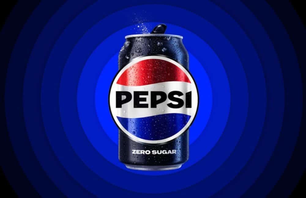
2. Pepsi – A much-needed return to form

Pepsi has always been partial to a new marketing strategy. It feels like we get the chance to report on their roaring successes and comical failures at least once every five years. And for that, we’re incredibly grateful.
While Pepsi’s logo changes have come under heavy scrutiny in recent years, the soft drink brand’s latest approach seems like a step in the right direction.
For the uninitiated, Pepsi recently celebrated its 125th anniversary. To commemorate the occasion, they unveiled their new vintage logo. And it’s fair to say this one’s a winner.

The new look celebrates the vintage 90s aesthetic that made Pepsi famous way back when. It feels like the brand is unashamedly embracing its roots, rather than trying to cover them up with responsive digital designs and minimalist patterns.
The rebrand is much closer stylistically to the old Pepsi logo (pictured below), albeit with a contemporary twist to catapult the retro aesthetic into the modern day.

Out of all of the logo designs on this list, this is the one that felt the most necessary.
If anything, at least it prevents their logo from drawing comparisons to an obese Pepsi enthusiast. And, for that, it takes our top spot.

Wrapping up: Here’s to 2024
We’ve no idea what 2024 will bring for logo design, but if it’s anything like this year, we’re sure to have lots to love and lots to laugh about.
Are you hoping more brands will return to a vintage aesthetic next year? Hoping the Twitter bird will make its grand return? Did we miss your favorite logo? Tweet at us and let us know your thoughts.

The 7 Stages of Pushing Pixels: From Hope to Existential Dread
Designing a website starts with purpose. You’ve got a clear vision, a good brief, fresh UI components, and maybe even buy-in from stakeholders. This time, you tell yourself, the design…

AI Didn’t Kill Web Design —Templates Did It First
Let’s get one thing out of the way: AI is not the villain of web design. It’s just the flashy scapegoat we’ve all decided to blame while quietly ignoring the…

Stop Using Hero Images! They’re Killing Your UX
There’s a pattern that’s haunted web design for over a decade now—one so embedded in our collective workflow that questioning it feels almost heretical. The full-bleed hero image. You know…

Dear Loading Spinner, We Need to Talk
Look, Spinner, we’ve been through a lot together… I know you’re trying your best—endlessly twirling, patiently filling the void, bravely masking backend chaos like some overworked stagehand in a failing…

Web Design Will Become the Art of Profiling the User
Let’s get one uncomfortable truth out of the way: web design is no longer about aesthetics, usability, or even user experience. Those noble goals have been quietly pushed aside. The new…

Exciting New Tools for Designers, June 2025
Another month, another roundup packed with design tools that use artificial intelligence features to supercharge your workflows. Expect this trend in new design, development, and productivity tools to continue for…