In this month’s collection we’ve got some really beautiful examples of what can be done with a few images, a couple of great fonts, a handful of colors, and some good design skills.
Aside from a few persistent Bento elements making appearances, there are no noticeable design themes this time around. Instead we have aimed for a range of approaches to various design challenges, from a clean, minimal aesthetic to the heavily characterised, illustrated style. Enjoy.
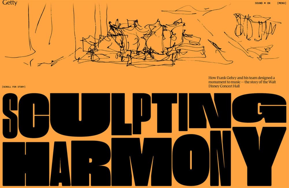
Sculpting Harmony
This is a beautifully put together exhibition on the process of designing the Walt Disney Concert Hall in Los Angeles. It effectively combines video, images, and illustration, keeping the focus entirely on the content.
The Studio Museum in Harlem
In advance of the opening of its new building, The Studio Museum in Harlem has undergone a rebrand, including a new website and custom typeface. The site is clean, bold, easy to navigate, and overall pleasing to use.
Pebble
This site for the new Pebble motorhome makes good use of some Bento elements — rounded boxes, nested boxes — without doing a full Bento layout. It works nicely, along with some smooth transitions and on scroll animations.
Supershine
Design subscription services look to be a growing trend among design agencies at the moment. Supershine offers unlimited design tasks for a flat monthly rate. The site is very upbeat, with a retro feel and lots of illustration.
Yahya J. Aifit
This portfolio site is a lovely homage to Web Desktops. It catches the attention, but by keeping things simple it avoids veering towards being a novelty gimmick. The movie reference is a nice touch.
Middle Name
Middle Name design studio’s site features a slide-in menu that is reminiscent of Pantone color cards. It’s a nice, subtle design feature in an otherwise very simple design.
Flayks
Flayks makes use of a strong color palette, smooth color transitions, and oversized type to create a sense of confidence and creativity. Side sliding panels containing additional info makes for minimal navigation.
Bertch Capital
Bertch Capital’s site is sharp lines, clean type, and a classic color scheme of black and white with an orange-red accent. This contrasts really well with the photography, much of which is misty forests and mountains.
30×30 Solutions
30X30 Solutions takes Target 3 of the Kunming – Montreal global biodiversity framework and breaks it down into bite sized chunks, elaborating on each chunk with explanations and resources. It is very easy to use and visually appealing.
D’une rive à l’autre
The design concept behind this site for two wine estates is based around the fact that they are on opposite banks of the same estuary. By swiping left and right on mobile, or using arrow keys on desktop, the user can switch ‘banks’ to see different content.
Roses
Roses uses a combination of fullscreen video and almost brutalist design aesthetic to create a modern, indie fashion feel.
Make HR Work
Make HR Work is easy to get around, with some nice transitions and pleasing interactions. The illustrations add friendliness.
Ethnocare
Ethnocare make a sleeve with an air expansion system for use with prosthetic limbs. The site has a high tech feel, with black backgrounds and scrolling animation.
Oxypac
Oxypac is moulded fibre packaging, including for food, so it’s fitting that this site is Bento inspired. Image mask numbers add a touch of color and brightness, making a good contrast to the otherwise muted palette.
Enpower Trading
Enpower Trading’s site uses no photography, relying solely on animated illustration for visual interest. This can be a tricky approach, but it works very well here. There is also a set of options to adjust performance and power usage.
Wizardly
As part of recent rebrand, Wizardly design agency produced this new site. The concept behind the design was puzzle pieces, with the agency being the piece that fit for the client. The abstract icons are rather charming, as is the color scheme.
Somvai
Somvai is a new device to wake you from a nap at the optimum time. The site for it features calming beige and brown tones and some pleasing animated product illustrations.
Abetka
Abetka is a collection of 33 fonts by modern Ukrainian designers: one for each letter of the Ukrainian alphabet. The visual design of the site alludes to grids and outlines used in type design. The color scheme is predominantly black and white, with accents of blue and yellow.
Hawkridge
This site for Hawkridge luxury land development site sets the scene with beautiful photography, an elegantly understated serif display font, and soft gold tones.
Nautilus Biotechnology
Blue is a popular colour choice for science related websites, and the different shades used here work particularly well. The palette is not truly monochrome: the fruity peach tone used for CTAs and as a highlight adds a pleasing contrast.
