1
Why Positive Colors Matter in Web Design
Optimism and positivity in design are much more than aesthetic choices. These elements serve a functional purpose, impacting user behavior and brand perception.
Optimistic design promotes positive UX (user experience), leading to increased engagement and potentially improved metrics. When your design is more inviting, it encourages users to stay longer and interact more with the content. Positive design influences user psychology, creating an emotional response associated with a brand.
The aesthetic-usability effect is a key principle in UXD (user experience design). It states that users are more likely to perceive aesthetically pleasing designs as more straightforward to use than less attractive designs, regardless of whether the beautifully designed system is actually simpler.
In the context of color in web design, this means that a visually attractive and optimistic scheme can enhance UX, increase engagement, and boost conversion rates.
Warm Colors in Web Design
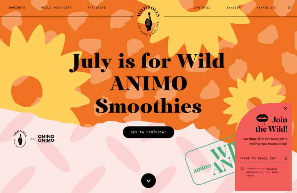
When it comes to positive colors, warm colors such as reds, yellows, and oranges immediately spring to mind, as they serve to attract attention and evoke emotional responses. They are particularly effective in creating a vibrant, uplifting, and energetic atmosphere on a website.
Red is often used for calls to action because of its ability to catch the user’s eye. In some cultures, it symbolizes passion, urgency, and excitement, motivating users to act. But be cautious as too much—particularly primary— red can be overwhelming.
Orange can be a good alternative to red as it combines red’s command with yellow’s natural happiness and is often associated with creativity, enthusiasm, and friendliness. It’s a popular choice for children’s websites, creative agencies, or any brand wishing to convey a sense of fun and energy.

Yellow provokes a happy response because it is often associated with sunshine. It’s a popular choice of designers, but it needs to be used with caution because yellow produces poor contrast against white, which can lead to usability issues.
Red, orange, and yellow are not the only choices for warm colors; it’s possible to create a warm green by adding yellow to create an inviting and cozy atmosphere or a warm blue by adding a touch of red to arrive at a more vibrant and dynamic tone.

Fresh Colors in Web Design
Another way to instill a sense of optimism and positivity through color is by using fresh hues. These colors typically fall within the green and blue spectrum and all the variations in between.
Green signifies growth, vitality, and nature in most cultures. Its tranquil and reassuring qualities make it an ideal choice for brands that want to associate themselves with health, wellness, and environmental consciousness. It can range from sharp yellow greens for an energetic and vibrant feel to darker leafy greens for a more lush, soothing feel.

Blue is another popular choice in the fresh color palette. It conjures feelings of trust, reliability, and calm, making it a favored choice for corporations hoping to persuade customers that they are trustworthy. Depending on the shade and saturation, blue can evoke a wide range of emotions – from the serene and contemplative tones of a deep navy to the refreshing and invigorating vibes of sky blue.
In between green and blue, there’s a whole range of dynamic hues for you to play with. From turquoise to teal, these colors blend the best of both worlds – the growth and wellness of green with the tranquility and trust of blue. They’re perfect for brands looking to merge a sense of innovation and creativity with stability and reliability.
Remember, maintaining high saturation levels is key to using fresh colors effectively. Dull or less saturated colors can appear muddy or dirty, negatively impacting a site’s aesthetic. Always aim for crystal clear, vibrant shades to keep your designs fresh and appealing.
Muted Colors
So far, we have talked about colors with a high level of saturation, but an alternative approach is to use a muted color scheme. Pastels and soft tones evoke positive energy and have a unique capability to convey a serene and peaceful ambiance.
Muted pinks, peaches, and caramel tones are an excellent choice for brands aiming to exude a sense of tranquility, wellness, and positivity, such as the self-care sector. Their subdued nature doesn’t overpower the design and allows other elements on the webpage to stand out.

Incorporating muted colors in web design often involves a careful balancing act. It’s crucial to ensure that the website remains engaging and visually appealing, despite the softer color palette. For instance, pairing muted backgrounds with bold typefaces or dynamic images can create a striking contrast that piques visitor interest. Moreover, using gradients of muted tones can add depth and dimension to the design, making the overall website appear sophisticated and modern.
Putting the Color Pieces Together
The key to effective color combination is contrast. Try to pair a warm or fresh color with a softer, muted tone. This allows you to create a sense of positivity without overwhelming the design with too many bright colors.
For instance, a warm orange accent can be paired with softer beige or cream shades to create a warming and inviting color scheme. Alternatively, for brands that want to convey a sense of freshness and vitality, pairing a bright green with a softer blue can evoke feelings of growth and tranquility.

Remember that the best color combinations are those that align with the brand’s personality and message. Always consider the emotional associations of your color choices and how they can contribute to a positive user experience.
Conclusion
Selecting positive colors in web design is all about understanding the brand, knowing its audience, and triggering the right emotions. Whether it’s vivid hues or softer tones, strategic color pairing can amplify your design’s appeal.
Positive colors like warm hues, fresh blues and greens, and muted pastels help create a positive vibe, facilitating deeper emotional connections with your audience.

The 7 Stages of Pushing Pixels: From Hope to Existential Dread
Designing a website starts with purpose. You’ve got a clear vision, a good brief, fresh UI components, and maybe even buy-in from stakeholders. This time, you tell yourself, the design…

AI Didn’t Kill Web Design —Templates Did It First
Let’s get one thing out of the way: AI is not the villain of web design. It’s just the flashy scapegoat we’ve all decided to blame while quietly ignoring the…

Stop Using Hero Images! They’re Killing Your UX
There’s a pattern that’s haunted web design for over a decade now—one so embedded in our collective workflow that questioning it feels almost heretical. The full-bleed hero image. You know…

Dear Loading Spinner, We Need to Talk
Look, Spinner, we’ve been through a lot together… I know you’re trying your best—endlessly twirling, patiently filling the void, bravely masking backend chaos like some overworked stagehand in a failing…

Web Design Will Become the Art of Profiling the User
Let’s get one uncomfortable truth out of the way: web design is no longer about aesthetics, usability, or even user experience. Those noble goals have been quietly pushed aside. The new…

Exciting New Tools for Designers, June 2025
Another month, another roundup packed with design tools that use artificial intelligence features to supercharge your workflows. Expect this trend in new design, development, and productivity tools to continue for…