1
The late 90s were a time of excitement and apprehension, with the Y2K bug scare and popular TV shows like “Friends,” “The X-Files,” and “Buffy the Vampire Slayer.” Musically, Britney Spears, Destiny’s Child, and the Spice Girls dominated the charts, drawing inspiration from clubs that played Techno and Drum & Base music.
The most transformative change was the World Wide Web, rapidly becoming a household staple and a space of endless possibilities. The iMac was the must-have technology. The dot-com boom was in full swing, and startups were growing rapidly, characterized by flashy graphics, neon colors, and simple animation that encapsulated the Y2K aesthetic.
For the first time in decades, youth culture was driving business as well as pop culture, and Y2K graphics reflected a bright future filled with possibilities as the new millennium dawned.
So why is the Y2K aesthetic growing in popularity 25 years later? After a few rough years, it’s unsurprising that a design trend focussed on optimism and positivity is being picked up. Combine that with the generational cycle of design trends, and the time is right for the Y2K style to take over once again.
Defining Features of Y2K Graphic Design
During the era of the Y2K aesthetic, shapes were more impactful than words. Websites, advertisements, and pop culture adopted this new design language, revealing that traditional, inflexible geometries of the past were being revamped. Essentially, the Y2K aesthetic was a departure from corporate boxiness, a cutting-edge interpretation of the familiar.
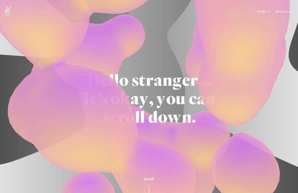
Pinks, Purples and Blues
The Y2K aesthetic embraced pinks, purples, blues and greens. Iridescence was a wildly popular approach. These tones were sometimes muted, and sometimes bold neon. Pink especially embodied youthful energy and unbridled enthusiasm. Additionally, purple, historically a symbol of royalty and luxury, was reimagined in its neon form, representing creativity and imagination. Meanwhile, blue, unapologetic and lively, brought a burst of energy that mirrored the rapidly evolving digital culture and pace of innovation.

Organic Forms
In contrast to the structured and confined corporate designs of the early 90s, the Y2K aesthetic embraced more organic forms. These shapes were not merely arbitrary curves but represented the new millennium’s fluidity, dynamism, and limitless potential. The curves were interwoven, edges blurred, and the designs appeared alive and pulsating with energy. This movement and fluidity hinted at the adaptability and transformative nature of the times.

Blobs & Glossy Orbs
Blobs were a prominent feature during the Y2K era of web design. With their shiny appearance, these shapes were frequently used as clickable buttons. They were more than just blobs; they represented the future, welcoming and subtly animated. On the other hand, orbs added a touch of elegance. They resembled bubbles or liquid mercury, reflecting their environment with a shimmering effect. This suggested a polished, advanced world that was easily attainable.

Transparent Elements
Adding transparent elements to design is like providing a glimpse into the future. Multi-layered designs with see-through components create depth on web pages, making them seem less like flat canvases and more like multidimensional portals. These design choices, such as translucent navigation bars and floating transparent icons, represent clarity, openness, and the potential for new discoveries.

Gradients
During the early 2000s, gradients became a popular design element that embodied people’s hopes and expectations for the future. The Y2K aesthetic marked a shift away from plain, single-color designs as gradients seamlessly transitioned from one hue to the next. These gradients represented more than just color transitions; they symbolized humanity’s yearning for progress and a desire to transition effortlessly into a new era. In essence, the gradient was a visual representation of a dream that combined the familiar with the innovative and the past with the future.

Non-Metallic Metal
Metallics were a must-have element in any design to capture the essence of the year 2000. Achieveable in print, on screen designers got good at faking chrome. Silver, in particular, was a popular choice and could be found in website backgrounds and product designs. Its shiny appearance evoked the vastness of the universe and the excitement of exploring new frontiers. Chrome accents added a touch of elegance with their reflective and polished finish. Together, silver and chrome embodied the futuristic aesthetic, giving everything a streamlined and modern feel that was perfect for the world of tomorrow.

Y2K’s Cultural Impact
As we entered the new millennium, the Y2K aesthetic became a pervasive cultural movement that wasn’t limited to just web or graphic design. It seeped into all aspects of society, leaving an unmistakable and vibrant mark on the era’s cultural fabric. From advertising and cinema to fashion, everyone embraced the Y2K aesthetic.
It represented our collective hopes, anxieties, and dreams as we stepped into the unknown territory of the 21st century. It became the visual language of an era that stood at the crossroads of the analog past and digital future, capturing the essence of a time when anything seemed possible.
To recapture the Y2K spirit in your designs:
- Use metallic finishes and liquid textures;
- Incorporate glass-like transparency for depth and dimension;
- Use shimmering text or moving gradients;
- Float shapes across the screen, reminiscent of early screensavers;
- Experiment with asymmetrical designs;
- Overlap elements for depth and intrigue;
- Opt for readable yet techno-inspired fonts;
- Use 3D renders, chrome effects, and neon lines.
The Timeless Appeal of the Y2K Aesthetic
The Y2K aesthetic has left an undeniable mark on design and culture, from the anxious anticipation of the new millennium to the explosion of neon lights and metallic sheens across various media. It emerged at a time when the world was filled with both trepidation and optimism, capturing our collective heartbeat as we took uncertain steps into the 2000s.
The Y2K aesthetic pushed the boundaries of design with its unique shapes, challenging the conventions of the time and redefining what was considered futuristic. The mesmerizing dance of organic forms, glossy orbs, and transparent layers evoked a sense of motion and progress. At the same time, the palette of neon shades and metallics painted a vivid picture of a world eager for innovation yet nostalgic for simpler times.
What’s truly remarkable is how the Y2K aesthetic transcended its time, leaving an indelible impact on the cultural zeitgeist. It influenced fashion, movies, music, and even the nascent digital spaces that were beginning to shape the modern world.
Today, the allure of the Y2K aesthetic remains undiminished. Perhaps it’s the pull of nostalgia, a yearning for a time when the future was a canvas of endless possibilities. Or, in an era of rapid technological advancements, it serves as a reminder of our first collective step into the digital age. Either way, the Y2K aesthetic is not merely a relic of the past but a testament to the human spirit’s constant quest for progress, innovation, and a brighter tomorrow.
Looking back, we can’t help but appreciate this unique era’s vibrancy, reminding us of a time when we looked forward with hope, wonder, and boundless imagination.

Exciting New Tools for Designers, March 2025
Spring into action this season with new tools to boost your workflows, facilitate creative thinking, and help you be a more efficient designer. This roundup is packed with new goodies…

Compilation: 15 Hilarious Google Flops
When it comes to tech, Google has been synonymous with innovation, success, and world domination (hello, Android and Chrome!). But even the mightiest giants trip over their own feet from…

3 Essential Design Trends, January 2025
Happy New Year! If the website design trends we are already seeing are any indication, 2025 is going to be a great year for visual communication. This month’s collection of…

Exciting New Tools For Designers, January 2025
Welcome to our first tools round up of 2025. It’s the first Monday of a new year, and many of you are back at work after a much needed break….

40 Best New Websites, 2024
As regular readers will know, each month we roundup the best new designs of the previous 4 weeks. And now, at the end of the year, we’ve selected our 40…

The 30 Best Fonts of 2024
2024 has been a great year for type design. Over the past few years geometric sans have been less apparent, with cursive and serifs having something of a renaissance; that…