1
Even if they look good and follow some design principles, there’s a question about function or usability. These designs can sometimes surprise you and work amazingly, while other times, they simply fall flat. (You’ll have to be the judge here.)
Here’s what’s trending in design this month:
1. Text Above the Hero Image
This website design trend, featuring text above the hero image or video, can look a lot of different ways. In the examples below, you’ll see this range, from images that are still fully visible to those that sneak below the scroll.
This design style also has a totally different vibe between desktop and mobile devices. On a desktop, the image can get lost sometimes, and the visual sharpness seems lacking. On mobile devices, the focus on messaging drives home the importance of the words. There’s also the difference in how these groups of users interact and scroll, with a desktop user potentially missing the main message to get to the image or video, while it is hard to miss on phones.
Taste uses an oversized, stacked bold headline on a rather stark background to ensure you read the words before moving to the video tucked into the scroll. The only real color or motion on the home screen is the rotating menu button – a quite different navigation element. The big “TASTE” letters seem to break some design rules as well.

Lusion balances text about the hero image with an almost full-screen animation that’s scroll interactive. While there seems to be good eye flow, you might totally miss the main headline and go right for the more interactive part of the design. (The liquid hover is pretty slick.)

Liz Sintoni’s portfolio site leads with a beautiful oversized headline with an image/video element below. Here, she added one more element, an extra text element, and a button to the left of the image area to help get you further into the work and understand what she’s about.

2. Side-by-Side Storytelling
This isn’t really that unusual of a design device – side-by-side design elements have been popular off and on for a while – but it is evolving in terms of technique and display.
The challenge and trend that seems to be growing is that designers are overlapping elements in the side-by-side storytelling display. There’s less of a clear distinction between the left and right panels.
Sometimes this works beautifully, such as in the first example below. Other times, this can lead to severe readability challenges.
The Midnight Post Book is a website that’s for a book, making it a great example to showcase a storytelling device. With the main illustration to the left and the text to the right, there’s a clear reading flow and a nice balance in the design.

Café Del Mar is one of those examples where the sides bleed over a bit. Readability doesn’t become too much of a concern here, but gets a little tricky at some breakpoints. It’s also a lot for the user to digest with a funky typeface, side-by-side design with moving images, an interesting separation element (the zig-zag), and colors without a lot of contrast.

CCL Hospitality Group takes the most traditional approach to side-by-side storytelling but has a twist of its own with a non-standard video shape on the right side of the screen. While it looks great, video composition and placement here was probably way more difficult than it looks.

3. Wait … What?
Every now and again, you see a handful of designs that are all totally different but leave you with the same impression. Each of these designs encapsulates a head-scratching trend all of its own. Are you brave enough to try any of these techniques?
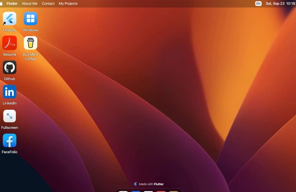
DC Tech’s portfolio site will make you do a double-take because it looks like a default Mac desktop. Elements in the “Finder” navigation are clickable, as are all of the icons.

White Stone incorporates plenty of design effects and elements into a seemingly simple aesthetic. The part here that’s different is the overlapping video blocks and almost haphazard placements of elements on the screen. Tack the giant headline and animated mouseover effects onto that, and there’s just a lot to take in visually.

The Bowie design (a student project) is interesting because it’s more like a poster for the web. It’s designed to showcase artwork and is almost art in itself. Note there are no real traditional homepage elements present – navigation, text elements, or calls to action. There are some scroll and animated effects as you move down the screen, but this one-page design is definitely different from the norm.

Conclusion
Often, when we think about website design trends, it’s with the caveat that there are design things that we must do or try. But that’s not always the case. What works for one won’t always work for all.
Each of the trends and examples here are in the spirit. While they might work for the content therein, there may not be a practical application for other projects. That’s for you to experiment with and decide. Have fun!

Exciting New Tools for Designers, March 2025
Spring into action this season with new tools to boost your workflows, facilitate creative thinking, and help you be a more efficient designer. This roundup is packed with new goodies…

Compilation: 15 Hilarious Google Flops
When it comes to tech, Google has been synonymous with innovation, success, and world domination (hello, Android and Chrome!). But even the mightiest giants trip over their own feet from…

3 Essential Design Trends, January 2025
Happy New Year! If the website design trends we are already seeing are any indication, 2025 is going to be a great year for visual communication. This month’s collection of…

Exciting New Tools For Designers, January 2025
Welcome to our first tools round up of 2025. It’s the first Monday of a new year, and many of you are back at work after a much needed break….

40 Best New Websites, 2024
As regular readers will know, each month we roundup the best new designs of the previous 4 weeks. And now, at the end of the year, we’ve selected our 40…

The 30 Best Fonts of 2024
2024 has been a great year for type design. Over the past few years geometric sans have been less apparent, with cursive and serifs having something of a renaissance; that…