 Most web designers and getting more and more requests from clients to design custom blog themes.
While designing a blog theme isn't entirely different from designing any other type of website, there are some unique challenges that blog theme designers face.
There are plenty of sources available for designers who are seeking inspiration from high quality blog design, but it's also important to understand specifically what will influence and determine the success of a blog theme design. In this article we'll examine 13 characteristics that separate great blog themes from the rest.
Most web designers and getting more and more requests from clients to design custom blog themes.
While designing a blog theme isn't entirely different from designing any other type of website, there are some unique challenges that blog theme designers face.
There are plenty of sources available for designers who are seeking inspiration from high quality blog design, but it's also important to understand specifically what will influence and determine the success of a blog theme design. In this article we'll examine 13 characteristics that separate great blog themes from the rest.
1. Readability
Since blogging revolves around content, readability is a critical priority. Even great content with poor readability will struggle to attract and retain readers. While a blog theme's design is important, it shouldn't detract from the content itself. When designing a blog theme, areas of the design like the header, navigation and sidebar often get a lot of the attention, and styling the content within the post itself is frequently overlooked. There are a number of factors that influence readability, all of which should be considered when designing a blog theme: Padding - The padding or margin that separates the content of a post from the edges of the content area can help the reader to visually separate the content and focus on it without distraction. Freelance Switch uses plenty of padding to keep the content easy to read. Short Paragraphs - Readers will have an easier time with short paragraphs. Long paragraphs on a screen can be difficult and intimidating to readers. Short paragraphs often draw readers in because they can be reader faster.
Lists - Use unordered (bulleted) lists or ordered lists when appropriate. Instead of using paragraph format exclusively, lists help to break up the monotony of the text and allow for easier scanning. The points will also stand out more as they grab readers attention.
Bold Text - Having a screen full of text that is all the same weight and size makes it more difficult for readers to quickly see what's important. Many blog visitors are not going to read posts word-for-word, so your options are to make it easier for them to scan, or watch them leave.
Line Spacing - Especially for blogs that publisher longer, more detailed posts, it's important to have sufficient space between the lines of text. Not spacing the lines properly causes the text to be crammed.
Sub Headers - Blog posts can be broken up by sub headers (usually h3 or h4 tags). When designing and styling a theme, these sub headers should be given plenty of attention. When done correctly they will help with readability, scanning, and they'll help the writer to make points clearly.
Mirificam Press styles its sub headers to make a visual impact.
Short Paragraphs - Readers will have an easier time with short paragraphs. Long paragraphs on a screen can be difficult and intimidating to readers. Short paragraphs often draw readers in because they can be reader faster.
Lists - Use unordered (bulleted) lists or ordered lists when appropriate. Instead of using paragraph format exclusively, lists help to break up the monotony of the text and allow for easier scanning. The points will also stand out more as they grab readers attention.
Bold Text - Having a screen full of text that is all the same weight and size makes it more difficult for readers to quickly see what's important. Many blog visitors are not going to read posts word-for-word, so your options are to make it easier for them to scan, or watch them leave.
Line Spacing - Especially for blogs that publisher longer, more detailed posts, it's important to have sufficient space between the lines of text. Not spacing the lines properly causes the text to be crammed.
Sub Headers - Blog posts can be broken up by sub headers (usually h3 or h4 tags). When designing and styling a theme, these sub headers should be given plenty of attention. When done correctly they will help with readability, scanning, and they'll help the writer to make points clearly.
Mirificam Press styles its sub headers to make a visual impact.
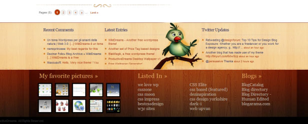
2. Useful Sidebars
Sidebars are an important part of blog design because they play a large role in navigation for visitors and because they provide the opportunity to add some creativity to the design. Additionally, they give the theme designer and the blogger a chance to determine what content or pages on the blog get exposure to all of its visitors. A good sidebar will feature an attractive design, be easy to use and navigate, feature the appropriate content, and encourage a high number of pageviews. Some common elements in blog sidebars include:- Popular posts
- Recent posts
- Blogroll/friends lists
- Advertisements
- Category links
- Date-based archives
- Link to RSS feed
- Recent comments
- Promotion of products/services
3. Unique
With millions of blogs and thousands of different blog themes out there, it's pretty easy for visitors to have a hard time distinguishing which blogs they have been to before and which ones they have not. Great blog designs will stand out from all of the free themes and similar designs in one way or another. The designer can take a number of different approaches to accomplish this goal, but the important part is that the design will not only be memorable, but it should also fit with the message and purpose of the blog. Possible Approaches:Artistic/Creative
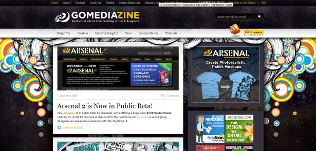
One way to make your design stand out is to design something extremely creative that will easily give your blog it's own distinct mark. Web Designer Wall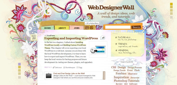 GoMediaZine
Typography-Based
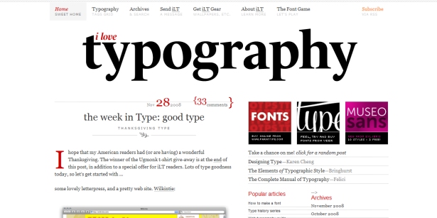
Astheria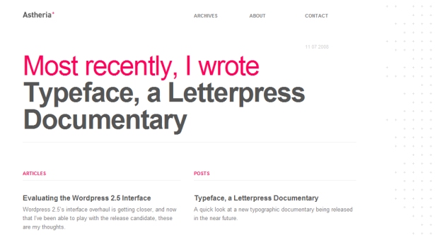 I Love Typography
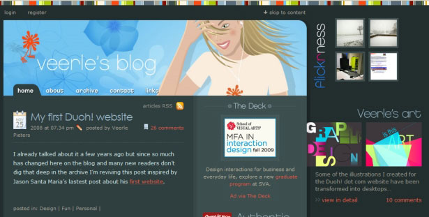
Colorful
Macalicious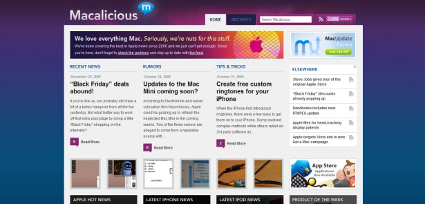 Veerle's Blog
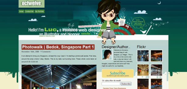
Interesting Headers
Mostly Lisa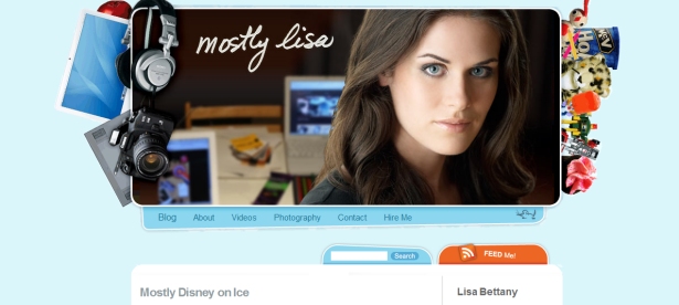 Octwelve
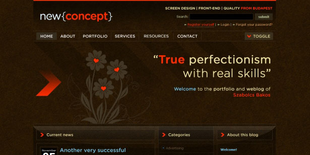
Dark
Evan Eckard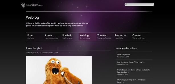 New Concept
 Of course, these are only a few different styles and options for designers. There are countless ways that you can go about creating a unique theme, however, the blog should have some type of distinct look that helps to brand the site and keep it from blending in with all the other blogs.
4. Comment Design
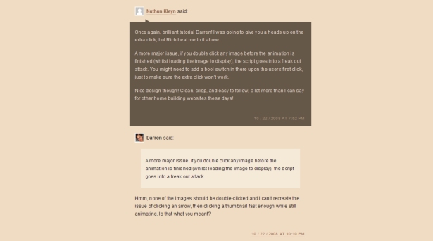
The comment area is often a last priority for theme designers, but a well-designed comment area can give the blog a totally different feel for readers, especially those who comment themselves. Designers have the options of including avatars for commenters, styling author comments to stand out from others, alternating comments with different styles, using speech bubbles, etc. Avatars are becoming increasingly common on blogs, in part because of the ease of doing so with WordPress and Gravatars. Avatars help to give the comment area a more personal touch and to give each commenter more of a personality of their own. Pro Blog Design makes excellent use of avatars and color in the comment area.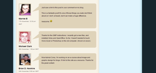 Darren Hoyt uses smaller avatars and different style for author comments.
5. Integration of Ads
Most blogs today (at least those that are professional and not personal) are using advertisements of some sort to monetize the site. This could include AdSense, affiliate ads, or direct banner ads. While ads are a necessity in most cases to keep the blog going, they can also have an adverse effect on the design and the user experience if they are not implemented properly into the design. Some bloggers and designers choose to place ads in locations that will draw a lot of attention, such as within the context of the blog posts. While this may help to produce more ad revenue, it will decrease the overall look of the blog and will put off some readers. This is a decision that will need to be made by the blog owner, but from a designer's perspective it's best to keep the ads in places that are specifically designated for ads. Location of the ads is important, but styling the ads, or the area around the ads, is also an option for the designer. The ads may feel as though the are more a part of the theme and less intrusive if they are treated as part of the design. CSS-Tricks uses a border on banners in the sidebar that changes to a red color on hover, and the header banner is placed on a grungy background that also has a hover effect.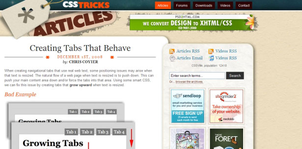
6. Effective, Usable Navigation
Navigation is one of the most significant factors in determining the user's experience on the site. Nothing is more frustrating than not being able to find what you're looking for, and visitors are bound to leave if this happens to them. On the other hand, effective navigation can lead to more pageviews and a more resourceful blog that takes advantage of the content that is available. Developing and maintaining effective navigation is a challenge for blog theme designers, because content will be continually added to the blog, making it easier for posts to get buried in the archives. In some ways, maintaining the navigation is up to the blogger, in terms of using internal links within posts and updating older posts with new links. However, there are some steps the designer can take to improve navigation. First, there should be a primary navigation menu that takes visitors to any major page on the site (such as an About page or a Contact page), and secondary navigation menus are often used as well. Second, the sidebar should be used to nudge readers towards the most important content on the blog. Popular posts are a common way of doing this. Third, the sidebar should also include some standard blog navigational elements that visitors will expect to find, such as category links or a link to an archive page. Fourth, the bottom of the post area can be used to include links to related posts, or this can be done manually by the blogger when desired on specific posts. The header of Noupe includes category links as the primary navigation, which makes it easy for visitors to find content that they want, plus it makes the navigation feel less like a boring category list.
7. Images in Posts
Part of a blogger's effort to get their posts read and noticed is using pictures within blog posts. Of course, the use of images is outside the control of the blog theme designer, but the designer can have an impact on this aspect by including styles for post images. Images can be much more effective and attractive when styled with CSS to give them a nicer touch. Designers may want to provide a few different classes for images that can be used, or for many bloggers it may be easier to style all images alike. Use of a border and padding are common, sometimes in conjunction with background colors. Fuel Your Creativity uses about 10 pixels of padding and a gray border around images. Spyre Mag uses a light gray background and a slightly darker border.
8. Footer Design
When designing a blog theme, or any website for that matter, the footer is one area of the design that typically gets very little attention. Most blogs include a copyright, a link to the homepage, and maybe a few other links to pages of the site (or to the theme designer and/or to the blogging platform). While many visitors won't scroll all the way down to even see the footer, those that do will be able to benefit from a well designed footer. What should a blog footer include? There are no absolutes, but in general, some blogs are using them essentially as an extension of the sidebar. By this I mean that many of the same elements that you would find in the average sidebar are also showing up in some blog footers. Social media integration, such as recent entries to Twitter are popular. Additionally, some blogs link to popular posts, recent comments and even blogs of friends from the footer. In addition to just using the footer to be a home for more information and links, designers are also using this area to get creative with the theme. The footer is much like the header in that it provides a large canvas for a motivated designer to experiment. Blog.SpoonGraphics uses a footer that points to popular content with a stylish design. Productive Dreams includes links to recent posts and comments, as well as Twitter and Vi.sualize.us integration.
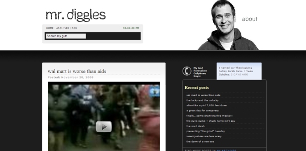
9. Color Scheme
Color is, of course, one of the most significant factors in any kind of design. Finding the right color scheme for a blog theme is something that doesn't usually happen instantly, but getting the colors right is crucial. The colors will sometimes make the look, and other times they can destroy the design. Fortunately, there plenty of tools and resources for finding color schemes. The color scheme of a blog will play a considerable role in the branding of the blog, and thus it is very important for the long-term success of the blog. Some blogs use a bright and vibrant color scheme, while others use fewer colors, or a monochromatic scheme. Like most things when it comes to design, there is no right or wrong, just different choices for different situations. Web Design Ledger features an attractive color scheme with several different shades of neutral colors accented by orange and blue.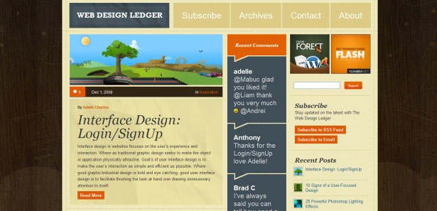 Mr. Diggles uses a very basic color scheme that includes very little color, but it works very well.
10. Icons
Icons can be used to improve the look of a site and to improve usability at the same time. The whole point of icons is to present a message to visitors without even using any text. For example, an icon of a home is commonly understood be to a link to the homepage without saying so, and a speech bubble is often used to represent blog comments. When used properly icons provide somewhat of a subtle improvement to the design. Icons are rarely the highlight of any blog theme, but all blogs could make use of well-designed icons. Blog theme designers can either design their own icons, or use any number of free icon sets that are available. NETTUTS, and the other sites in the tuts family, use the free icons from Function.
11. High Content
Because blogs are so dependent on content, the blog theme design should allow for the content to start above the fold. Oversized headers allow for more creativity in design, but for blogs it typically works best to focus on getting the content in view quickly. This is my personal preference and there are some well-designed blogs that push content down, but as a general rule it's best to keep the content high in the layout. The theme of Devlounge uses a small header area that features the start of the content very high on the page.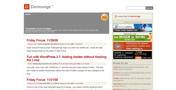
12. Subscription Areas
RSS and email subscribers are the lifeblood of blogs. For this reason it is obviously important for blogs to be able to convert visitors into subscribers. Many blog visitors will be accustomed to the standard blog convention of including links to RSS feeds and email subscription options in the sidebar. Usually these areas are located at the top of sidebars, but sometimes they're a bit further down. The benefit to staying with the norm here is that it's easier for people to find the links, and you don't want to make it difficult for people to subscribe. Most blogs also include RSS icons along with the link. There are countless RSS icons available for download in all kinds of variations. Darren Rowse of ProbBogger includes RSS and email subscription options at the top of the right sidebar, a fairly standard location.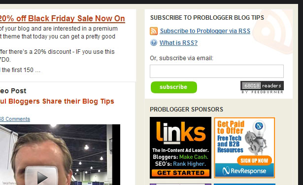 You the Designer uses the right side of the header for subscription links and an icon.
13. Social Media Integration
More and more blogs are starting to include buttons, badges or links to encourage readers to vote for their content on social media sites. When it comes to these items, overkill can harm the look of the blog. Too many buttons can cause the theme to look cluttered and unorganized. The best method is to use a design the implements social media elements, such as voting buttons, subtly without overpowering anything else in the design. Six Revisions includes a small Digg voting button, and text links to Stumble or bookmark at the top of each post. The smaller Digg button is more friendly for the design than the bigger "Digg This" button that many blogs use. The StumbleUpon and Delicious links are placed below the title where they have very minimal interference. Additionally, the small StumbleUpon and Delicious icons help the links to be found by readers.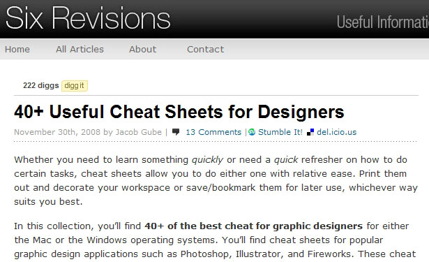
What's Your Opinion?
What elements do you feel have the biggest impact on the success of a blog theme design?WDD Staff
WDD staff are proud to be able to bring you this daily blog about web design and development. If there's something you think we should be talking about let us know @DesignerDepot.


Read Next

3 Essential Design Trends, May 2024
Integrated navigation elements, interactive typography, and digital overprints are three website design trends making…

How to Write World-Beating Web Content
Writing for the web is different from all other formats. We typically do not read to any real depth on the web; we…
By Louise North

20 Best New Websites, April 2024
Welcome to our sites of the month for April. With some websites, the details make all the difference, while in others,…

Exciting New Tools for Designers, April 2024
Welcome to our April tools collection. There are no practical jokes here, just practical gadgets, services, and apps to…

How Web Designers Can Stay Relevant in the Age of AI
The digital landscape is evolving rapidly. With the advent of AI, every sector is witnessing a revolution, including…
By Louise North

14 Top UX Tools for Designers in 2024
User Experience (UX) is one of the most important fields of design, so it should come as no surprise that there are a…
By Simon Sterne

What Negative Effects Does a Bad Website Design Have On My Business?
Consumer expectations for a responsive, immersive, and visually appealing website experience have never been higher. In…

10+ Best Resources & Tools for Web Designers (2024 update)
Is searching for the best web design tools to suit your needs akin to having a recurring bad dream? Does each…
By WDD Staff

3 Essential Design Trends, April 2024
Ready to jump into some amazing new design ideas for Spring? Our roundup has everything from UX to color trends…

How to Plan Your First Successful Website
Planning a new website can be exciting and — if you’re anything like me — a little daunting. Whether you’re an…
By Simon Sterne

15 Best New Fonts, March 2024
Welcome to March’s edition of our roundup of the best new fonts for designers. This month’s compilation includes…
By Ben Moss

LimeWire Developer APIs Herald a New Era of AI Integration
Generative AI is a fascinating technology. Far from the design killer some people feared, it is an empowering and…
By WDD Staff