 In this tutorial, we'll explore how to add more energy and dynamism to a photo. The effects can be extended and used on a multitude of photos to create a feeling of motion and vibrancy to a static image.
The tutorial was created and written by renowned artist Mike Harrison (a.k.a. destill) and this is his first tutorial for a blog. His work has been featured in Computer Arts and Advanced Photoshop magazines.
OK, enough of an introduction, and on with the tutorial...
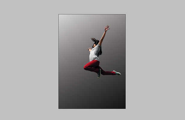
Step 1
Start by choosing an image similar to this one of someone jumping in the air (original image). Pick an image that you feel has a lot of energy already, even before you’ve added everything else. Create a new document at A3 size with 300dpi, or if you prefer slightly smaller, then go for A4 300dpi.

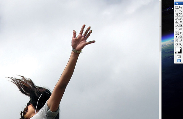
Step 2
Drag your image into the new document and grab the pen tool, carefully start adding point by point until you’ve drawn around the entire body of the girl. Hit A to select the path selection tool and right click on the path>create vector mask. This will give us a clean edge and knock out the background, ready for us to add our own.
Step 3
With a blank background, let’s create some instant depth to this piece by adding a gradient. So select the gradient tool and keep it black to white. Now drag from the bottom right to top left, but drag over the canvas edges so that it sort of goes from dark grey to light grey.
Step 4
Now I sometimes like to get colour palette and tone sorted early, and in the case of this piece let’s do just that. What we’re going to do is something ever so simple but very effective in creating the mood of the piece. In the menu go to Layer>New adjustment layer>Gradient map. Now choose the preset blue, red to yellow gradient, hit ok and set this layers opacity to 40%. It looks a bit washed out, so something you should always do is add a couple more adjustment layers and for this piece we’ll add one for brightness/contrast, set to +8 for brightness and +28 for contrast, and one for levels which we’ll set to 15, 1.00 and 246 for the 3 input boxes.

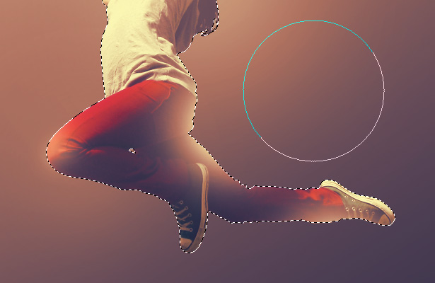
Step 5
Let’s give some pop to the girl and add some lighting. Ctrl+click on the original stock layer to create a selection around the girl, then on a new layer, grab the brush tool and using varying sizes and the flow set to around 24%, begin brushing areas you think would look good with some white light on them. Then lower the opacity to around 15-35%.
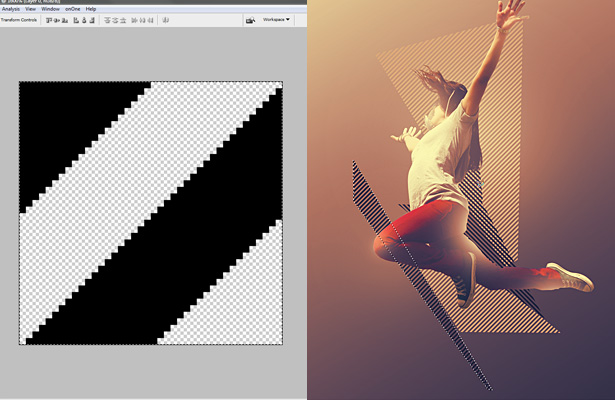
Step 6
Give the piece some instant energy appeal by adding some diagonal stripes in the form of random geometric selections filled with a pattern. Create a new document 40 x 40 pixels and create a shape similar to the screenshot on the left below, make the background transparent then Ctrl+A and go to Edit>define pattern. Now back to your main document and create some random geometric selections with the polygonal lasso tool and Edit>Fill them with your pattern. Keep them in the direction of the energy of your person in the piece and make some black, some white.
Step 7
Time to add some big bright coloured shapes to get this piece moving. Again with the polygonal lasso tool, create some big geometric multi-sided shapes, and with the gradient tool set from red to yellow, fill your selections and position/transform until you have a nice arrangement. Place them above or behind the diagonal striped shapes, whatever you feel looks good.
Step 8
Now start to layer it up by adding lots more shapes of various sizes over and behind the girl. Do what we did in the last step by using the polygonal lasso tool and create sharp shapes. Fill some with a black to white gradient, others with a yellow to transparent or red to transparent, play around with it until you’ve padded out the illustration with a nice amount of shapes.
Step 9
Looking good? I thought so. Now let’s get some detail worked into this piece. To do this lets create some shards to enhance to energy of the piece. Grab the polygonal lasso tool again and create a small angular shape, hold down shift and create another. Repeat this several times until you have a bunch of shapes. Then fill them with black/white and position. You could also use the pen tool, but in this instance the lasso tool is better as the shapes will feel more erratic and unplanned, which is what we want.
Step 10
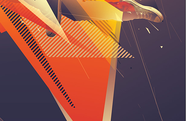
Time to develop the piece some more. Grab the polygonal lasso tool (yet again) and create some more selections, but keep these quite square and not as sharp to provide some contrast to the other shapes we created earlier. Fill with black and apply a gradient overlay with the settings shown in the screenshot below. Notice the effect on the girls arm, it’s now showing through as a solid shape because of the lighting we added to her in step 5. So place a shape behind that layer so it shows through, also feel free to create this effect with other body parts of the girl.

Step 11
For some added energy, flow and detail we can add some thin lines to the image, both over the top of most layers and some right in the background. So grab the line tool and set it to 2 pixels wide, on a new layer start drawing some lines in the direction of the rest of the shapes, don’t go too crazy with them though, keep them subtle. Now make the line tool 1 pixel wide and on another new layer draw some more lines, almost as if the lines are fragmenting.
Step 12
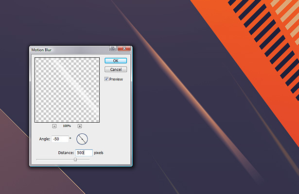
To further enhance the energy let’s create some light streaks. So create some more thin sharp shapes and fill them in white. Go to filter>blur>motion blur and make the angle the same as the angle of your shape, with the distance set quite high to around 4-500. Duplicate and arrange some shapes and play with opacity and blending modes for more interest.
Step 13
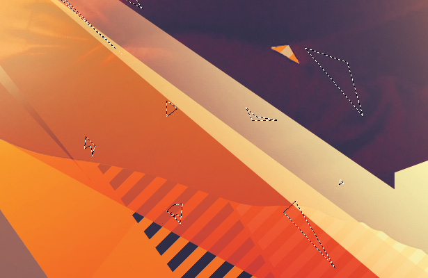
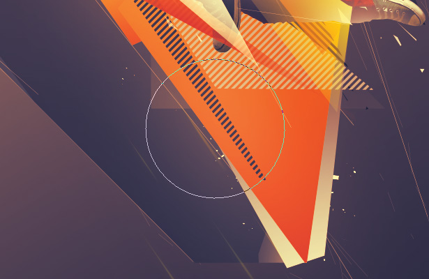
The image is now looking great but it’s not quite complete, it needs some finishing touches. So create some more particles with the pen or lasso tool and fill them with white and position them behind most of the layers. Also create some larger shapes with subtle gradients and overlay blending mode to give off a nice look, position them as you’d like to achieve a nice balance. I’ve marked out where I’ve added some extra shapes to using selections in the screenshot below.

Step 14
Almost there, and to make things abit more dynamic for some of the shapes. Grab the brush tool at a size around 900 with the flow set to around 15-20%. Gently brush onto areas to lighten it up, be very subtle with this though as you don’t want to kill it. Then lower the opacity to blend it in nicely.
Step 15
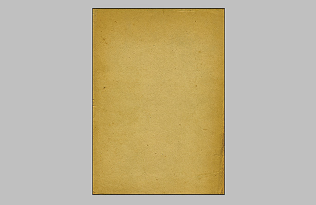
For the finishing touch well, you may not be a fan of textures but I am, and for this piece it will work really well. Find a high res paper texture like the one in the screenshot and drag it above all layers in your main document, scale it up to fit if needs be and set the blend mode to color burn with opacity at around 40%. This makes the colours really come to life and makes the image more moody.
Step 16
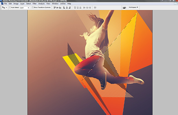
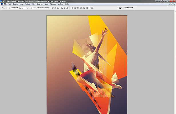
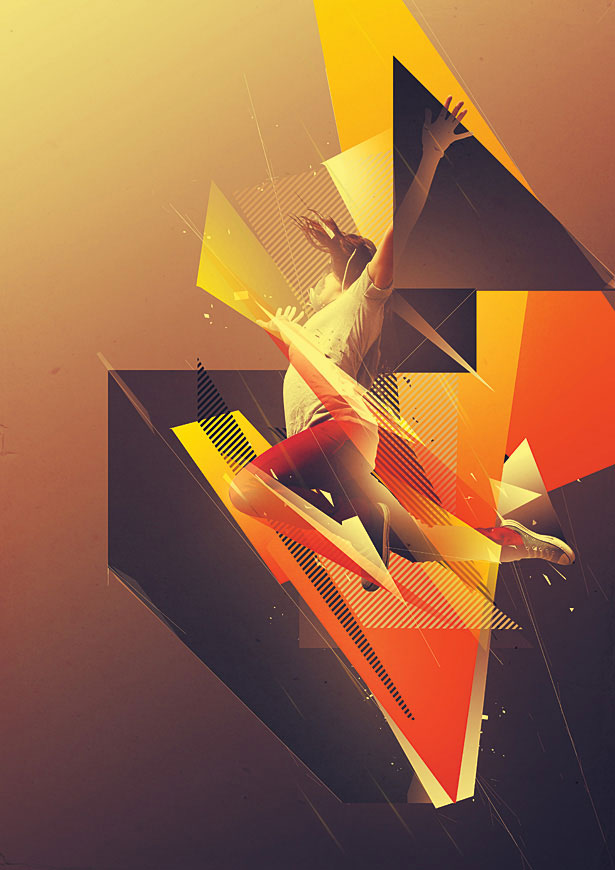
So there we are, check the finished image below! With images like this, there is a minimalist route and a more chaotic route where we could have kept on going adding more and more shapes. But in this instance we’ve settled for something in the middle with a really nice balance.
Written exclusively for WDD by Mike Harrison. You can see more of his work at his website destill.net
Don’t let me stop you adding more elements, do whatever you feels looks good, just don’t go over the top. I hope you’ve enjoyed this tutorial - please share your comments below...
WDD Staff


Read Next

3 Essential Design Trends, May 2024

How to Write World-Beating Web Content

20 Best New Websites, April 2024

Exciting New Tools for Designers, April 2024

How Web Designers Can Stay Relevant in the Age of AI

14 Top UX Tools for Designers in 2024

What Negative Effects Does a Bad Website Design Have On My Business?

10+ Best Resources & Tools for Web Designers (2024 update)

3 Essential Design Trends, April 2024

How to Plan Your First Successful Website

15 Best New Fonts, March 2024
