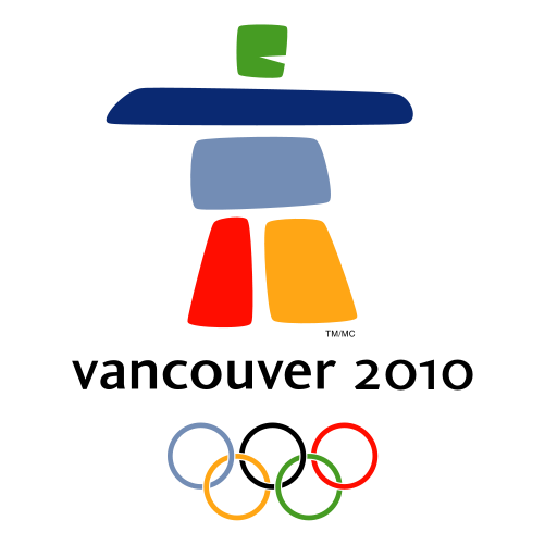
 Living in Vancouver, Canada, I've been seeing the logo of the upcoming 2010 Winter Olympic Games more and more around the city as the date draws closer.
I thought it would be interesting to take a look at how the design trends in Olympic logos have evolved over the years.
Noticeably, the logos seem to have changed from a monochromatic trend to a more multicolor approach in recent years.
Logo design seems to have been streamlined to simpler and cleaner shapes. This article features every logo from the summer and winter Olympic games from 1924 to 2012.
Paris - Summer 1924

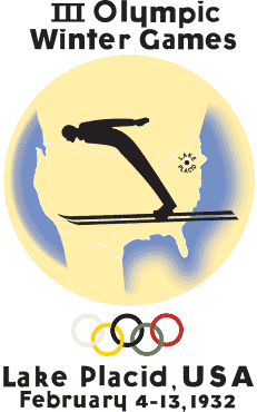
Lake Placid - Winter 1932
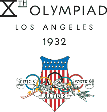
Los Angeles - Summer 1932
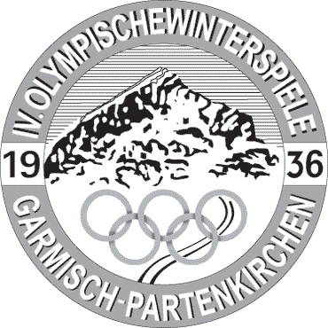
Garmisch-Partenkirchen - Winter 1936
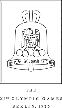
Berlin - Summer 1936
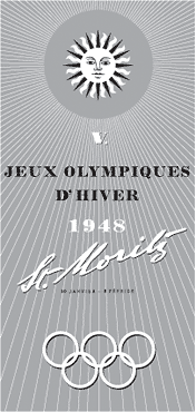
St. Moritz - Winter 1948
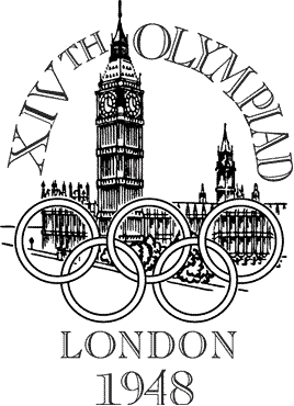
London - Summer 1948
Oslo - Winter 1952

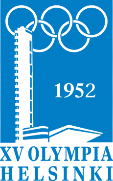
Helsinki - Summer 1952
Cortina d'Ampezzo - Winter 1956

Melbourne / Stockholm - Summer 1956

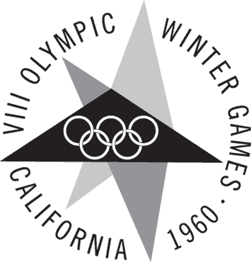
Squaw Valley - Winter 1960
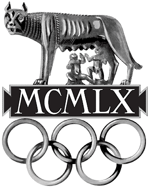
Rome - Summer 1960
Innsbruck - Winter 1964

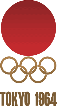
Tokyo - Summer 1964
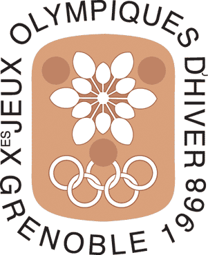
Grenoble - Winter 1968
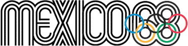
Mexico - Summer 1968
Sapporo - Winter 1972

Munich - Summer 1972

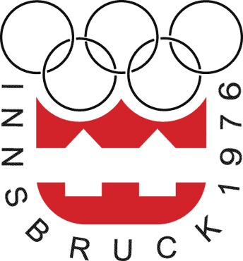
Innsbruck - Winter 1976
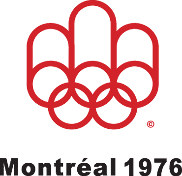
Montreal - Summer 1976
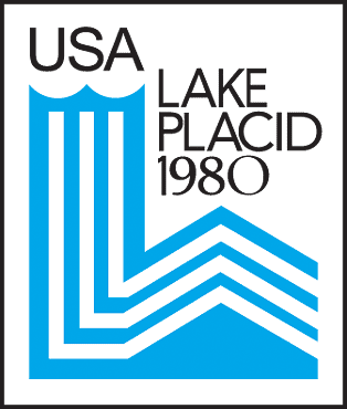
Lake Placid - Winter 1980
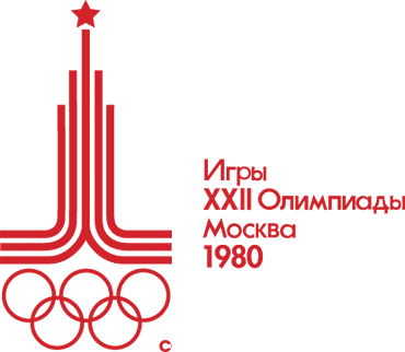
Moscow - Summer 1980
Sarajevo - Winter 1984

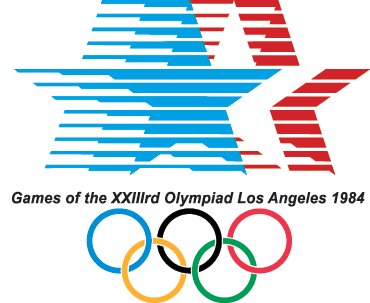
Los Angeles - Summer 1984
Calgary - Winter 1988

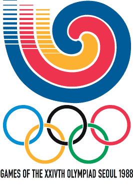
Seoul - Summer 1988
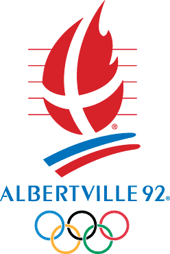
Albertville - Winter 1992
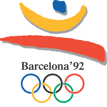
Barcelona - Summer 1992
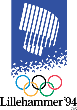
Lillehammer - Winter 1994
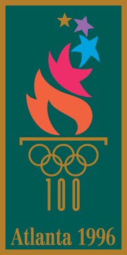
Atlanta - Summer 1996
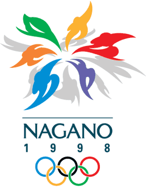
Nagano - Winter 1998
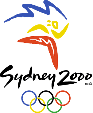
Sydney - Summer 2000
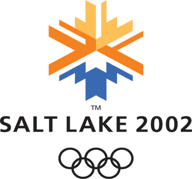
Salt Lake City - Winter 2002
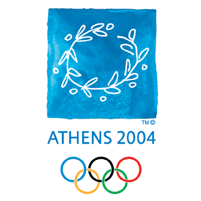
Athens - Summer 2004
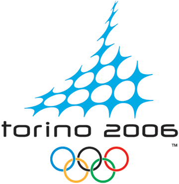
Turin - Winter 2006
Beijing - Summer 2008
![]()
Vancouver - Winter 2010
London - Summer 2012
![]()
Which is your favorite logo and what do you think of the logos of the upcoming Vancouver and London games?
WDD Staff
WDD staff are proud to be able to bring you this daily blog about web design and development. If there's something you think we should be talking about let us know @DesignerDepot.


Read Next

3 Essential Design Trends, May 2024
Integrated navigation elements, interactive typography, and digital overprints are three website design trends making…

How to Write World-Beating Web Content
Writing for the web is different from all other formats. We typically do not read to any real depth on the web; we…
By Louise North

20 Best New Websites, April 2024
Welcome to our sites of the month for April. With some websites, the details make all the difference, while in others,…

Exciting New Tools for Designers, April 2024
Welcome to our April tools collection. There are no practical jokes here, just practical gadgets, services, and apps to…

How Web Designers Can Stay Relevant in the Age of AI
The digital landscape is evolving rapidly. With the advent of AI, every sector is witnessing a revolution, including…
By Louise North

14 Top UX Tools for Designers in 2024
User Experience (UX) is one of the most important fields of design, so it should come as no surprise that there are a…
By Simon Sterne

What Negative Effects Does a Bad Website Design Have On My Business?
Consumer expectations for a responsive, immersive, and visually appealing website experience have never been higher. In…

10+ Best Resources & Tools for Web Designers (2024 update)
Is searching for the best web design tools to suit your needs akin to having a recurring bad dream? Does each…
By WDD Staff

3 Essential Design Trends, April 2024
Ready to jump into some amazing new design ideas for Spring? Our roundup has everything from UX to color trends…

How to Plan Your First Successful Website
Planning a new website can be exciting and — if you’re anything like me — a little daunting. Whether you’re an…
By Simon Sterne

15 Best New Fonts, March 2024
Welcome to March’s edition of our roundup of the best new fonts for designers. This month’s compilation includes…
By Ben Moss

LimeWire Developer APIs Herald a New Era of AI Integration
Generative AI is a fascinating technology. Far from the design killer some people feared, it is an empowering and…
By WDD Staff