 Color choice is a key element to the success of any design. It invokes an atmosphere and sets the mood. One method for using color is to use only shades of a color, which is known as a monochromatic color scheme.
Of all the color schemes, the monochromatic is one of the easiest to pull off successfully. This reason for such ease is that one shade of a color will naturally almost always work with another shade of the same color.
One of the most popular monochromatic color schemes is Blue. This is likely because blue is seen as trustworthy, dependable and committed. Blue, however, is not the only successful color scheme. Greens, Purples, Browns, Reds can also appropriately set a mood.
In this article, we feature 50 monochromatic website designs, categorized based on the predominant color that they use.
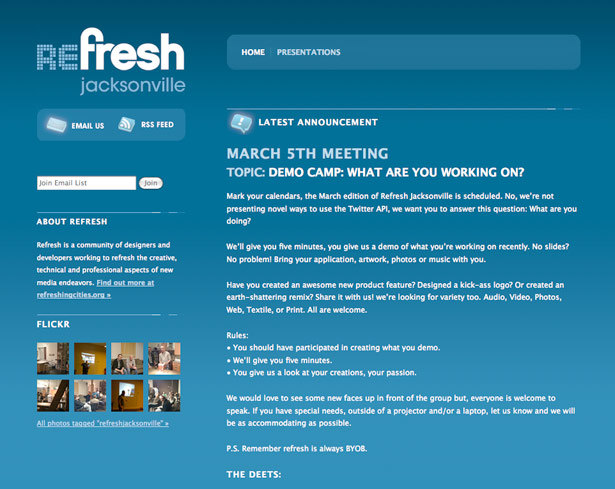
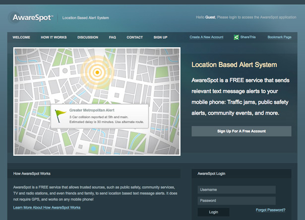
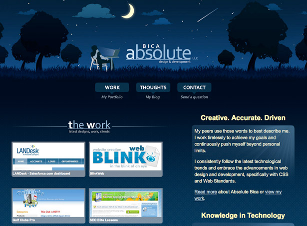
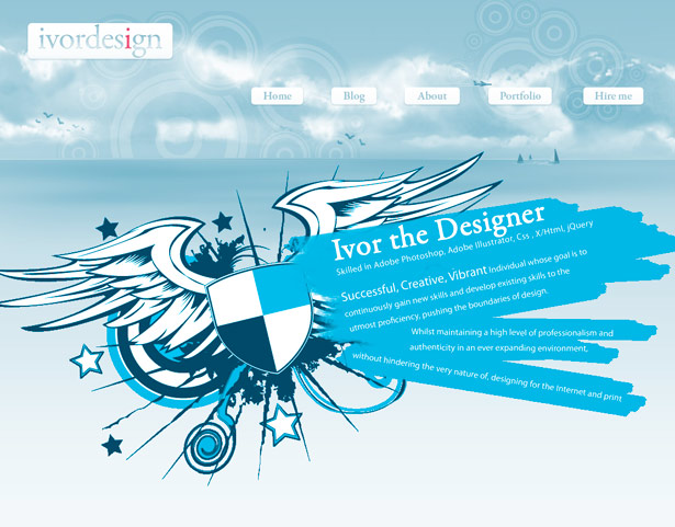
Blues
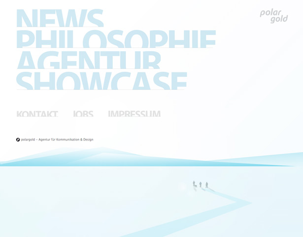

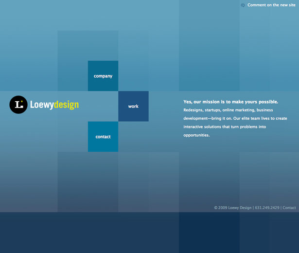
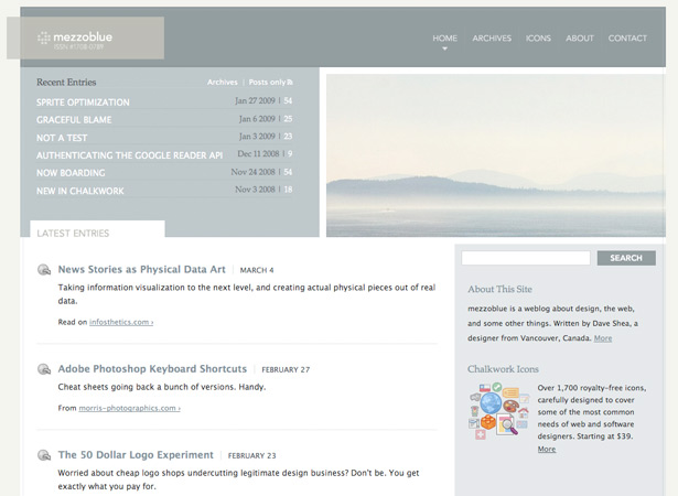

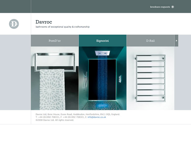
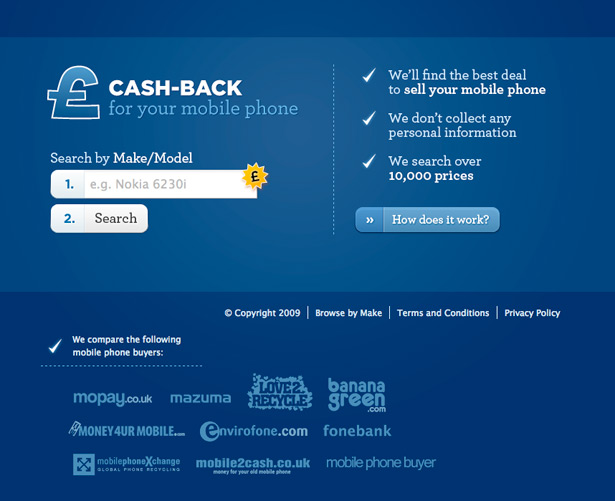


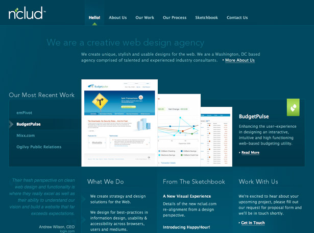

![]()


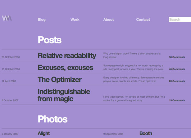
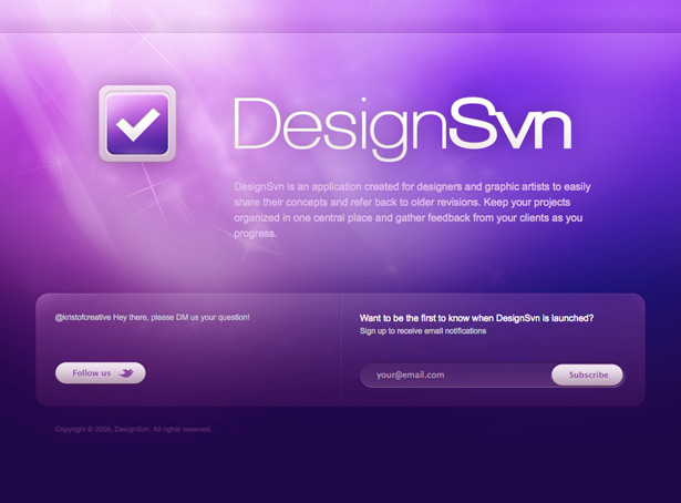
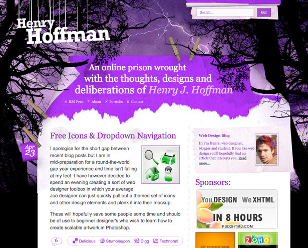
Purples
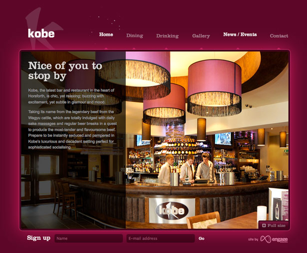
Reds


Oranges


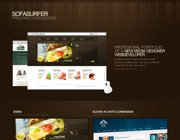
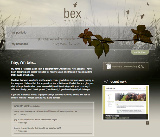
Browns


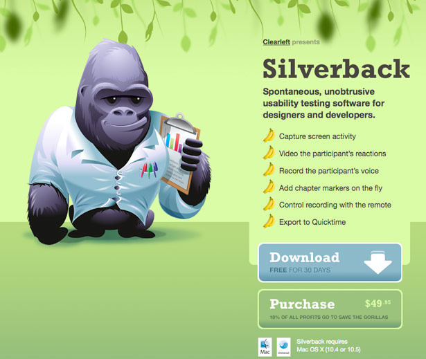
Greens


Blacks, Whites and Grayscale


Compiled exclusively for WDD by Michael Shelton. Michael is a web designer and graphic design student who has worked in both web and print for over 4 years.
Which color scheme is your favorite to use and why? Do you know of any other examples besides the ones listed here? Please post them in the comments section of this post.
WDD Staff


Read Next

3 Essential Design Trends, May 2024

How to Write World-Beating Web Content

20 Best New Websites, April 2024

Exciting New Tools for Designers, April 2024

How Web Designers Can Stay Relevant in the Age of AI

14 Top UX Tools for Designers in 2024

What Negative Effects Does a Bad Website Design Have On My Business?

10+ Best Resources & Tools for Web Designers (2024 update)

3 Essential Design Trends, April 2024

How to Plan Your First Successful Website

15 Best New Fonts, March 2024
