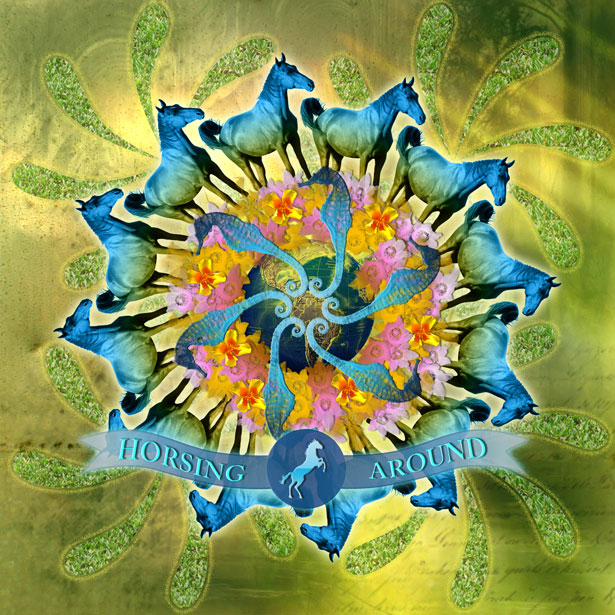
 Ready for an exciting challenge? As you know, we always like to bring you great resources for inspiration, as well as tutorials and tools to empower you to become a great designer.
Today, we're trying something new... This should be a fun weekend project, where you can let your imagination run wild and put to practice some of what you have learned from reading WDD.
The challenge is to create a unique photomontage using at least three specific images from Sxc.hu. The theme and feeling of the image that you create is entirely up to you, so use your creativity in any way you want.
To enter, simply email your creations as a JPEG file. On Monday, I'll be posting the best images received and featuring the designers. [THIS CHALLENGE HAS NOW ENDED, SEE THE RESULTS BELOW]
Ready for an exciting challenge? As you know, we always like to bring you great resources for inspiration, as well as tutorials and tools to empower you to become a great designer.
Today, we're trying something new... This should be a fun weekend project, where you can let your imagination run wild and put to practice some of what you have learned from reading WDD.
The challenge is to create a unique photomontage using at least three specific images from Sxc.hu. The theme and feeling of the image that you create is entirely up to you, so use your creativity in any way you want.
To enter, simply email your creations as a JPEG file. On Monday, I'll be posting the best images received and featuring the designers. [THIS CHALLENGE HAS NOW ENDED, SEE THE RESULTS BELOW]
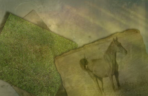
Objective:
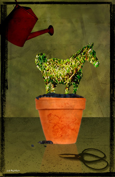
Create a unique photomontage using a combination of at least the three images below. Go wild and edit them in any way that you desire. You can use more images if you like, as well as Photoshop brushes, textures, patterns, filters and anything else you wish.
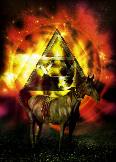
Example:
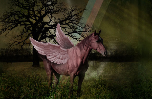
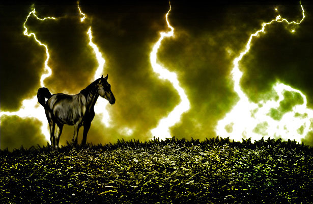
Here's a quick example that I made today using only these three images and a couple of Photoshop brushes however, the possibilities are endless and you can use more images if you wish:
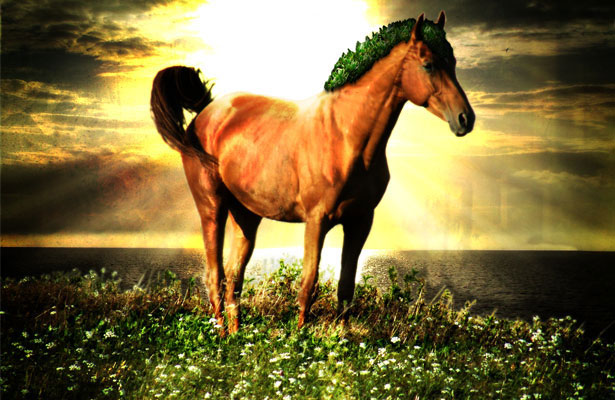
"Magical Horse" by Walter Apai
Materials:
These images are free for you to use however, we may not distribute them through the blog for legal reasons, so simply register for free at Sxc.hu in order to download the following three images: http://www.sxc.hu/photo/1140863http://www.sxc.hu/photo/1173847
http://www.sxc.hu/photo/1172851
Requirements:
- Final image must be 615px wide x 400px high at 72dpi resolution, in JPEG format (up to 150kb).
- The design must include all 3 images specified however, feel free to edit, crop and modify them in any way that you please.
- You may also add your own images, textures, brushes, filters, illustrations, etc...
- Your first name must be included with your submission. You may wish to optionally also include a short bio about yourself, link to your website or blog and a one short paragraph explaining the image that you created and the techniques that you used. We may publish this info with your image if it is chosen.
- Email the final image and the required information to us before Monday, April 20th
- [CHALLENGE IS NOW CLOSED, THANKS FOR THE GREAT SUBMISSIONS]
What's in it for you?
This is a great opportunity to get the word out about yourself and your work through WDD, and a chance to showcase your abilities. A selection of the best works sent to us will be posted on Monday. We challenge you to go all out and show us what you can do and above all, have fun and experiment with this exciting challenge. We can't wait to see what you come up with!Your images:
Below, please find your submissions in no particular order. The works created were really awesome and varied and showed how a simple concept can be interpreted in so many engaging and different ways. We'll certainly be doing more challenges soon and let you showcase more of your talents.1. Austin Timmons
 Name: Austin Timmons
Location: Baton Rouge, LA
Bio: I am a student studying marketing currently at Southeastern Louisiana University. I am deeply in love with God and His plans for my life. An intense passion for design and graphic arts burns in me. I have been designing for roughly 3 years now seriously and about 3 years before that learning and experimenting. I am still learning about what there is out there and different techniques to use.
Technique: In this design, I began to play and tweak with the layers stacking. I add one of the three selected pictures twice to see the effect it would give. There is some gradient overlay in there. I took the horse out of the actual picture and feathered it, to give it a ghost type look. I added the grass picture behind the silhouette of the horse to give it a nice feel. I'm not really to sure how I ended up where I did, no plan. I just played around till I got somewhere that I was satisfied with. Hope you all enjoy it.
Website: ohsnaptimmons.tk
2. Joshua Choo
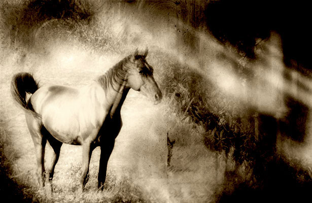
Name: Joshua Choo
Bio: I'm a web designer and a photographer.
Comments: The horse piece was designed to be very soft and bleach and a little grain and glow as well. Just to make it a very inspirational piece to tell a very old times story.
Blog: blog.fazai38.com
Website: me.fazai38.com
3. Duret
Location: France
Bio: autodidacte, formatrice sur logiciels graphiques, mac and photoshop addict ;-)
Blog: ccommeca.free.fr/dotclear
Website: zencrea.com
4. Christina
Name: Christina
Location: Norway
Comments: In the collage I wanted to use some humour, and relations between animals and humans. It's created with lots of layers, mixing and tricking :)
Blog: funlightnonstop.com
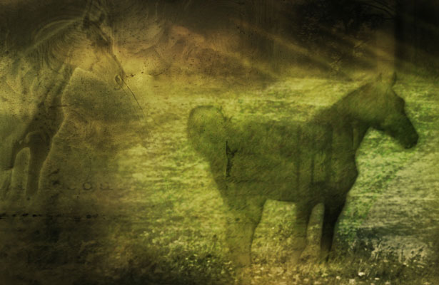
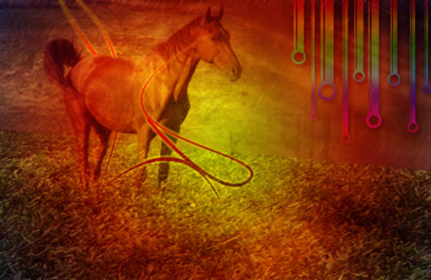
5. Chris Everett
Name: Chris Everett
Bio: I'm an old school graphic designer. Years before I got my first computer in 1985, I did conventional cut-and-paste layouts using galley type and hand-drawn illustrations.
Comments: Strangely enough, I never had any reason to do a photomontage before. That's why I appreciated this challenge. Your original images were very diverse in content, scale and style. My goal was to take each element and completely transform it. Thank you for giving me the incentive to try something completely new for me. It was a terrific learning experience. The attached JPG is called "History" - just because.
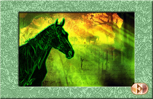
Technique: To reinforce the foreground horse image, I added my own background image of horses and trees in silhouette to show through the texture background that was part of the challenge. I took the green lawn image and used Photoshop's "Note Paper" filter to turn it into a texture for the frame.
Website: chriseverettonline.com
6. Gernot Böhm
Name: Gernot Böhm
Location: Hagenberg, Austria
Bio: 22 year old student, studying at the University of Applied Sciences
Comment: why a horse? WDD: why not? ;)
Website: b-multimedia.com
Twitter: twitter.com/bmulti
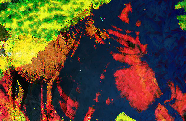
7. Randy Gonzalez
Name: Randy Gonzalez
Bio: Web Developer
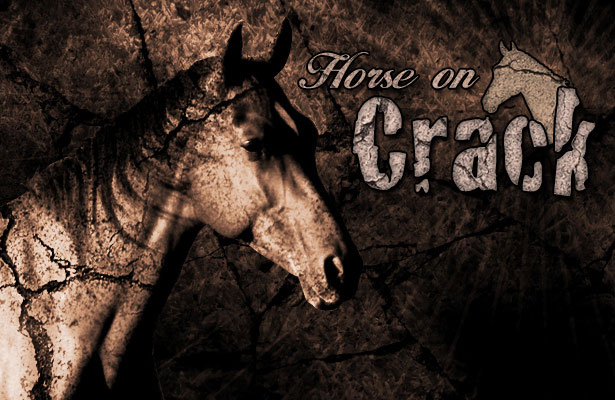
Technique: In this photomontage I thought it would be funny to depict a "Horse on Crack". I had a couple of "cracked wall" textures and was able to make use of them. So after a couple of texture layers correct lighting and blend modes I think I got the point across.
Website: digitalaxis.us
8. Brett Jankord
Name: Brett Jankord
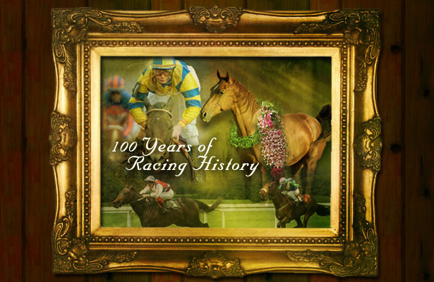
Technique: I used layer blending and masks to create this faux antique racing picture.
Website: webphibian.com
9. Benjamin Franck
Name: Benjamin Franck
Location: Belgium
Bio: I'm a web designer. I'm addicted to graphic design whether it's online or offline, music, movies and ... coffee.
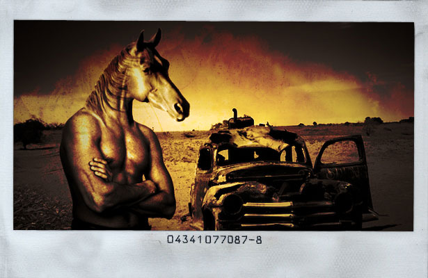
Comments: Well, I'll have to admit one thing, I wasn't very excited about the horse, but then I thought: what if I chop its head off?
Technique: I went looking for some new body on the stock.xchng website and found a muscular one. Basically, I cut out the head with the lasso, rough cut. Then with a mask, I got rid of the extra background.
Transforming and adapting the horse neck to the human one, was easier than I thought thanks to warp transform. Then I had to find some background. As I had a half-horse half-human character, I wanted some trash/weird background. Found this wrecked car in a desert, and thought it could work.
The 'kind-of-grass' pic, is the one I liked less: I used it to put some grass/vegetation on the left bottom corner. The 'texture' pic is the one I used to get the weird color effect. Turned layer mode to color burn and played with levels. Added a polaroid frame just for fun, and here it is: some weird image with a horse head on top of a human body.
Website: benjamin-franck.com (Enjoy it with coffee!)
10. Ben Homan
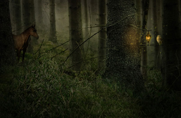
Name: Ben Homan.
Technique: I used all three required pictures; in addition, pictures of birds, an owl, a forest, clouds, and a lamp. The main technique that I used was the mask tool. I also used a lot of overlay and multiply features and desaturated almost everything.
Website: skillfulantics.com
11. Gerald Yeo
Name: Gerald Yeo
Bio: I'm a Singapore-based freelance web designer.
Comments: The title of the photo montage is: "A horse's mystical dream"
Technique: Only one additional image was used on top of the given images. I took different sections of it and overlayed them, applying different light modes (hard light/soft light) on them. The smudge tool was also used. This gives it a very aged water-paint look.
Website: www.fusedthought.com
12. Bjorn Peters
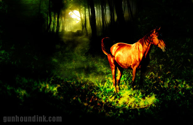
Name: Bjorn Peters
Location: Mt Gambier, South Australia
Bio: Between my partner Talie and myself we have been running our home based illustration, website and design business for the last five years.
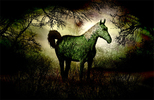
Comments: I've never done anything like this before so I took my time trying out different things as too get an idea of what I wanted it to be. I've always been a fan of the Sleepy Hollow story so I decided that a nice dark forest is what I would go for because of the horse.
Technique: I used some dark forest shots, a moon to stick way in the back and then set about it. I turned the third image (the brown papery texture) upside down for starters and when I was flicking through the layer blending options noticed one gave it a nice dark look at the top of the image.
I then cut the top half of the horse out to make sure it didn't get lost in all the gloom and then set about trying to match the images together so there were no lines overlapping, etc. Lots of layer duplicating and blurring later and I was pretty happy with it. I added a light filter over the top of the final image and then played with the colour balance a little to finish it off.
Website: gunhoundink.com
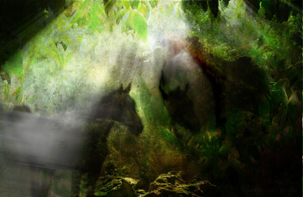
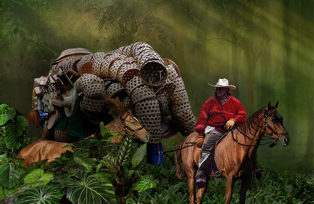
13. Shep Reiquam
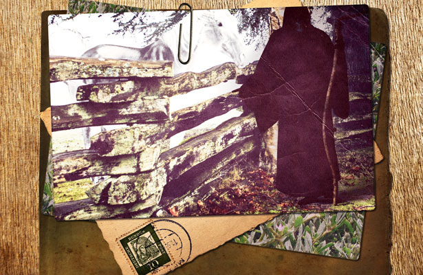 Name: Shep Reiquam
Bio: I am a 19 year old first year design student.
Comments: All my work up until now has been work I have done because I wanted to, not for any client. I love photo-manipulation and try new things each time I come across an interesting idea. This idea came from my obsession with Terry Pratchett's Discworld book series and the Grim Reaper. In the books, he is portrayed as a tall figure with a scythe and a bright white horse. I did my best to portray this and gathered some other random photos together on what could be his desk.
DeviantArt: skelifish.deviantart.com
14. Marlon Cureg
 Name: Marlon Cureg
Location: Phillipines
Bio: Just learning Photoshop and web design. Currently working here in Higher College of Technology, Muscat, Oman.
Blog: www.kutserongkulot.com
15. Julie Lê
 Name: Julie Lê
Location: Québec City, Canada
Bio: Web designer
Comments: With the springtime and summer coming, I wanted to do something vivid, colorful, more like a painting.
Technique: I mainly played with curves, layer masks, ink outlines and difference filters.
16. Liora Blum
 Name: Liora Blum
Bio: I'm a graphic designer.
Technique: I made this whole image from brushes and layer effects. All images are from the stock exchange site.
Blog: www.brushthis.com
Website: www.liorablum.com
17. Joel K.
 Name: Joel K.
 Location: Spring Valley, New York
Bio: A new web developer and designer.
Comments: I can do better than this image. I just think this would be unique because I only used the three original images. I also used an image of a landscape which you can barely see under the grass just to indicate that these are individual images. I would name the image "My grandfathers horse". This is an image I can see sitting on an old craftsman's desk collecting dust.
Website: eVeltdesign.com
18. Constantin Potorac
Bio: I'm a Graphic Designer and also I like to call myself a Digital Artist. I have started my artistic journey a few years ago and since then I must say that I have discovered my one true love.
Technique: About the Illustration: I have first started working on this piece with a simple idea, to make the horse cut in different places as seen and in the end to apply some organs, but as I progressed with the image I have thought that combining this with the Omega Code theme and a retro feel could give the piece a better approach.
19. Carla Ceia
 Name: Carka Ceia
Bio: I'm a young graphic designer and illustrator from Portugal.
Comments: This is a story about floating islands on the dark blue skies, inhabited by horses with magical powers. This image took about 2.5 hours to complete and was done using lots of stock pictures, some 3D elements and some digital painting too.
Website: hauntedcathouse.org
20.Pasquale Di Maio
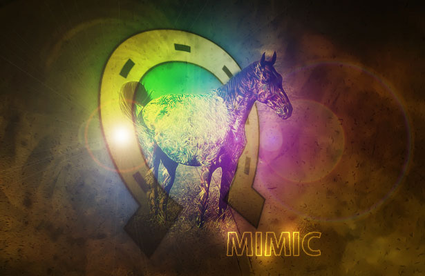 Name: Pasquale Di Maio (linux29)
Country: Italy
Technique: I used only the 3 images, a gradient map and lens flare. The horseshoe was created by me with Illustrator.
21. Sander Rosenbrand
 Name: Sander Rosenbrand
Country: Netherlands
Bio: I’m a freelance web designer.
Comments: Love to read webdesignerdepot nearly every day! Great work guys! This is my submission for the contest. I don’t really have a name for it, but if required, I would call it ‘The forrest grass horse’… how original ;-) It was really fun to work on, because I usually just do websites. Thanks for all the great articles on the site!
Technique: All 3 required images are in the montage. I used two additional photos from stock.xchng and some vector tree and branches. The rest is all Photoshop…
Website: active-element.com
22. Shane Gillies
 Name: Shane Gillies
Bio: Print & Web Design.
Comments: Thanks! That was fun!
Technique: The elements should be obvious. I used all three required photos, plus a few extras.
Website: Fishgill Graphics
Twitter: shanegillies
23. Knut
 Name: Knut
Country: Poland.
Bio: I'm graphic and sound designer. I hope you enjoy my CALL SMALL.
Website: knutmobius.com
24. - Joosep Kõivistik
 Name: Joosep Kõivistik
Comments: Well, the image doesn't really have much background... just wanted to create something surreal... ended up with something just "strange" unfortunately it's not that finished... got delayed and reached the deadline.
Technique: Hmmm... cut, paste, chop'n crop? your usual stuff really... cut some images, brush them some shadows and highlights with the stylus, apply a few layer styles, etc.
Website: koivistik.com
25. Guisella Acuña (aka DraRock)
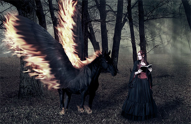 Name: Guisella Acuña (aka DraRock)
 Country: Peru
DeviantArt: drarock.deviantart.com
Technique: I definitely wanted to make a winged horse (I love feathers J) so at first I attempted a Pegasus, but I found very difficult to make it white and look real, so I chose to go with a black one, a dark horse that found a dark lady, walking together into the deep forest. I used the pen tool to isolate the horse and the magnetic lasso for the lady, I attached the black wings to the horse with a soft brush blending them smoothly, and the grass was also smoothed so it can be merged with the forest image and stamped some of the grass to cover all the width of the image. The fire for the wings was distorted and smudged, and for the final touch some color blending to give it a somber tone.
26. Erik
 Name: Erik
Website: erikiggmark.se
27. Kenneth Wiggins
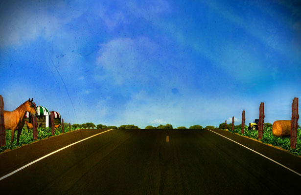 Name: Kenneth Wiggins
Bio: Interactive graphic designer.
Comments: I've been designing for about 5 years and really never tried submitting to a contest before. I enjoyed creating this and will definitely look forward to more! Thank you for the chance!
Technique: I wanted to illustrate something you would see when driving through the country side. Added were a few images used to complete the countryside look.
Website: www.kdwiggins.com
28. Claire Williams
 Name: Claire Williams
Bio: I am a photographer and graphic designer as well as currently a stay at home mom.
Technique: I used all three images in the sky background in various layers and opacities. The grass picture was used as a pattern overlay in one of these layers. I used brushes of fire and vines to add a smoky grunginess to the sky. The vines look like lightning of pure darkness to me. Motion blurs on the foreground horse and landscape give an ethereal quality. I was inspired by the story of the four horsemen of the apocalypse, and the image is my take on if a horse could reflect the properties of its horseman as well. This horse represents War. Photomanipulation title: War
Website: claireity.net
29. Mauricio Esparza, M@U
 Name: Mauricio Esparza, M@U
Comments: Thanks for create this competition, I hope you’ll post another one soon...
Blog: mau.cristalab.com
30. Nancy Raskauskas
 Name: Nancy Raskauskas
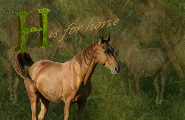
Bio: I am a Teacher (Grades 6-12), Technologist, Freelance Artist, Tech Writer, Blogger and owner of The Cosmic Networks; Blog, Forum, Support, Classifieds, Social Network and E-folio services for my school community. I have written articles and reviews for many technology publications. Besides teaching, my current projects include editing a documentary film and writing and illustrating an alphabet book for my seaside community which gave me the idea for this adaptation.
Comments: I discovered this while tweeting earlier. Thank you for the opportunity.
Technique: My design included repetition of all three elements. In Photoshop I started with a dark brown to black gradient background and layered the grass and texture with transparency, I copied the horse several times and resized the copies, also lowering their transparencies to various levels and merging them into my layered background. I then cut out, via magnetic lasso, the horse image, placed it on the background and resized it. I created a 3D letter "H" in Illustrator and applied the textured image to the beveled edge and the grass image to the surface and played with the levels until I got the desired effect. I brought this into the Photoshop image. I added the words "is for horse" in a color extracted from the horse itself.
Website: cosmicthings.com
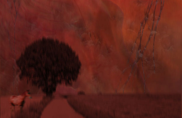
31. Rand Duren
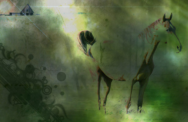 Name: Rand Duren
Technique: Through the image I wanted to give the idea of going away, leaving home. Tried to capture this by having the horse waking opposite the house while the sun sets which is usually the time to come back home. I basically added one more photo, worked with some brushes, changed the opacity and the blending modes of most pictures and added some plain shapes which served to give some change in the colors.
Website: randrambles.com
32. William Byrd
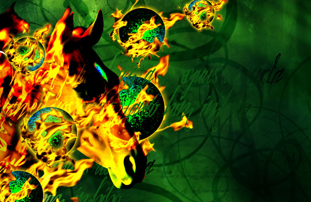 Name: William Byrd
Bio: I'm a designer and web developer.
Comments: This is actually the first design challenge I've taken part in; hope to do some more - it was fun! Great practice.
Technique: I used all three images, but wasn't really feeling the plant image, so I balled it up and set it on fire (figuratively speaking)... I also used some brushes and some pictures of fire I took.
Website: william-byrd.com
Which ones are your favorites? Please add your feedback below...
WDD Staff
WDD staff are proud to be able to bring you this daily blog about web design and development. If there's something you think we should be talking about let us know @DesignerDepot.


Read Next

20 Best New Websites, May 2024
Welcome to May’s compilation of the best sites on the web. This month we’re focused on color for younger humans,…

Exciting New Tools for Designers, May 2024
This year, we’ve seen a wave of groundbreaking apps and tools. AI is reshaping the industry, enhancing productivity,…

Using AI to Predict Design Trends
Design trends evolve at a blistering pace, especially in web design. On multi-month projects, you might work on a…
By Simon Sterne

15 Best New Fonts, April 2024
Just like web design, type design follows trends. And while there’s always room for an exciting outsider, we tend to…
By Ben Moss

3 Essential Design Trends, May 2024
Integrated navigation elements, interactive typography, and digital overprints are three website design trends making…

How to Write World-Beating Web Content
Writing for the web is different from all other formats. We typically do not read to any real depth on the web; we…
By Louise North

20 Best New Websites, April 2024
Welcome to our sites of the month for April. With some websites, the details make all the difference, while in others,…

Exciting New Tools for Designers, April 2024
Welcome to our April tools collection. There are no practical jokes here, just practical gadgets, services, and apps to…

How Web Designers Can Stay Relevant in the Age of AI
The digital landscape is evolving rapidly. With the advent of AI, every sector is witnessing a revolution, including…
By Louise North

14 Top UX Tools for Designers in 2024
User Experience (UX) is one of the most important fields of design, so it should come as no surprise that there are a…
By Simon Sterne

What Negative Effects Does a Bad Website Design Have On My Business?
Consumer expectations for a responsive, immersive, and visually appealing website experience have never been higher. In…

10+ Best Resources & Tools for Web Designers (2024 update)
Is searching for the best web design tools to suit your needs akin to having a recurring bad dream? Does each…
By WDD Staff