 A graphic symbol is often used as part of logo design in order to convey a particular idea or concept in an effective and eye catching way.
The shapes of these graphic symbols vary a lot, but one of the most commonly used shapes is the circle.
Circular logos have been some of the most popular trends in logo design. A circle is timeless, simple and memorable.
In this article we’ll take a look at 50 excellent circular logos. These logos make use of the circle in many creative ways, sometimes containing typefaces, symbols and images as seen in the examples below.
eNASA
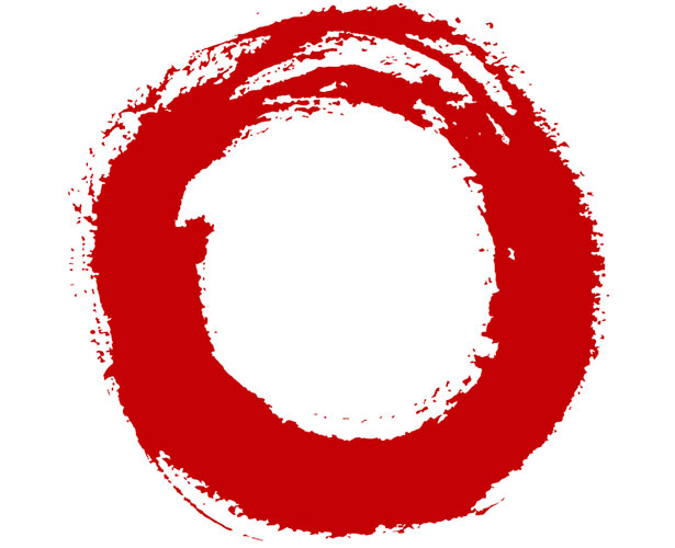
Indra
Lucky Strike
Virgin Express
Volkswagen
BMW
WordPress

Target
Korean Air
Holden
Accelrys

Tide
Bayer
London Underground
Lucent
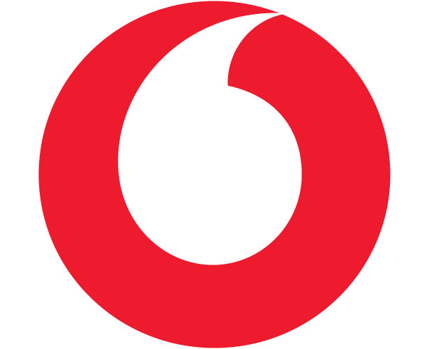
Vodafone
Yamaha

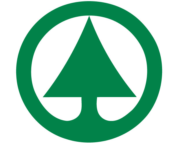
Spar
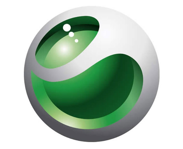
Sony Ericsson
AT&T
Air Canada

Obama '08
Bacardi
Filmax
ABC
Timberland

CBS
Alfa Romeo
Der-Grune-Punkt

Schindler
Radio Shack
Palm
Vattenfall
Motorola
Firefox

PBS
Danone
General Electric
Tupperware
Texaco
ESA
Starbucks
Oxfam

LG
Mercedes Benz
Rexel
Safari
Nissan
Pepsi
Caltex

Compiled exclusively for WDD by Edward Calugtong, a graphic and web designer from the Philippines. He also writes design related articles on his blog.
Which ones are your favorites? Did we leave any good examples out? Please share with us...
WDD Staff


Read Next

3 Essential Design Trends, May 2024

How to Write World-Beating Web Content

20 Best New Websites, April 2024

Exciting New Tools for Designers, April 2024

How Web Designers Can Stay Relevant in the Age of AI

14 Top UX Tools for Designers in 2024

What Negative Effects Does a Bad Website Design Have On My Business?

10+ Best Resources & Tools for Web Designers (2024 update)

3 Essential Design Trends, April 2024

How to Plan Your First Successful Website

15 Best New Fonts, March 2024
