 Today we're going to compare the websites of two monumental companies: Apple and Microsoft.
The two giants pride themselves for producing cutting edge consumer and business products, and are leading the developments in software and hardware.
But what about their websites? How do they both compare, and more important, which one is better and more usable?
Well, in this article we'll take a look at both websites for closer examination from a usability point of view.
One important thing to note before we proceed to compare these two websites is that each company's business revolves around different markets.
Microsoft primarily makes its profits from business to business, which mainly consists of selling licenses to its operating system to computer manufacturers and office suites for enterprises.
That's not to say that they don't sell to consumers -- they do, and they have consumer only product lines as well, such as the Xbox gaming console, and of course home users also buy Windows and Office. This means that their business targets pretty much everyone, from home computer owners to developers and enterprises; which in turn stretches the purpose of their website to try and serve everyone.
On the other hand, Apple is primarily a consumer company, and makes most of its profit selling hardware, like its iPod music players and Mac computers. This makes the target of Apple's site much clearer -- marketing, selling and providing support for its products to consumers.
They don't have to worry about selling licenses to manufacturers because they're the only manufacturer, so the key purpose of the website would be to advertise and promote their multiple product lines, as well as selling them through their online store.
1. Homepage
The homepage is one of the most important pages of the whole site because it's the first, and in many cases the only chance you get to impress the visitor enough to keep them browsing. You've got a few seconds to convince them that the site has enough value for them to keep using it, because if it doesn't, the visitors will leave.
Apple's approach to the homepage has been consistent throughout all the years that the site has been running. They use this page as a kind of advertising board that always shows a big ad of their latest product, followed by 3 other ads to another 3 products or news that is important at the moment.
If you're not interested in any of the 4 suggested items, you can use the large navigation bar at the top, which is split into their core businesses: Mac, iPod and iPhone, followed by a couple of other important links, such as the online store and support pages. The navigation bar also incorporates a search field.
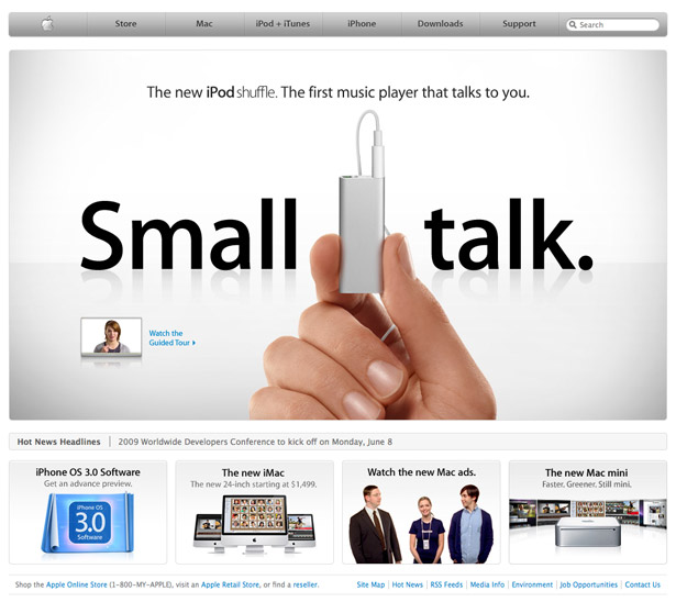
The interesting thing here is that the main ad at the top is huge -- indeed it almost covers the entire page. If this doesn't grab your attention then nothing will. Apple knows the importance of getting the customer's attention using good marketing, so they're not afraid to really go for it.
One other thing to note is the lack of content. You're not distracted by sidebars, notices or extra navigation items -- there are only a few items on the page, focusing your attention and making the decision of where to go next easier.
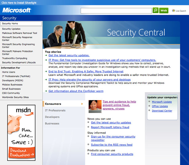
Microsoft has a different approach to their homepage. Firstly, they feature a similar style of ad at the top, designed to be attention grabbing. These are large images, but only one out of 3 ads is shown at a time -- you have to hover over the other two to expand them. This focuses attention, but may potentially weaken the effectiveness of the two hidden ads since the visitor has to work to see them. Right at the top of the page is the navigation, together with search.
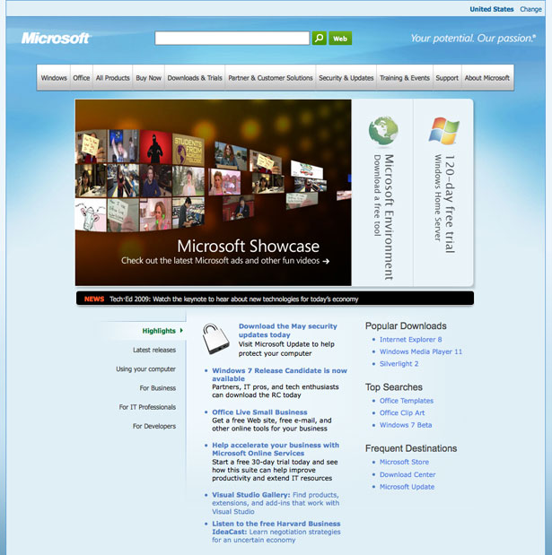
What's below the main ads is more interesting though. As I mentioned previously, Microsoft's business operates in many markets, including both business to business and business to consumer.
The space below acts as a set of highlights and news for these various areas of the business. One big problem with the content featured here is that it's fairly boring and overwhelming, with a lot of information packed into a very small space, without anything try to make it scannable.
Sure, it's broken down into bullet points, but the font is small and there are hardly any images to differentiate between the items. As it stands, there is little to attract me to make me want to read through this content because it's just, well... boring.
2. Flow
What I mean by flow is this: is the site structured and laid out in such a way that I can easily find items to focus on? Do I know what to read after I focus on those items -- is the site design directing me across the page with less effort on my part, or do I have to work to try and navigate around the content to find what I need?
Here's the MobileMe section on Apple.com:
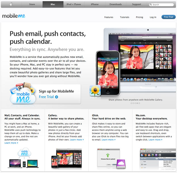
I think Apple has done a great job at structuring all of their pages. Here, the first thing you focus on is probably the picture on the right and then the large headline on the left.
After you've read the headline you can proceed to read the marketing blurb below, which leads nicely into a call to action signup button for the free trial. If you're not interested in the trial, there are more features below to persuade you, each one ending with a "Learn more" link to a more detailed feature page. This leaves no dead ends and keeps the user browsing.
Microsoft seems hit and miss in this department. Here's the SharePoint section:
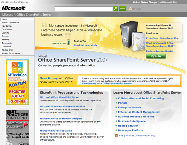
Yes, there is a focal point at the top that grabs your attention -- the large quote and the image of a server -- but what's next?
All of the content below is extremely monotonous, especially the "Learn More" box with a list of 8 links. The dry presentation gives the user less incentive to click around. Some Microsoft sites use better layout to direct the flow of attention, but they generally all suffer from the same illness: too much content.
When you present the user with too many choices, you make them work -- they have to think about what they want and they have to process more information. By reducing choice, Apple directs the users through a more carefully designed funnel, which generally delivers a better experience.
3. Navigation
Apple's website has a large navigation bar at the top, which remains there consistently whichever section of the site you go to.
The options available show the main sections split by its lines of business as well as a couple of essentials, such as support and the store. The bar also integrates search and branding as the home button displays the Apple logo instead of a label.
Any extra sub-navigation is located on individual site pages and is placed within the context of that page, whether on a sidebar, or as a horizontal bar at the top.
![]()
Microsoft has a similar navigation bar on the homepage, but that navigation bar is not consistent across the site. Actually, all of the sub-pages tend to use their own navigation bar, in style and in content. The homepage navigation thus acts as a site map to the rest of the Microsoft website sections.
In a lot of the navigation bars, including the one on the homepage, Microsoft uses drop-down menus -- unlike Apple. They don't just use drop-down menus -- they use huge drop-down menus. In some cases, the menu even has a scrollbar (in Firefox):
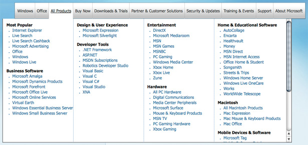
Is this good or bad? In a recent Alertbox entry, Jakob Nielsen, a well known usability guru, has written that mega drop-down menus can work.
They work because they present a lot of choices in groups, so they allow for easier scanning as you can jump to the group that you want and scan the items inside them. You have to get certain things right though, like the order of the groups and only mentioning each element once, for them to work well.
In this case, I think it makes sense for Microsoft to go the route of the drop-down menus, but I feel that they may have gone a little too far. For example, some options point to the same thing, like the 'Office' drop down and 'Office' option in the 'All Products' drop down.
The drop-down also blocks the content below, so if you accidentally moused over the menu, you have to mouse off from it again to get to the content below -- all the while being careful not to hover over other items.
There are also a lot of options under each group -- sometimes showing about 13 items, which makes processing the options much more difficult. Also, the inconsistency of navigation across the different sections makes it much harder to jump from one area of the site to another, e.g from the Office site to the Xbox site.
4. Readability
Because most of the content on the sites is text, it's vital to ensure that everything is readable and legible. Here are the main things to consider when working on readability of your site's content:
- Make the text large enough so that it's easy to see and read.
- Ensure that there is enough contrast between the text and background.
- Provide enough white space around the text to keep other content and graphics from distracting the reader.
- Provide plenty of headings or highlighted/bold text to allow users to quickly scan the content for key information.
- Add images and icons to make it easier to focus on individual sections of the text, i.e. product or feature descriptions.
- Keep the text short and to the point.
Let's see how Microsoft and Apple fare in this area. Here's a typical page on the Apple.com website:
Apple does a great job of keeping everything easy to read. The text is generally small, but never too small so as to be a problem. Headings are set in heavier type and stand out, allowing you to quickly get the gist of each section.
Apple also makes heavy use of white space to separate everything apart and adds images to make each text blurb more interesting.
Here's a typical page from Microsoft.com from the Windows section:
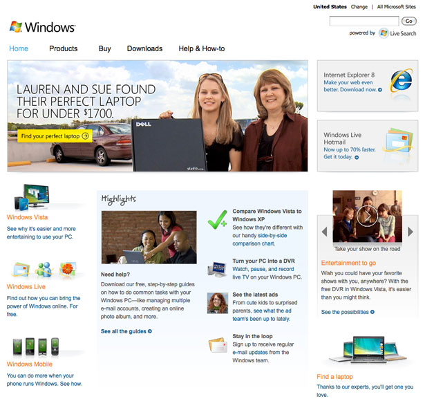
It follows the general usability guidelines by breaking things down into small bite size pieces of text that are easy to digest. It looks a lot busier than the Apple site because there is more content on one page and there are many different treatments for headings and highlighted words.
Too much variety causes visual chaos on the page, with each different colored or bold item competing for your attention. In this case, the page really needs to be simplified to make it easier for the viewer to process.
Here's another page, this time from the Microsoft security section:
The text on this page is probably a little too small to be comfortable to read, and the site needs more white space around the content to separate the text. Let's see what a really busy page on Apple's site looks like:
This is the Apple store. Really busy with lots of products and category links everywhere. Fonts get pretty small to allow more content to fit in, although good use of white space ensures things are still usable.
5. Search
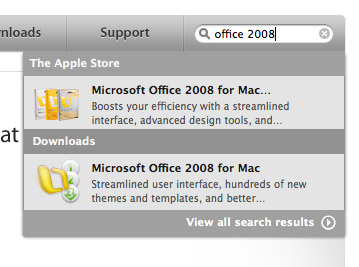
Apple's search is integrated into the navigation bar. When you type something in the search box you actually get live search results with AJAX, by way of a little box which pops up, showing you the results as you type.
It's very well done -- there is no lag when typing, the results are grouped in categories and are fetched very quickly, usually before you finish typing your full query. Here's what it looks like:
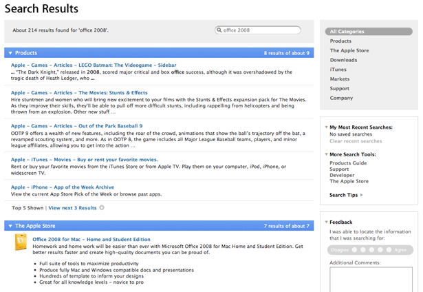
If you want to see more results you can just hit Enter when you've finished typing and you'll be taken to the standard search results page. It's very clean and organized by categories.
You can drill the results further down by category, selectable from the menu on the right. It's functional and clean, and works well when you're trying to find any products that they sell.
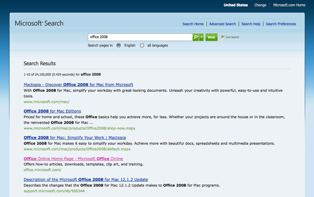
Microsoft has a more familiar search results page that looks a lot like Google (or any other search engine these days).
That's because it uses Microsoft's own Live search engine. It's certainly good at finding what you're looking for and got the results that I wanted. The format of the results is one big list, which makes sense for Microsoft because of the nature of their business, with a lot of sub-pages and different content to search through.
It's functional, but the look and feel is different to the other pages, which makes it look like you're browsing a different website.
6. Aesthetics
Apple's website aesthetics closely mirrors that of its product line. The navigation bar looks like it's crafted out of aluminum and features gentle gradients and indented text.
There are also plenty of reflections and minimalist design elements. Apple has always worked on unifying the look and feel of its interface across its entire product line, from the hardware to software, and their website is no exception.
Do aesthetics have anything to do with usability? Actually, they do. Research shows that people perceive better looking interfaces as more usable.
Attractive interfaces will set better first impressions and may even make their users more tolerable to problems. So how does Microsoft fare in the aesthetics department? Here's the Internet Explorer 8 page:
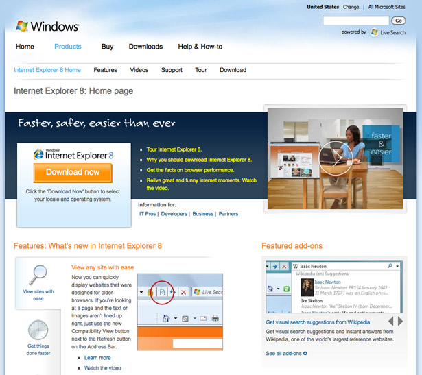
The site follows a faint Windows theme with the light blue clouds, but there is little else to say that this is a page for Internet Explorer or Windows.
The look and feel is very generic and doesn't do enough to differentiate itself or build a coherent brand. Here's another page; this is the Download Center:

Again, we have a completely different design, although the light blue color is used here too for the backgrounds. If there was no title on the page, could you tell that this is a Microsoft or Windows page? Probably not.
The designs are overall pretty good, but pretty good just isn't enough. There are plenty of inconsistencies and a lack of polish, which puts Apple ahead in this area.
7. Consistency
Consistency is important because it allows you to develop usage patterns. This basically means that if your site has a consistent interface throughout, your visitors will quickly learn how it works and will be able to use this knowledge in any of the new pages that they visit, since they'll all be using the same, or very similar, interface.
Apple does a great job of keeping the interface consistent. All of the product pages feature very similar aesthetics and are structured in the same way.
The whole site looks and feels the same throughout and the global navigation bar at the top is always there, on every page. This means that the entire experience is very unified and coherent -- you know you're on the same website wherever you go.
Here's a Microsoft page for the Azure platform:
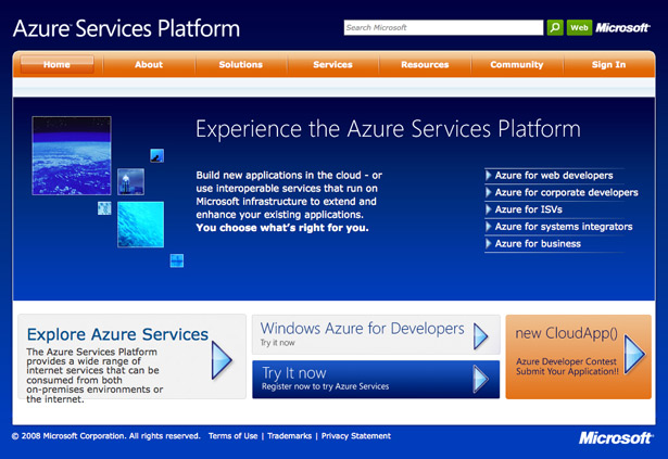
Could you tell that this is a Microsoft page if you took away their logo? Custom graphics, styles and color palettes across all the Microsoft sections help little to maintain a coherent brand image on the web.
Microsoft really struggles here. There are many different sections across Microsoft.com and they all feature their own look and feel, including their own navigation.
So once you go to a section on their site, be it the Microsoft store, the Office site, or the Security pages, they will all look and feel like separate websites.
What's worse, the global navigation bar is also gone, meaning that you have to go back to the homepage, or the site map, to see an overview of all of their sites. It's really an ecosystem of websites hosted under the same domain and therefore it doesn't get the benefit of consistency that Apple has. The brand image is also terribly fragmented making it impossible to define what a Microsoft site looks like.
Conclusion
Which site is the winner? If you're looking at usability alone, Apple comes out ahead. They have a better designed homepage that offers less choice, which means the user needs to think less.
They have consistent navigation across all of their pages. They use a lot of white space and sub-headings to make everything more readable, yet they keep things simple by not overusing too many different text treatments.
The Apple site is generally more user friendly and offers a much better experience to consumers who use it to check out Apple's latest products.
Having said this, the Apple website is much smaller in scale than Microsoft's site. Unlike Apple, Microsoft hosts many different sites and sections under the Microsoft.com brand, creating a whole ecosystem of sub-sites. Each site is packed with information and the Live powered search that Microsoft offers tends to yield good results. The biggest problem for Microsoft is consistency.
Microsoft just doesn't have a consistent, coherent and unified brand. Every section looks and feels different. There is no global navigation and there are not many visual clues that tell the user that this is a Microsoft site -- unlike Apple, where the whole site shares one unique aesthetic that mirrors that of their hardware and software, thus creating a powerful brand.
For these reasons, I think Apple is the clear winner here.
Written exclusively for WDD by Dmitry Fadeyev. He runs a blog on usability called Usability Post.
What do you think? Have we got it right? We'd love to read your thoughts and comments, so go ahead and leave us a comment below...
WDD Staff


Read Next

3 Essential Design Trends, May 2024

How to Write World-Beating Web Content

20 Best New Websites, April 2024

Exciting New Tools for Designers, April 2024

How Web Designers Can Stay Relevant in the Age of AI

14 Top UX Tools for Designers in 2024

What Negative Effects Does a Bad Website Design Have On My Business?

10+ Best Resources & Tools for Web Designers (2024 update)

3 Essential Design Trends, April 2024

How to Plan Your First Successful Website

15 Best New Fonts, March 2024
