 Simplicity is key to any successful website or web app.
If your site is too complicated, the user will have to go through too many hoops to find what they are looking for and won't even bother trying it out.
The Jackson 5 got it right back in the 70's when they sang "easy as 123".
A simple and effective approach is to break down your services, signups and checkouts into 3 easy steps. This will improve usability, increase sales, signups and conversion rates.
In this article, we'll take a look at 20 great examples of the 3 step approach for effective website usability.
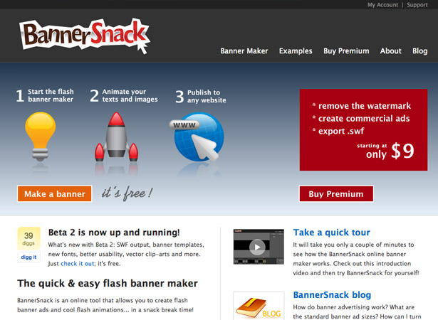
1. Banner Snack
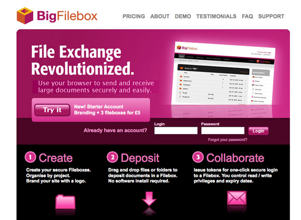
2. Big Filebox
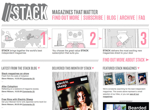
3. Stack Magazines
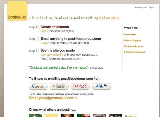
4. Posterous
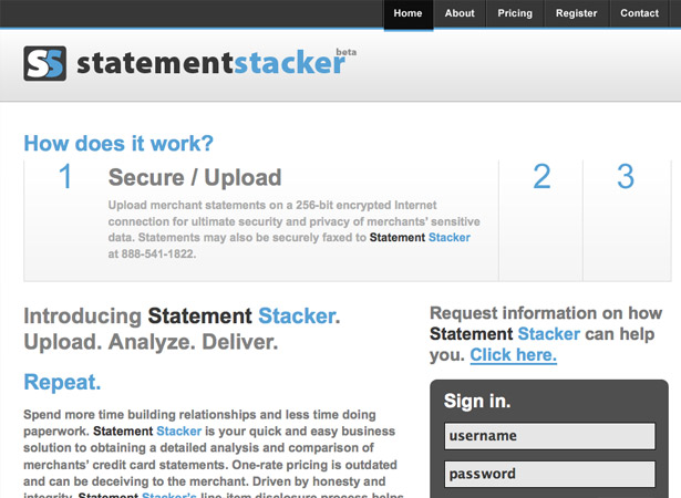
5. Statement Stacker
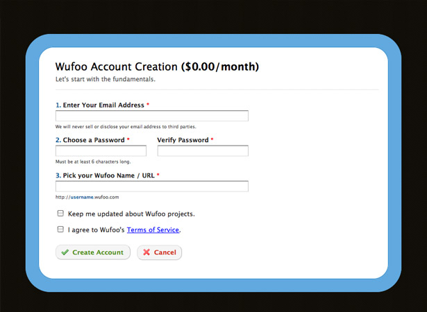
6. Wufoo
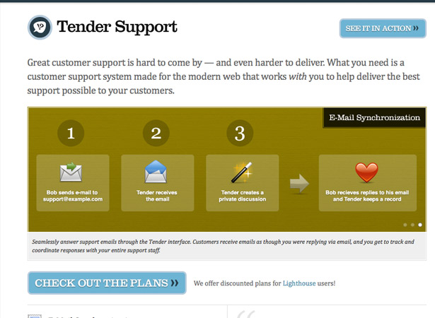
7. Tender Support
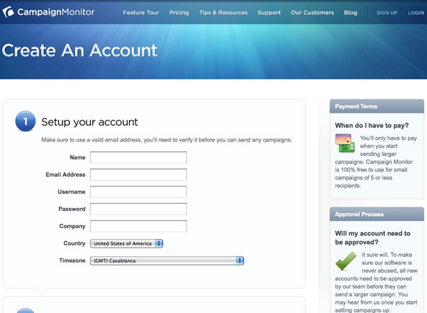
8. Campaign Monitor
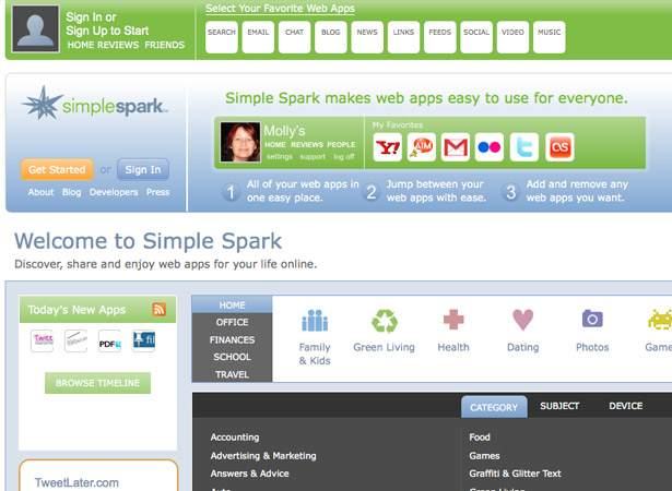
9. Simple Spark
10. CSS Rockstars

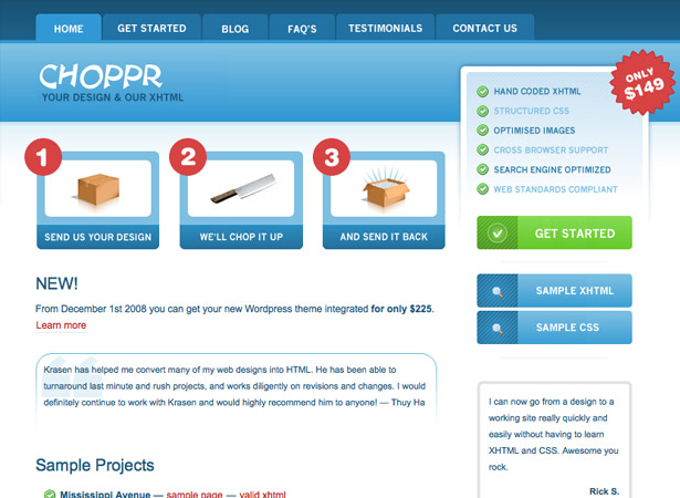
11. The Choppr
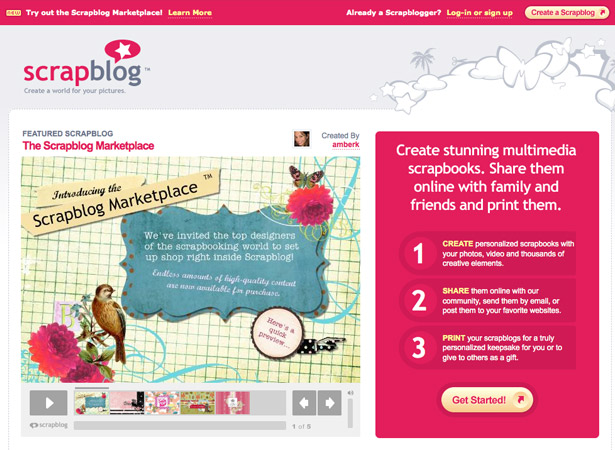
12. Scrap Blog
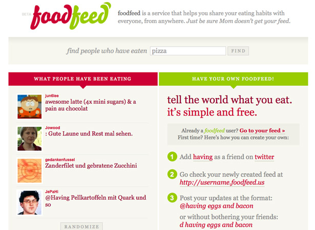
13. Food Feed
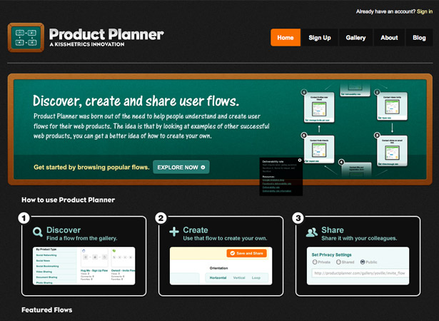
14. Product Planner
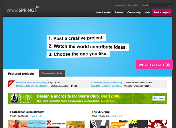
15. Crowd Spring
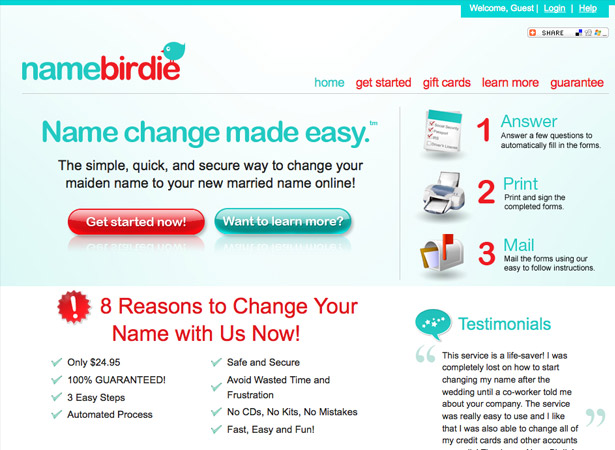
16. Name Birdie
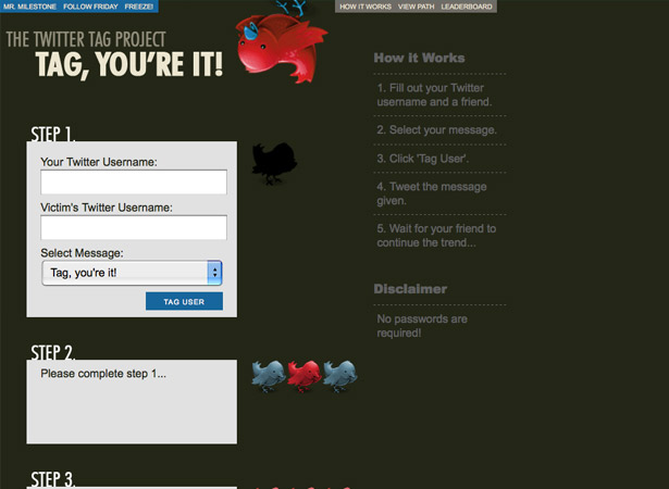
17. The Twitter Tag Project
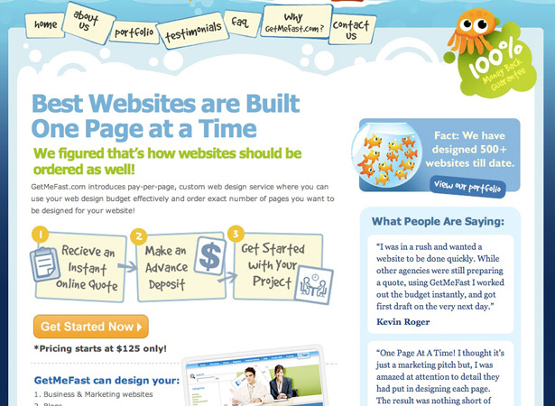
18. Get Me Fast
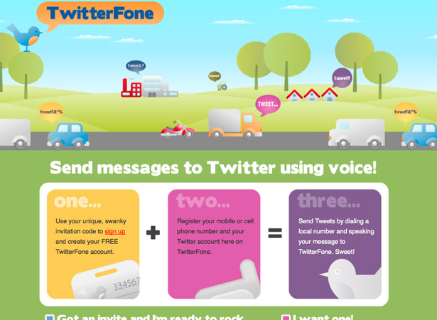
19. TwitterFone
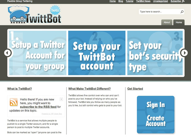
20. TwittBot
Written exclusively for WDD by Lee Munroe, a freelance web designer and blogger. You can find more of his writing at his blog or follow Lee on Twitter.
Is the 3 step approach an effective way to simplify your web design? Please share your comments below...
WDD Staff


Read Next

3 Essential Design Trends, May 2024

How to Write World-Beating Web Content

20 Best New Websites, April 2024

Exciting New Tools for Designers, April 2024

How Web Designers Can Stay Relevant in the Age of AI

14 Top UX Tools for Designers in 2024

What Negative Effects Does a Bad Website Design Have On My Business?

10+ Best Resources & Tools for Web Designers (2024 update)

3 Essential Design Trends, April 2024

How to Plan Your First Successful Website

15 Best New Fonts, March 2024
