 As web design and design in general have evolved, rules have been established to ensure consistent and usable designs.
Some of these rules were created simply because website creators abused certain principles without regard for their users.
But these rules are not enforced by anyone and should be broken when necessary, especially when breaking them would lead to a stunning design.
In this article, we present 10 rules that you can break if it suits your design needs.
Rule #1: Do Not Display the Horizontal Scroll Bar
A significant number of mice don't have a horizontal mouse wheel. This makes it awkward to scroll left or right when a web page's content extends past the sides of the browser.
It can be annoying to have to bring the mouse cursor down to the bottom of the window and drag the scroll bar over just to see a word or two that lies beyond the viewable area of the page. That said, here are some well-designed sites that put the scroll bar to work in effective ways.
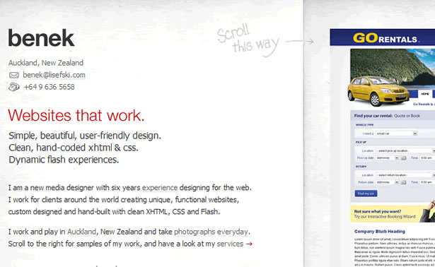
Benek
Benek uses JavaScript to change the scroll direction of the mouse wheel from vertical to horizontal. Each item in Benek's portfolio is separated into its own column. The site has a surprisingly fresh feel and flows smoothly.
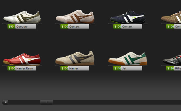
Shoe Guru
Shoe Guru gets away with horizontal scrolling because it takes advantage of the way people look at shoes. People look at most products from top to bottom, but shoes are different. People's eyes usually move across the length of the shoe. Using this habit to its advantage, Shoe Guru makes its website's design flow in the same direction, making the motion feel natural.
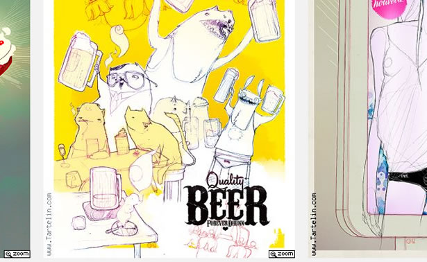
Stephane Tartelin
Stephane Tartelin uses the horizontal scroll bar to make his artwork look like it's in an art gallery. Although the vertical mouse wheel doesn't function like it does in the examples above, the effect works surprisingly well. You could even argue that the effect would be diminished if the mouse wheel were re-coded to scroll horizontally.
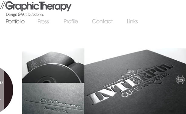
Graphic Therapy
While Graphic Therapy doesn't display a horizontal scroll bar on its page, it still allows horizontal scrolling by clicking and dragging around the screen. Graphic Theory used horizontal navigation because all of its images are the same height but not the same width. The horizontal navigation helps the site flow smoothly.
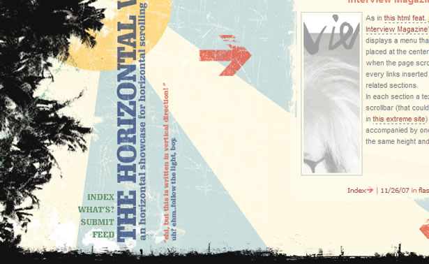
The Horizontal Way
The Horizontal Way is a showcase of websites that use horizontal scrolling. The grungy graphics are beautiful, and this site is unique as far as CSS galleries go.
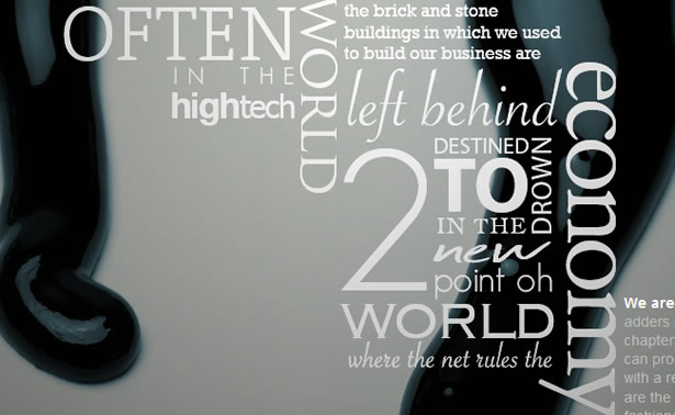
Rule #2: Use a Minimal Number of Font Faces
Too many fonts usually conflict with each other and overwhelm the viewer. Each font has a personality, and too many personalities can create disorder.
To effectively use more than just a couple of fonts, a design has to be very text-oriented, and the rest of the design needs to be relatively quiet. Here are some examples of sites that use this sense of conflict and disorder to engage the user.
Links LA
Links LA uses many fonts in a non-linear layout to create a sense of energy. The page is difficult to read quickly but draws the user in. It's also worth noting that none of the fonts are overly decorative; each word is legible, keeping the design crisp and clean.
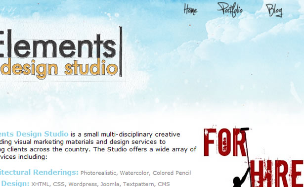
Geo Elements Design Studio
Using a variety of fonts usually conveys a sense of energy and chaos, but Geo Elements Design Studio's website is very open and clean. Each font is given its own space so that the viewer doesn't associate it with another font. The image of the sky in the background helps reinforce the sense of openness.
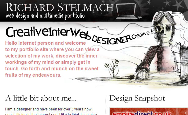
Richard Stelmach
Unlike the last example, Richard Stelmach pushes his different fonts close together. The design works because only one font doesn't look hand-drawn, and the other two work well with the illustration. Hand-drawn fonts usually work well together, even when there are many different font faces.
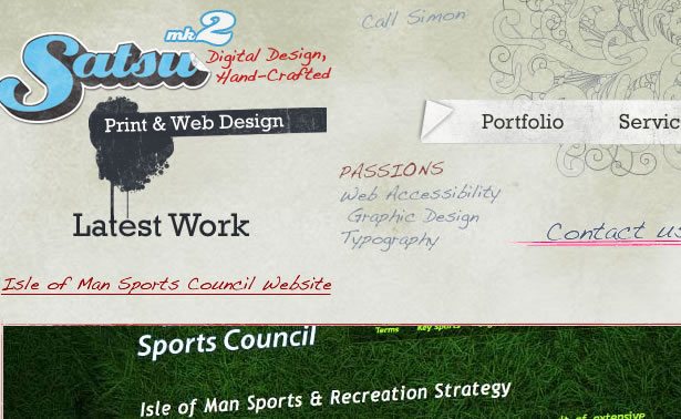
Satsu
Satsu seems to have a lot of different fonts but actually only has three (not including the Sports Council portfolio item). By spacing everything carefully, Satsu associates certain lines of text with each other, even though the text may be in different fonts.
The logo title is in one font, and the two sub-titles each have their own font, but the viewer naturally groups these three text items together. Satsu is able to create energy without overwhelming the page with personalities.
Rule #3: Do Not Use Too Many Colors
The fear of going too far with a design is what separates professionals from rookies and rookies from the oblivious. The oblivious try to make their designs as extreme as possible, with words on fire, blinking text, and as many colors as possible.
Rookies want to keep their designs subtle and easy on the eye, but in the end their designs can sometimes look lifeless. The following eye-pleasing designs are by some true professionals who are pushing boundaries.
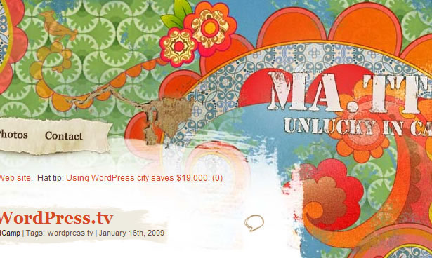
Matt Mullenweg
Matt Mullenweg's beautifully colored design looks like a watercolor painting (site has been updated since this article was written). All of the colors in the background would grab anyone's attention.
Generally, good designs with a ton of colors will have these colors in the background, with a simpler palette up front. Reading text is very difficult when too many things are going on.
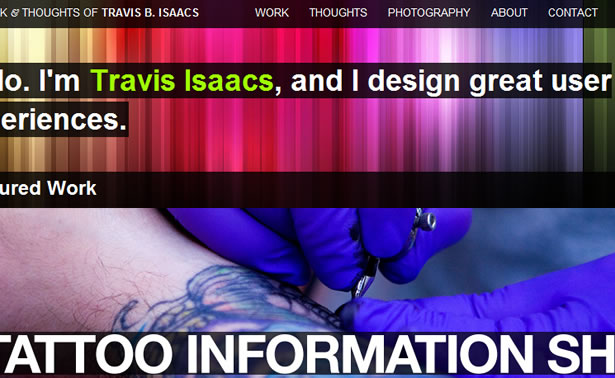
Travic Isaacs
Travis Isaacs's design has a colorful vertical gradient in the background that makes the design seem colorful throughout. This website has bright pink as its link color, which is a great choice for designers who want to create a colorful effect.
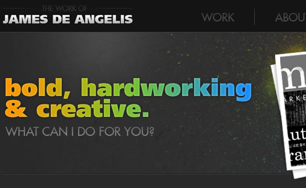
James De Angelis
James De Angelis' website shows that text can be colorful without coming across as rookie-like. The design is very spare, and the tagline is certainly given center stage.
Rule #4: Make Your Site's Goal Obvious
Something that really gets crammed in the ears of young designers is that a design should instantly tell viewers what they are looking at before they read any text.
Brand recognition is important for large corporations, but sometimes the smaller guys need to be a bit more clever to get the viewer's attention. Holding back information can intrigue the viewer and "tease" people into wanting to learn more.
Applying this technique to web design can greatly increase the time that users stay on your site.
Cetrotrees
On most portfolios today, the freelancer or company usually introduces themselves and explains their work. Cerotreees instead puts some vaguely labeled links on the left and samples of its work on the right, but nothing explains the idea or person behind it.
The air of mystery surrounding the site entices the user to stay.
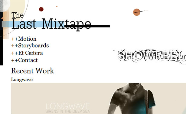
The Last Mixtape
The Last Mixtape is another portfolio that shows its work and nothing more. Such designs exude a feeling of extreme confidence. They never try to sell themselves; they just expect the user to be blown away and come begging for a contract.
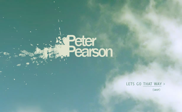
Peter Pearson
Using a splash screen is a good way to slow the user's thought process and inspire them to dig deeper. The splash page's goal is usually to explain the site quickly with photos or a short bit of text.
But in Peter Pearson's case, its goal is to evoke a feeling. The big sky and splattered text effect do a great job at evoking curiosity because these things don't usually appear together. This site also does a great job at continuing the emotion created by the splash page into the actual content.
The side-scrolling motion and animated lines that follow the user are really effective.
Piepmatzel
A great way to get around the language barrier is to not use any words. Piepmatzel is a CSS gallery, and people who have seen a CSS gallery before will likely recognize it as one right away.
Those who haven't may be intrigued enough to give a few of the thumbnails a click in the hope of figuring out the pattern. The small amount of text at the bottom of the page helps with sorting and is superfluous.
Rule #5: Navigation Should Be Easy To Figure Out
Navigation should not be the bottleneck of a site. Users should be able to find what they want quickly. Sometimes, though, unintuitive yet engaging navigation can help the user feel connected to the site and what it is promoting.
Alvin Tang
As mentioned in the previous section, an air of confidence is conveyed when a portfolio doesn't spell itself out. This is the case in Alvin Tang's photography portfolio. When first arriving on the site, the user does not immediately recognize the words they see as links.
This uncertainty should prompt them to poke around a bit. Moving the mouse over a word reveals that it is indeed a link, and upon clicking it, a gorgeous photo loads. The photo will entice users to continue browsing.
To see more photos, users have to click the "Back" button on their browser (something most people understand to do) and then click another link. There is no hand-holding in the design, and it works extremely well. This isn't a conventionally "gorgeous design," but it delivers exactly what it needs to.

Kasulo
Kasulo's navigation isn't terribly hard to figure out, but the average user may not know exactly what to do upon arriving on the site. After the first click, though, everything becomes obvious.
The user navigates the portfolio pieces in 3-D style, and the latest items appear closest to the beginning. Using the mouse wheel is even more fun.
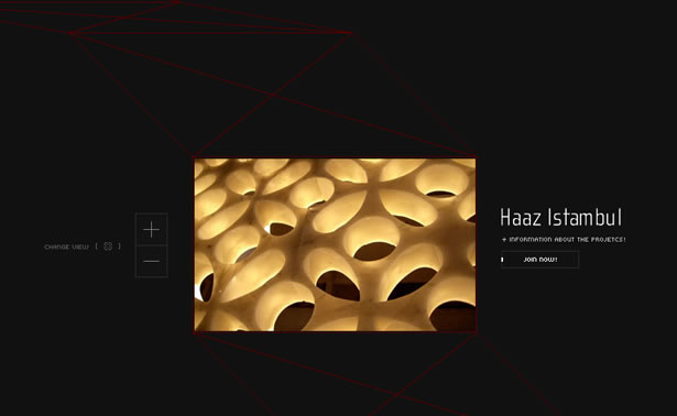
Marcio Kogan
Marcio Kogan's site is another example of great navigation that isn't immediately obvious. The instruction "Drag me" is hard to resist, and once the user does that, they're on their way to cruising the portfolio items. The mouse-over previews are a small detail but really impressive.
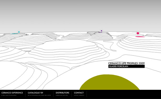
Ceranco
If a client were to ask a designer to make their site in 3-D, like a first-person shooter video game, most designers would silently laugh to themselves, take a deep breath, and then slowly explain why that would be a bad idea.
While the website for Ceranco isn't exactly a 3-D shooter, it could easily be confused for some sort of indie computer game. Sites like this are great at engaging users. While the long loading time and poor search engine optimization make this less than ideal for most projects, it's definitely worth a second thought.
Rule #6: Use Different Colors for the Text and Background
This rule perhaps isn't written all over the place, but many rookies are so afraid of making text unreadable that they don't consider using the same base color for both the background and font itself. You can follow some simple techniques to make the similar colors work.
Linksys
The Linksys site is neat because of how it has one blue for all of its links, even though the background color is various shades of blue. While a risk and maybe not the greatest color decision, it does work.
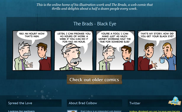
Brad Colbow
Brad Colbow's design is similar to Linksys' because of the blue text on blue background. Blue on blue is difficult to pull off nicely, especially with so many different blues throughout the site.
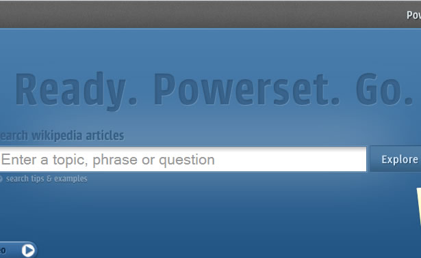
Powerset
So far in this section we've seen only blue websites, because blue text is hardest for the human eye to read, and so legible blue type is always impressive. If a text effect works in blue, it will most likely work in any color.
Powerset uses a letterpress style for its font to create a 3-D effect that effectively separates the text from the background.
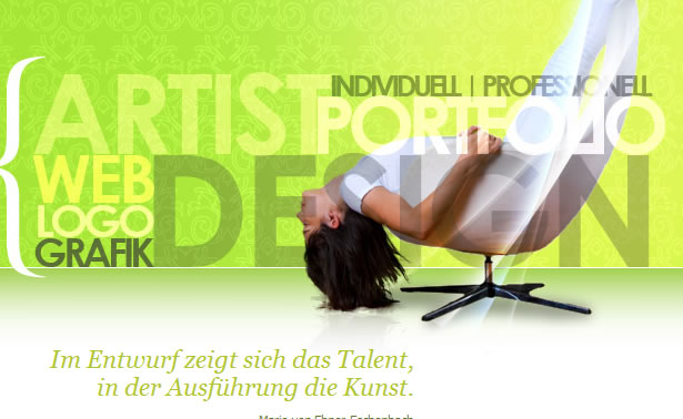
Artist In Design
Artist In Design not only has green text on a green background and yellow/beige text on a yellow background but has text directly on top of a photo.
While some individual letters may be hard to read, the words as a whole remain legible. This type of effect should almost always be center stage in a design.
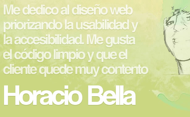
Horacio Bella
Horacio Bella uses another 3-D effect on his portfolio. In this case, the letters appear to pop out rather than be dented inwards. Without this effect, legibility would have been greatly reduced. Another good effect used here is the tight kerning of letters, which further improves legibility.
Rule #7: Don't Put Animation in the Way of Your Content
Seriously, don't pop up little Flash ads right where the user is reading. Same goes for those survey boxes that show up whenever the user is in the middle of a sentence. Users do not enjoy being distracted when they're halfway through a sentence. Unless...
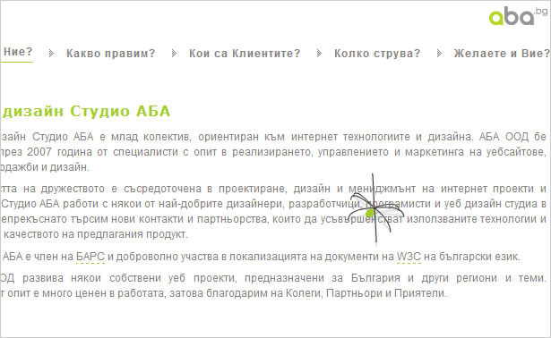
It's really hard to not be enthralled by the little spider on ABA's site. The design is clean, and although the spider is a distraction, it's okay. So far, this site I think is the only exception to the rule.
Rule #8: Stick to Web-Safe Fonts
Although font face replacement techniques are still young, they're already making a big splash. sIFR was the first, and recently Cufón and Typefasce.js have emerged.
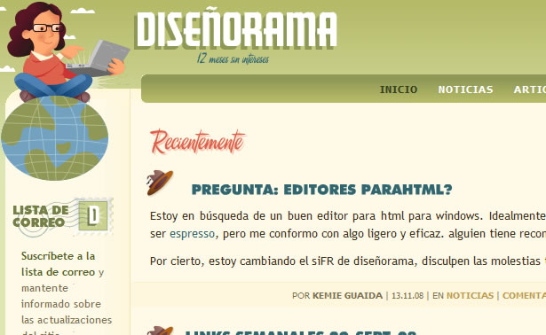
Diseñorama
On the Diseñorama website, the red "Recientemente" text is selectable. One downside is that if the site doesn't load instantly, the user will see the original plain font briefly.
Another downside is that if the user has either JavaScript or Flash disabled, they would only see the original font. All things considered, it's still pretty cool. Hopefully it's a preview of what's to come in the next few years.
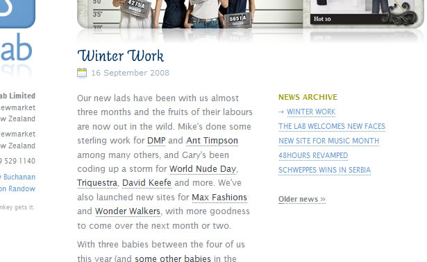
Cactuslab
Cactuslab also uses sIFR for the blue sub-headers (such as "Winter Work"). Although sIFR is the most complicated of the font-replacement techniques, text can be copied and pasted, giving it a big advantage over the two other techniques.
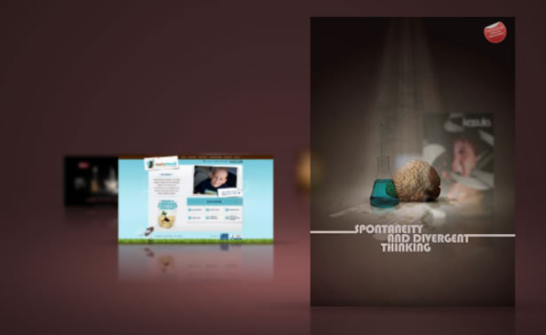
Rule #9: Don't Have a Splash/Landing Page
Many designers have had that same old discussion with their clients about why a splash page is not a good idea. Google tends to rank such pages lower, and they slow down the user from getting the content that they're after. But they can be incredibly beautiful and inspiring if done right.
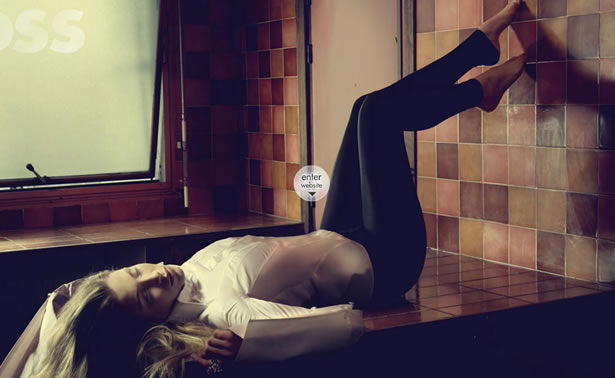
Gloss Postproduction
The purpose of the portfolio sample that appears on the splash page of Gloss Postproduction's website is to elicit an emotional reaction from the user.
Upon each visit, a random photo from the portfolio is loaded. Clicking on the photo scales it down and puts it in its place among the other portfolio pieces on the site. The scaling and motion effect provides continuation and helps carry over the user's emotion to the rest of the company's work.
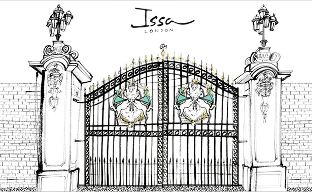
Issa London
When a site is completely done in Flash, the loading bar can serve as a splash page. When a user sees a loading bar, they will either close the page and go somewhere else or switch to another tab and browse elsewhere while they wait.
Once the page loads, it's best to wait for the user to return before starting up. In Issa London's case, the gate is a perfect metaphor to say that the site is ready and the user may enter.
When the user clicks on the gate, the gate opens and various illustrated models appear. Using the gate on the splash page is a great design idea because upon entering, the user feels engaged.
Rule #10: Don't use Tables
Any web designer who uses tables in their designs will instantly be called a rookie by experienced designers. Tables don't display the same in all browsers, and they can make the source code look messy, but at the very least you'll know what you're getting with them. Here are some examples of designs that incorporate tables.
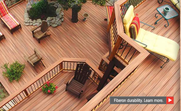
This table is slightly hard to see but is tucked in there between the two chairs. It's a nice little side table but sadly doesn't contribute much to this site's design.
Tables are way in the background of this design on Work at Play, but they keep the workers' laptops and other items within easy reach. Without these tables, the room would feel much emptier, and the background photo wouldn't have the same effect.
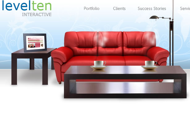
Although this design mostly features chairs, a nice little table appears in the top-right of the thumbnail. Looks like a pot is sitting on it.
As far as designs with tables go, this is one of the best. With two tables featured in this Flash animation, the design gives them a lot of attention. This site should be on every designer's list of great designs that use tables.
Break the Rules!
Breaking the rules is okay when a design calls for it. Many of the design choices reviewed here would not be considered by the average designer. This is what separates great designers from average ones.
Those brave enough to go against what they've been taught always stand out.
Written exclusively for WDD bt Eli Penner. He runs his own website at SleepyHero.com
Do you break any rules in your web designs? Why or why not? Please share your views with us...
WDD Staff


Read Next

3 Essential Design Trends, May 2024

How to Write World-Beating Web Content

20 Best New Websites, April 2024

Exciting New Tools for Designers, April 2024

How Web Designers Can Stay Relevant in the Age of AI

14 Top UX Tools for Designers in 2024

What Negative Effects Does a Bad Website Design Have On My Business?

10+ Best Resources & Tools for Web Designers (2024 update)

3 Essential Design Trends, April 2024

How to Plan Your First Successful Website

15 Best New Fonts, March 2024
