 The logo is the face of any brand -- the very first impression -- so its design is extremely important.
When executed correctly, a logo is a powerful asset to your client's brand.
However, creating an effective visual representation of a brand requires much more than just graphic design.
Like any line of work that involves a set of specific skills, logo design requires plenty of practice and experience for it to be successful; knowledge is definitely power for any graphic designer.
For this reason, we have outlined 12 essential rules to follow in order to design an effective logo.
1. Preliminary Work Is a Must

2. Create Balance
Balance is important in logo design because our minds naturally perceive a balanced design as being pleasing and appealing.
Keep your logo balanced by keeping the "weight" of the graphics, colors, and size equal on each side.
Though the rule of balance can occasionally be broken, remember that your logo will be viewed by the masses, not just those with an eye for great art, so a balanced design is the safest approach.
3. Size Matters
When it comes to logo design, size does matter. A logo has to look good and be legible at all sizes. A logo is not effective if it loses too much definition when scaled down for letterheads, envelopes, and small promotional items. The logo also has to look good when used for larger formats, such as posters, billboards, and electronic formats such as TV and the Web. The most reliable way to determine if a logo works at all sizes is to actually test it yourself. Note that the smallest scale is usually the hardest to get right, so start by printing the logo on a letterhead or envelope and see if it is still legible. You can also test for large-scale rendering by printing a poster-sized version at a print shop.4. Clever Use of Color

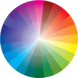
- Use colors near to each other on the color wheel (e.g. for a "warm" palette, use red, orange, and yellow hues).
- Don't use colors that are so bright that they are hard on the eyes.
- The logo must also look good in black and white, grayscale, and two colors.
- Breaking the rules sometimes is okay; just make sure you have a good reason to!
5. Design Style Should Suit the Company

6. Typography Matters... a Lot!
Choosing the right font type and size is much more difficult than many beginner designers realize. If your logo design includes text, either as part of the logo or in the tagline, you will need to spend time sorting through various font types -- often, dozens of them -- and testing them in your design before making a final decision. Try both serif fonts and sans-serif fonts as well as script, italics, bold, and custom fonts. Consider three main points when choosing a font to accompany your logo design:- Avoid the most commonly used fonts, such as Comic Sans, or else your design may come off as amateurish.
- Make sure the font is legible when scaled down, especially with script fonts.
- One font is ideal, and avoid more than two.
7. The Goal IS Recognition

8. Dare to be Different
To stand out from the competition, you must distinguish yourself as a designer with a distinct style. Rather than copy another design or style, be innovative and stand out from the crowd.
So, how can you be different? Try breaking the rules of design and taking risks.
Try a variety of styles to find the one that works best for your client. Try different color combinations until you find one that makes your design truly original.
Have fun with the design program you use, and keep tweaking the design until you feel you’ve got it right.
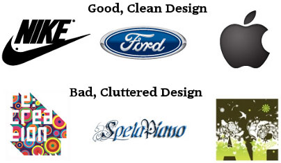
9. K.I.S.S. (Keep it Simple, Stupid)

10. Go Easy on Effects
Adobe Illustrator, Freehand, Photoshop, and other graphic design programs are extremely powerful tools and have many filters and effects that you can apply to your logo, but don't get carried away!
There’s a time and place for these powerful tools, but it is not necessarily to design a logo.
Of course, playing around and seeing whether they enhance a logo is fine, but just remember that simplicity is key.
11. Develop a Design “Assembly Line”
To produce consistently high-quality logos, you need to develop your own design process, or “assembly line.” This should include the following steps:- Research
- Brainstorm and generate ideas
- Preliminary sketches
- Develop vector designs
- Send to client
- Add or remove anything the client wants
- Finalize the design and resubmit to client
12. Use Other Designs for Inspiration Only!
The last rule for designing an effective logo is quite simple: don’t copy other designers' work! While there’s nothing wrong with being inspired by other designers, copying another person's ideas or work is morally and legally wrong. Gallery websites exist that let you use vector art images free of charge, with proper attribution under the Creative Commons License, but I strongly recommend not going this route. These websites can be helpful for getting ideas during the brainstorming stage, but you're better off starting your design from scratch and making it 100% original.Written exclusively for WDd by Jarkko Laine.
Do you follow these rules when designing your logos? Why or why now? Please share your comments with us...
WDD Staff
WDD staff are proud to be able to bring you this daily blog about web design and development. If there's something you think we should be talking about let us know @DesignerDepot.
Read Next
3 Essential Design Trends, May 2024
Integrated navigation elements, interactive typography, and digital overprints are three website design trends making…
How to Write World-Beating Web Content
Writing for the web is different from all other formats. We typically do not read to any real depth on the web; we…
By Louise North
20 Best New Websites, April 2024
Welcome to our sites of the month for April. With some websites, the details make all the difference, while in others,…
Exciting New Tools for Designers, April 2024
Welcome to our April tools collection. There are no practical jokes here, just practical gadgets, services, and apps to…
How Web Designers Can Stay Relevant in the Age of AI
The digital landscape is evolving rapidly. With the advent of AI, every sector is witnessing a revolution, including…
By Louise North
14 Top UX Tools for Designers in 2024
User Experience (UX) is one of the most important fields of design, so it should come as no surprise that there are a…
By Simon Sterne
What Negative Effects Does a Bad Website Design Have On My Business?
Consumer expectations for a responsive, immersive, and visually appealing website experience have never been higher. In…
10+ Best Resources & Tools for Web Designers (2024 update)
Is searching for the best web design tools to suit your needs akin to having a recurring bad dream? Does each…
By WDD Staff
3 Essential Design Trends, April 2024
Ready to jump into some amazing new design ideas for Spring? Our roundup has everything from UX to color trends…
How to Plan Your First Successful Website
Planning a new website can be exciting and — if you’re anything like me — a little daunting. Whether you’re an…
By Simon Sterne
15 Best New Fonts, March 2024
Welcome to March’s edition of our roundup of the best new fonts for designers. This month’s compilation includes…
By Ben Moss
LimeWire Developer APIs Herald a New Era of AI Integration
Generative AI is a fascinating technology. Far from the design killer some people feared, it is an empowering and…
By WDD Staff


