 Wrapping your brain around data online can be challenging, especially when dealing with huge volumes of information.
And trying to find related content can also be difficult, depending on what data you're looking for.
But data visualizations can make all of that much easier, allowing you to see the concepts that you're learning about in a more interesting, and often more useful manner.
Below are 50 of the best data visualizations and tools for creating your own visualizations out there, covering everything from Digg activity to network connectivity to what's currently happening on Twitter.
Music, Movies and Other Media
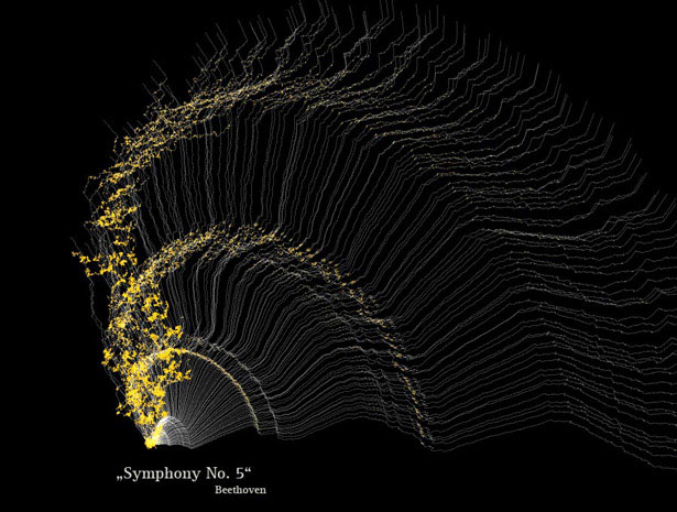
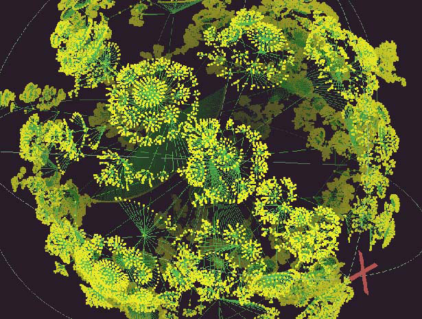
Narratives 2.0 visualizes music. Different music tracks are segmented into single channels that are then shown in a fan-like structure.
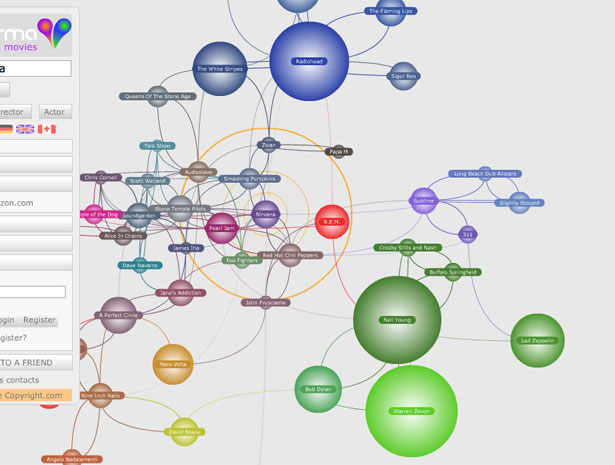
Liveplasma is a music and movie visualization app that aims to help you discover other musicians or movies you might enjoy. Type in the name of a band, artist, movie, director or actor and liveplasma will show you related people, bands or movies.
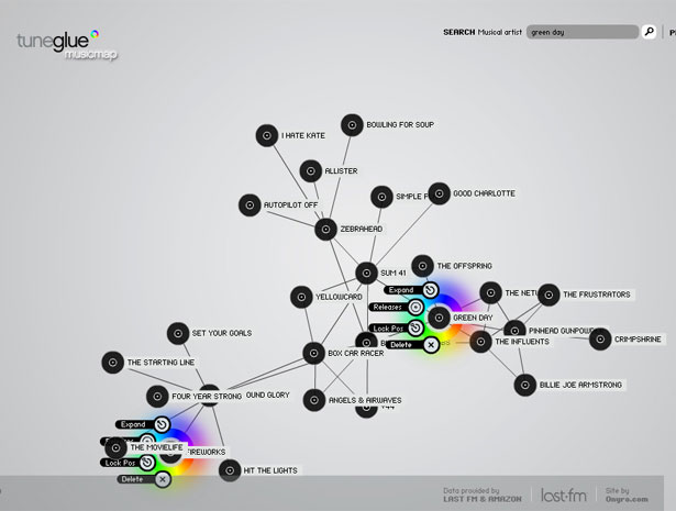
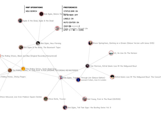
Tuneglue is another music visualization service. Just type any artist or band into the search box and hit enter. A circle comes up representing that band. You can then expand from there, clicking on any new additions after each expansion to expand further. By click on "releases" you can order their albums from Amazon.
MusicMap is similar to TuneGlue in its interface, but seems slightly more intuitive. Search for an artist or band and a list of albums will come up. Once you choose an album a circle pops up on the map. From there you can expand to get related albums, remove that album, or get more information.
Last.Forward is a downloadable, open-source tool to visualize any Last.fm user's social network, including relationships between other users.
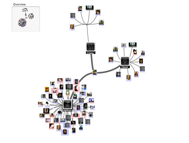
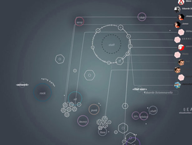
Fidg't is a desktop app that uses Flickr and Last.fm tags to let you visualize your network and their tagging activities. You can see what your network's predispositions are toward different tags and types of content.
Digg, Twitter, Delicious, and Flickr
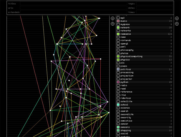
Looks Del.icio.us is a collection of different Delicious bookmark visualizations. They're created with a python-based graphics library and layout engine.
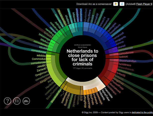
Arc is a product from Digg Labs that shows the latest Diggs, and the relationships between the users submitting and digging them. There are two different speed modes, the slower of which is great if you actually want to read the story headlines.
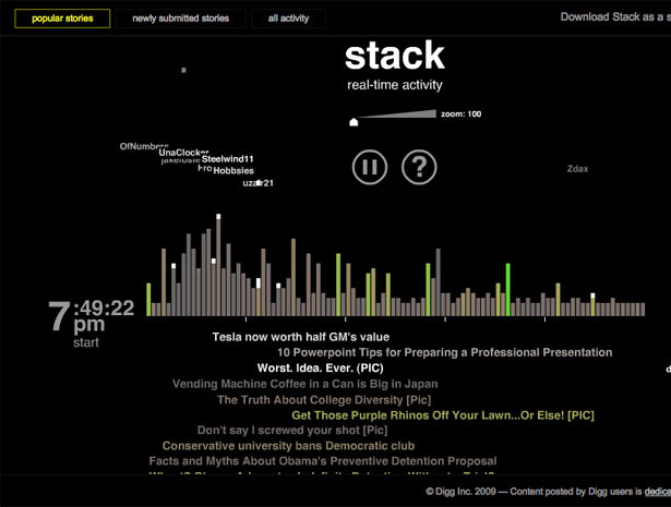
Stack is probably the most useful of the visualization offerings from Digg. Stories with the most recent activity load across the bottom of the screen and then 'Diggs' seemingly fall from the sky to land and create a real-time graph of what stories are popular. Whenever a 'Digg' hits a story stack, the title of the story is shown at the bottom of the screen, pushing previous stories down, and eventually off the screen.
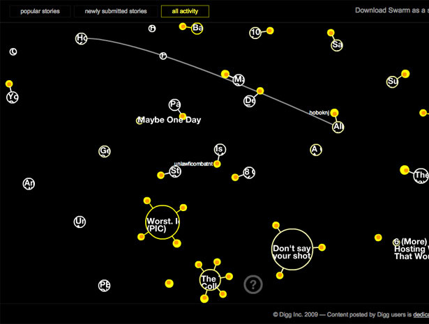
Swarm has one of the cooler user interfaces of all the Digg Labs offerings, with stories and users flying around on the screen. When someone 'diggs' a story, they fly over to the circle representing the story itself and are briefly linked up to it. Hovering over a story or user shows its name and allows you to click. You can also download Swarm as a screensaver.
Research Chronology shows the relationships between one student's research paths via Delicious bookmarks over the course of a semester. It's an ongoing project and includes bookmarks for more than 270 websites.
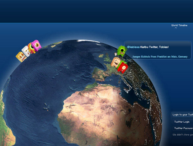
TwittEarth shows live tweets from all over the world on a 3D globe. It's a great visualization tool to see where tweets are coming from in real time and discover new people to follow. It's also fascinating just to sit and watch.
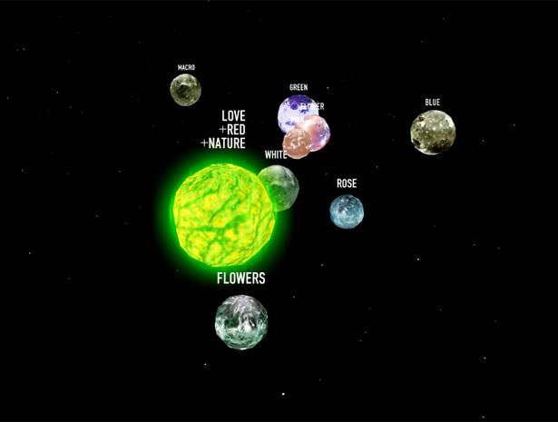
Tag Galaxy lets you search for Flickr tags and have them shown visually in a mockup of a star system. Clicking on any planet (tag) within the first representation changes the image and recenters that tag as the star and pops up new related tags as planets. Clicking on the sun itself brings up a globe covered in images tagged as you've specified.
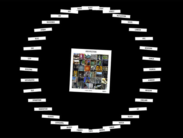
The Flickr Related Tag Browser allows you to search for a series of tags and see related tags. Clicking on a different tag brings up new related tags. You can zoom into the tag selected in the center of the screen by hovering and see images tagged with that word. It also gives a total image count and lets you browse by page.
Internet Visualizations
Mapping the Blogosphere is a collection of maps of the blogosphere, including hyperbolic maps, as shown here.
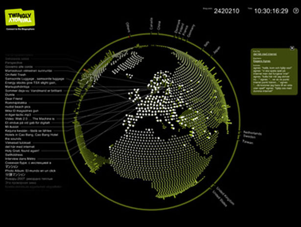
The Twingly Screensaver visualizes the blogosphere worldwide in real time. You get a continuous feed of blog activity straight to your screen.
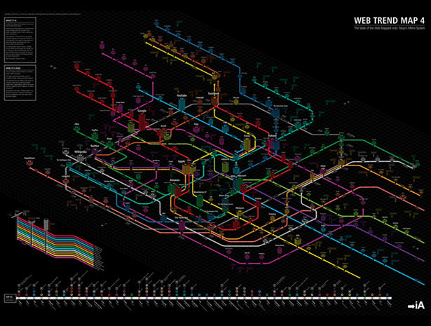
Web Trend Map 4 shows a visualization of current trends online. This is the fourth iteration of this map and the most detailed one yet.
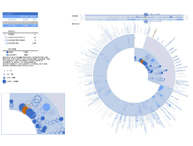
The Bloom Diagram is a project from the IBM Watson Research Center that visualizes the contributions of individuals to open source projects.
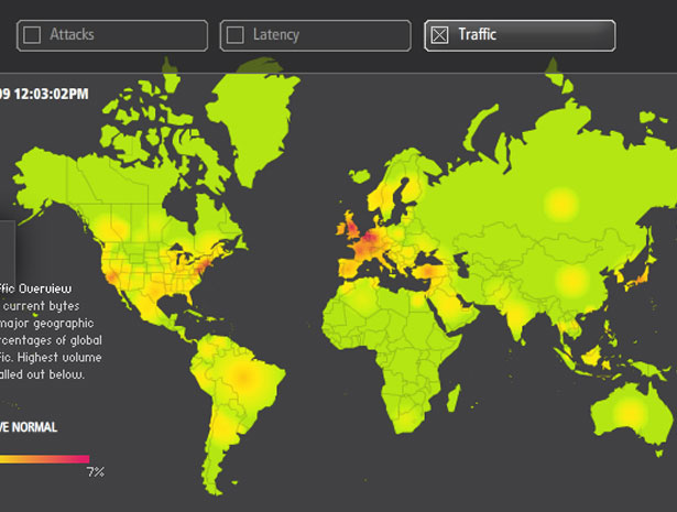
Akami Real-time Web Monitor shows a map of the world with real-time information about internet traffic, latency and current network attacks. The maps are color-coded and easy to read, but only give very generalized information.
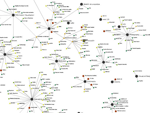
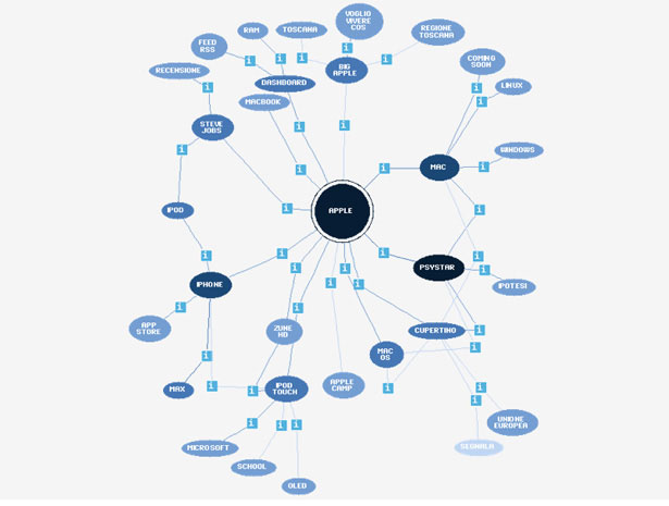
The Mapa de Conocimiento (Map of Knowledge) is a schematic of knowledge involved in any given idea or project. Built in Flash, this tool visualizes a group of URLs organized under main ideas. The map is available in English and Spanish.
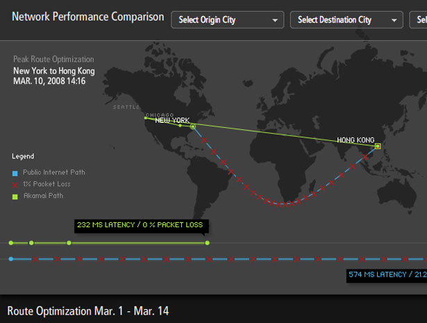
Akami Network Performance Comparison shows the packet loss and network speeds between different cities around the world (to showcase how their technology is better than the standard "public" internet). It also shows graphs of the information.
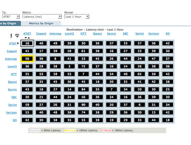
Internet Health Report shows the latency, packet loss, and network availability of the major ISPs and backbone providers worldwide in a color-coded grid format. Hovering over any of the cells in the grid gives more information about the health of that particular connection.
The Hierarchical Structure of the Internet was a study that looks at how the Internet is organized, both in terms of structure and connectivity. It shows how the central core of the Internet is made up of about 80 core nodes, but that even if those nodes failed, 70% of the other nodes would still function via peer-to-peer connections.
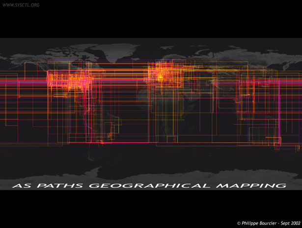
Rootzmap—Mapping the Internet is a series of maps based on data sets provided by NASA and created by Philippe Bourcier. There are a number of different maps available.
Websites as Graphs shows the structure of different websites based on the tags used in their code in a color-coded map that grows on the screen as you watch. Tags are somewhat intuitive in their color-codes, with blue for links, red for tables, and gray for any tags not specifically given a color.
Schemaball visualizes SQL database schema. Relationships are shown based on foreign keys within tables. It's capable of showing schemas with hundreds of different tables and relationships.
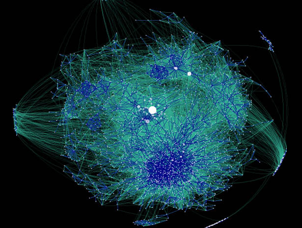
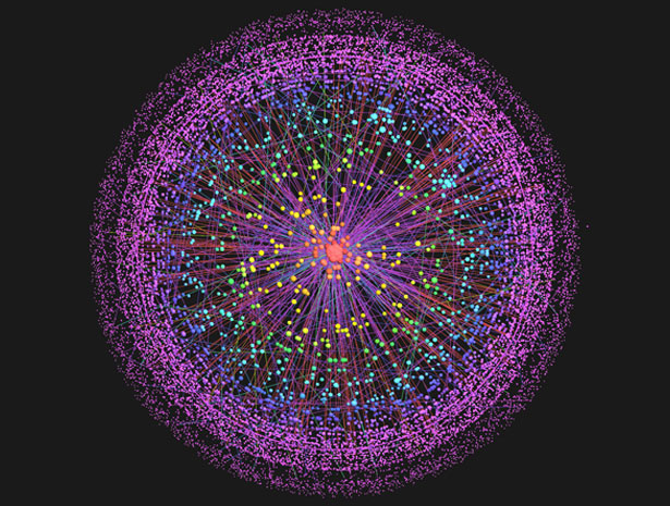
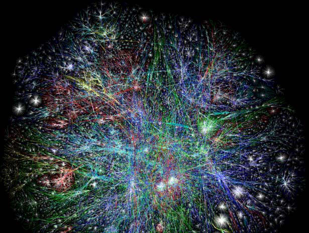
The Opte Project aims to map every class C network on the Internet from a single computer and a single Internet connection. The overall goal is to create a map of the entire Internet.
Miscellaneous Visualizations and Tools
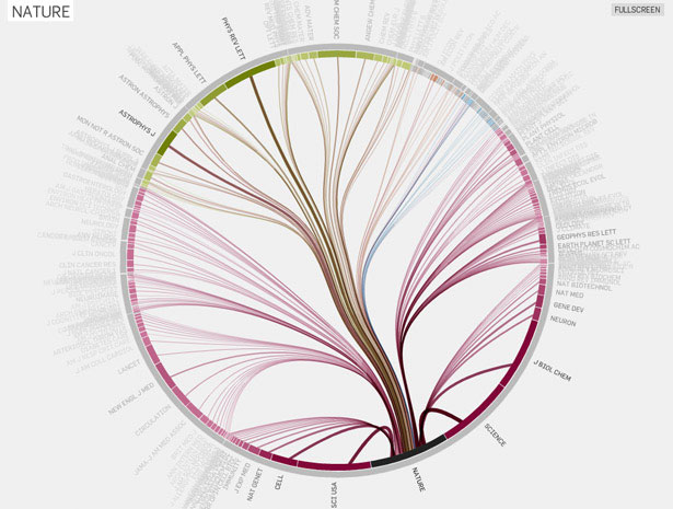
Visualizing Information Flow in Science includes a set of four visualizations showing relationships between citations in scholarly journals that are used to evaluate the importance of each journal.
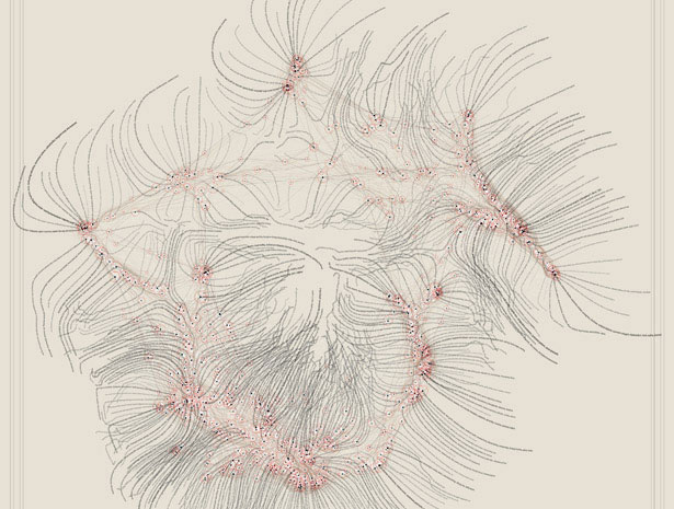
The Micro Fashion Network: Color visualizations show the continuous change of styles in fashion, with a particular look at the basic elements of color. It was created by using a fixed camera and special software to map the colors of clothing people in Cambridge were wearing.
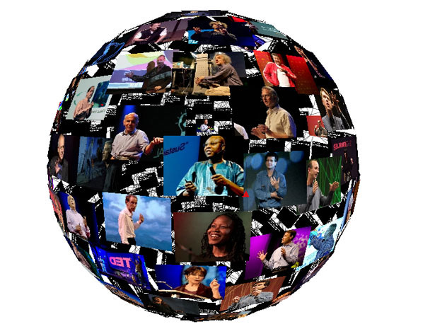
The TED Sphere shows videos from the TED conference in a spherical format with 3D navigation. You can view the sphere from inside or outside and the layout of videos is based on semantic compatibility.
Visualizing The Bible gives a visual overview of more than 63,000 textual cross-references within the Bible. It's intention is to be more beautiful than functional.
Walrus is a visualization tool that allows you to interact with massive graphs in a 3D interface. Interaction is based on selecting any node and then having the graph zoom in to expand on that point.
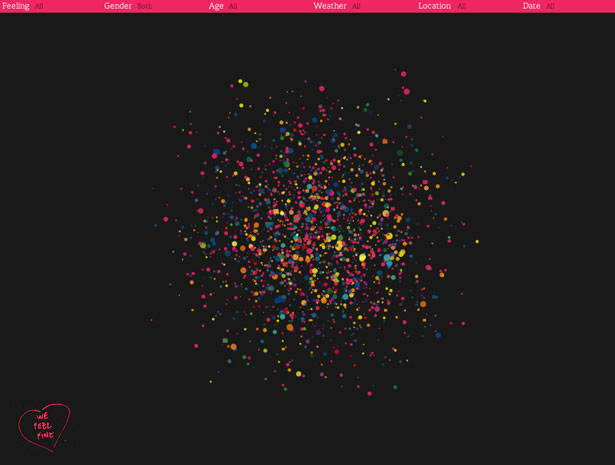
We Feel Fine is one of the most interesting visualization tools I came across. It provides visualizations on the general feelings populating the blogosphere on any given day. You can filter results based on age, location, gender, weather, and other criteria. There are six different visualizations available: Madness, Murmurs, Montage, Mobs, Metrics, and Mounds, each of which give a different portrait of the general feelings abounding on the internet.
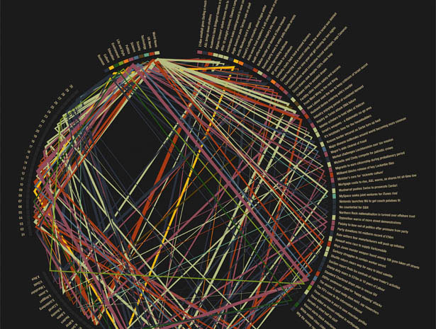
One Week of The Guardian is a visualization of the stories from The Guardian newspaper. It focuses on the relationships between headlines, authors, pages, and categories.
Nemulator is a project that aims to visualize "nemes," or different fragments of states of mind. It also aims to serve as a starting point for discussions relating to the scalability of nemes.
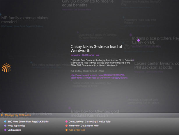
Voyage is a web-based RSS reader that visually displays RSS feeds on a timeline. It's a great way to explore the different feeds you subscribe in a completely different format.
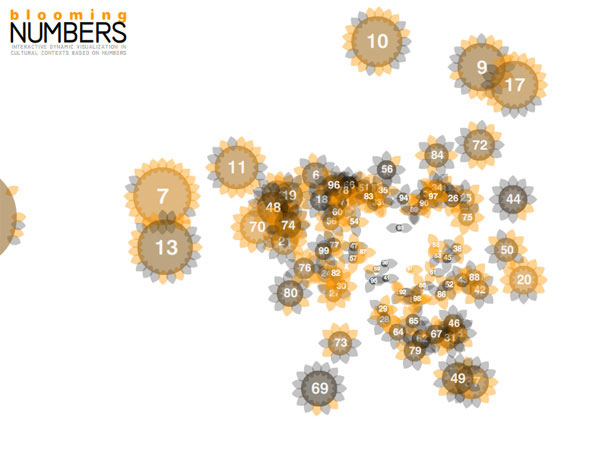
Blooming Numbers is the 2006 CGD MFA Thesis Project of Yuri Lee. It's goal is to show the relationships between preferences of numbers and cultural contexts in an interactive way.
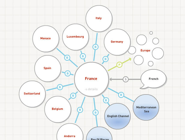
CIA World Factbook Visualization shows a visualization of relationships between different countries and continents based on data from the CIA World Factbook. It shows semantic relationships for each country, including neighboring countries, languages, water and terrestrial boundaries, and more.
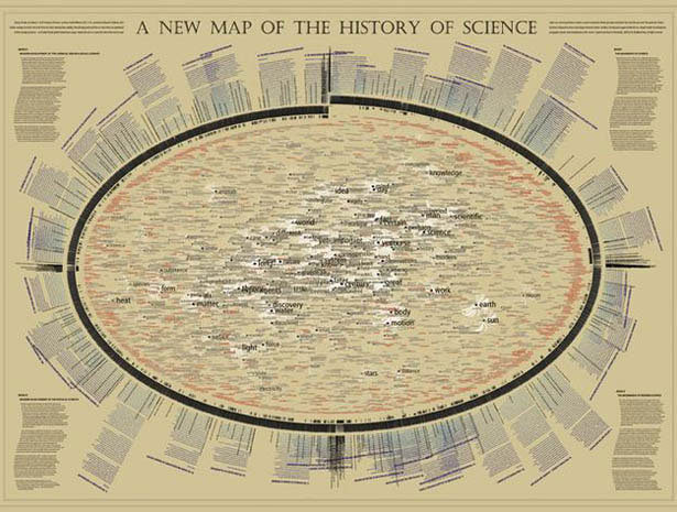
TextArc Visualization of The History of Science is a static visualization of the book The History of Science. It was originally displayed at the NYPL Science, Industry, and Business Library in New York.
This Newspaper Map is a visualization of the rules of the daily production of a newspaper is a striking graphic format. The closeness of words signifies their relationships with each other as do lines traced between words.

GraphNews is a news visualization browser from the Libero WebNews service. It shows news stories in a mind-map-like format. Clicking on one node recreates the graph with the clicked item as the focus.
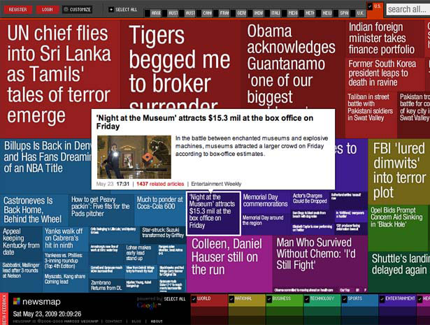
Newsmap shows a visual representation of current headlines on Google News. It shows the relationships and patterns between different news stories across cultures and within different news segments. Be sure to click to the new JavaScript version for the best features.
FreeMind is a Java-based mind mapping software that allows you to build your own data visualizations quickly and easily. Finished maps can be exported into clickable XHTML files as well as other formats.
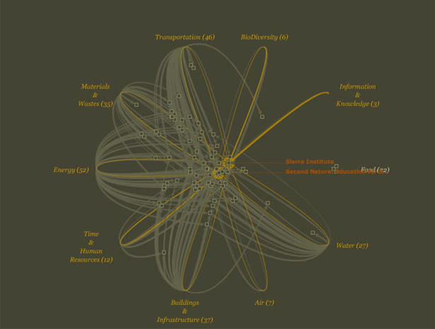
Resource System Reference Database was presented as a poster at InfoVis2004, IEEE's annual conference. In this visualization, line weight shows the strength of relationships.
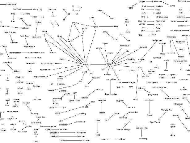
Is the New documents instances of the phrase "is the new" and shows the relationships between the subject and object of that phrase. Examples include "Purple is the new pink" and "Technology is the new religion."
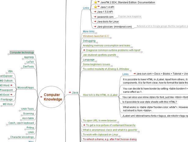
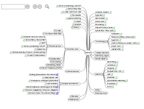
WikiMindMap is a tool to visually browse Wiki content in a mind-map format and includes the ability to download any of their mindmaps in FreeMind format.
How Scientific Paradigms Relate shows the relationships between more than 700 scientific paradigms based on how they were mentioned in more than 800,000 scientific papers. Relationships are also based on how often different papers were cited by each other and by authors of other papers.
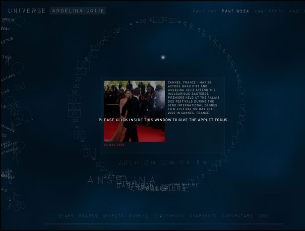
Universe is a great app for visualizing the "universe" of particular search terms. There are sample terms available or you can input whatever you choose. The visualization given is reminiscent of astronomical charts.
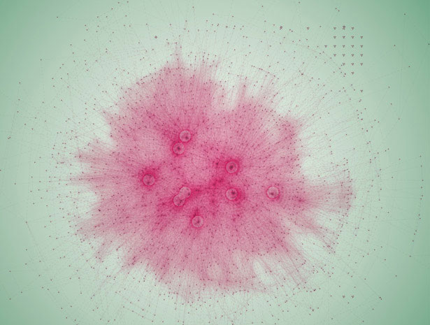
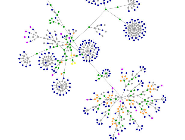
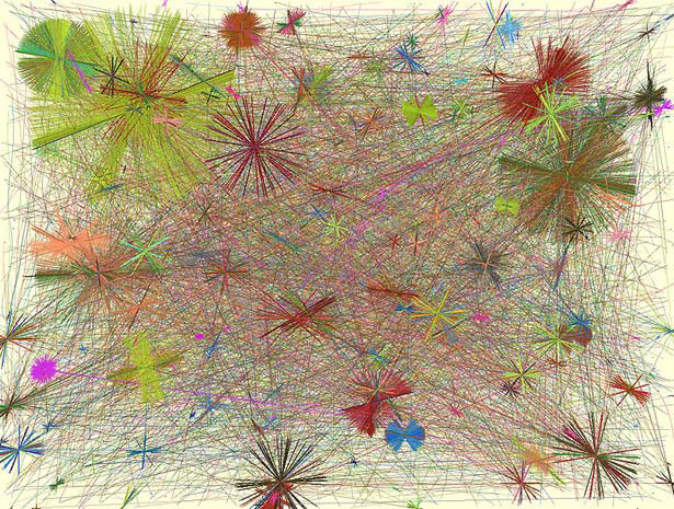
visualcomplexity.com isn't strictly a visualization software, but rather a collection of visualizations already created and categorized. Categories include business networks, art, internet, knowledge networks, biology, transportation networks, social networks, and more.
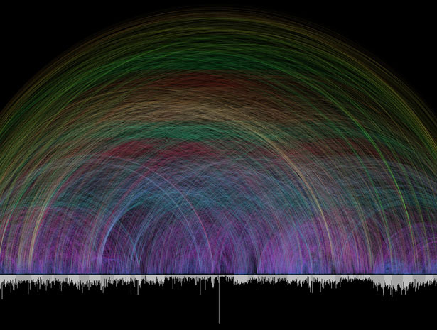
The Strengths of Nations is a visualization of the scientific advancement of ten different nations, including the United States, United Kingdom, France, China, and Australia. The map analyzes 23 different scientific areas, including math, biochemistry, and astrophysics.

Written exclusively for WDD by Cameron Chapman, a freelance writer and designer.
Which 0nes are your favorites? How important is the way we visualize data? Please share your comments with us...
WDD Staff


Read Next

3 Essential Design Trends, May 2024

How to Write World-Beating Web Content

20 Best New Websites, April 2024

Exciting New Tools for Designers, April 2024

How Web Designers Can Stay Relevant in the Age of AI

14 Top UX Tools for Designers in 2024

What Negative Effects Does a Bad Website Design Have On My Business?

10+ Best Resources & Tools for Web Designers (2024 update)

3 Essential Design Trends, April 2024

How to Plan Your First Successful Website

15 Best New Fonts, March 2024
